

Balmistry is a fictional Hungarian brand that combines a love for travel and folk traditions. It collects natural medicinal ointments from ancient traditions around the world under one brand name.
Minimalism and mutability were important to me in creating the brand image. Red is the main brand color because it can be found in almost every country’s flag, and it is quite eye-catching. The logo’s wave was inspired by the sand lines of Zen gardens, and this is where the other main color of the brand, sandy beige, comes from.
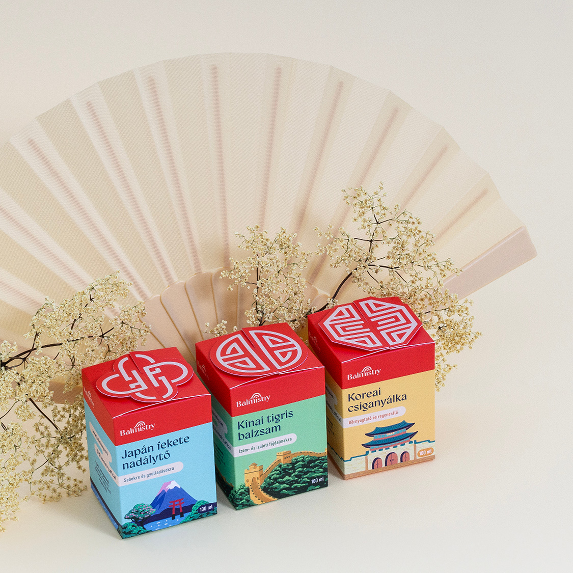
In this project, I focused on the Asian product line, designing packaging for a total of three countries: China, Korea, and Japan. Mutability was also an important aspect of the packaging design, as I imagined it to be adaptable to most countries in the brand’s repertoire.
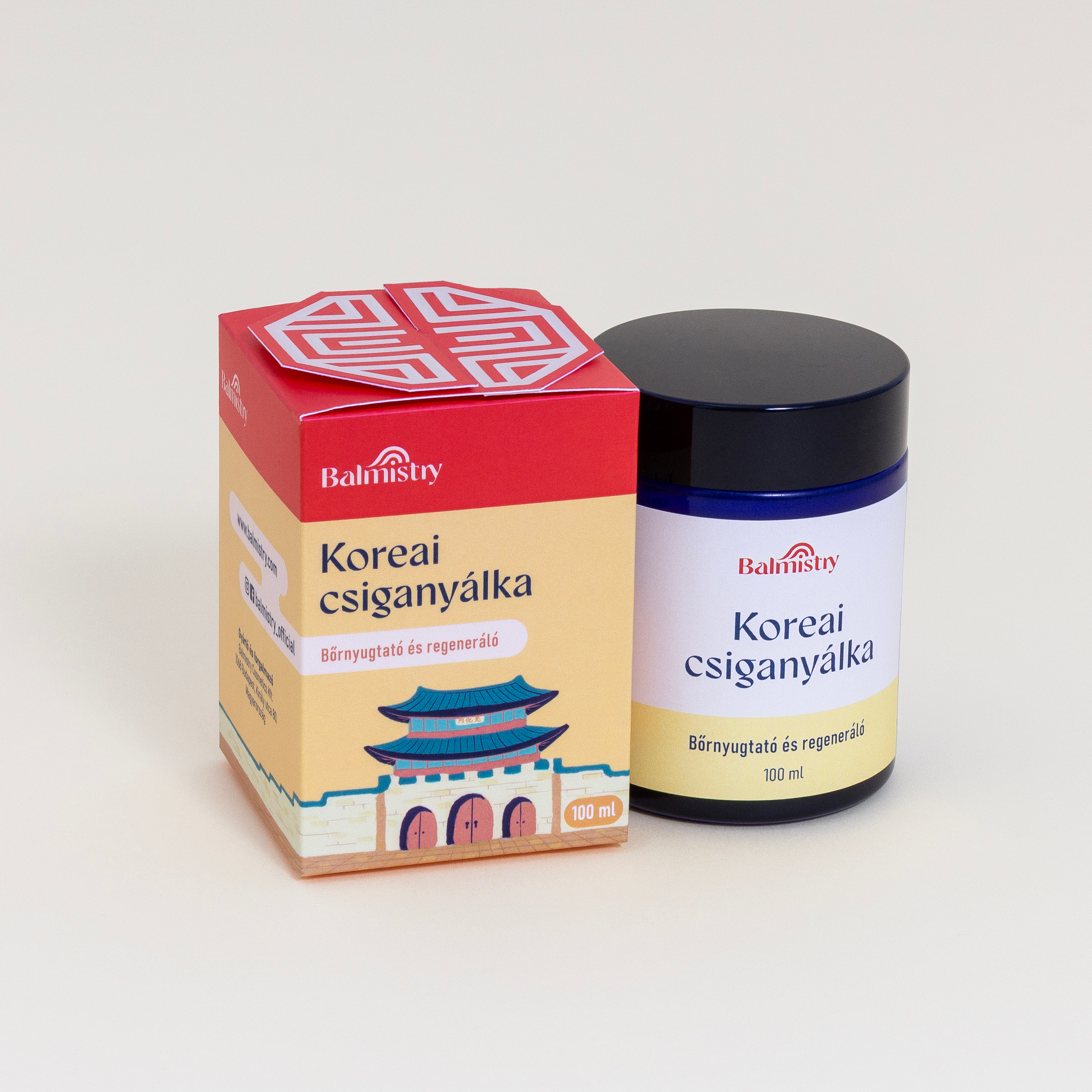
The packaging consists of 100 ml glass jars and accompanying boxes, which are connected at the top in a different shape for each country. It was important to me to include an extra distinguishing feature in addition to the colors and illustration elements—this is how the different roof elements were conceived, based on regional cultural and architectural symbols. For example, the circle on the Chinese packaging is an Asian symbol of longevity.
I created the illustrations with Posca markers, depicting the famous characteristic landscapes and buildings of the countries. The illustrations run throughout the packaging to create a coherent whole.
I imagine this branding and packaging could be adapted for all kinds of medicinal ointments from around the world. While maintaining some static elements, there are enough ways to distinguish between countries of origin to make each product special, while still presenting a coherent, recognizable, and unified product line.




 Alessandro Ammaturo
 Amblr Studio
 vladlenalevit
 Sis Tsarukyan
 monther al omari
 alchimistestudioParis
 designsbysukaina
 About House of Ta
 Amjad Battal
 UPRISE
 Maruf Nishat
 Dozen Agency
 neo creative studio
 Muhammad Tawfeeq
 Stefano Bracci
 Widakk Design
 Studio Garces
 宏洛图品牌设计HONGLT
 DN Designs
 BoldCrest
 Oksana