
The Design
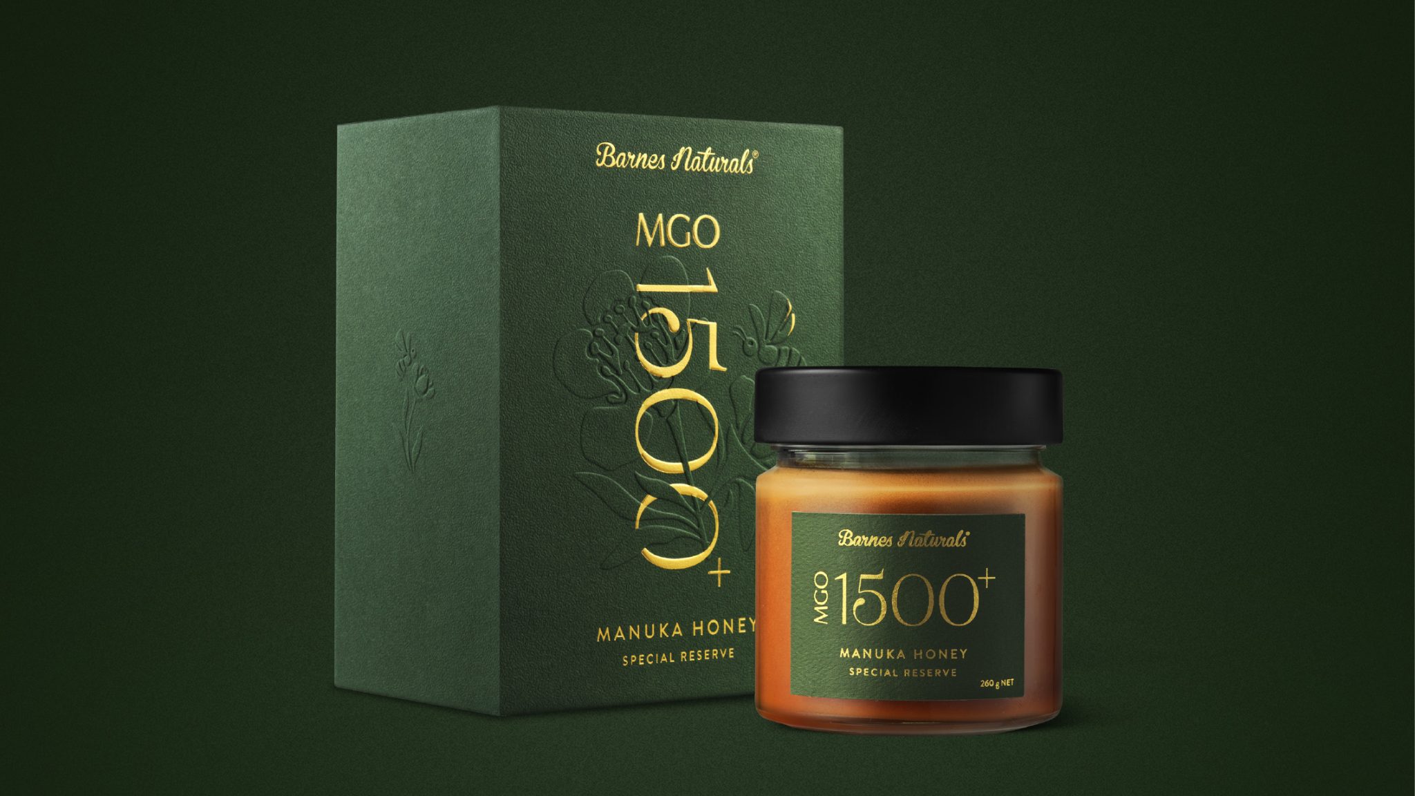
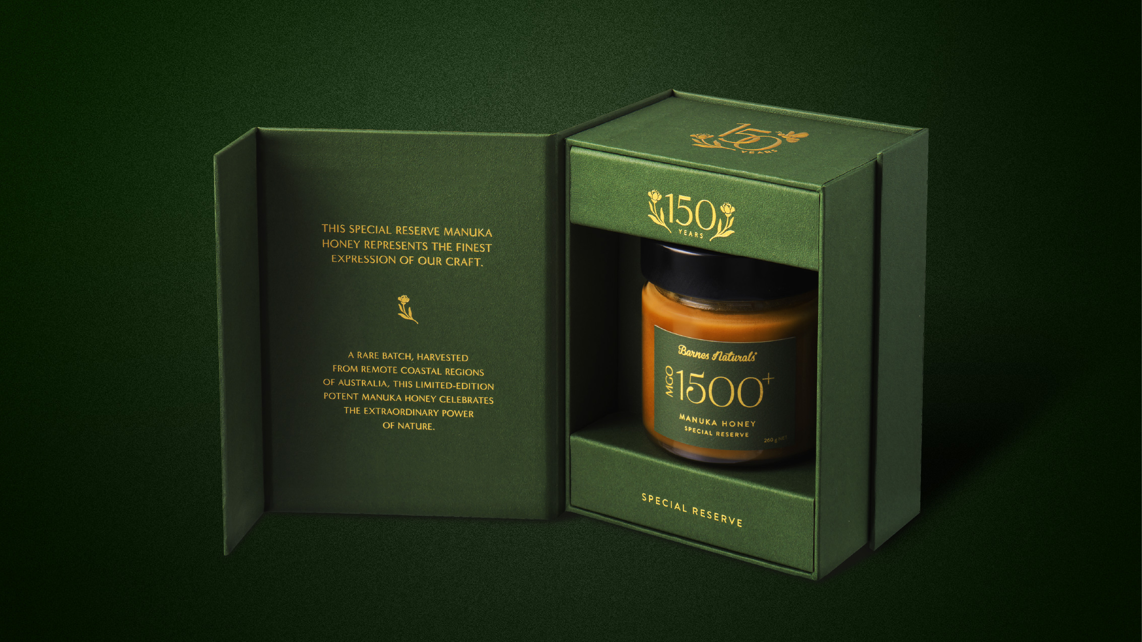
The packaging draws on a refined heritage palette, deep forest greens layered with gold detailing to create depth, richness and strong shelf presence.
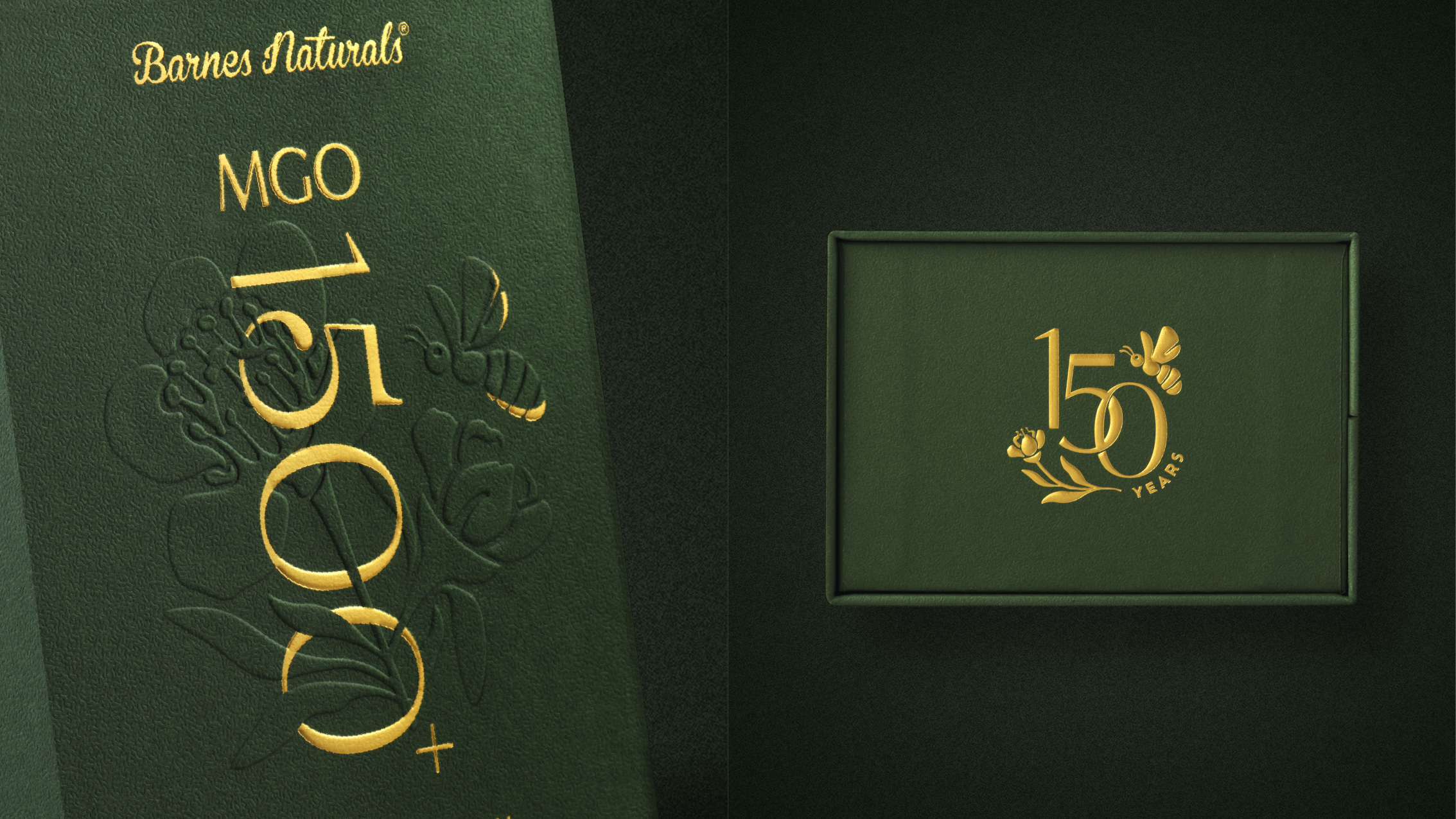
Gold foil stamping and sculpted emboss elevate the anniversary emblem, while blind embossing through the floral illustration introduces a quieter, tactile moment. The interplay of foil and embossing adds dimension, deliberately restrained to maintain sophistication.
Every production decision, from stock weight to finishing, ensures the pack feels as significant in hand as it looks on shelf, reinforcing its authority and price.
To anchor the anniversary, we developed a distinct 150-year emblem, designed to function across packaging, campaign and retail environments.
The result is a commemorative release that balances craft and control: tactile, premium and confidently positioned at the top of the category.
 Derrick Lin
 Biaa
Biaa Petitmoulin Studio
 White Bear Studio
 Eva Chistyakova
 monther al omari
 Atipus
 alchimistestudioParis
 oneandother
 bloomburo
 helocrene
 Shapers Studio
 Denver Design
 Aidearte
 andrew.huerta
 softmachine
 airobtq
 Buzz & Co.
 Ruby
Ruby themythographer
 IDNB Inc.
 viktorflr
 Zenpack