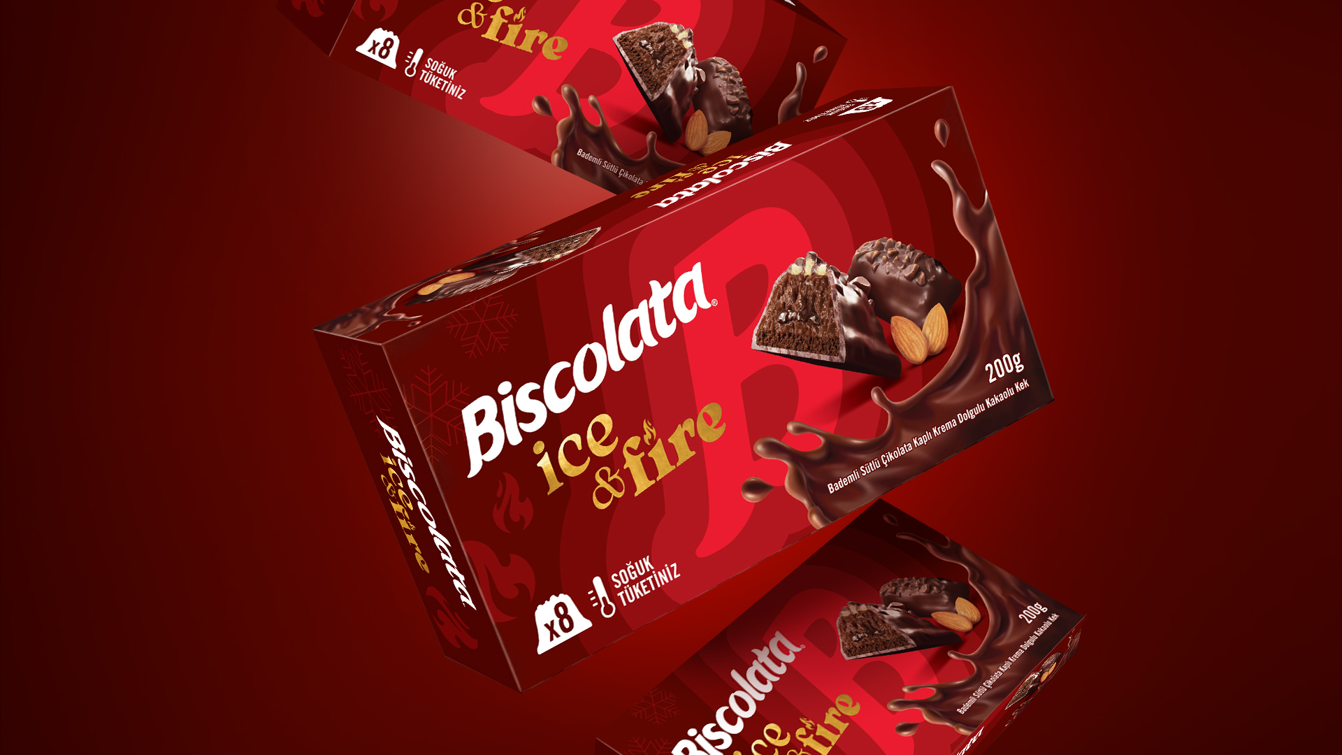

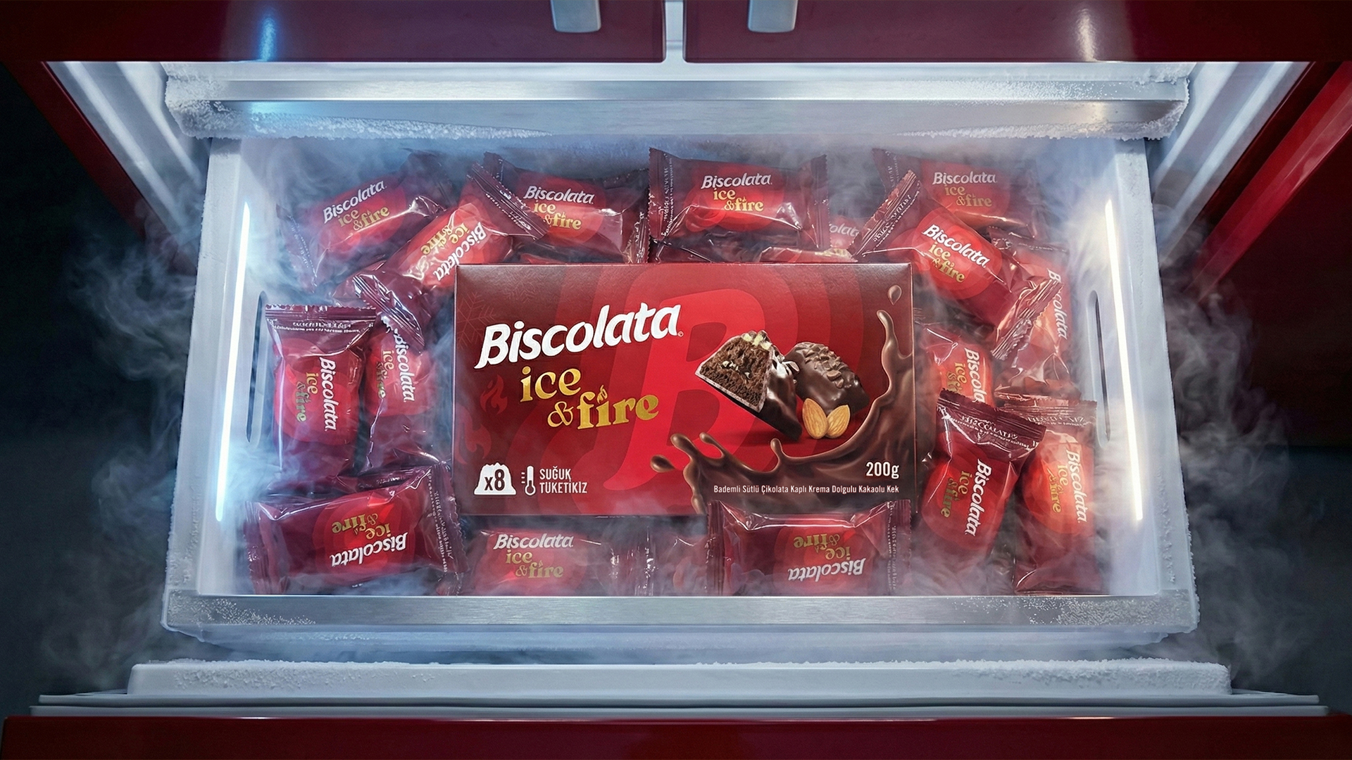
Biscolata was entering the refrigerated category for the first time with Ice & Fire, creating the need for a new packaging identity that could feel distinctive while remaining connected to the Biscolata brand.
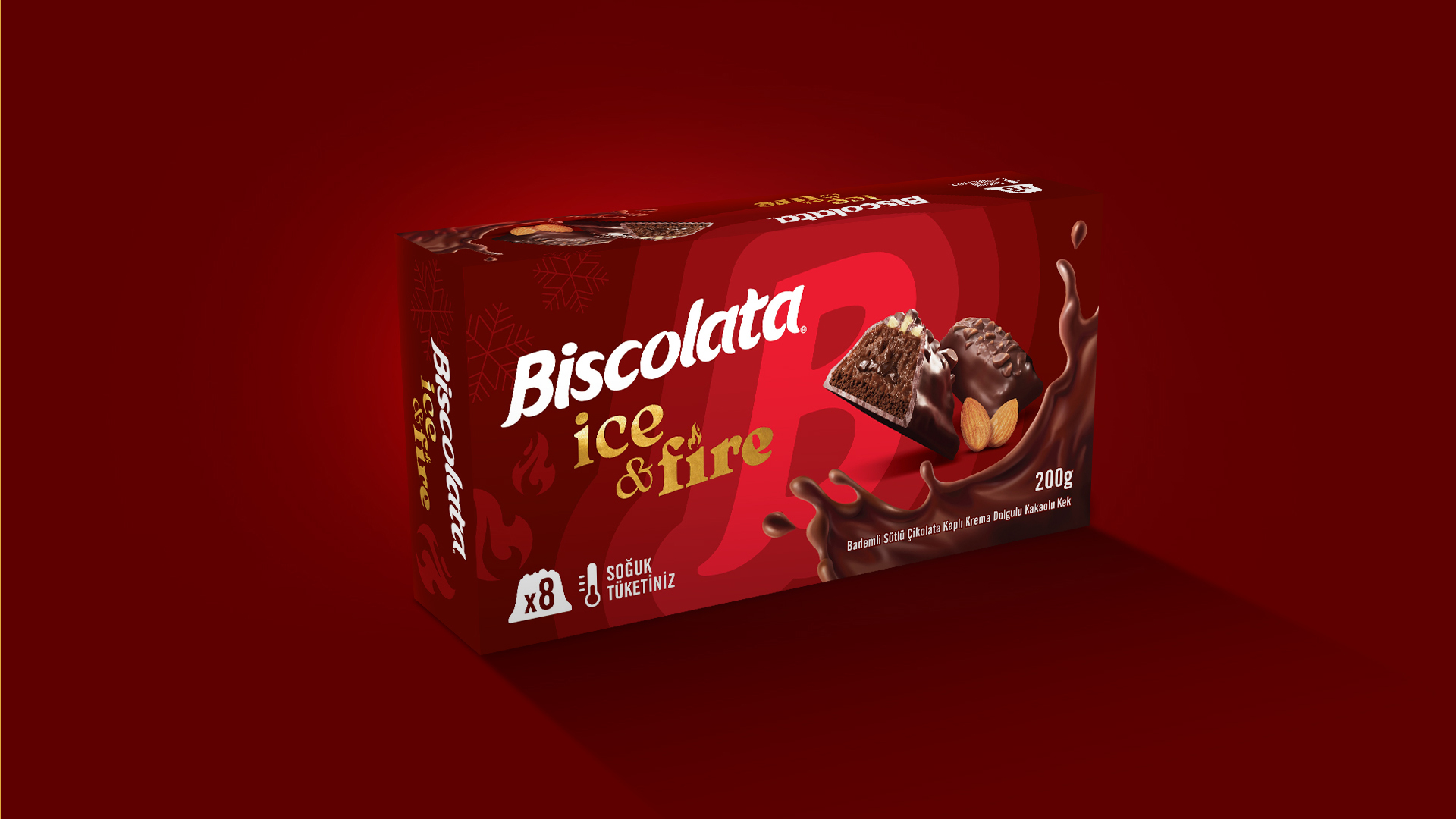
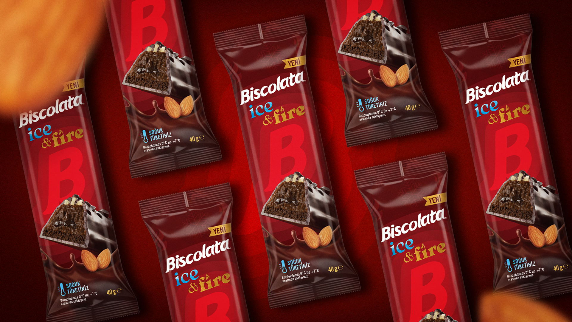
We found the starting point within the Biscolata logo itself. We took the “B” from the logotype, enlarged it and turned it into the hero graphic of the packaging. What had previously been part of the logo became a bold visual device that gave Ice & Fire its own recognizable identity.
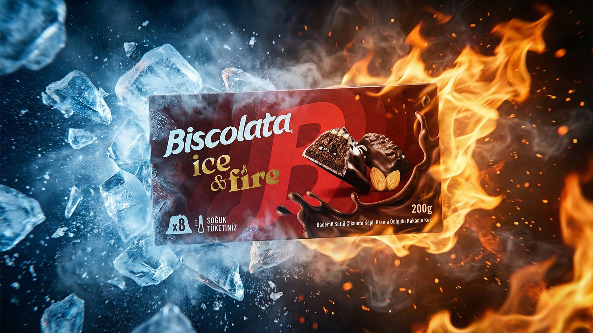
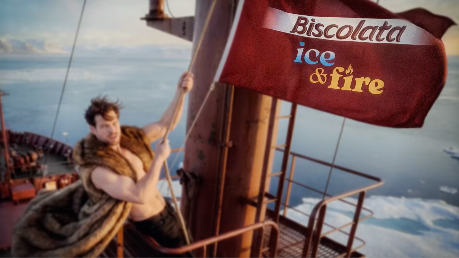
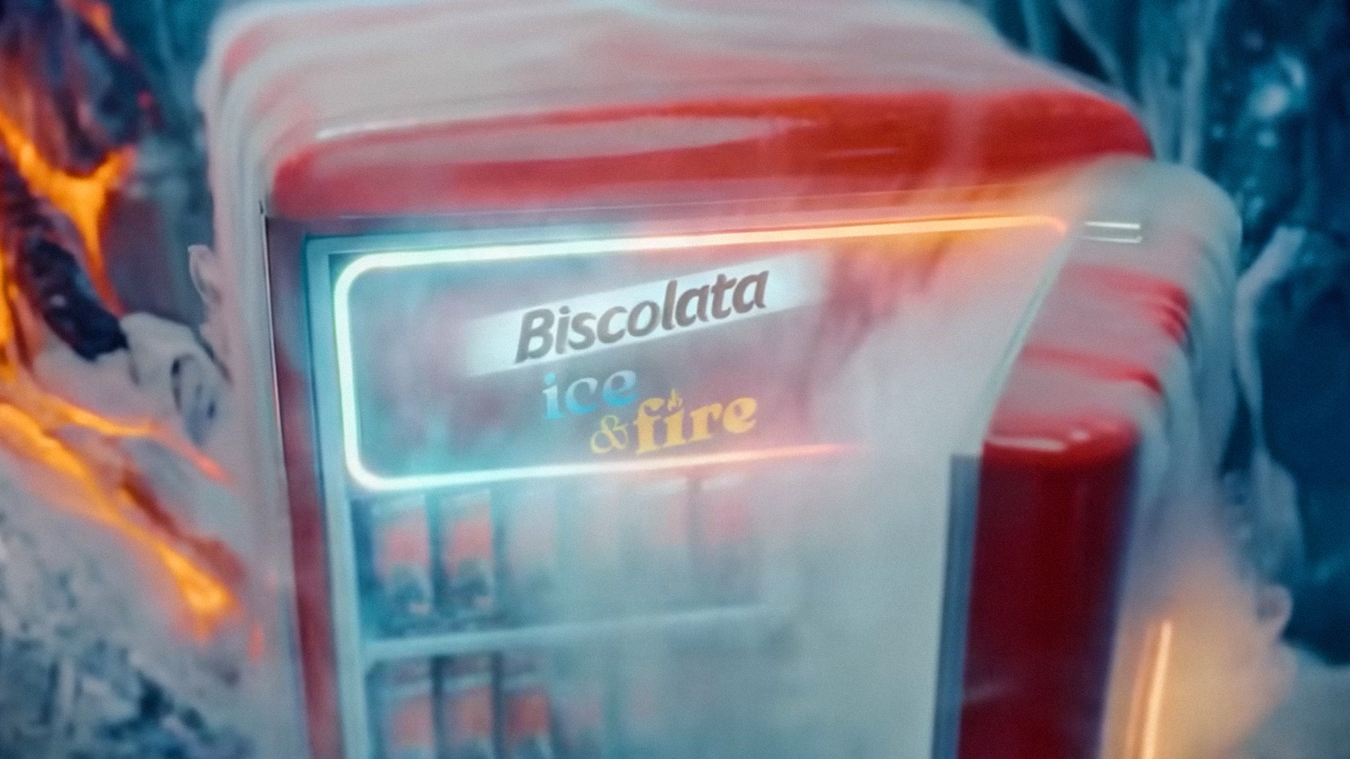
The name also became part of the idea. Ice and Fire represent two opposing sensations, so the colors, typography and composition were built around this contrast, bringing cold and heat together within the same packaging world.
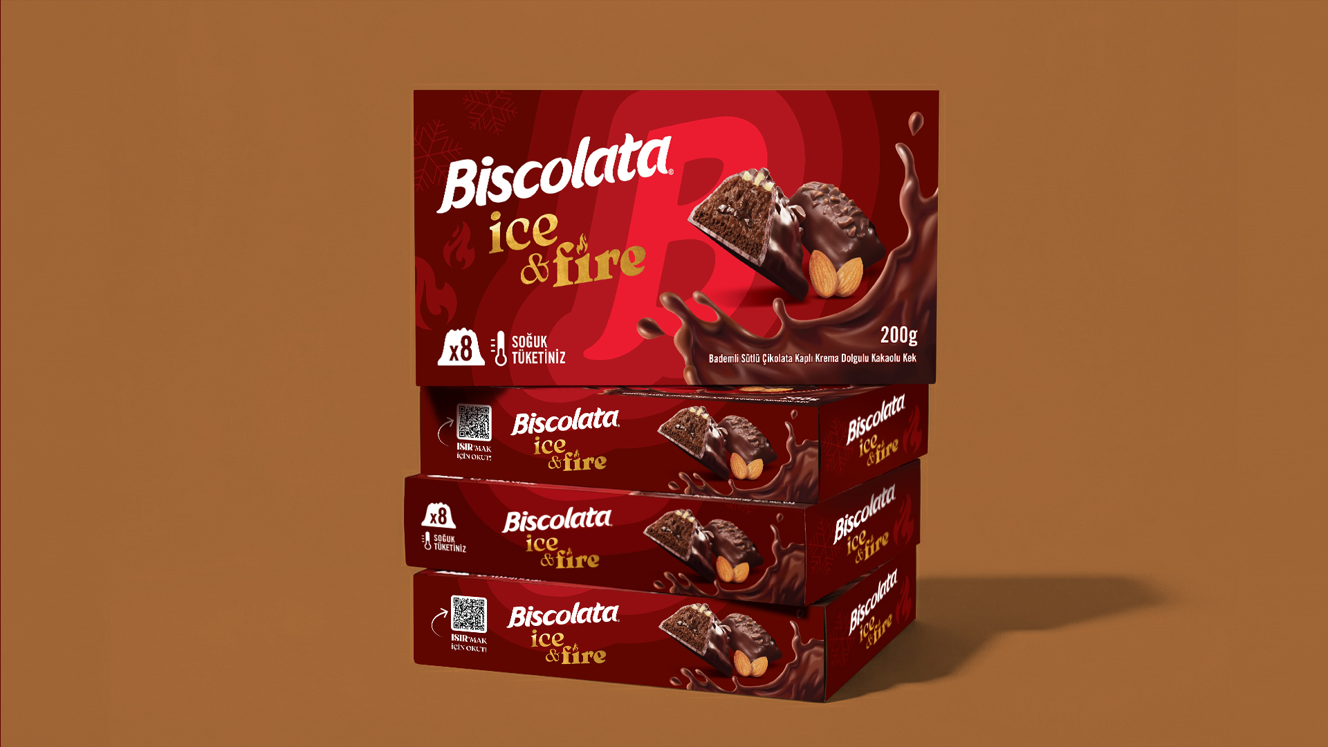
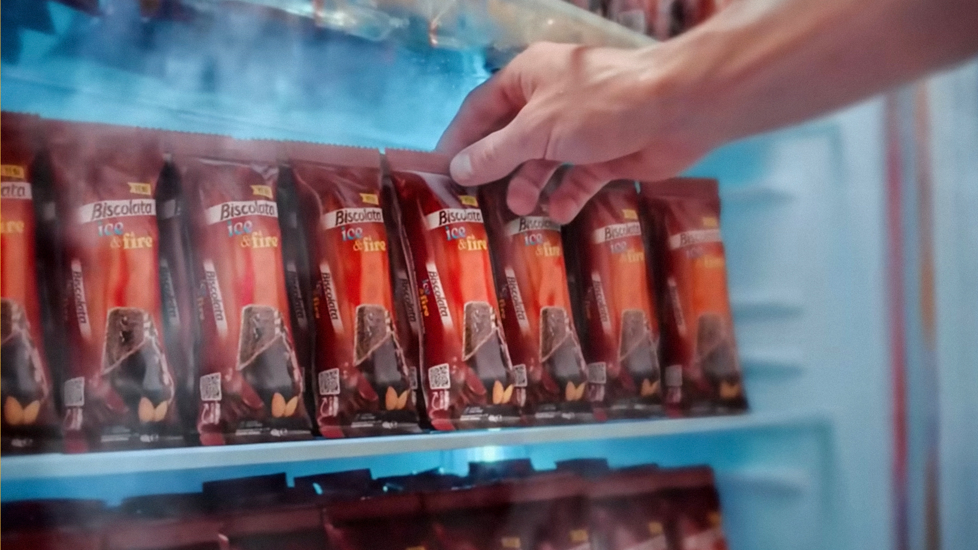
The system was first developed for the multipack and later extended to the single-serve products, allowing the idea to grow consistently across the range.
One brand, a new category, and a new expression of Biscolata without losing the world it already belongs to.
Client: Şölen / Biscolata
Creative Studio: Mark Creative Studio
Creative Direction & Design: Mert Göker
Brand Identity & Packaging Design: Mark Creative Studio
Product CGI / Illustration: Basthead Studio
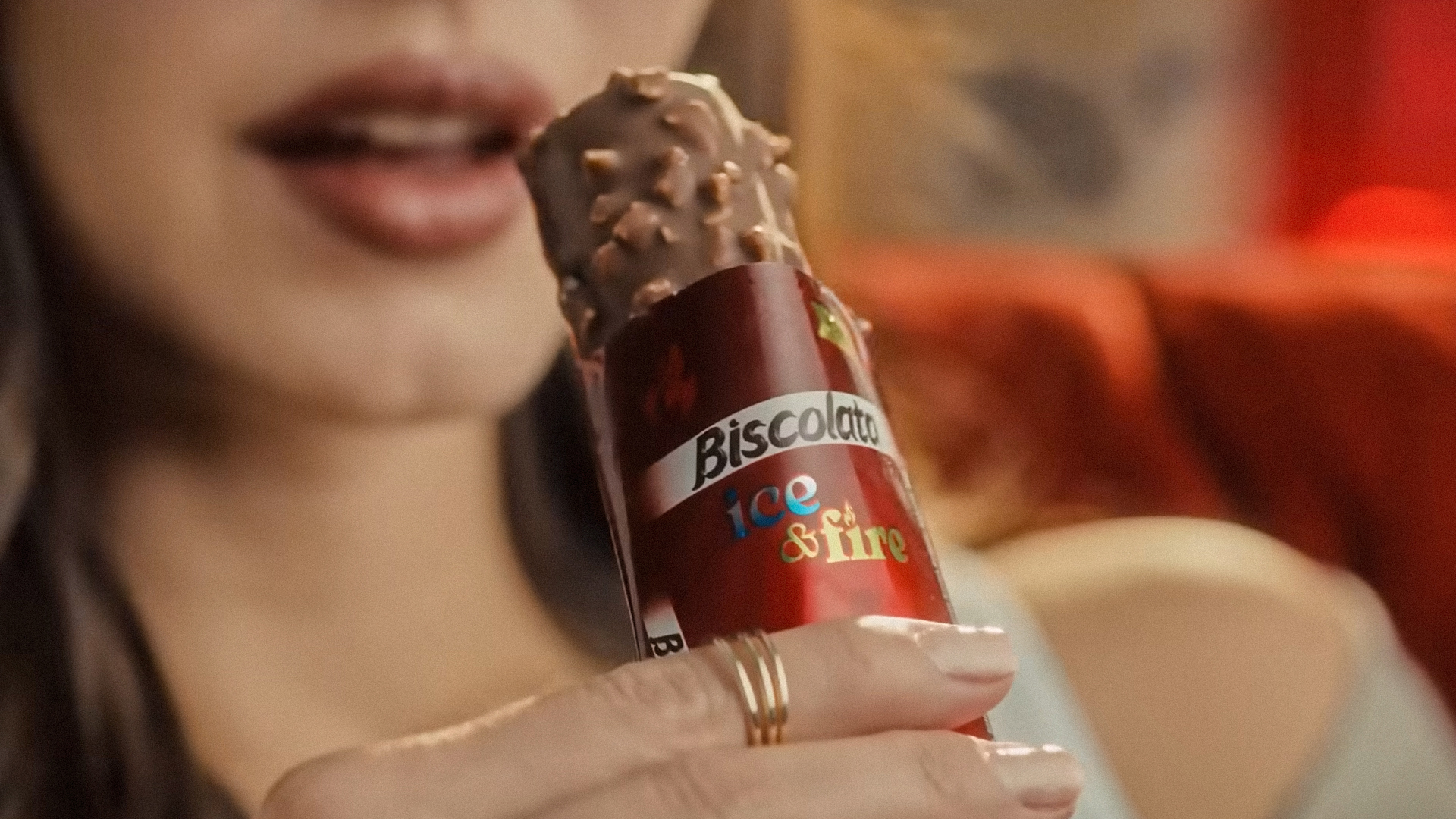
Campaign Film Stills: Courtesy of Şölen / Biscolata
Year: 2025
Location: Istanbul, Türkiye
 Derrick Lin
 Sophiagdotcom
 Sofia Nikishina
 studionerius
 monther al omari
 Monroe
 KateChachava
 Snob Duck
 宏洛图品牌设计HONGLT
 Studio Six F
 Just Design
 New Century Design
 VIEWPOINT
 Abbydraw Designs Unique Conceptual Branding & Packaging Designing Ideas
 BexNelson
 Vladimir Shmoylov
 Kris
 Agence des Coteaux
 Julia M.
 Rabia zouina
 www.branding.uz
 Diego Alves do Amaral
 studioaslihan
 Minim Brand Design