
About
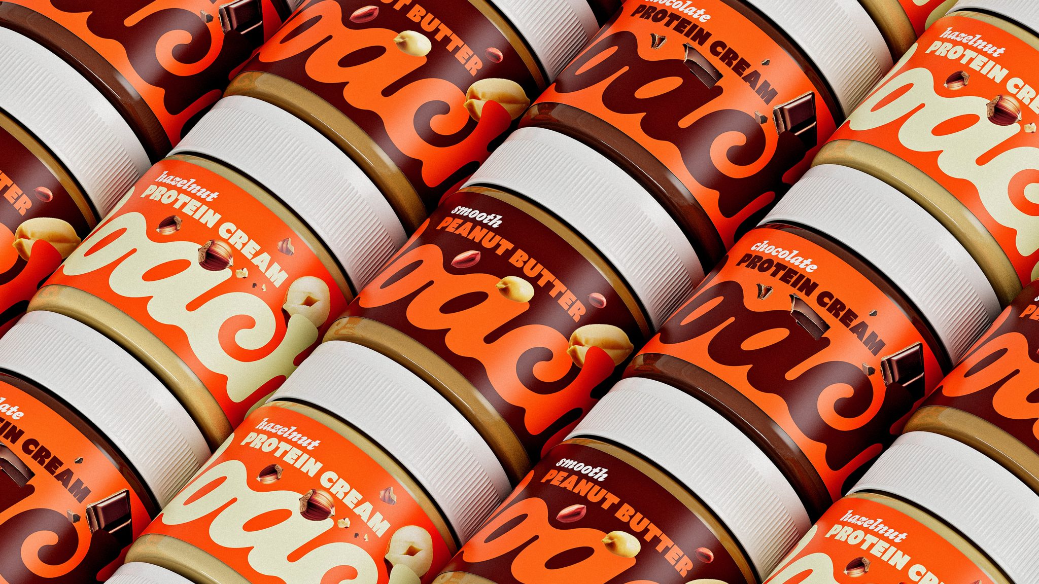
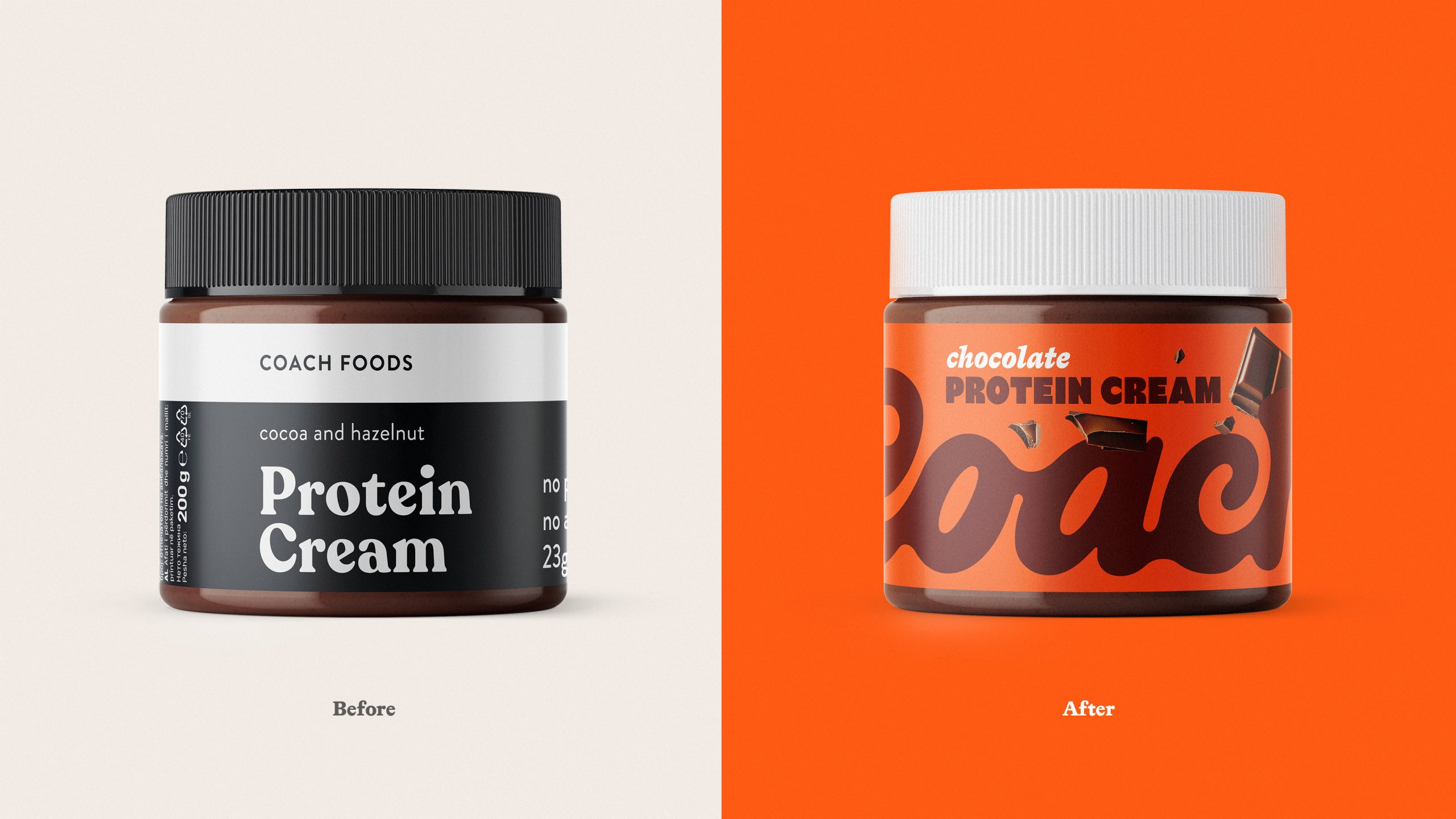
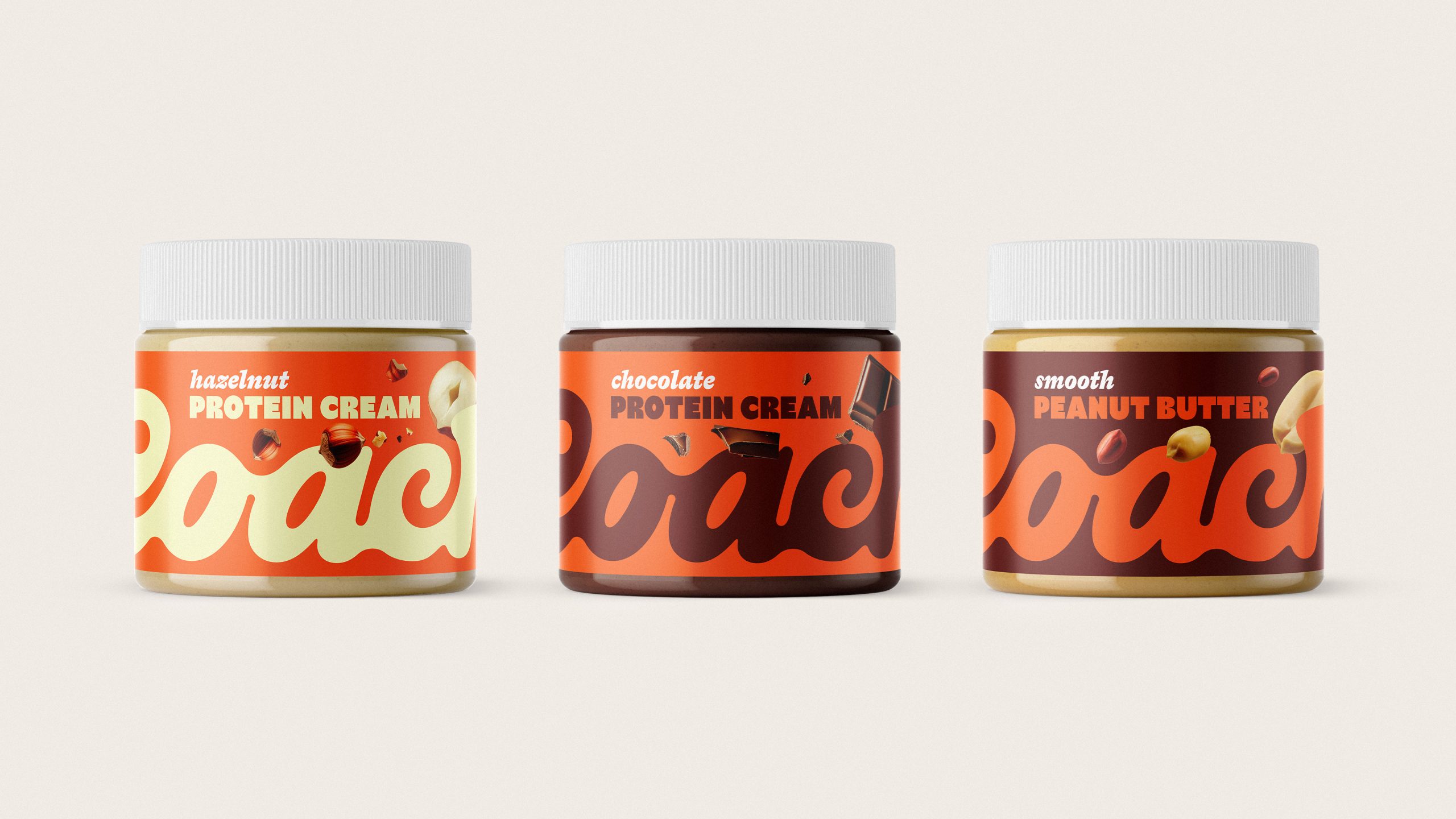
Coach is a Nutella-style chocolate spread brand from North Macedonia, made without sugar, sweetened with alternatives, and boosted with protein. The product tastes indulgent, the profile is cleaner. The old packaging did not say that on shelf. SKUs used very different colors, pink beside black beside blue, so the line felt scattered. There were few flavor cues and no clear family read. The brief was to flip the visual order, show taste first and confirm the clean story second, and to unify the range on shelf.
Solution
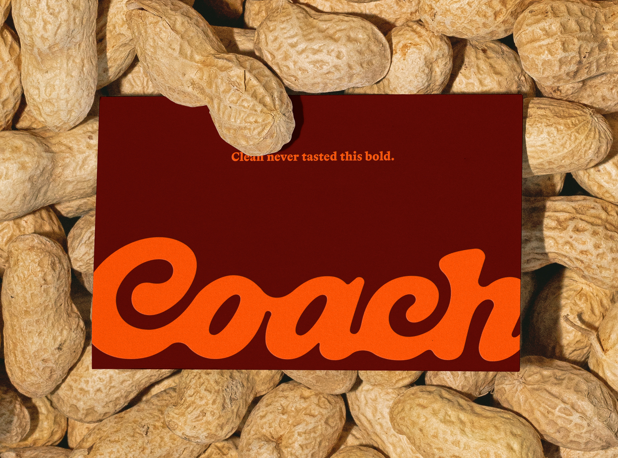
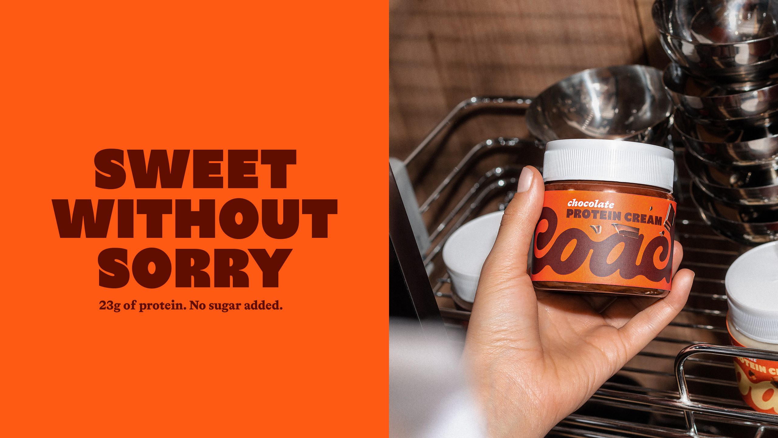
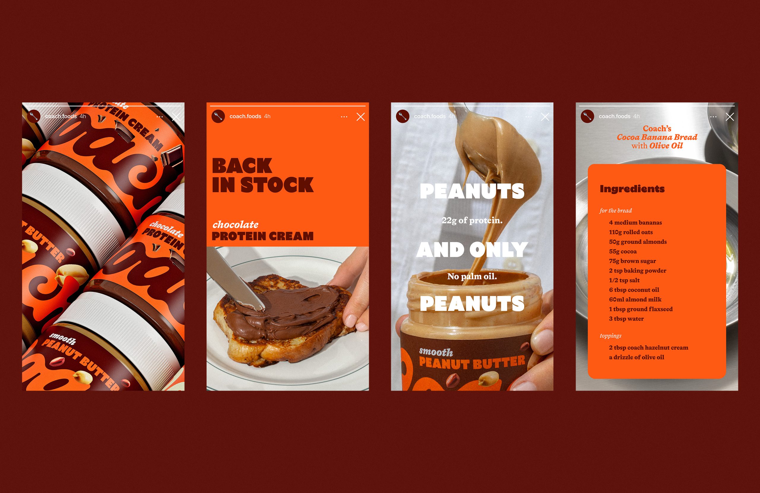
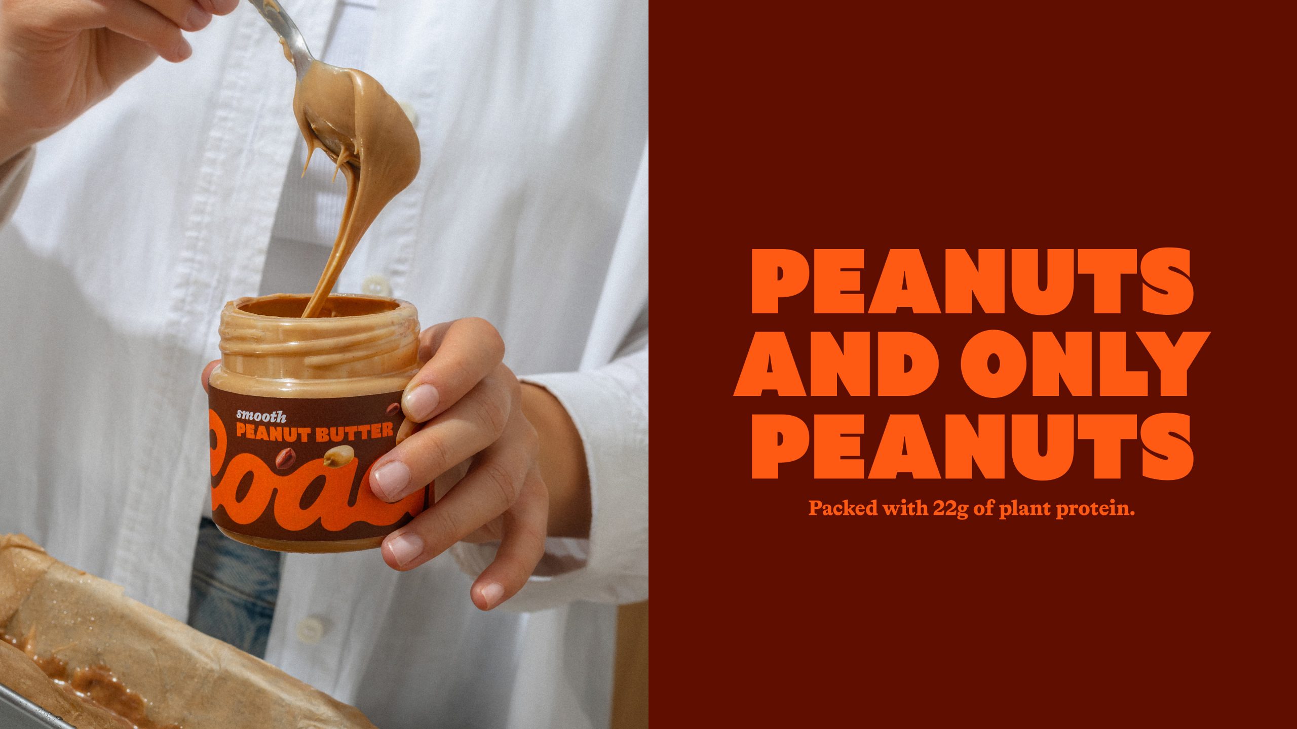
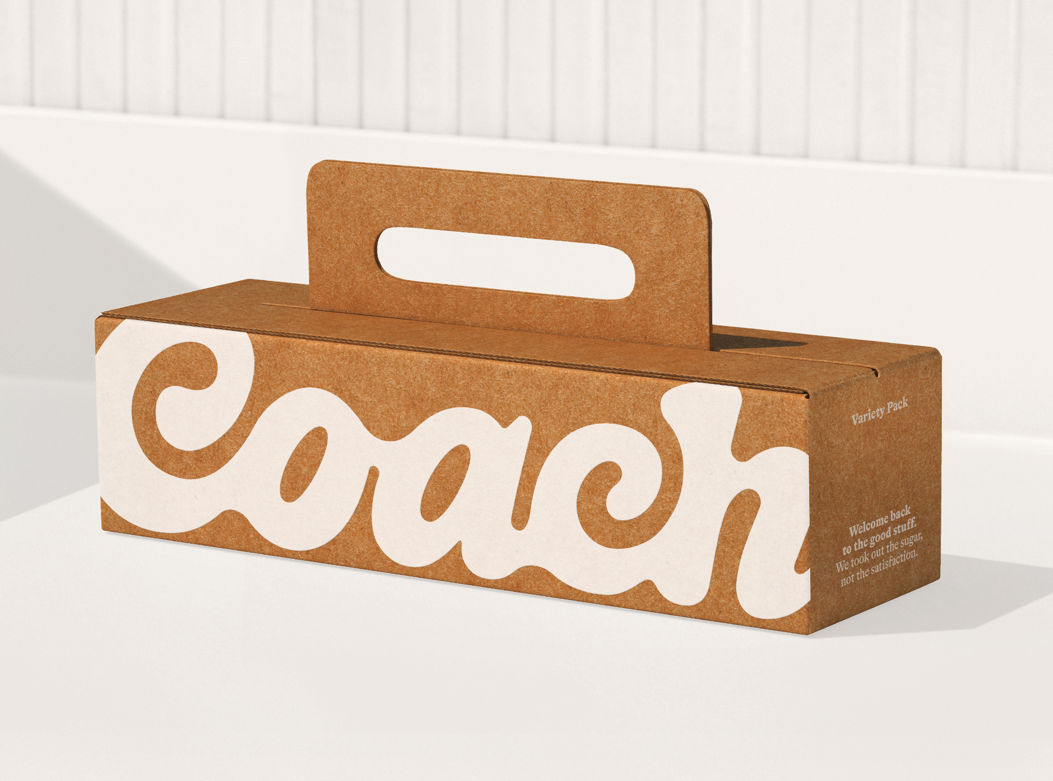
We shortened the name from Coach Foods to Coach to improve recall. We built a warm, chocolate-led palette so jars read as one family from the aisle. Small ingredient cues, peanuts, hazelnuts, chocolate pieces, help shoppers spot flavor without crowding the layout. The logotype is large and confident. Type is simple to scan. Claims and nutrition sit where people expect them, so reassurance comes after the grab. Scope covered identity, label architecture, color logic across SKUs, messaging, print-ready files, e-commerce assets, and 3D shelf renders for sell-in. Guiding line, Clean never tasted this bold.
Results
On shelf, Coach now forms a bold, unified block that signals “this tastes amazing” at a glance. Up close, the clean-label proof is easy to read. Early buyer feedback notes stronger flavor clarity and easier shopability. The system balances appetite and order, which helps the product get picked up in a crowded aisle. Coach rolls out across the Balkans in 2026, with a US DTC launch planned for the second half of the year.
Credits:
Client: Coach Foods
Brand Identity & Packaging Design: Relish
Creative Direction: Dimitar Popov
Design: Anastzija Manasievska
Photography: Anja Kalin
3D Renders: Zach Peterson


 Li Jie
 Lung-Hao Chiang
 Alessandro Ammaturo
 Antonia Skaraki
 Narrow House Packaging Branding & Design
 teresaredon
 Eva Chistyakova
 Akshay 11
 cheleto
 nadayasser13e
 hello ocean
 Modern Theory
 Alexander Skurihin
 Valérie Colace
 Squad
Squad Studio Zak
 Bhumika Singh
 宏洛图品牌设计HONGLT