
ABOUT
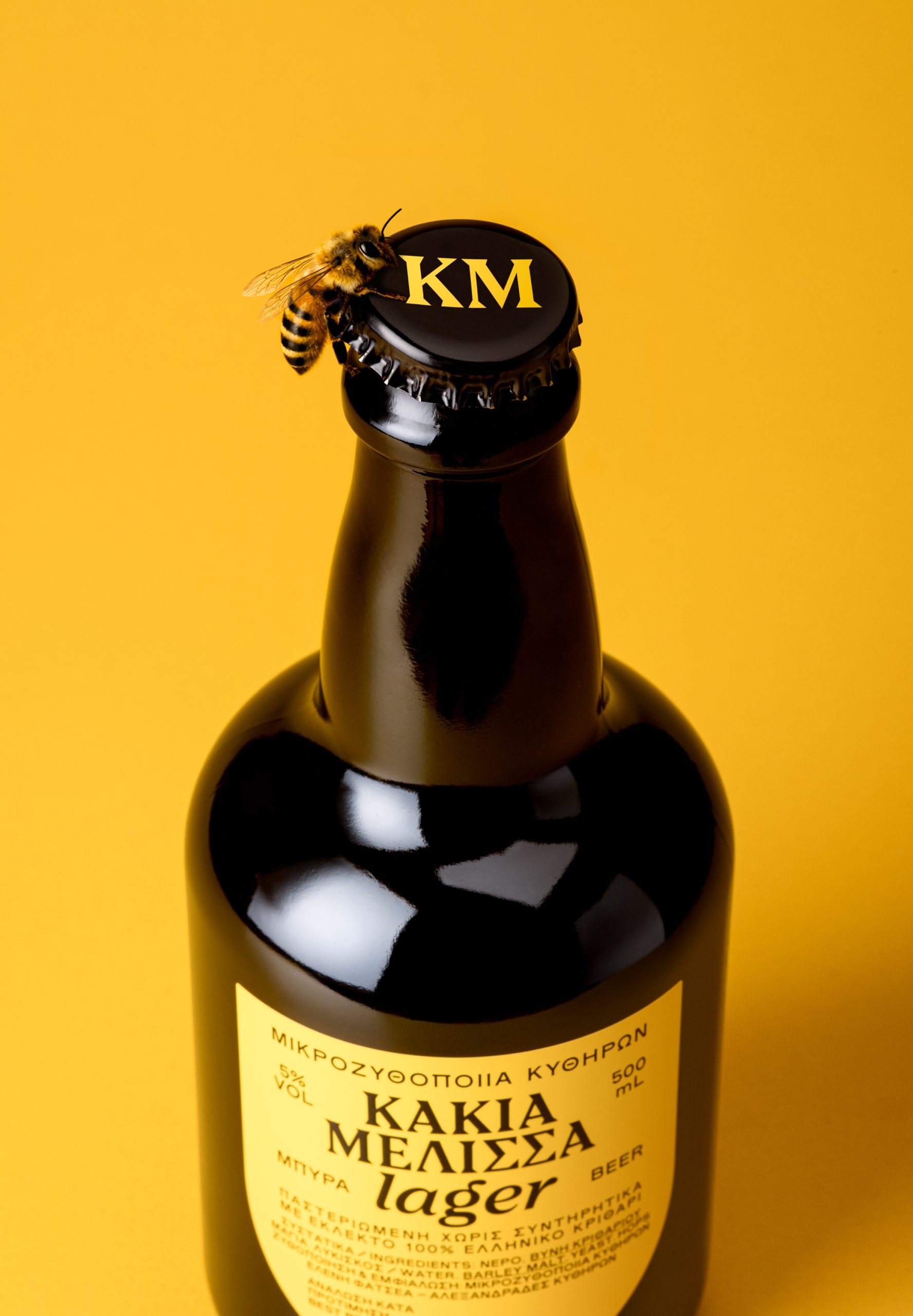
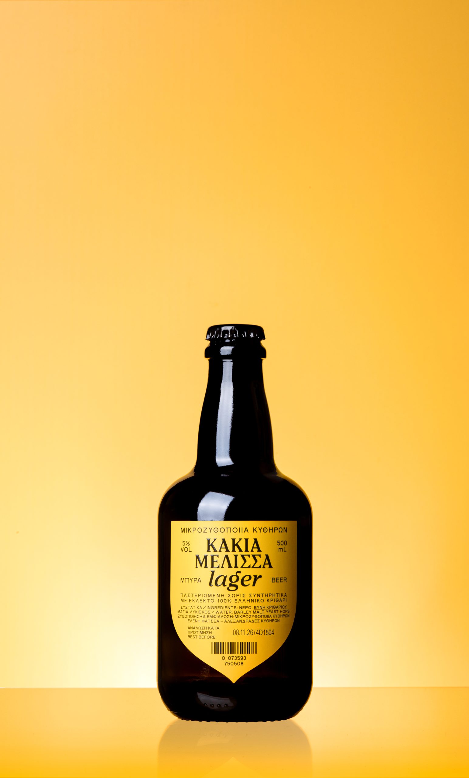
Kakia Melissa is a microbrewery beer from Kythera, Greece, inspired by a local legend rooted in the island’s history. According to the story, pirates attempted to raid a monastery inhabited by nuns, but a swarm of bees attacked the invaders and forced them to retreat. As they fled, they shouted the phrase “Kakia Melissa” (meaning “bad bee” in Greek), which gave its name to both the monastery and the beer and became the foundation of the brand’s identity.
SOLUTION
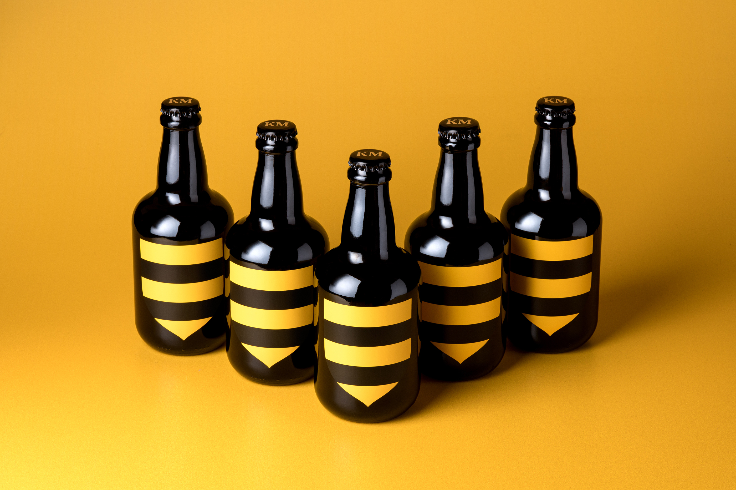
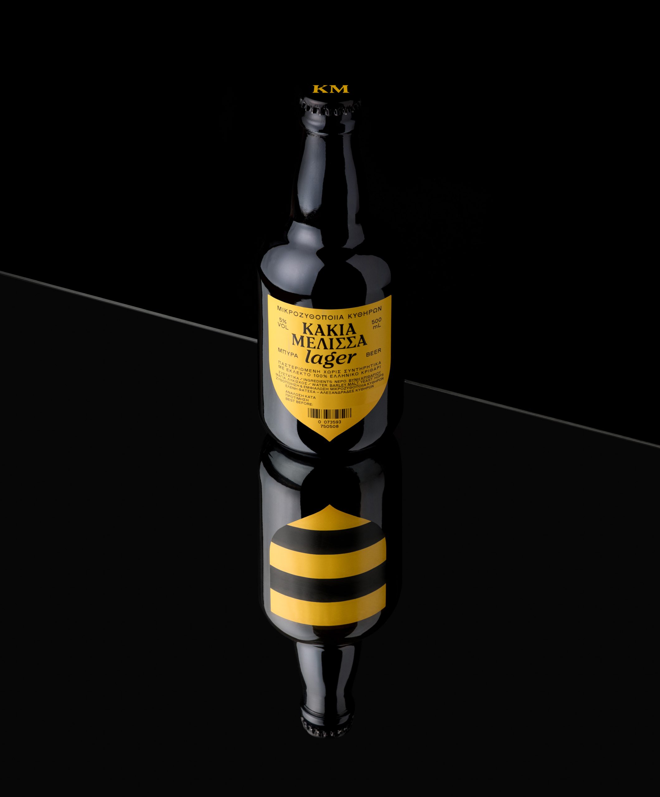
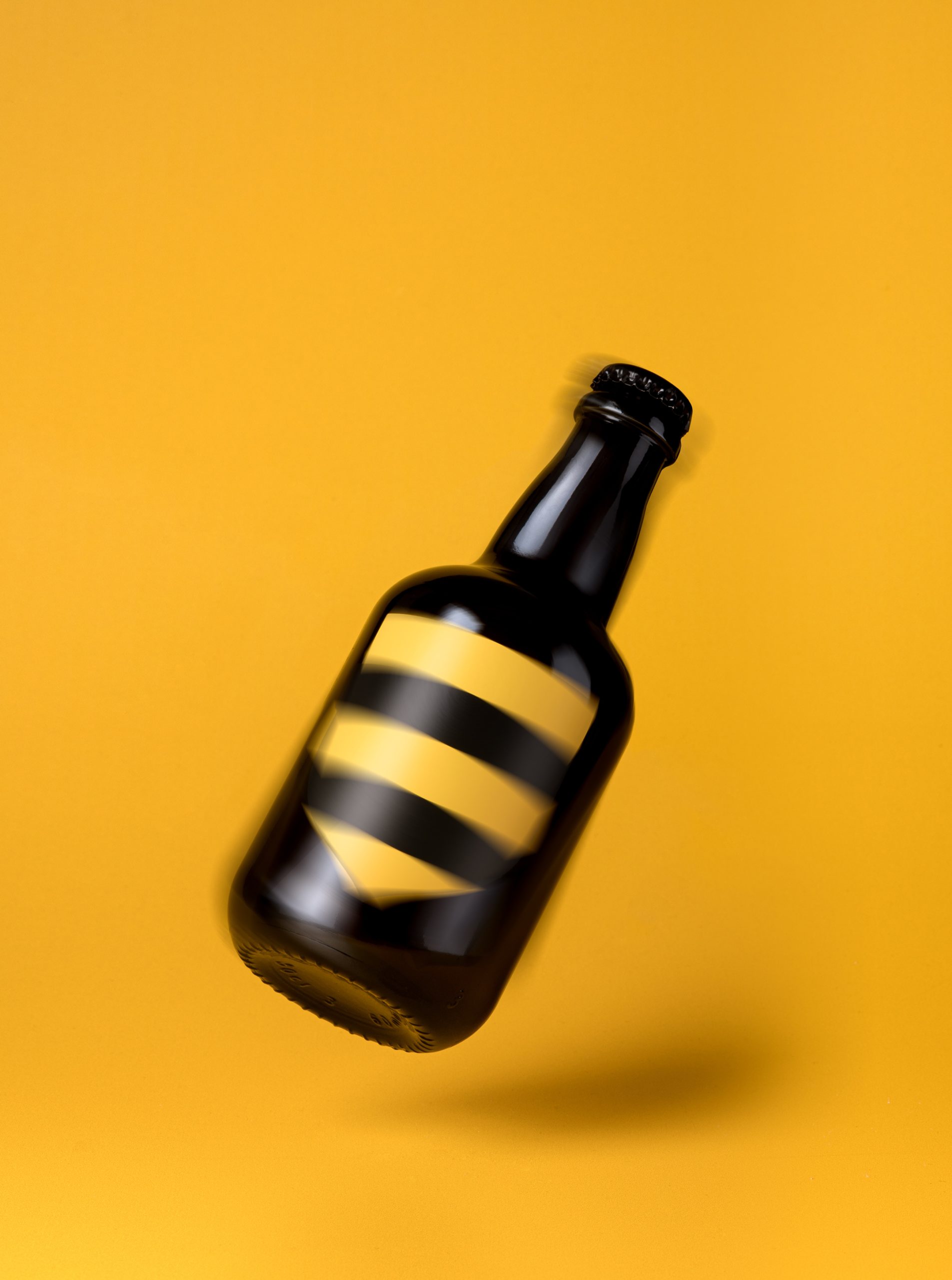
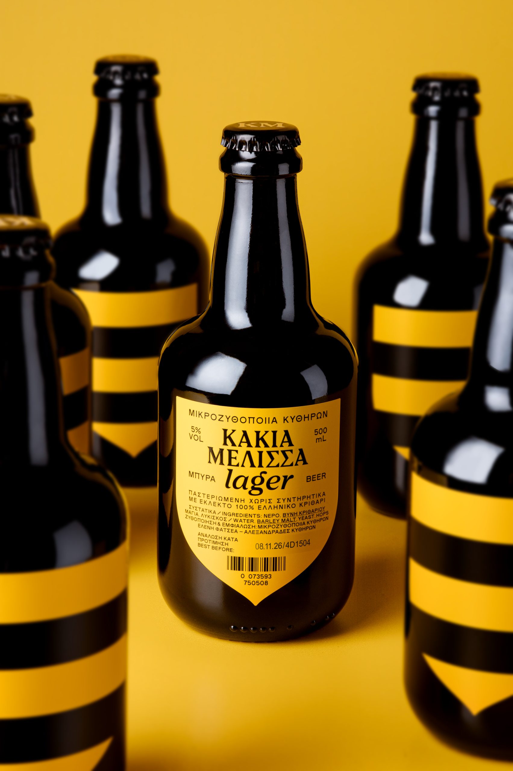
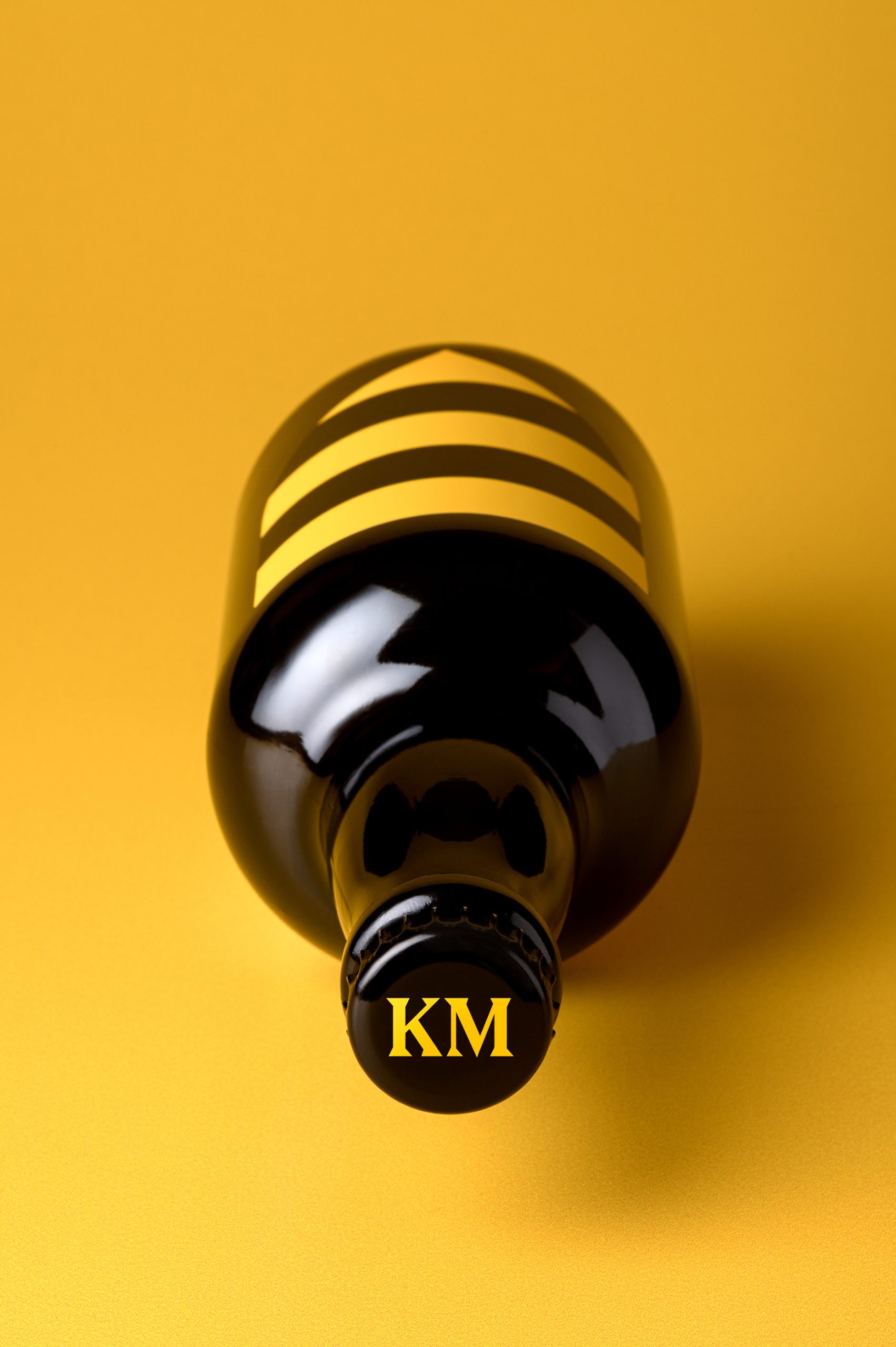
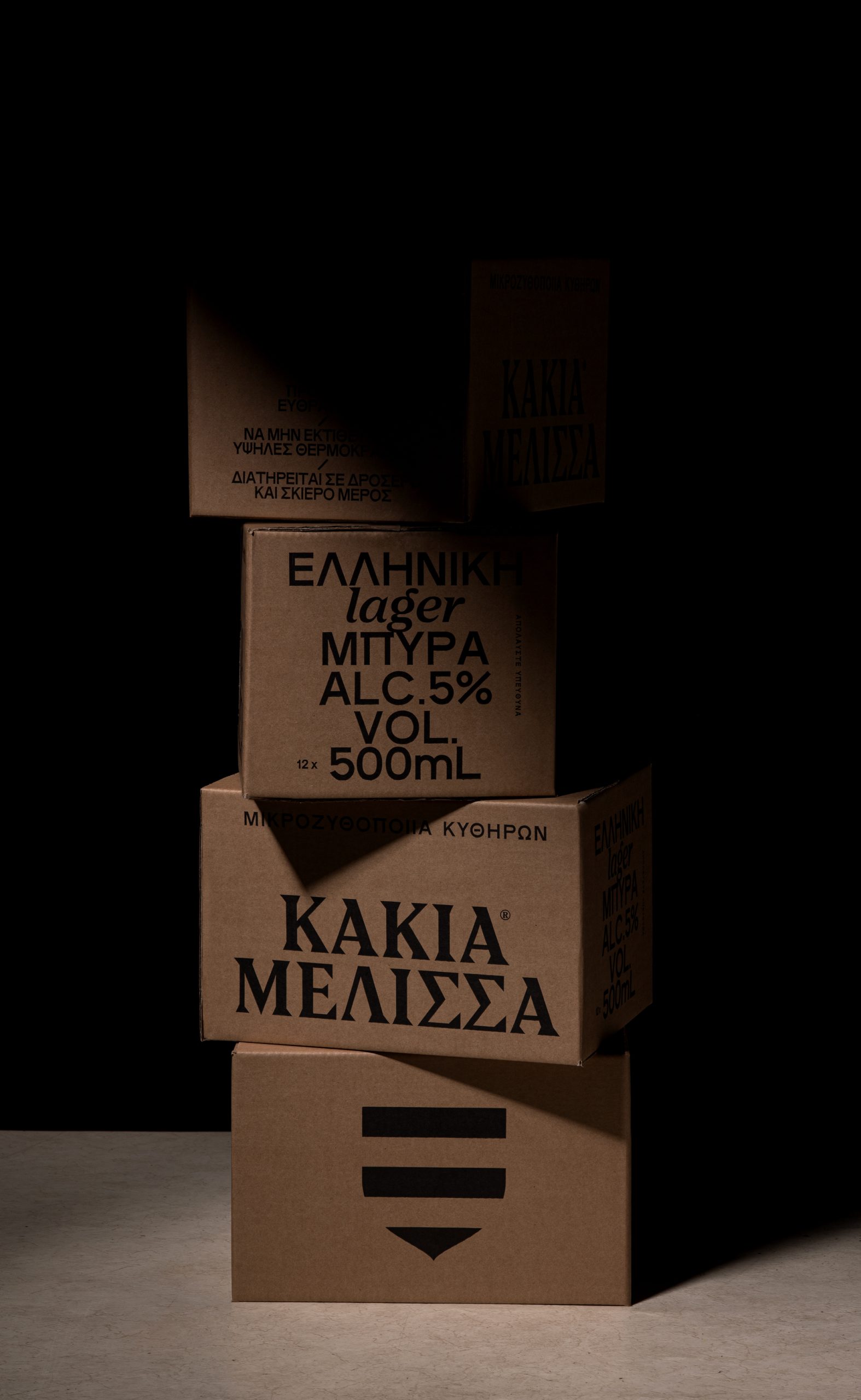
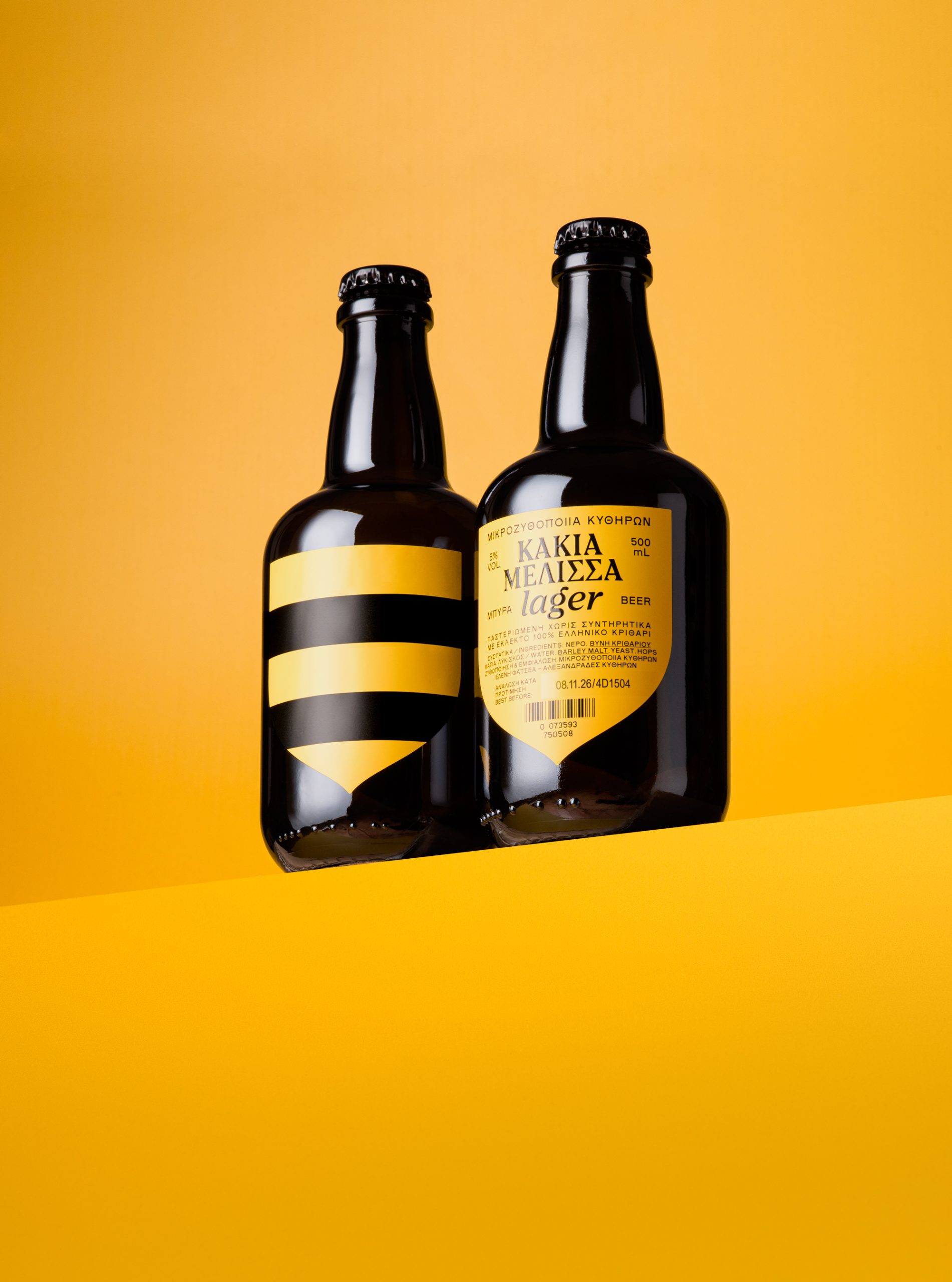
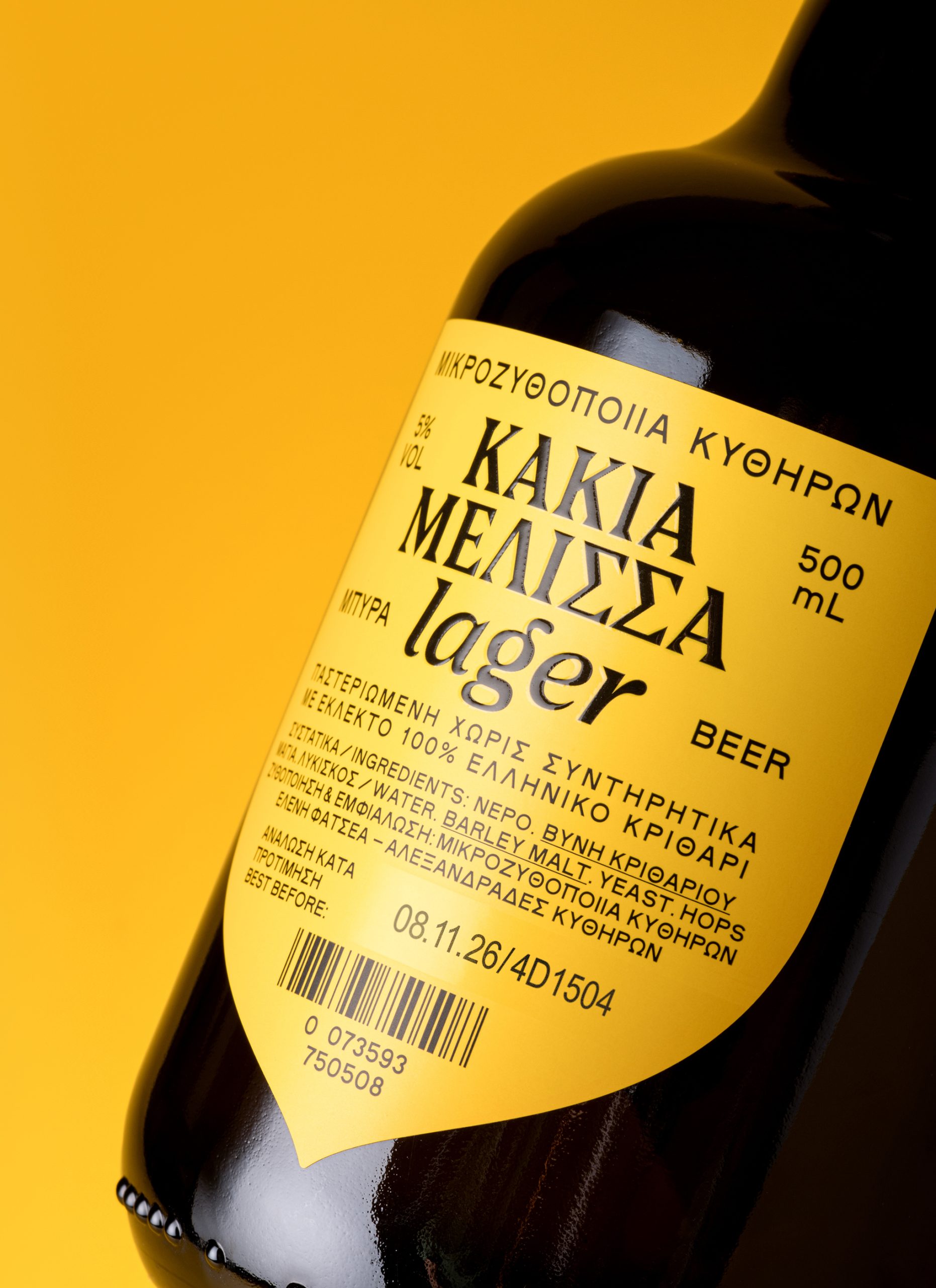
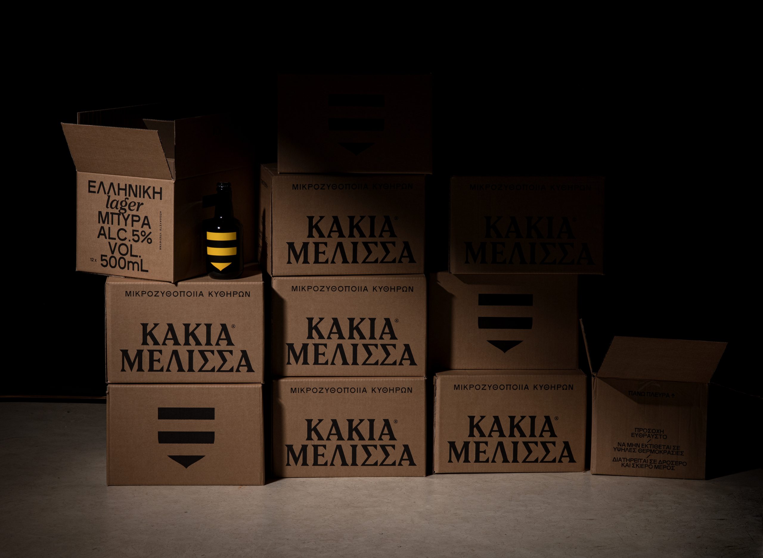
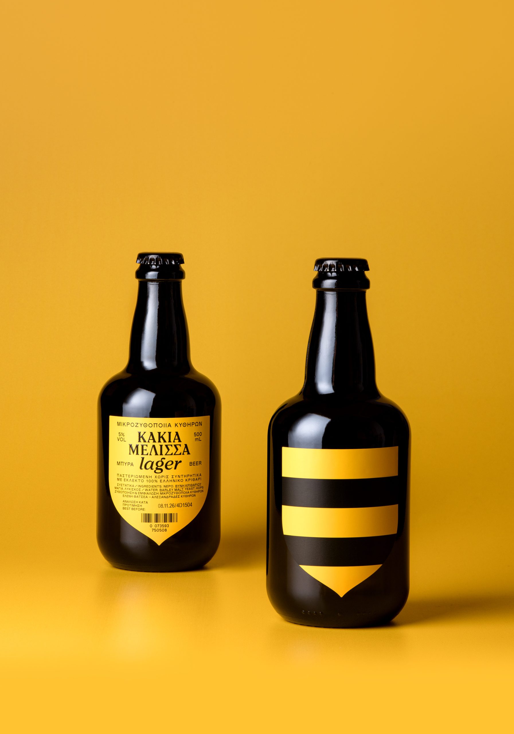
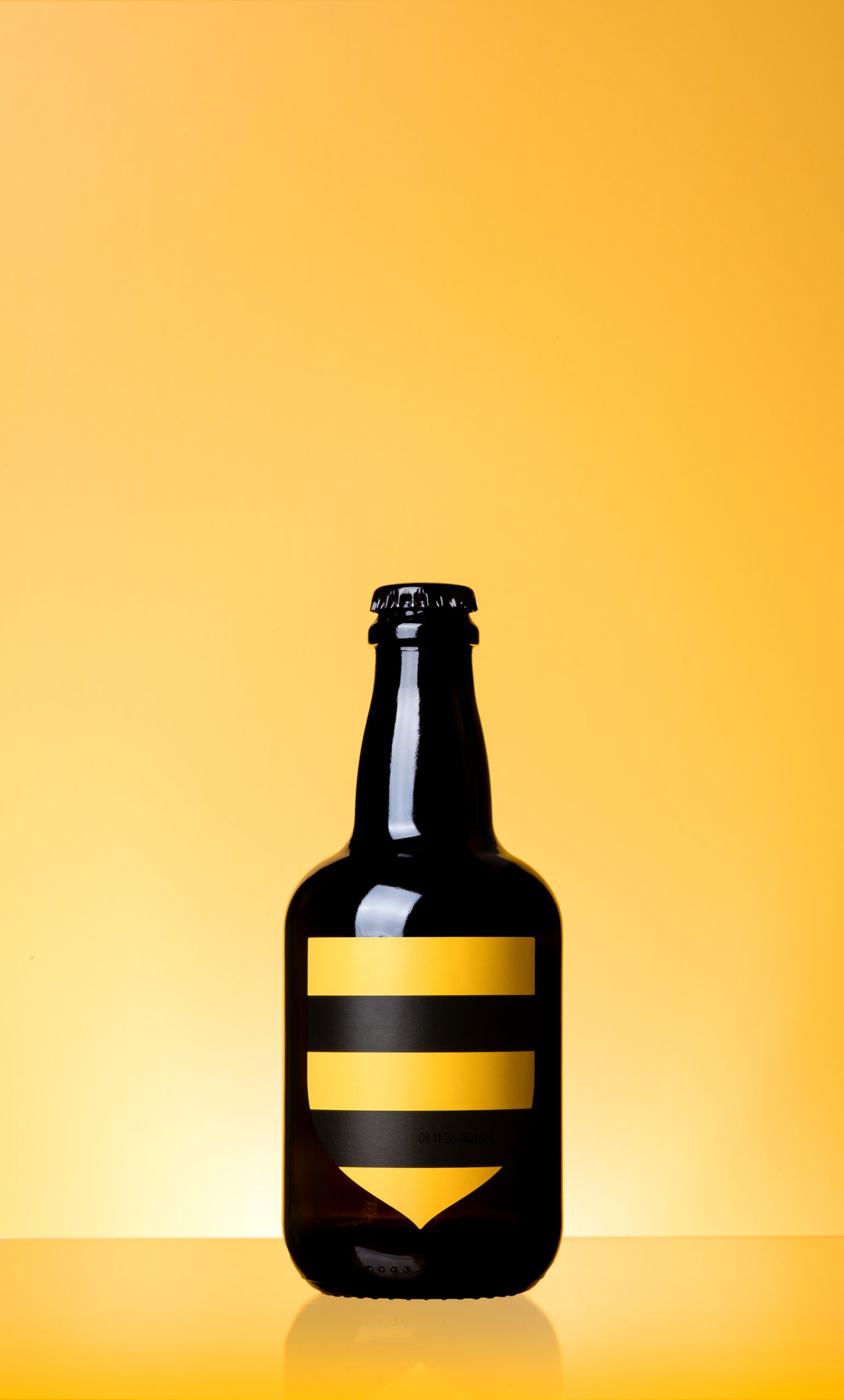
The packaging translates this narrative into a minimal and structured visual system. The black and yellow stripes reference the bee’s abdomen, while the pointed form emphasizes the stinger: an expression of threat and resistance. The overall form draws from the logic of the coat of arms, rooted in Kythera’s history and derived from the warrior’s shield, associated with identity, status, and protection. A mirrored version of the same form balances the opposite side of the bottle while carrying all essential beer information.
RESULT
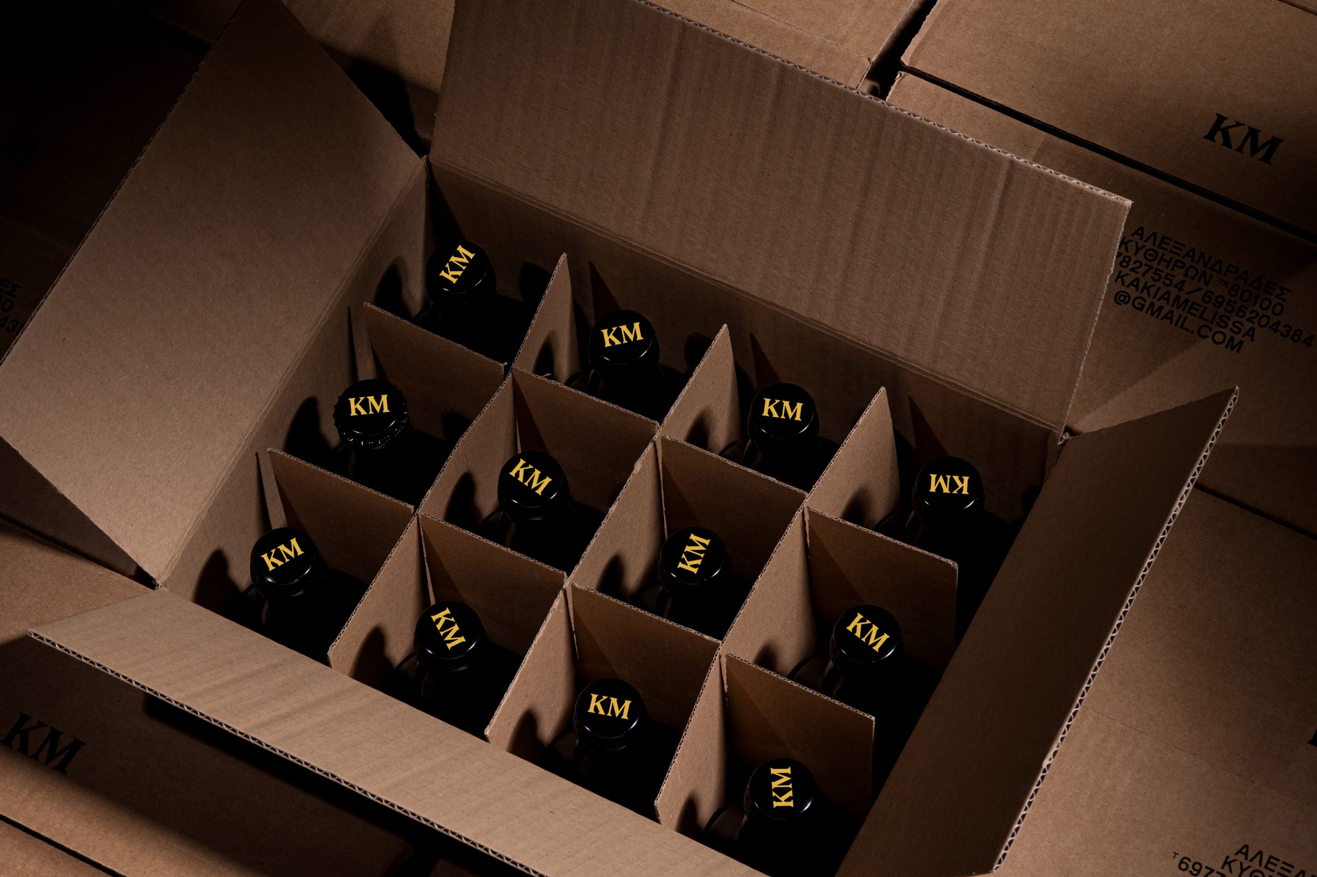
The result is a packaging that translates as a contemporary emblem. A distinctive mark that captures place, memory and resistance into a clear, iconic form.
Curator’s Insight:
The storytelling here does the heavy lifting, but the design is smart enough not to over-explain it. Stripes and a single geometric form are all it takes to communicate bee, threat, and heritage at once. What stands out is how the front and back of the bottle were treated as a unified system rather than two separate surfaces, one carrying the visual mark, the other the information, both sharing the same logic. For a brand built on local legend, it wears its origins lightly without losing any of the weight.
 Derrick Lin
 Sophiagdotcom
 Sofia Nikishina
 studionerius
 monther al omari
 Monroe
 KateChachava
 Snob Duck
 宏洛图品牌设计HONGLT
 Studio Six F
 Just Design
 New Century Design
 VIEWPOINT
 Abbydraw Designs Unique Conceptual Branding & Packaging Designing Ideas
 BexNelson
 Vladimir Shmoylov
 Kris
 Agence des Coteaux
 Julia M.
 Rabia zouina
 www.branding.uz
 Diego Alves do Amaral
 studioaslihan
 Minim Brand Design