

LÁGRIMAS DE COCODRILO
Packaging inspired by one of Costa Rica’s most recognizable expressions.
Some ideas don’t need to be invented—they already exist in everyday language.”Lágrimas de cocodrilo” is a popular Costa Rican expression used to describe someone who exaggerates their suffering, pretends to feel remorse, or plays the victim. It’s a phrase that has lived for decades in conversation and, more recently, found new life through internet culture and memes.
This project explores what happens when that expression becomes a brand.
Instead of illustrating the saying literally, the identity embraces irony. The crocodile appears as an exaggerated character—dramatic, expressive, and impossible to take completely seriously. It becomes the face of a beer that doesn’t pretend to be traditional or nostalgic, but embraces personality, humor, and local culture with confidence.
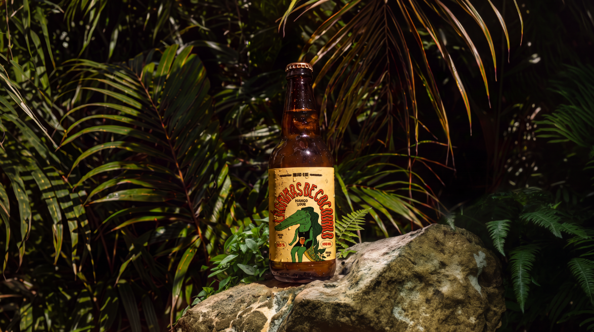
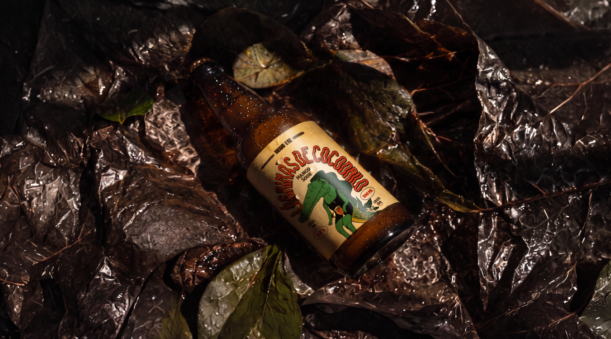
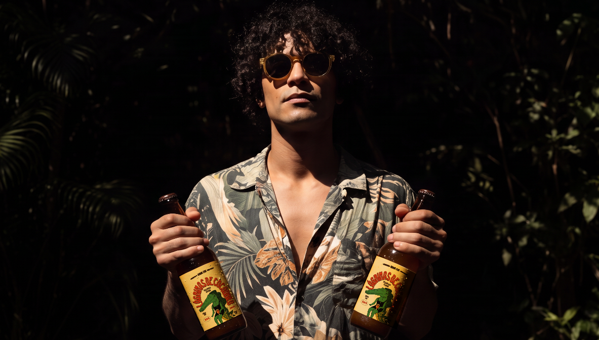
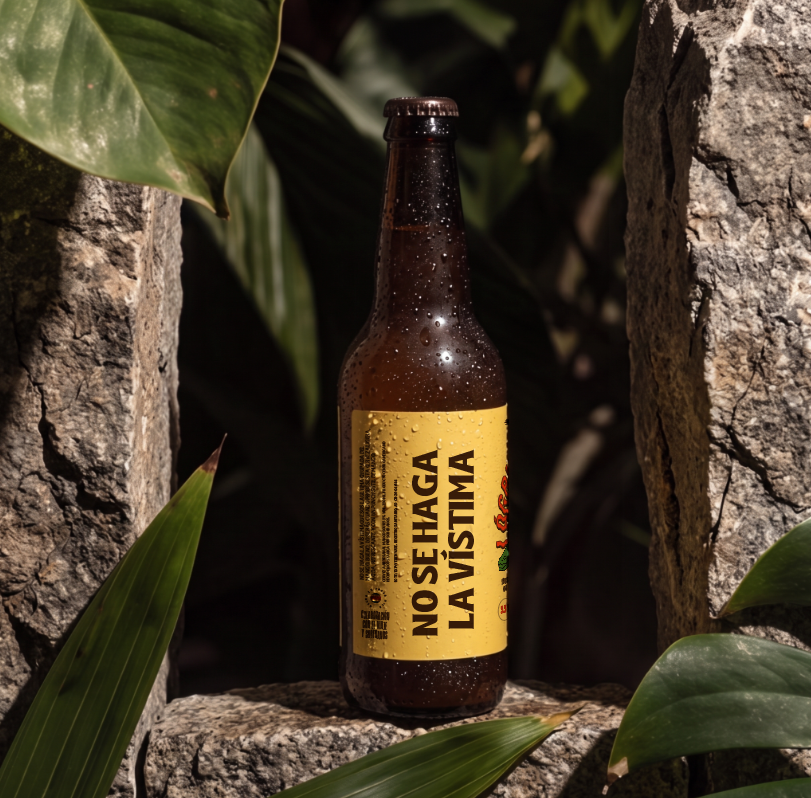
The visual system combines oversized typography, expressive illustration, and a tropical color palette inspired by ripe mangoes. The result feels bold without losing clarity, playful without becoming childish, and distinctive enough to stand apart from the visual conventions often found in the craft beer category.
The photography extends the same narrative. Volcanic rock, flowing water, tropical vegetation, and harsh midday light create an environment that feels unmistakably Costa Rican. The textures are intentionally raw, allowing the packaging to become the strongest visual element while remaining connected to its place of origin.
Rather than searching for inspiration in imported references, the project looks at something much closer: the expressions people use every day. A familiar saying becomes a recognizable character, a memorable package, and a visual identity with a distinctly local voice that still feels contemporary and universal.
The featured Mango Sour reinforces that contrast. Bright acidity, tropical fruit, and a refreshing finish are reflected through warm yellows, saturated reds, and an energetic composition designed to capture attention immediately, whether on the shelf or in hand.
Curator’s Insight
Most craft beer identities go looking for a story. This one already had one sitting in plain sight, a phrase Costa Ricans have used for years to call out fake remorse. The design work here is less about invention and more about knowing which local material is strong enough to carry a brand without dilution.
The choice to exaggerate rather than illustrate literally is what keeps it from feeling like a one-note pun. The crocodile isn’t a mascot performing sadness for laughs, he’s genuinely overplaying it, mid sob with a beer in hand, which mirrors the insincerity the phrase itself describes. That’s a harder trick than it looks: humor in packaging usually reads as either too subtle to land or too broad to respect the product. Here the joke and the character are the same idea, so nothing needs explaining on shelf.
The photography backs up the same instinct. Volcanic rock and harsh midday light aren’t styled to look premium, they’re styled to look real, which suits a brand built on an everyday phrase rather than an aspirational one.






 Derrick Lin
 monther al omari
 43oz
43oz lilyz design23
 Modern Theory
 Eighteen Brand Studio
 Bhumika Singh
 MohamedMashaly
 Pixels Studio
 Gulya
Gulya UPRISE
 Lizaveta Kharitonyuk
 Bonsanco Creative Studio
 DesignRepublic
 GIRAFA STUDIO
 PiotrWisniewski
 Sophiagdotcom
 CreativeWise
 SoreThumbStudio®
 Modern World Studio
 Palashcc
 Valérie Colace