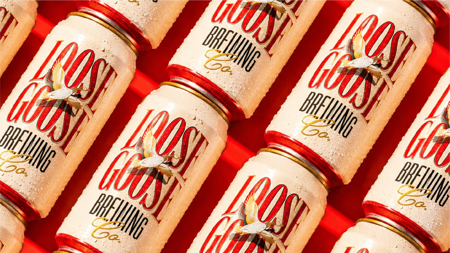

Loose Goose Brewing is a craft beer brand built around the belief that life is better when it’s shared. Inspired by spontaneous catch-ups, long afternoons in the sun, and conversations that stretch well into the evening, the brand celebrates the simple joy of gathering over great beer without taking life too seriously.
The challenge was to create an identity that stood apart from the often serious, heritage-driven visual language of craft breweries. Rather than focusing on brewing traditions or technical craftsmanship alone, the goal was to build a brand that felt approachable, expressive, and full of personality. The identity needed to capture the feeling of letting go, embracing spontaneity, and encouraging people to open up.
At the heart of the brand is the custom Loose Goose mascot, a playful character that embodies the carefree spirit of the brewery. More than a visual device, the goose becomes the face of the brand, representing curiosity, freedom, and the slightly mischievous nature of the people it’s made for. Its expressive personality carries across every touchpoint, transforming the identity into something instantly recognisable and memorable.
Supporting the mascot is a bold visual language built around confident typography, vibrant colours, and energetic compositions that reflect the lively atmosphere of social gatherings. The system was designed to feel dynamic and welcoming, creating a brand world that is equally at home on beer cans, merchandise, coasters, and taproom experiences.
Rather than positioning beer as the hero, Loose Goose Brewing celebrates the moments that happen around it. Every design decision reinforces the idea that a great beer is simply the catalyst for better conversations, stronger friendships, and memorable experiences.
The result is a character-led identity that feels playful without sacrificing quality. Loose Goose Brewing captures the spirit of modern craft beer culture through humour, storytelling, and personality, creating a brand that invites people to slow down, let loose, and enjoy the company around them.
Curator’s Insight
There’s a nice tension in this can between vintage type and a loose, cartoon-adjacent mascot. Stacked serif lettering usually signals tradition and heritage, but pairing it with a goose mid-flight pulls the whole thing back toward something friendlier and less formal. That balance is harder to land than it looks.
The red background does a lot of quiet work too. It’s not a color most breweries reach for, and it gives the can enough presence to hold its own on a shelf crowded with muted, earth-toned labels. Combined with the condensation on the can in this shot, it reads almost like a soda ad, which suits a brand that wants beer to feel casual rather than ceremonial.
If the goal was to feel like the brand behind a backyard hangout rather than a brewery with a origin story to defend, the type and mascot choices get there without overexplaining themselves.


 Stefano Bracci
 monther al omari
 Widakk Design
 Studio Garces
 宏洛图品牌设计HONGLT
 DN Designs
 alchimistestudioParis
 BoldCrest
 Maruf Nishat
 Oksana
 Dozen Agency
 erandy
 Leyma Design
 aabnasserr
 Palashcc
 habiba gomaa
 AntaPetrenco1
 Packart Bd
 sophioc
 Marta Wasilewska
 House of Thought
 Krithika Chakkaravarthy
 Reema
Reema