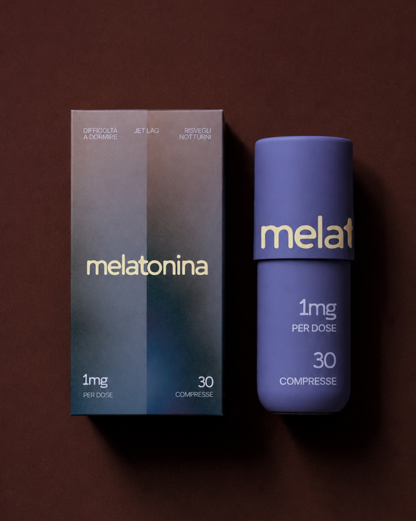

The Project
The project takes melatonin as its starting point, a hormone naturally produced by the body that plays a role in regulating the sleep-wake cycle.
The aim was to rethink its packaging, making it clear, informative, and contemporary while moving away from the more predictable visual codes commonly associated with sleep supplements.
Concept
The concept explores the threshold between wakefulness and sleep: the moment when our awareness of the outside world begins to fade, our perception gradually becomes less defined, and the body prepares for rest.
Rather than depicting sleep literally, the packaging captures the sensation of falling asleep: a gradual transition from a state of alertness and clarity to one that feels softer, calmer, and more relaxed.
What I Did and How
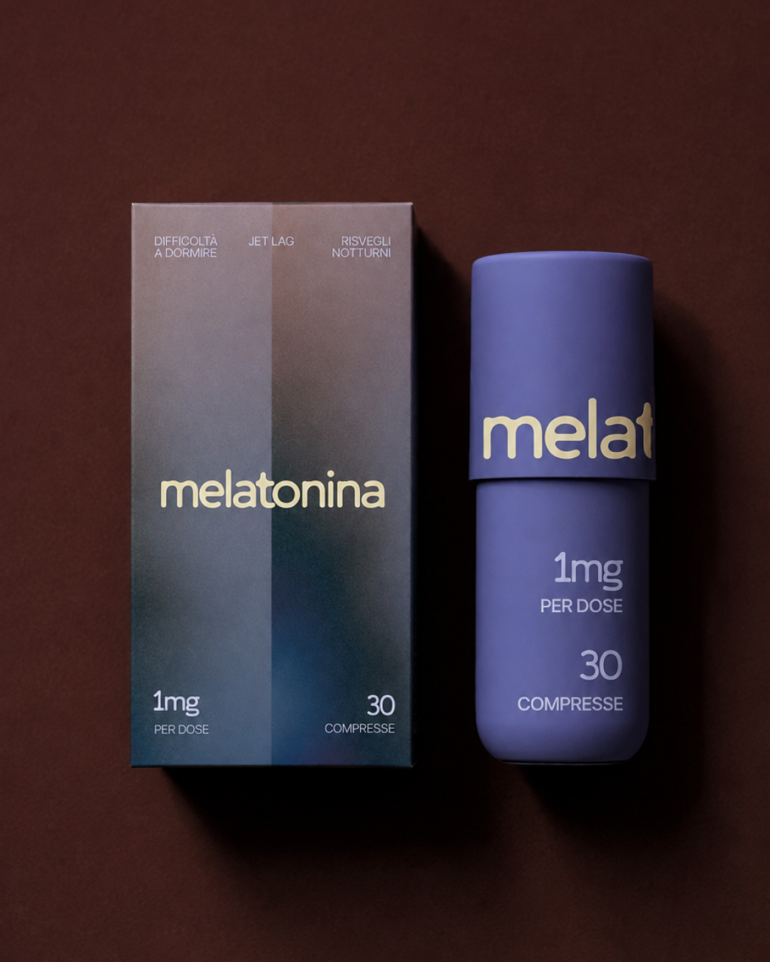
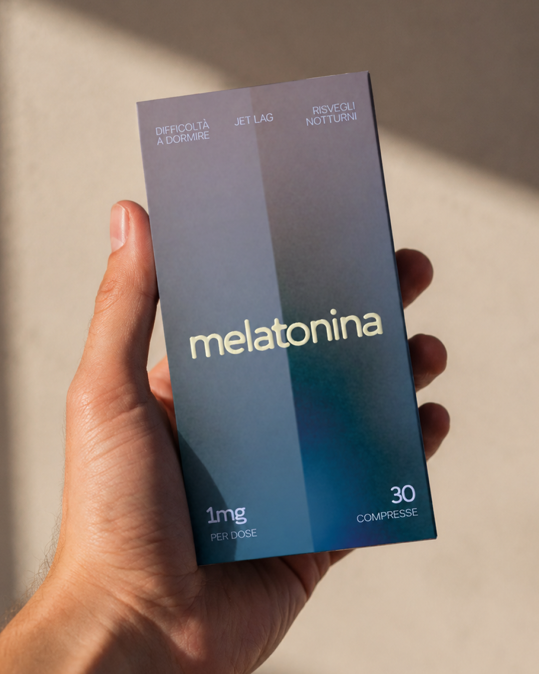
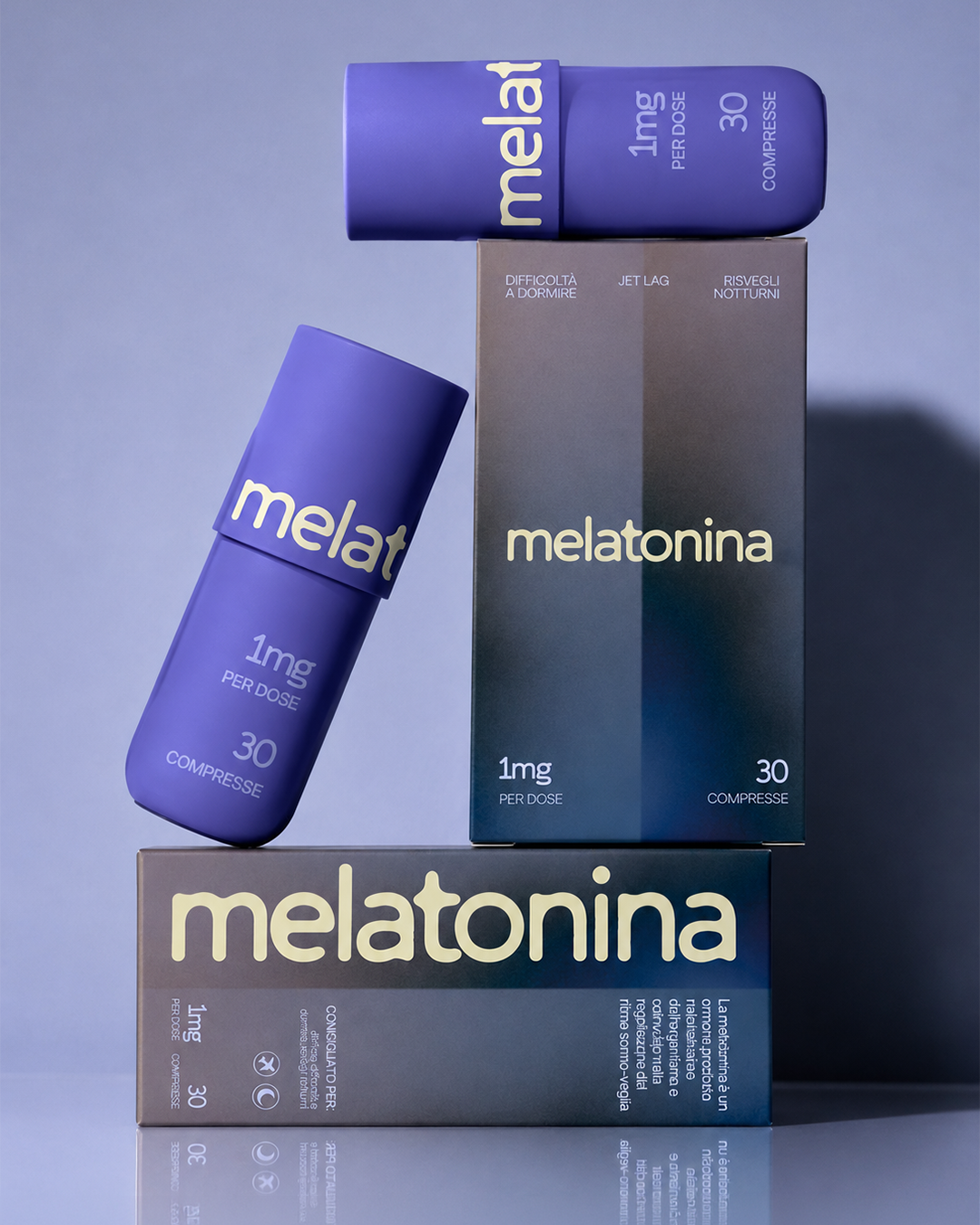
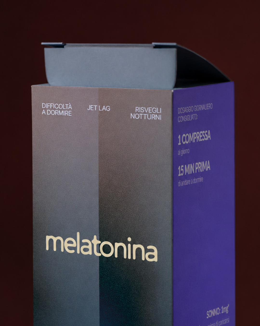
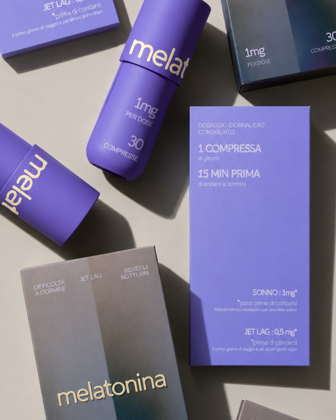
The front and back of the packaging visually represent the transition from wakefulness to sleep through gradients of soft, soothing colours.
The same concept is reflected in the lettering. Its forms are soft, light, and fluid, evoking a sense of relaxation and the gradual process of surrendering to sleep. The sides of the packaging serve a more informational purpose.
Blue references the colour codes traditionally associated with sleep and the product category, reinterpreted in a fresher, more contemporary shade.
What Makes This Packaging Unique?
The project moves away from traditional sleep-related symbols such as moons, stars, and night skies. Instead, it translates the real and familiar experience of falling asleep into the product’s visual language.
The colour palette also departs somewhat from industry conventions. Cool tones associated with nighttime are combined with warmer, more unexpected colours, creating a distinctive identity while maintaining a clear connection to the world of sleep.
The Result
An identity designed to stand out on the shelf without sacrificing the clarity and accessibility expected of an everyday product.

 omarchafik
 nastyaabeketova
 Roberto Núñez Studio
 ZarifGraphic
 octavio rojo
 Nadezhda Gorelikova
 Chris Creative Works
 Danh Huynh
 Pattopatricio
 cem kutlu
 David Byerlee
 marikvel
 FATLEG
 Fait Studio
 Effect Agency
 Yana Madoyan
 M&A CREATIVE AGENCY
 monther al omari
 Rabia zouina
 宏洛图品牌设计HONGLT
 Atiq Alam
 Poli Ortiz