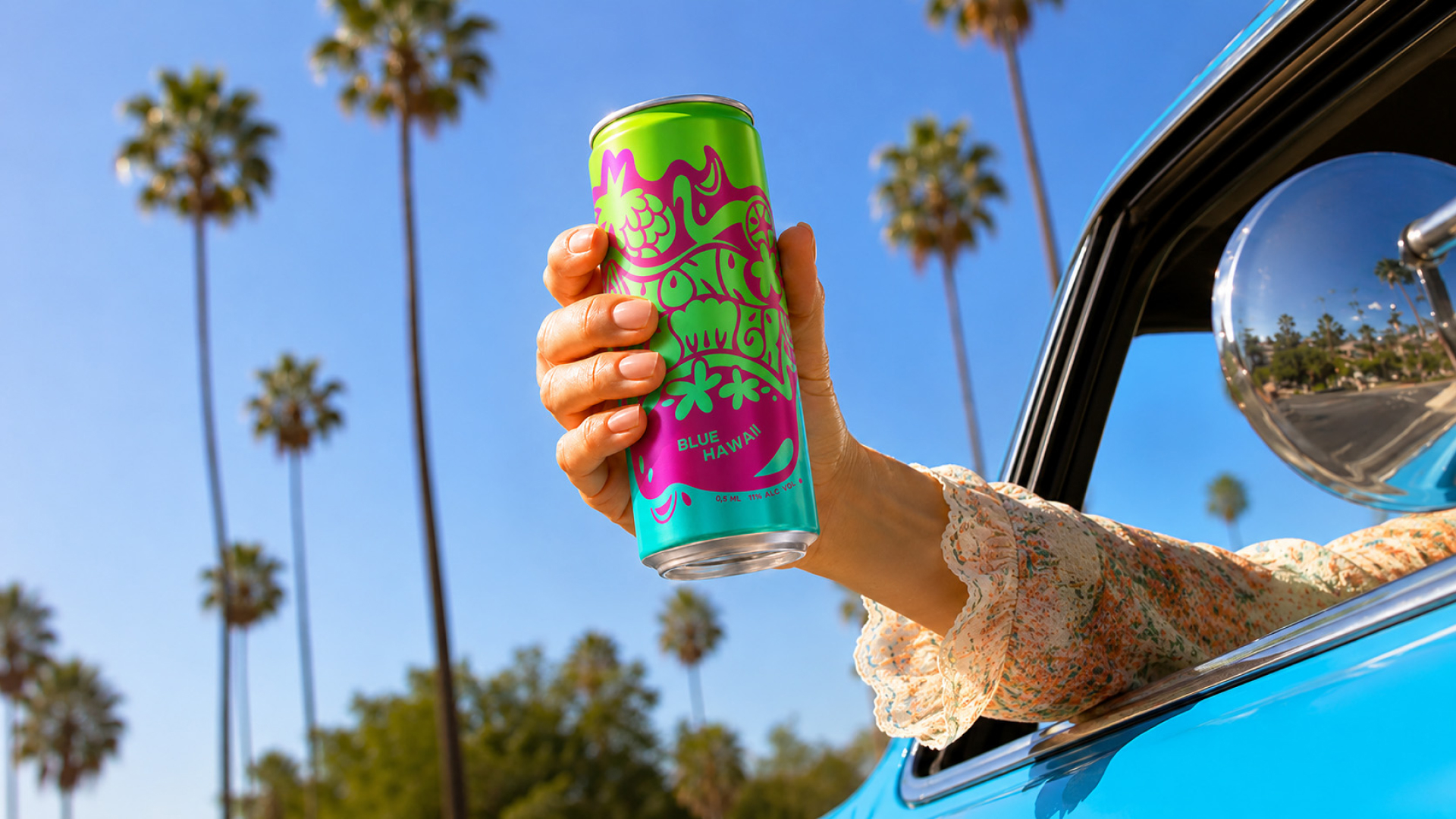

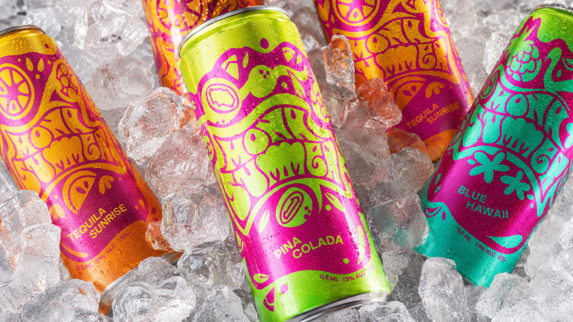
MONA SUMMER is a range of can cocktails whose concept appeals to the vibrant aesthetic of the 1970s. В проекте представлены Piña Colada, Tequila Sunrise и Blue Hawaii. The task of packaging is to convey the expressive nature of the brand and associate it with the content: to show the differences between cocktails, while maintaining a common visual system.
The concept is based on the image of MONA SUMMER as a “disco diva among drinks.” It connects the energy of disco with the loose, eccentric aesthetics of hippies. In design, this idea is revealed through rich colors, fluid shapes and hand-drawn letters. Fruit motifs connect the style with the product itself: the decorative composition simultaneously creates a mood and refers to the ingredients of the cocktail.
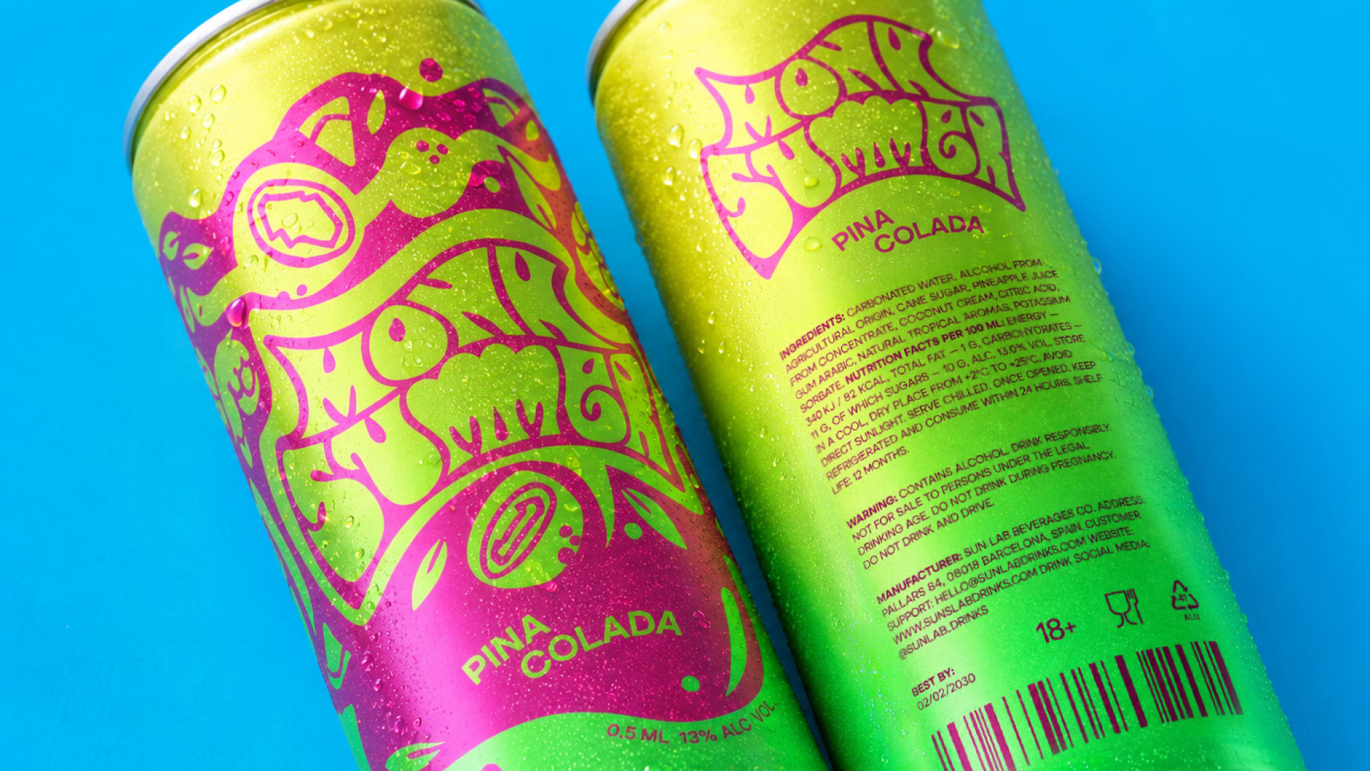
The packaging was based on manual lettering and illustration. The MONA SUMMER title is central to the composition. Curved contours, different letter widths and rounded endings create a moving rhythm that supports a reference to the 1970s. The inscription is inscribed in a wavy shape and interacts with the surrounding images, forming a solid pattern.
Stylized fruits, leaves, flowers and teardrop-shaped elements continue the plastic letter. Illustrations of fruits refer to the composition of a particular drink, so the graphics change within a single system. The general way of constructing the picture preserves the relationship between the variants, and individual motifs reveal their features.
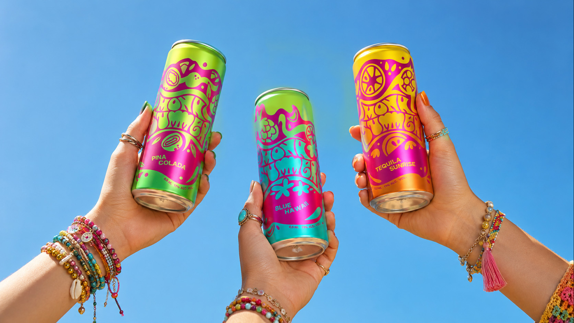
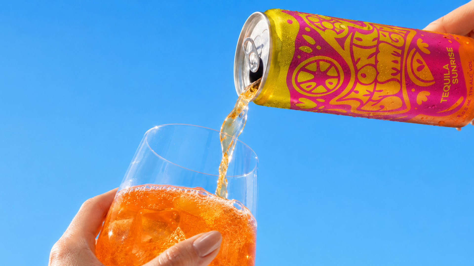
The color of the can is correlated with the color of the cocktail. Green, turquoise and yellow-orange shades are combined with rich pink graphics that combine the line. Color transitions maintain the fluidity of the composition and enhance its dynamics.
The names of the cocktails are typed in sans-serif and placed under decorative lettering. This creates an understandable hierarchy between the brand name and the drink version. On the back of the can, branded colors and a reduced style of MONA SUMMER are stored, and product information is collected in separate text blocks.
The presentation images continue the mood of the packaging: sunlight, palm trees, a car and clothes with details of the hippie aesthetic place the drinks in a summery context. So the image of the disco diva is revealed both in the picture of the can and in its surrounding visual environment.
 alchimistestudioParis
 Estudio Argo
 Modern Theory
 monther al omari
 Ohmybrand
 Affogato Brand Design
 Tancybox
 waanrong
 nazystudio
 Daria Fox
 g.apolly
 sahildoesartt
 Stiandco
 BREAK DESIGN
 ShreyaDighe
 Sameh Elnahas
 Minim Brand Design
 Ebbi
 Shabouk Printing & Packaging (Shabouk Carton Boxes – شعبوق)
 Brandegree
 Abbydraw Designs Unique Conceptual Branding & Packaging Designing Ideas
 bilel tkouri
 NEV
 Stefano Bracci
 Alina