
Context
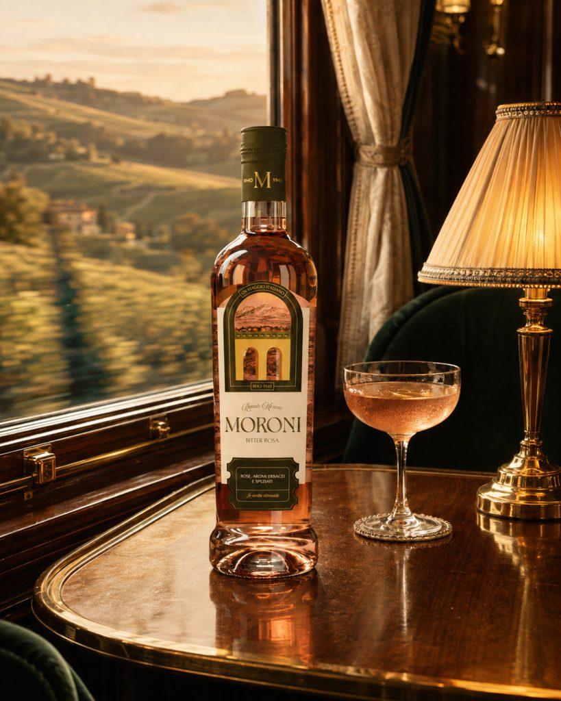
Moroni Bitter was born from a family recipe dating back to 1945, first created in post-war Milan and now brought back to market as an authentic alternative to more industrial aperitif brands. The product already had a genuine story, a strong artisanal heritage and a distinctive character, but its existing identity no longer reflected its value or supported the brand’s new positioning. The project therefore started with the need to build a more recognizable and contemporary world around Moroni, one that could preserve its roots without turning them into nostalgia.
Challenge
In a market shaped by brands with highly recognizable identities, the challenge was to find a distinctive space for Moroni, moving away from both mainstream aperitif codes and the more predictable expressions of Italian premium branding. The strategic analysis identified the Explorer as the brand’s main archetype: an invitation to discover new flavours through Italian landscapes, ingredients and local cultures. This led to the idea of a slow journey across Italy, imagined aboard a train, where every stop becomes an opportunity to experience a different territory. A journey through Italian taste.
Execution
The new visual system translates this idea into a range designed as a sequence of destinations. Each bitter is connected to an Italian territory related to the ingredients and sensory profile that define it, from the Gulf of Orosei to Gran Paradiso and the Langhe hills. Illustrated landscapes turn the labels into windows onto each destination, while engravings, frames and graphic details evoke the visual language of slow travel and vintage print, reinterpreted through a cleaner, contemporary approach. The Moroni logotype was redesigned, the colour palette made more natural and distinctive, and the entire packaging system structured to give each expression its own identity while keeping the range visually consistent. Moroni does not portray Italy as a single image. It travels through it.




 Anna Kachaeva
 vrai studio
 Studio Pistache
 Slice Design
 David Byerlee
 宏洛图品牌设计HONGLT
 The Creative Method
 Fond
 DS1 branding agency
 Ashwini Dang
 Dozen Agency
 We Craft Studio
 Likit
 Asprey Creative
 Firstrein
 Nouna design
 JavierGarduno
 Daria Kolesnikova
 HerCreativeSide
 lbeck