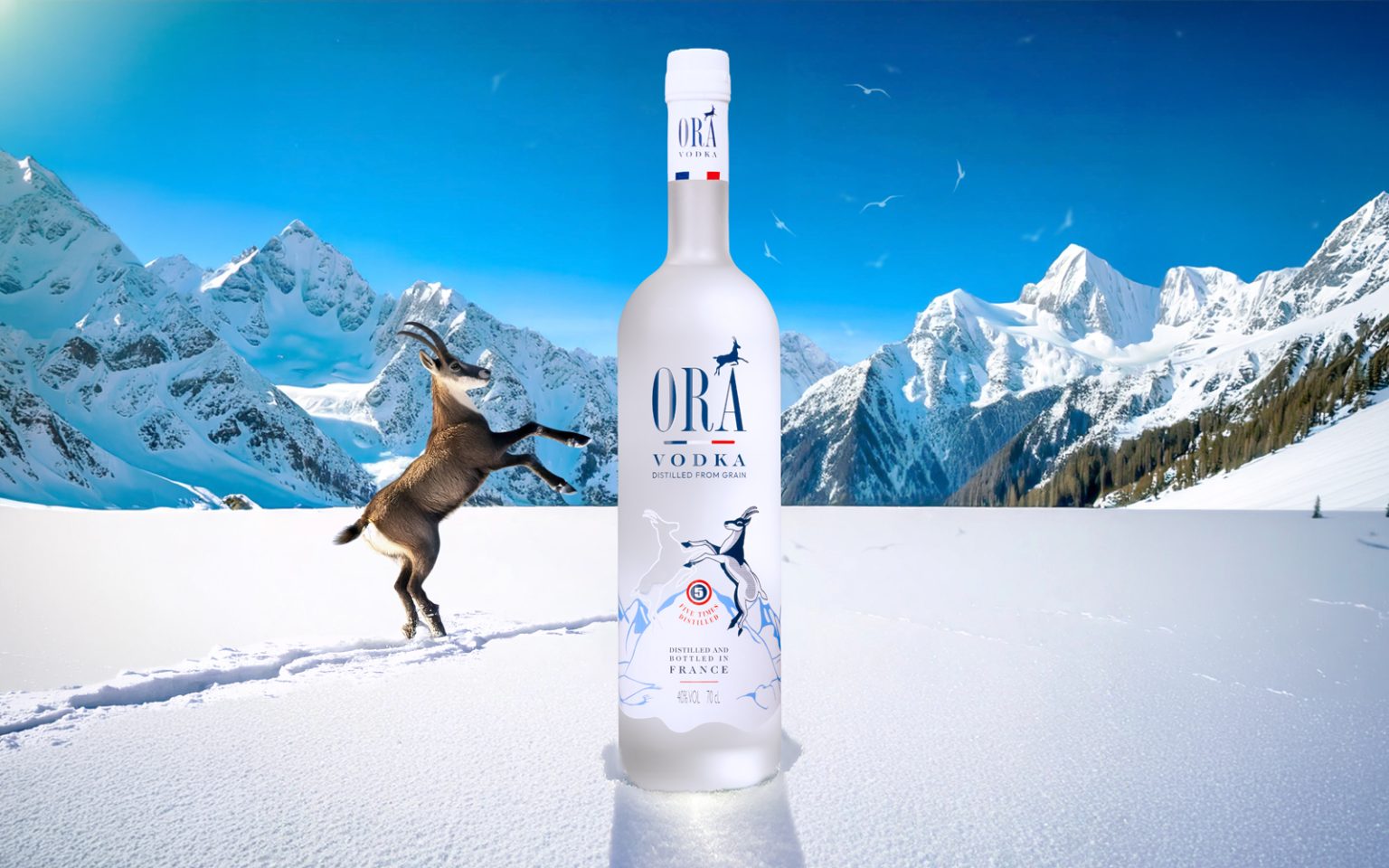

ORA Vodka – Revealing purity, affirming origin
The relaunch of ORA was driven by a clear intention: elevate the brand into a more premium territory without breaking away from its DNA.
The focus was on perception — bringing more presence, more status, more materiality.
The bottle now features a frosted glass finish that captures light softly, immediately suggesting purity. The blue, white and red silk-screen printing confidently asserts its French origin, while the cockade becomes a strong visual sign — both identitarian and institutional — fully embracing its heritage.
The isards, iconic symbols of the brand, have been reworked to gain graphic tension and refinement. One has been entirely redrawn with greater precision and character. The other appears in transparency, revealing the liquid and highlighting its clarity. This dialogue between opacity and transparency creates a dual reading: symbol and substance.
Distilled five times, ORA expresses technical mastery through visual restraint. The design translates this pursuit of purity into precision, balance and controlled elegance.
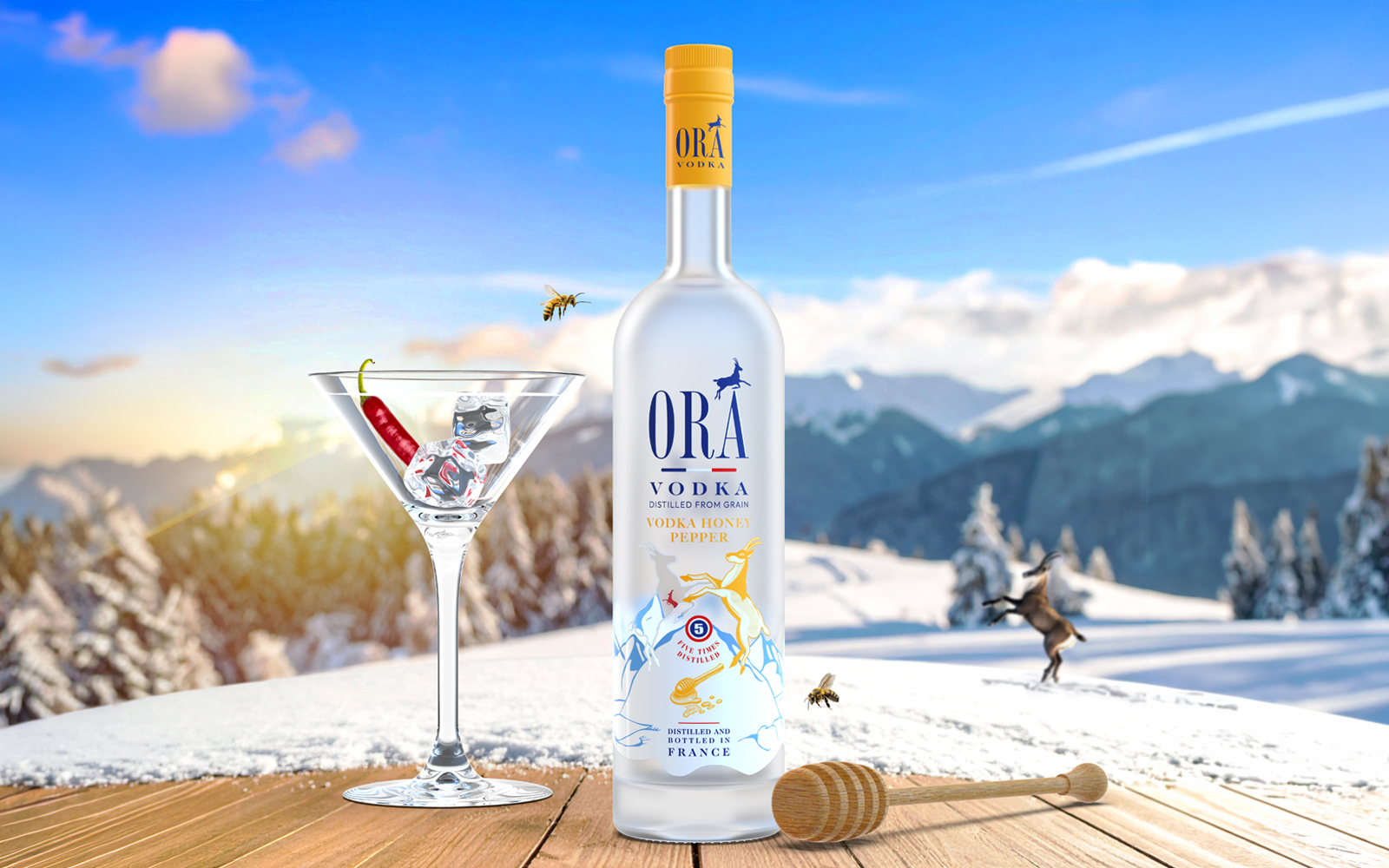
The second reference, ORA Honey & Pepper, introduces a bolder aromatic profile. It enriches the brand universe while laying the foundation for a future flavored range, built on the same formal and identity coherence.
More than a relift, this project is about clarification and elevation — a work on material, light and symbol, serving a vodka that now fully asserts its premium status.


 monther al omari
 Biaa
Biaa Akim Melnik Design Studio
 M&A CREATIVE AGENCY
 Valérie Colace
 Reynolds and Reyner
 bachir bachchar
 Maria Gruzdeva
 Hailey Yoon
 宏洛图品牌设计HONGLT
 Rosario Lo Iacono
 Panagiotis Maravas
 43oz
43oz Thirst
 Carreto Concepts Design Studio
 pastellofactory
 Omar Altayeb
 Cocoon Prague
 古戈品牌
古戈品牌 ZIMO Studio