

Papaya Sunflower Seeds Packaging Design
Project Description
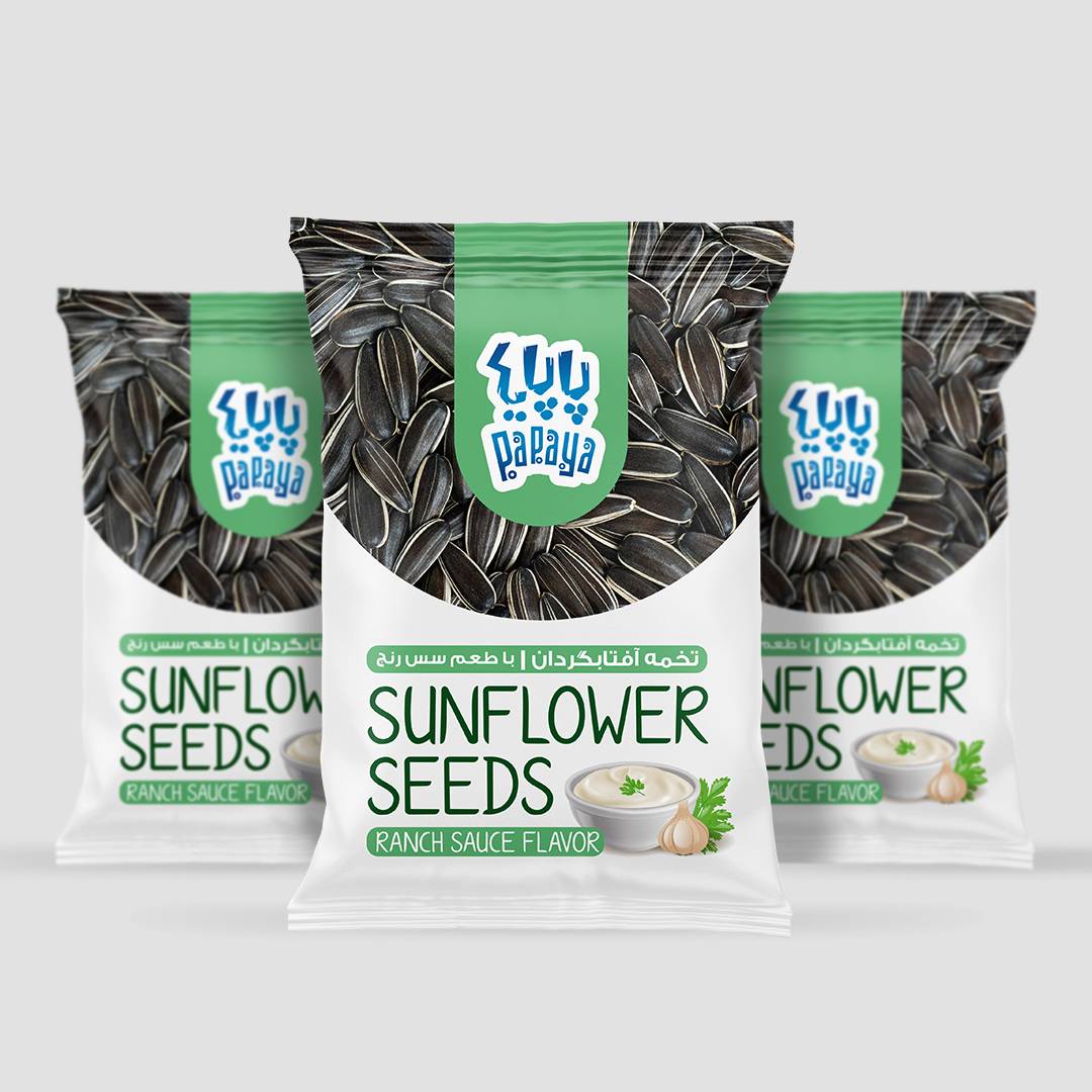
The new packaging system for Papaya Sunflower Seeds was designed to create a strong shelf presence while establishing a clear and memorable visual identity across multiple flavors.Sunflower seeds are an everyday snack product with a highly competitive market, where many brands rely on crowded graphics and heavy visual elements. The design challenge was to create a package that feels contemporary, approachable, and instantly recognizable while maintaining strong flavor differentiation.
The concept is built around a simple and bold visual architecture. The upper section of the pack showcases a realistic image of sunflower seeds, directly communicating the product and reinforcing authenticity. This photographic texture is balanced by a large white negative space in the lower section, creating a cleaner and more premium appearance.
A distinctive curved window acts as the main structural element of the design. This shape visually separates the product area from the information zone and gives the packaging a unique silhouette that can be recognized even from a distance.
Color plays a strategic role in the system. Each flavor is identified through a dedicated accent color:
- Yellow for Lemon Flavor
- Green for Ranch Sauce Flavor
- Blue for Salted Flavor
These vibrant color codes are applied consistently to the top panel and flavor information, allowing consumers to navigate the product range quickly and effortlessly.Typography was intentionally kept playful and lightweight to reflect the brand’s youthful personality. The hand-drawn style of the English typography creates a friendly and casual tone, while the compact bilingual hierarchy ensures clarity for both local and international audiences.
The result is a packaging system that combines simplicity, strong product communication, and effective flavor segmentation, giving Papaya a distinctive presence in the sunflower seeds category and creating a flexible foundation for future line extensions.


 Derrick Lin
 Biaa
Biaa Petitmoulin Studio
 White Bear Studio
 Eva Chistyakova
 monther al omari
 Atipus
 alchimistestudioParis
 oneandother
 bloomburo
 helocrene
 Shapers Studio
 Denver Design
 Aidearte
 andrew.huerta
 softmachine
 airobtq
 Buzz & Co.
 Ruby
Ruby themythographer
 IDNB Inc.
 viktorflr
 Zenpack