
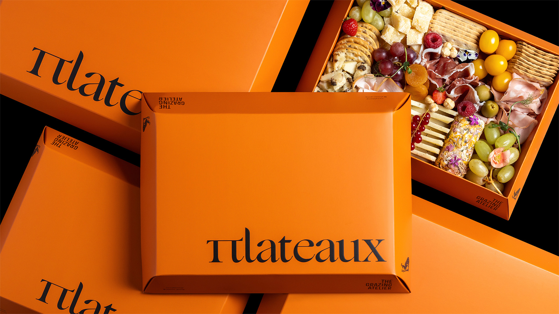
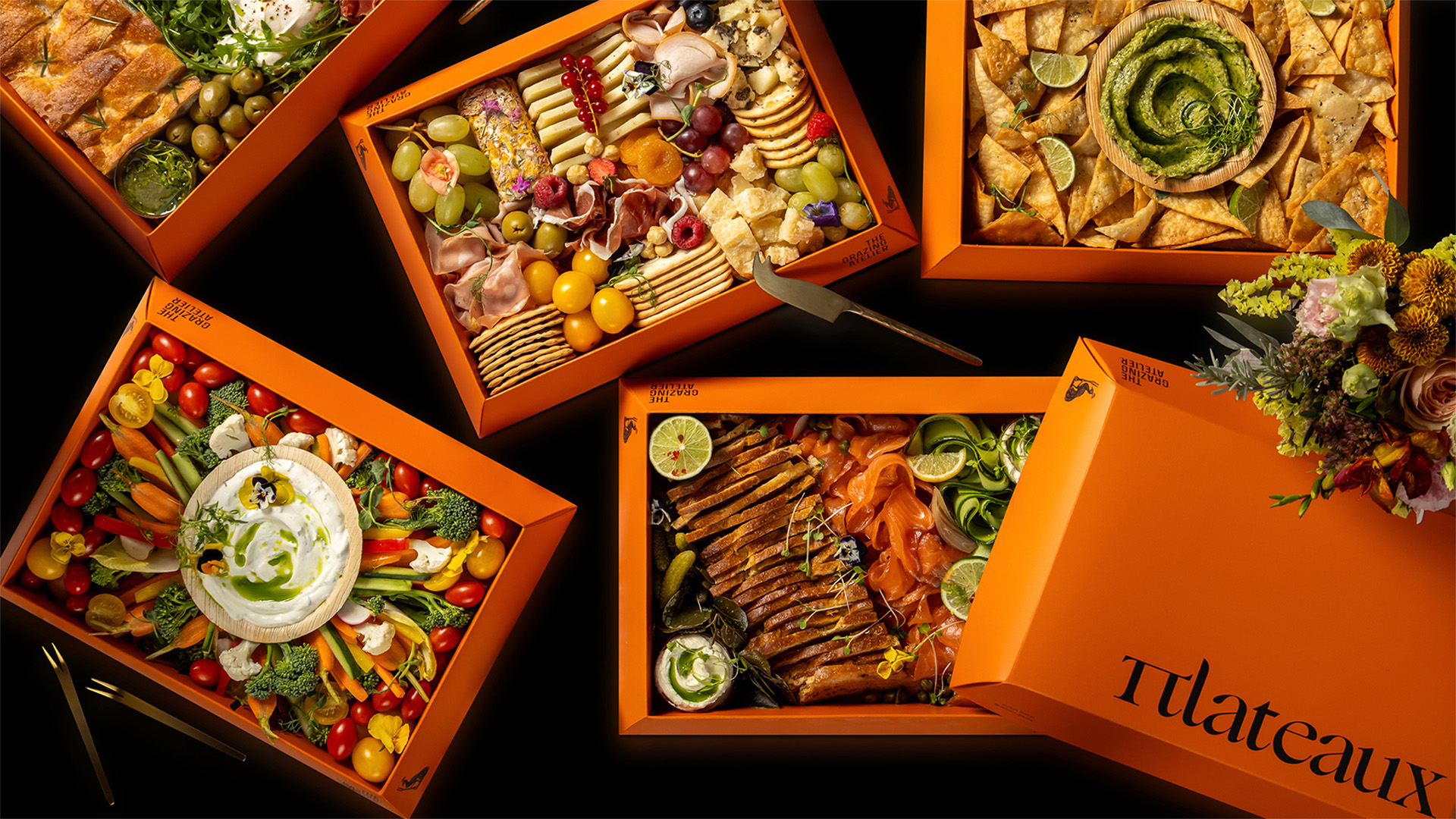
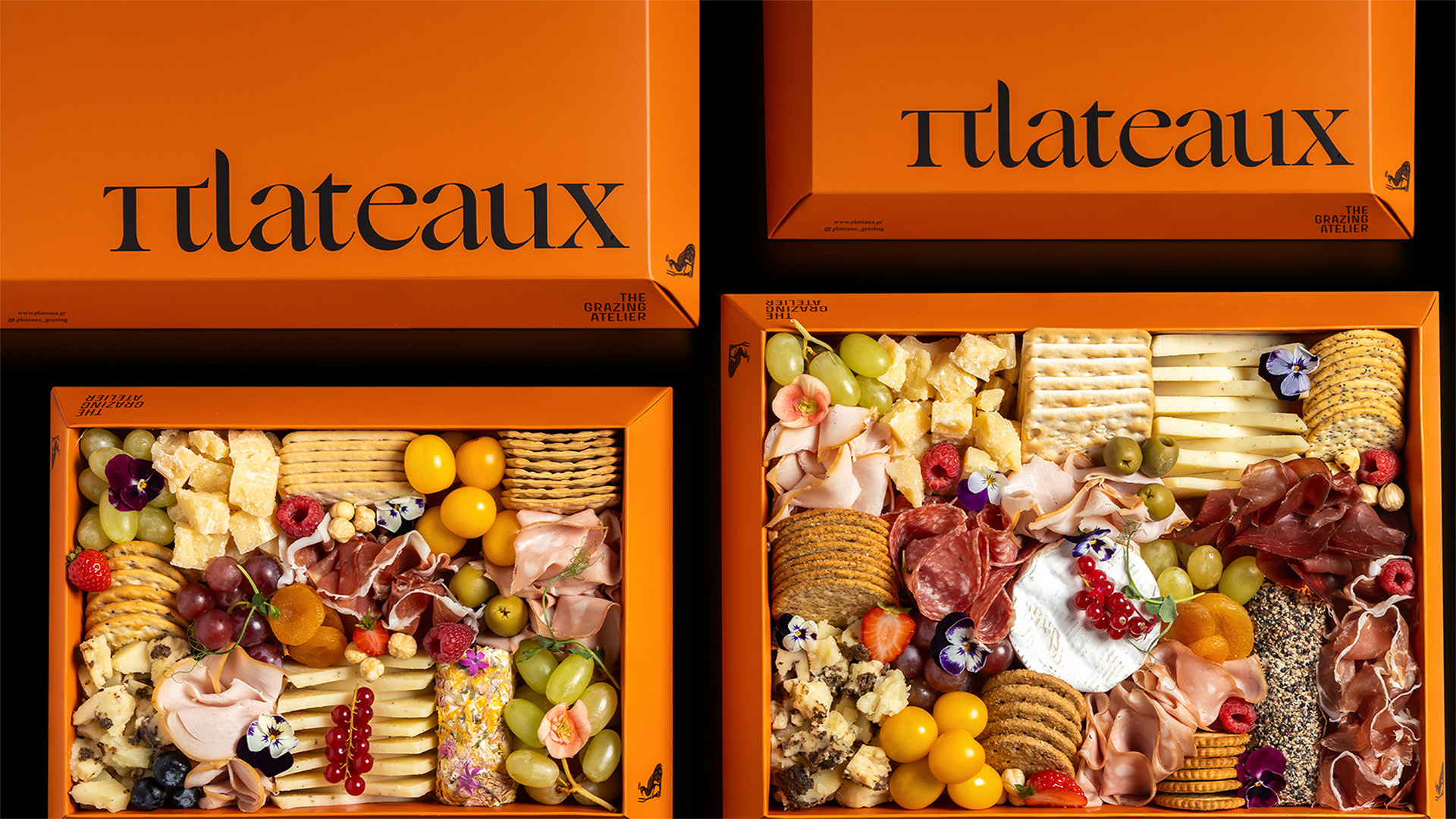
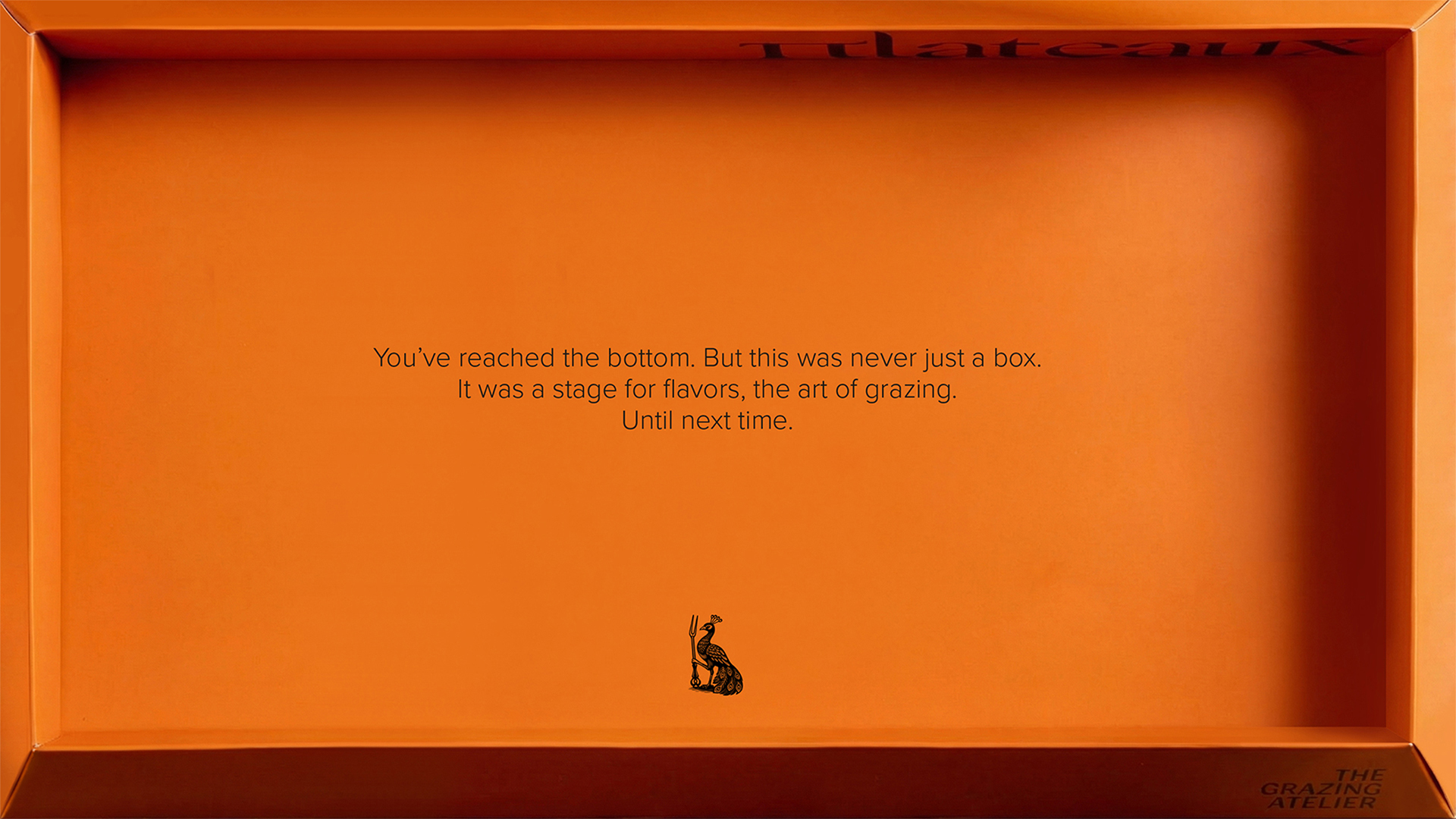
The design system treats the grazing box as a visual composition. Packaging functions as a framing device, presenting the contents as a curated arrangement of colour, texture and material.
Transparent surfaces reveal the food inside, allowing each selection to become the focal point and turning the box into a temporary display.
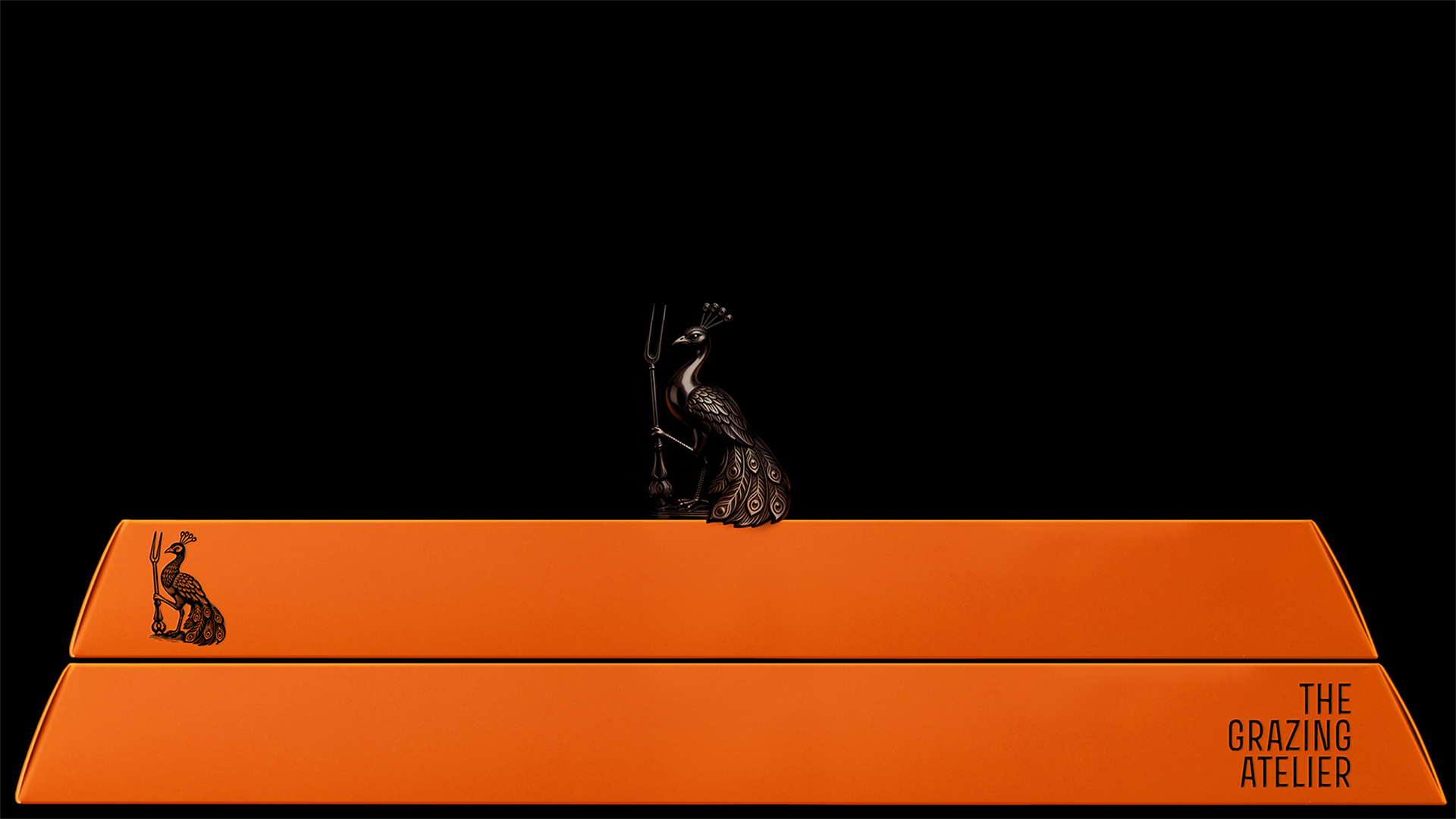
The Grazing Atelier informs the visual language, positioning presentation as a crafted act. Symbolism appears through the peacock and the ornamented fork, referencing abundance and ceremonial dining. The fork functions as a recurring graphic element across the system and extends into a series of ribbon-bound cards attached to each box. These cards identify the theme of the contents, linking what is seen on the exterior to what is experienced inside.
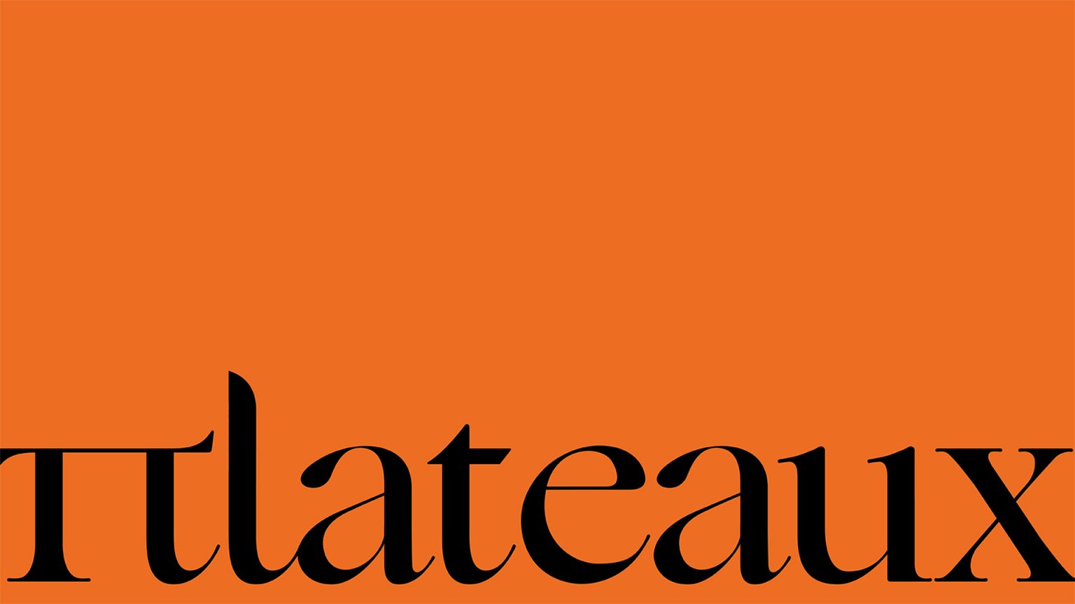
Typography establishes structure and recognisability. The name is written using the Greek character Π in place of the Latin P, introducing presence and referencing a surface where elements are laid out. The colour red makes a statement. This is a gallery of taste.



 monther al omari
 Ximena Ureta Design Studio.
 vitoramockup
 Up-Brands
 Sophiagdotcom
 Peter said
 ayeidadezigns
 Tancybox
 宏洛图品牌设计HONGLT
 Modern Theory
 Dozen Agency
 Atiq Alam
 Olio Studio
 Ruchi S. Joshi
 mmdesign
 awaiskhadim
 Octasoft
 United Creatives Studio
 Kingdom & Sparrow
 Anastasia Bakhmatskaya
 CreativeWise
 Great and Golden