

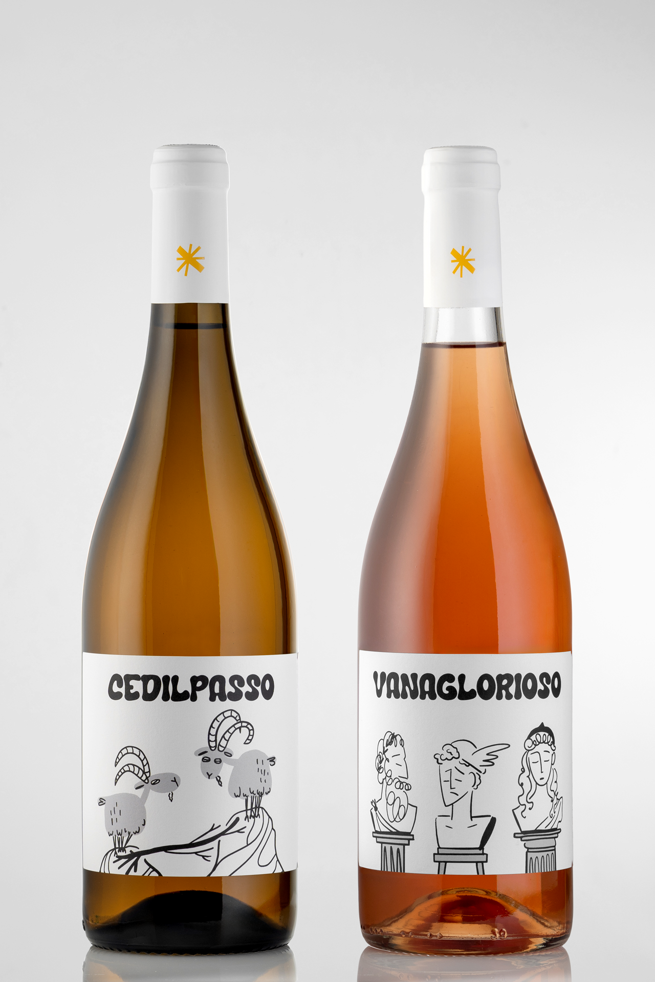
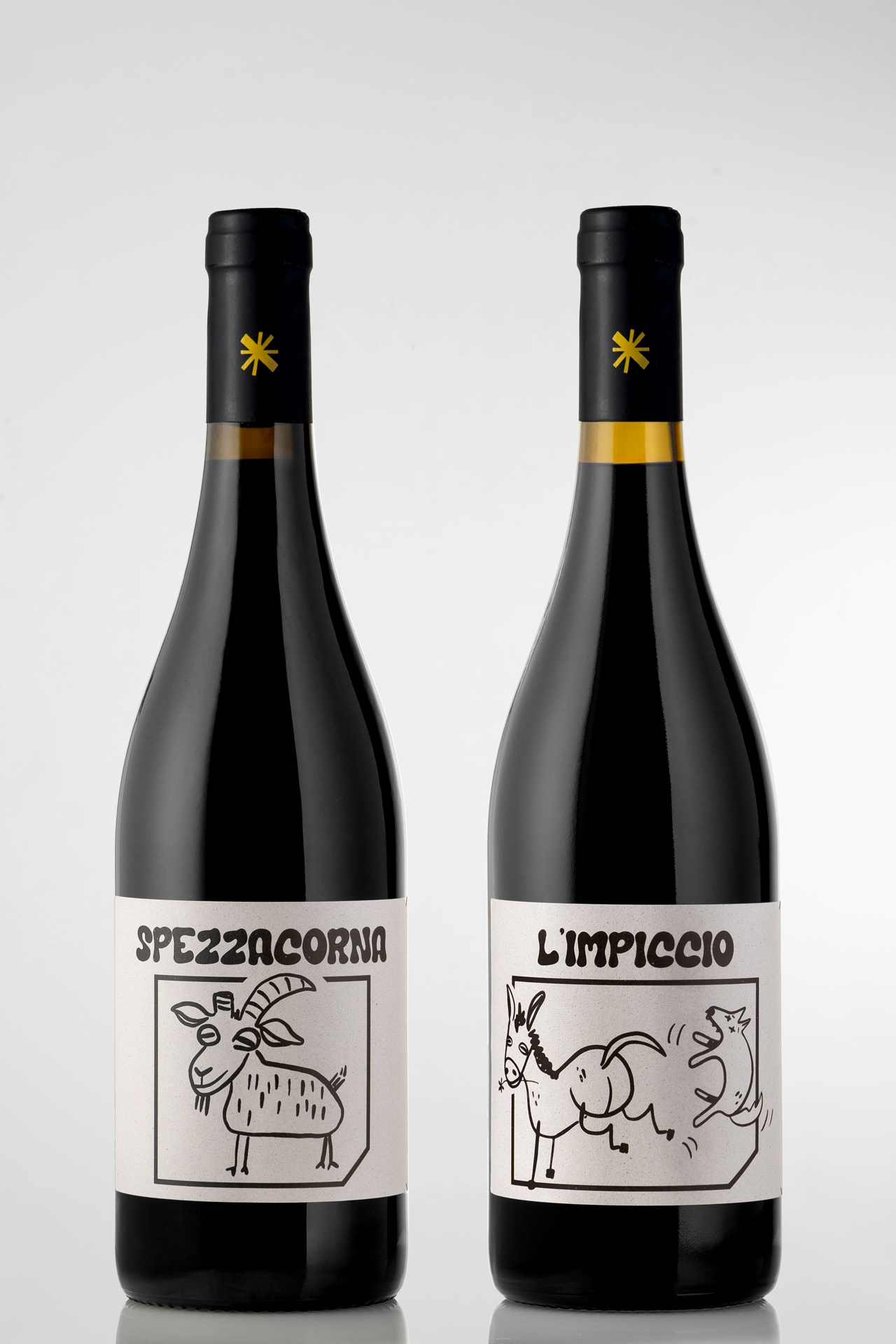
“Vini da Favola” (Fable-worthy Wines): the taste of storytelling. This label series for Agricola Stella’s natural wines turns each bottle into a small ritual of reading and tasting. The stories come from Aesop’s fables: ironic and universal tales that echo the character of the winery’s natural wines.
At the core of the project is the illustration system: an immediate visual language with a refined cartoon line. It makes characters and scenes instantly recognizable and perfectly tailored to Vanaglorioso (The Vainglorious One), Spezzacorna (Hornbreaker), L’impiccio (In Over Your Head), and Cedilpasso (Give Way!).
A printed leaflet with the fable and its moral, folded and tied near the neck, completes the way you approach the bottle. It is a small “booklet” that you detach and read, after the illustration has invited you to stop.
The choice of Fasson rCrush Grape natural paper, made in part from grape waste, physically anchors the project in the world of natural wine. The material becomes part of the story: here sustainability is not a technical detail, but a coherent extension of the narrative that the bottle carries.
Each label creates a slow moment of looking, reading, and tasting, where “every bottle truly ends with a moral”.
Curator’s Insight
Wine labels usually ask for one glance and a decision. This series asks for two: look, then read. The illustrations do the first job on their own, since the line work is loose enough to feel handmade but clean enough to read at a glance, so a shopper scanning a shelf gets the joke in the goat’s face or the tangle of hooves before they know anything about Aesop.
The leaflet tied at the neck is what turns that glance into a pause. Tying the story to the bottle rather than printing it on the label itself means the reader has to physically stop and untie something before the fable unlocks, which slows the moment down in a way flat text on the label never could.
The paper choice does quiet work too. Grape waste in the stock isn’t announced anywhere on the front of the bottle, it just sits underneath the story as a material fact, which keeps the sustainability angle from feeling like a claim and lets it function more like a footnote you discover later.
The transferable idea here: when a product’s whole pitch is “slow down and pay attention,” the packaging should build in an actual physical delay, not just quieter design. A tied leaflet forces a pause that a printed paragraph never will.





 monther al omari
 43oz
43oz Thirst
 Carreto Concepts Design Studio
 M&A CREATIVE AGENCY
 pastellofactory
 Omar Altayeb
 Cocoon Prague
 古戈品牌
古戈品牌 Pascal Riviere Design
 ZIMO Studio
 alchimistestudioParis
 Valérie Colace
 Platon Ivantsov
 Leyma Design
 Dina Gamal eldin
 clermentza
 Redlana
 anushrishah
 Natania Doshi
 NewFolderStudio
 francapovilla
 Mother Tongue Design
 CJMartins