

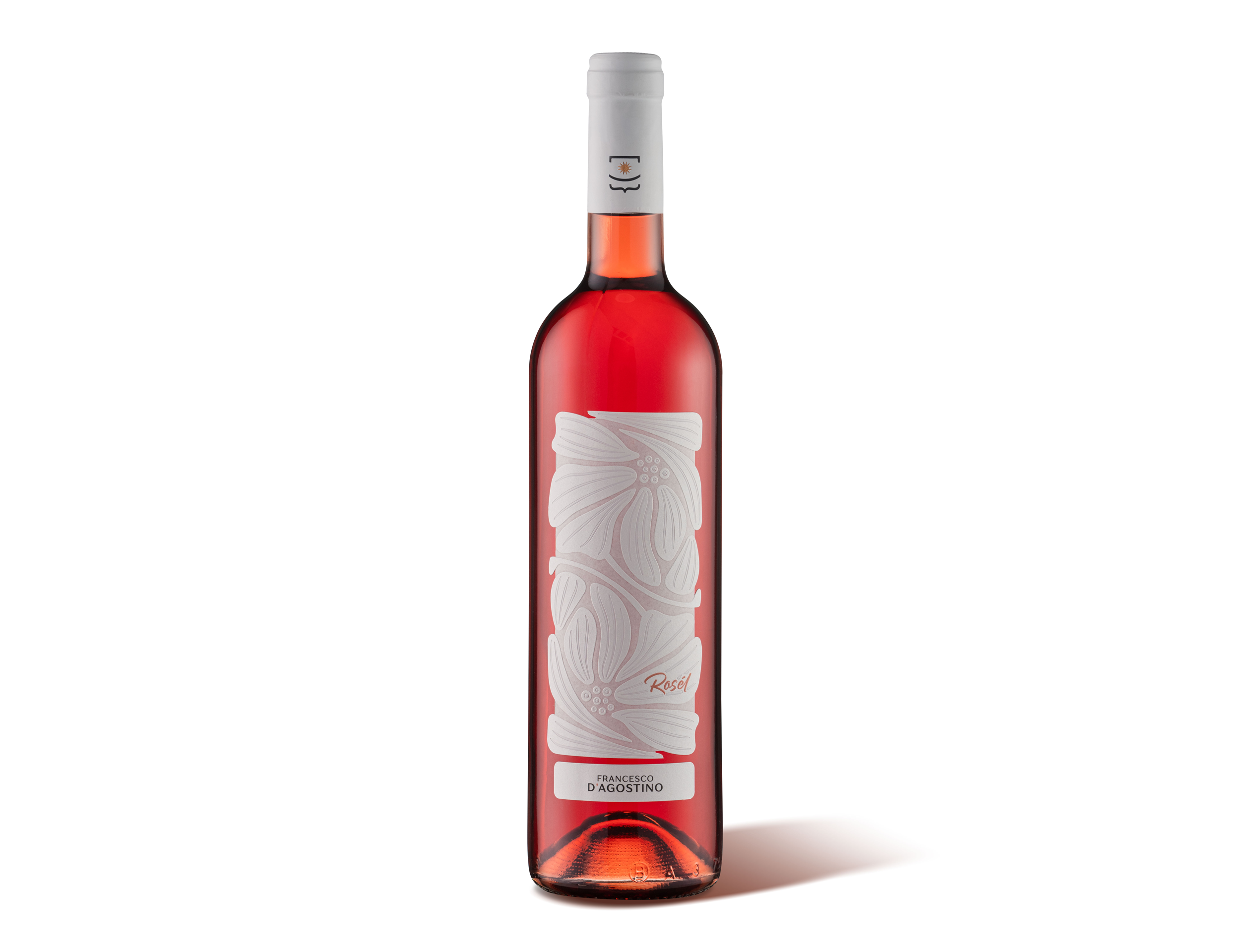
Rosél is a rosé wine that tells a family story. Its name comes from joining Rosa and Elena, the producers’ daughters, turning an emotional bond into a distinctive and authentic identity.
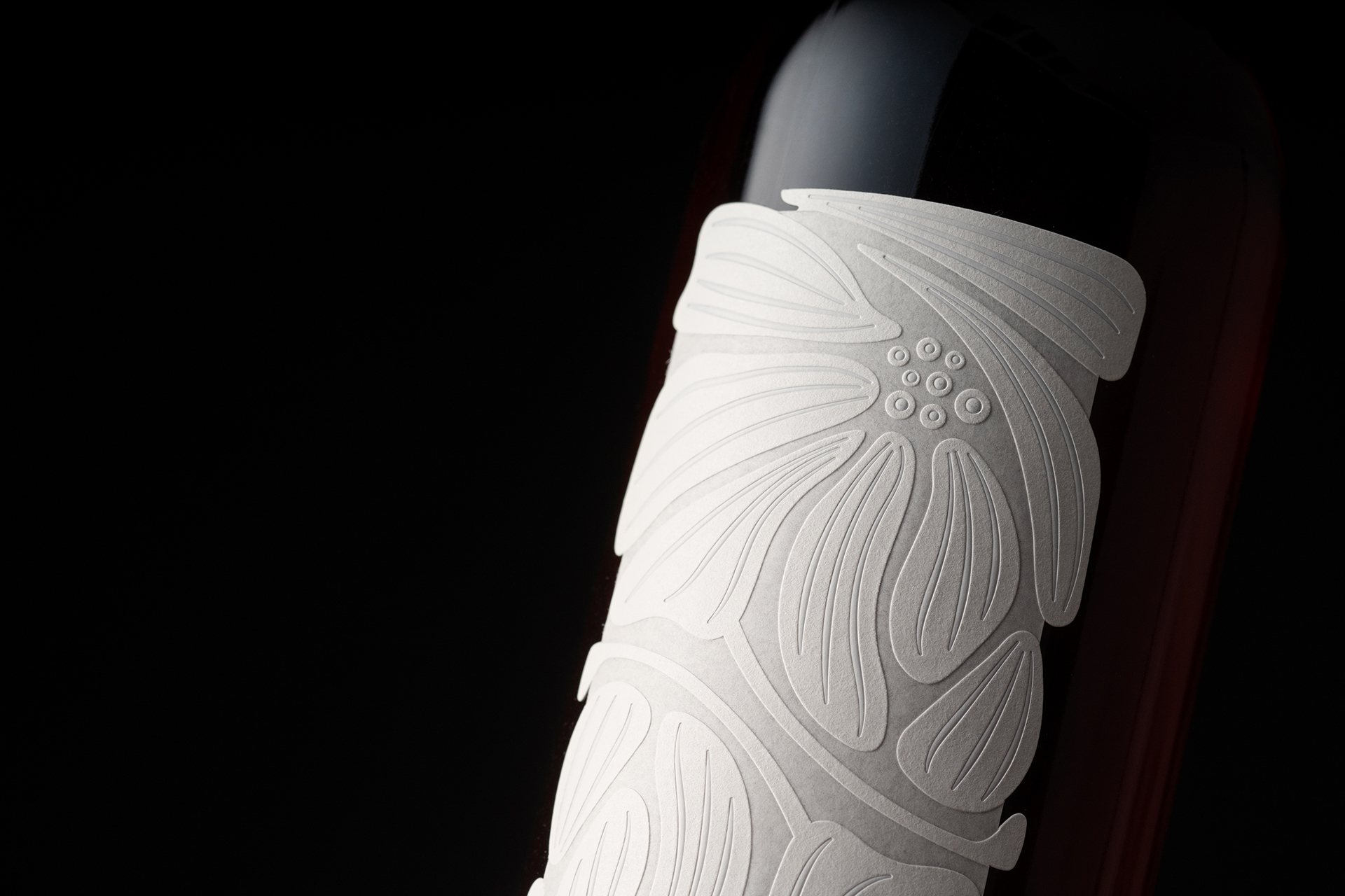
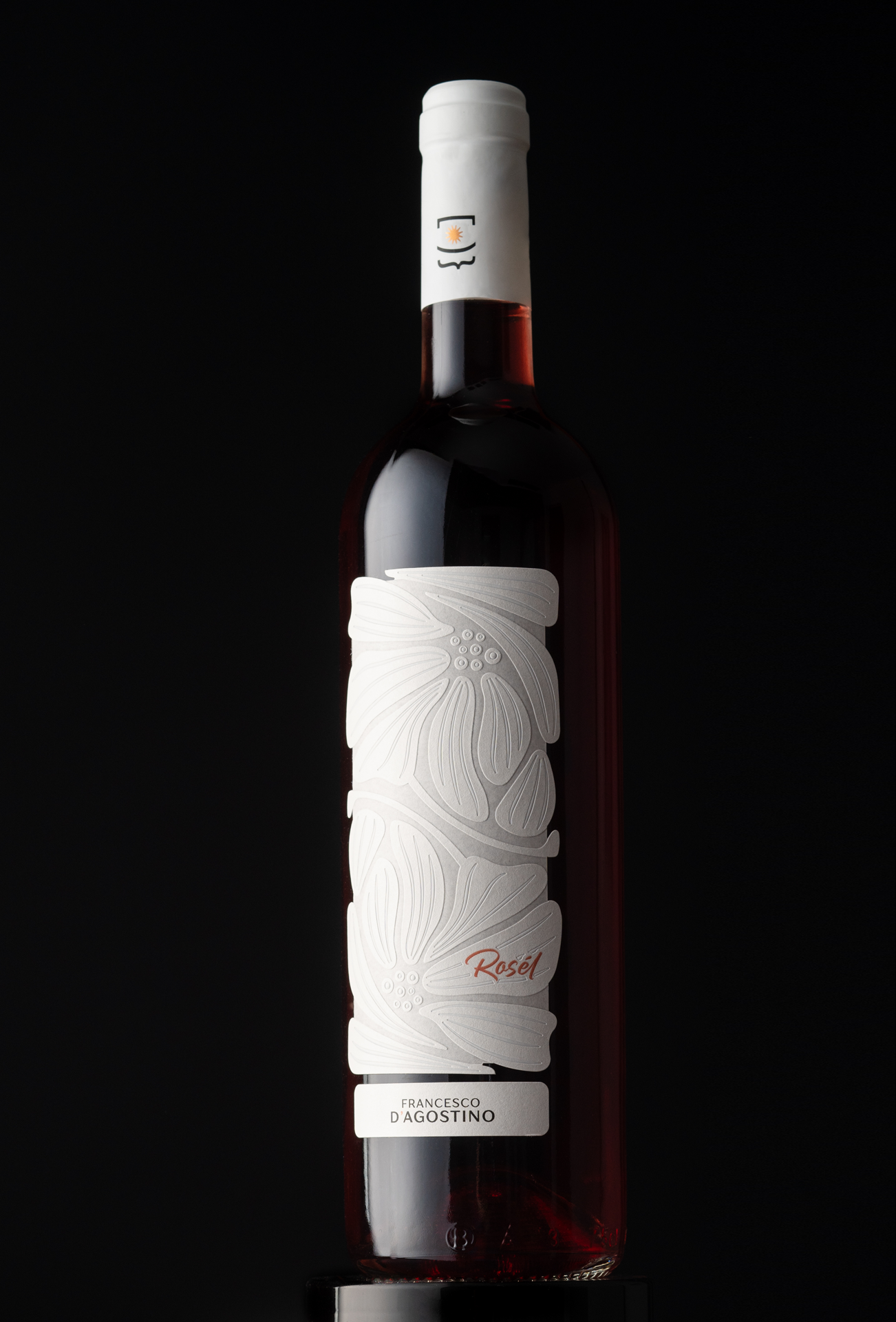
The visual concept draws inspiration from fashion and high‑end textiles, translating key elements of fine textile craftsmanship into a graphic language. The label is printed on Fedrigoni’s Moonlight, a natural white paper that, when debossed, becomes semi‑transparent and lets the colour of the wine filter through backlit.
Textures add depth and tactility to the label, evoking the sensation of a fine fabric wrapped around the bottle and creating a pattern of reliefs and transparencies that interacts with the rosé colour of the wine. In this way, the label does not simply dress the bottle: it uses the wine itself as part of the project, entrusting the definition of the colour palette to the liquid inside and transforming the bottle into a dialogue between light and content.
Rosél is not just a rosé wine; it is an homage to femininity, to meticulous attention to detail, and to the family ties that inspired its name. It is a project that dresses the bottle like a tailored garment, turning it into an object to be admired as well as tasted, a perceptual device that anticipates the character of the wine and begins to tell its story even before the first sip.
Curator’s Insight
What makes this label work is restraint paired with a clever material choice. Rather than printing colour onto the label, the design leaves a gap for the wine to fill. The floral debossing only becomes visible once light passes through the paper and picks up the rosé hue behind it, so the finished appearance of the pack is never fully fixed by the designer alone. That’s a quietly unusual move in label design, where colour palettes are almost always locked in before a single bottle is filled.
The textile reference also earns its place structurally, not just aesthetically. Raised floral linework reads like embossed fabric under raking light, giving the label a tactile quality that photographs differently depending on the angle and light source, which suits a product meant to be picked up and turned in hand at retail. It’s a good example of a label functioning as a lighting instrument as much as a graphic surface.
One flag: the brand story references a family and Italian styling cues, but the specific producer location isn’t stated in the brief. Worth confirming before this goes live.
 Derrick Lin
 Biaa
Biaa Petitmoulin Studio
 White Bear Studio
 Eva Chistyakova
 monther al omari
 Atipus
 alchimistestudioParis
 oneandother
 bloomburo
 helocrene
 Shapers Studio
 Denver Design
 Aidearte
 andrew.huerta
 softmachine
 airobtq
 Buzz & Co.
 Ruby
Ruby themythographer
 IDNB Inc.
 viktorflr
 Zenpack