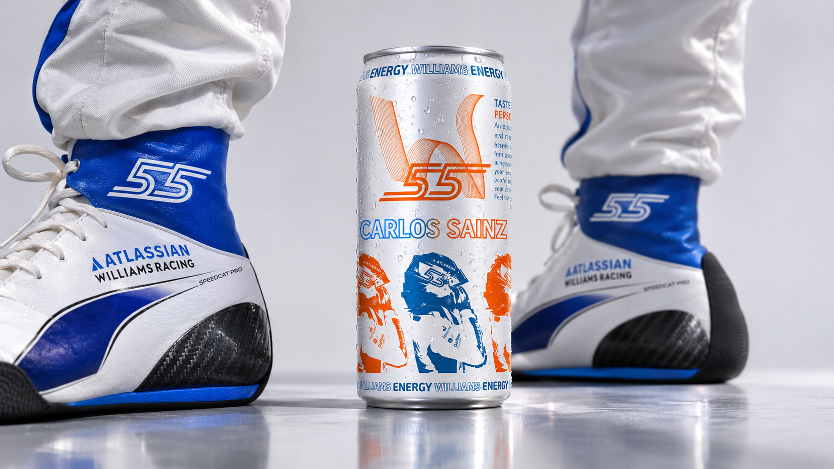

WILLIAMS ENERGY — A Taste of Racing
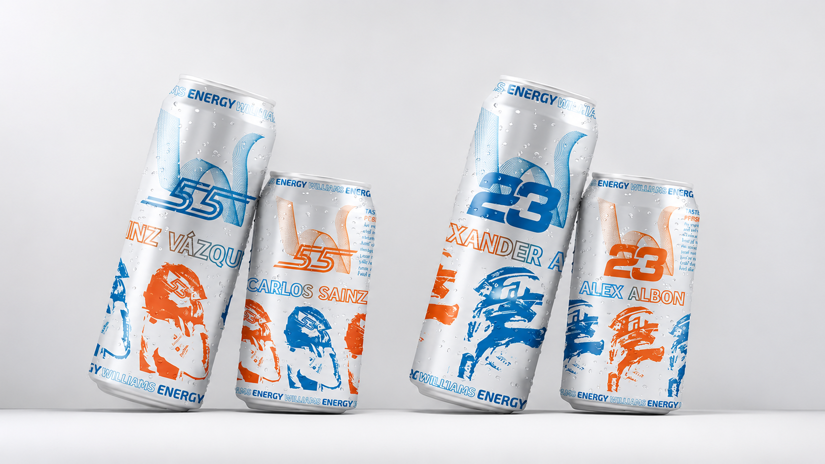
Williams Energy is a conceptual energy drink packaging project inspired by Formula 1 and the distinctive identity of Williams Racing. Born from a personal passion for motorsport and Carlos Sainz, the project explores how the atmosphere of a racing team can be translated into a collectible, driver-focused beverage series.
The central idea is to give each driver a drink with its own identity. Every edition features the driver’s racing number, name, individual flavor, and subtle references to songs or phrases associated with them. Rather than creating a single fixed design, the concept introduces a flexible packaging system that can evolve alongside the team’s driver lineup, bringing new flavors and visual interpretations with each change.
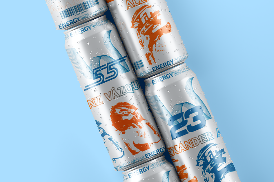
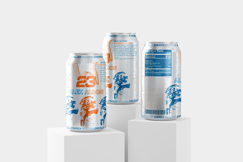
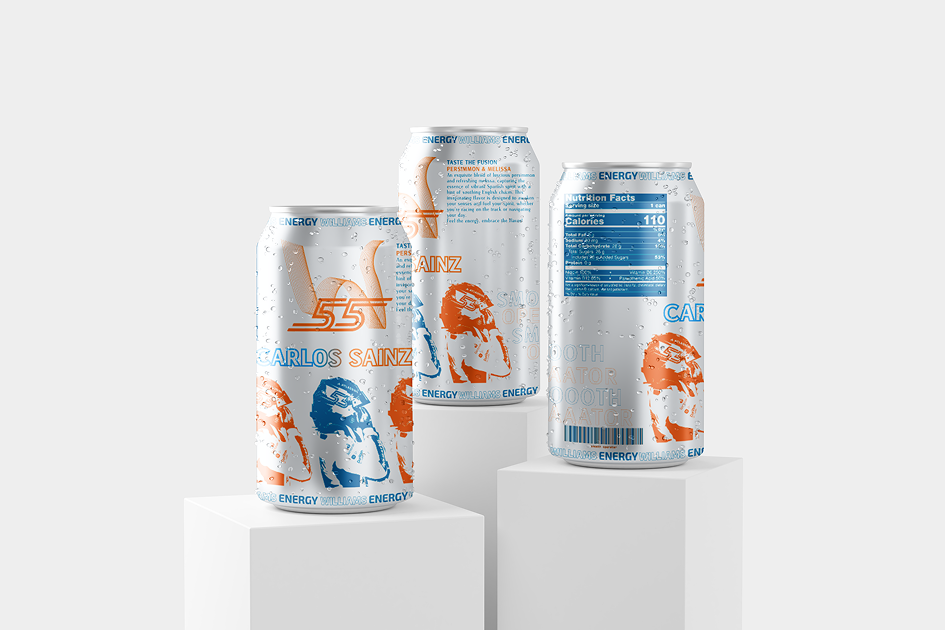
The visual language combines Williams Racing’s signature blue with contrasting orange accents. Photographs of the drivers were transformed into bold, print-inspired illustrations in Adobe Illustrator, giving the packaging a graphic, almost poster-like quality. Outlined typography, layered compositions, and repeated visual elements create a sense of movement while inviting viewers to discover smaller details and hidden references.
The final collection consists of four can designs for two drivers, presented in two different sizes. Larger cans feature the drivers’ full names, while smaller versions use shortened names. Inverted blue and orange color combinations add variety while maintaining a cohesive identity across the series.
Williams Energy is an independent student concept, not an official Williams Racing product. It reimagines an energy drink as a small piece of motorsport culture — something designed not only to be enjoyed, but also to be explored and collected.
 Derrick Lin
 Sophiagdotcom
 Sofia Nikishina
 studionerius
 monther al omari
 Monroe
 KateChachava
 Snob Duck
 宏洛图品牌设计HONGLT
 Studio Six F
 Just Design
 New Century Design
 VIEWPOINT
 Abbydraw Designs Unique Conceptual Branding & Packaging Designing Ideas
 BexNelson
 Vladimir Shmoylov
 Agence des Coteaux
 Julia M.
 Rabia zouina
 www.branding.uz
 Diego Alves do Amaral
 studioaslihan
 Minim Brand Design
 DesignPro