Curator's PicksSubmit a projectShare your work

Explore by Country

AfghanistanAfricaAlbaniaAlgeriaAmerican SamoaAndorraAngolaAnguillaAntarcticaArgentinaArmeniaAsiaAustraliaAustriaAzerbaijanBahamasBahrainBangladeshBarbadosBelarusBelgiumBeninBoliviaBosnia and HerzegovinaBotswanaBrazilBritish Indian Ocean TerritoryBrunei DarussalamBulgariaCambodiaCameroonCanadaChileChinaChristmas IslandColombiaCosta RicaCote D'ivoireCroatiaCubaCyprusCzech RepublicDemocratic People's Republic of KoreaDenmarkDominican RepublicEcuadorEgyptEl SalvadorEstoniaEthiopiaEuropeFijiFinlandFranceFrench GuianaFrench Southern TerritoriesGeorgiaGermanyGhanaGlobalGreeceGuadeloupeGuatemalaGuyanaHaitiHondurasHong KongHungaryIcelandIndiaIndonesiaIranIraqIrelandIsraelItalyJamaicaJapanJordanKazakhstanKenyaKuwaitKyrgyzstanLatviaLebanonLibyaLithuaniaLuxembourgMacedoniaMadagascarMalaysiaMaldivesMaliMaltaMarshall IslandsMauritiusMexicoMoldovaMonacoMongoliaMontenegroMoroccoMyanmarNepalNetherlandsNew CaledoniaNew ZealandNicaraguaNigeriaNorth AmericaNorwayOceaniaOmanPakistanPalestiniaPanamaPapua New GuineaParaguayPeruPhilippinesPolandPortugalPuerto RicoQatarRepublic of KoreaRepublic of KosovoRomaniaRussian FederationSan MarinoSao Tome and PrincipeSaudi ArabiaSenegalSerbiaSeychellesSingaporeSlovakiaSloveniaSomaliaSouth AfricaSouth AmericaSpainSri LankaSudanSwazilandSwedenSwitzerlandSyrian Arab RepublicTaiwanTajikistanThailandTrinidad and TobagoTunisiaTurkeyTurkmenistanUgandaUkraineUnited Arab EmiratesUnited KingdomUnited StatesUnited States Minor Outlying IslandsUruguayUzbekistanVanuatuVenezuelaViet NamVirgin Islands, U.S.YemenZambiaZimbabwe

Materials

Browse all

Monache Rosse

Creative Agency: nju:comunicazione
Project Type: Produced, Commercial Work
Client: Villa Raiano
Location: Eboli, Italy
Packaging Contents: Tomatoes and sauces
Packaging Substrate / Materials: Glass
Printing Process: Offset Printing

Monache rosse (Red nuns) is the rediscovery of an ancient taste promoted by villa raiano, to re-give substance to the forgotten flavours.

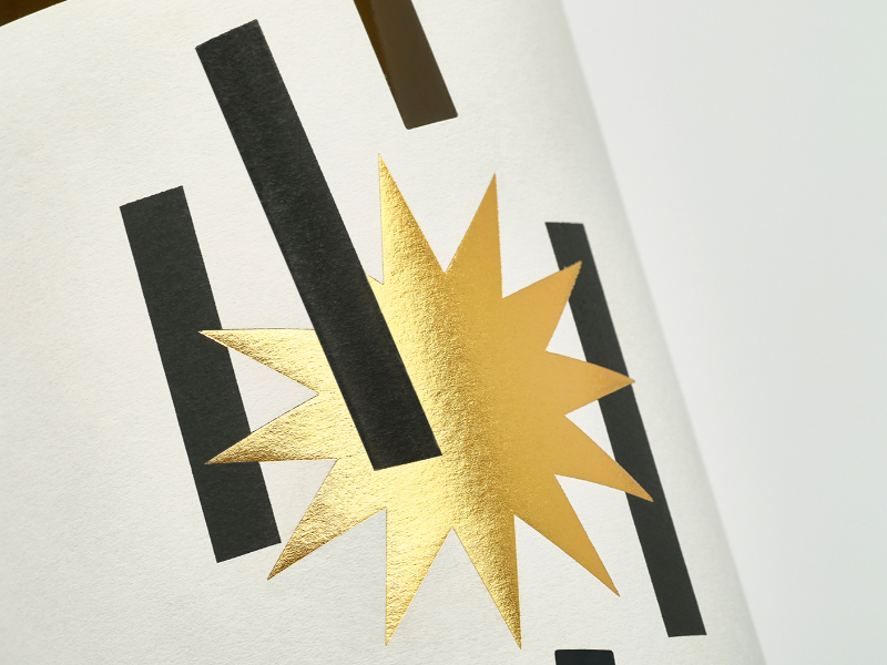
And they do it thank to the passion of the chef-architect Raffaele Vitale, who loves essential tastes, which brought the name of our roots, that exalted the identity of a land through a dish. For the packaging we designed labels with an oblique side. For the logo we designed an elegant and essential lettering, even if it appears like a “serif font”, only used in black or white. They suggest the shape of the “maccaturo”, the cap worn by the ladies that used to cultivate and collect the tomatoes here in Italy.

What’s Unique?
An unusual label wraps the vases and the oblique side, in absolute white in relation with the content, gives strong contrast to the final appearance.

Comments

2 comments

Comments are closed.