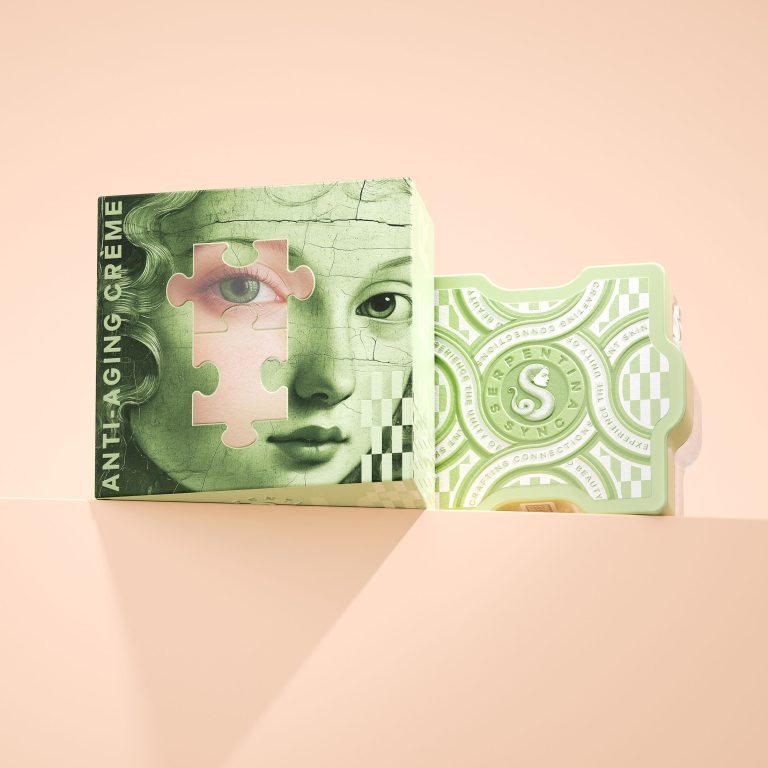
Serpentina Sync is an innovative skincare brand that redefines beauty through connectivity, transformation, and luxury. Drawing inspiration from the fluidity and elegance of the serpent, Serpentina Sync offers high-performance skincare products designed to bring out your skin’s natural radiance. At its core, the brand unites innovation with aesthetic allure, allowing customers to create a personalised collection that physically and metaphorically fits together.
The packaging features jars shaped like puzzle pieces, allowing users to connect their products. This playful, interactive design encourages consumers to build and expand their skincare routine. The puzzle pieces symbolize the interconnected nature of self-care, with each product playing a role in completing the beauty puzzle. The label includes a chain graphic, symbolizing strength and continuity, reinforcing the brand’s message of balance and transformation.
The brand’s symbol—a snake with a female face—represents wisdom, beauty, and renewal. The serpent’s body forms an ‘S,’ reflecting the brand name and the concept of continuous care. The label is designed with embossing, giving the packaging a textured and tactile feel.


