

Reshkin Natural Nuts
Reshkin is a premium line of natural nuts created for those who value healthy eating and elegant design. The name “Reshkin” resonates with the crunchy sound of nuts and metaphorically conveys the sun’s energy contained in each one, highlighting their natural goodness and rich flavors. The slogans “Healthy Eating Factors,” “Open the Energy of the Sun Inside,” and “Healthy Never Tasted Better” emphasize a wholesome lifestyle and positive energy.
Assignment
The task was to develop a comprehensive brand identity centered around the packaging design for a range of nuts. The packaging needed to stand out on store shelves and convey the brand’s core values: high quality, health benefits, and visual appeal. The project required creating a logo, brand mark, color palette, typography, and the packaging design itself, along with other supporting brand elements.
Solution
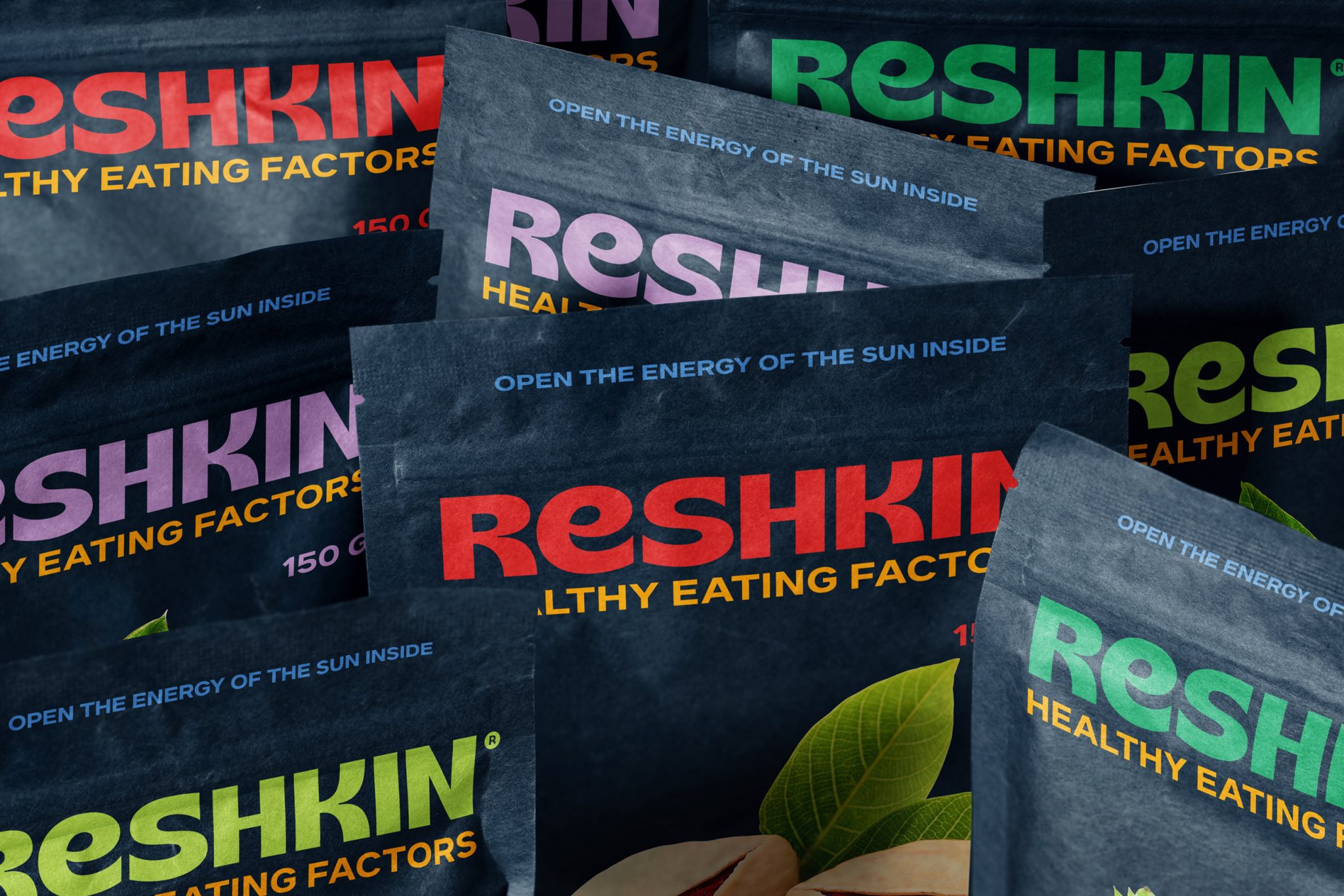
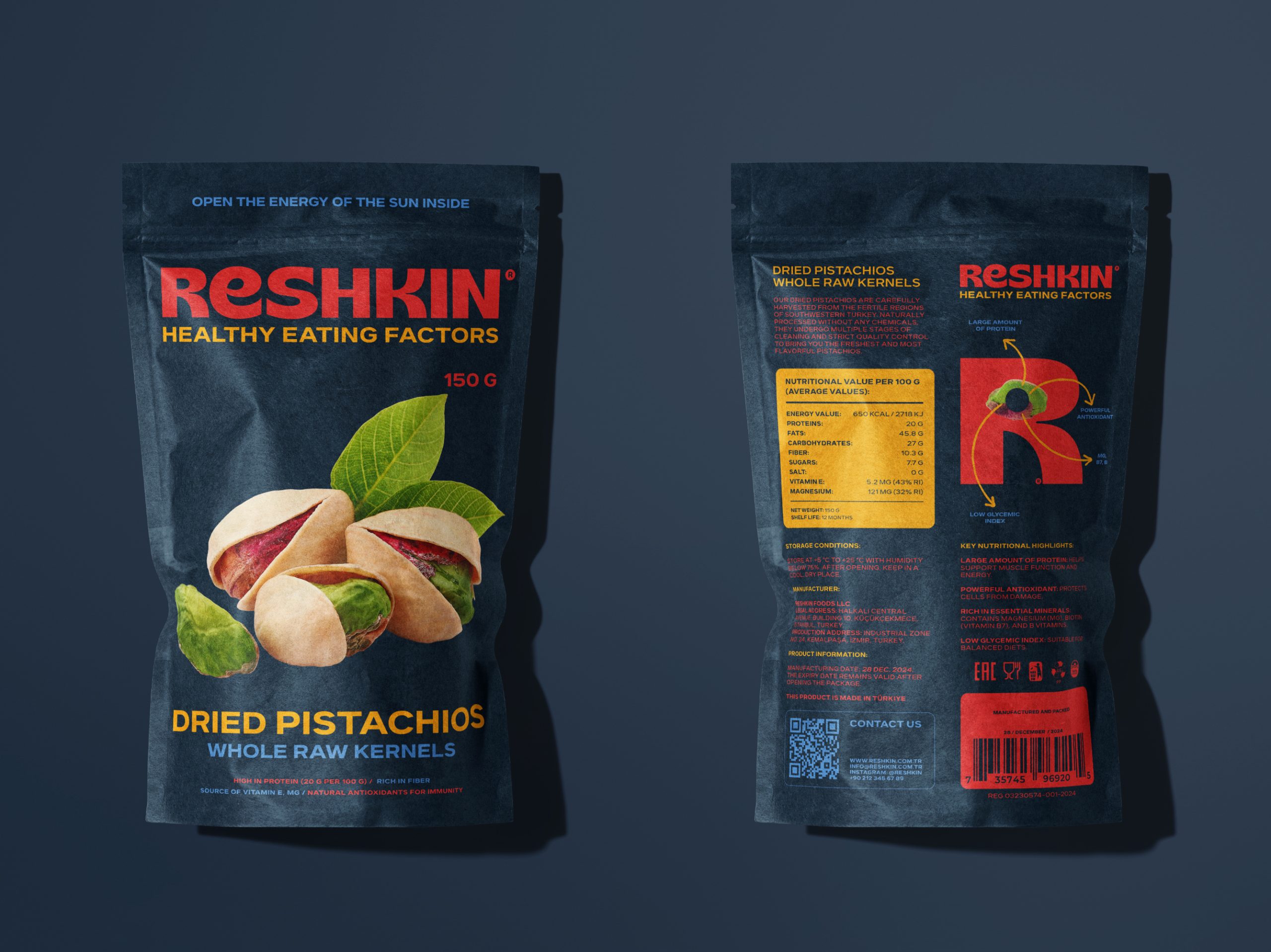
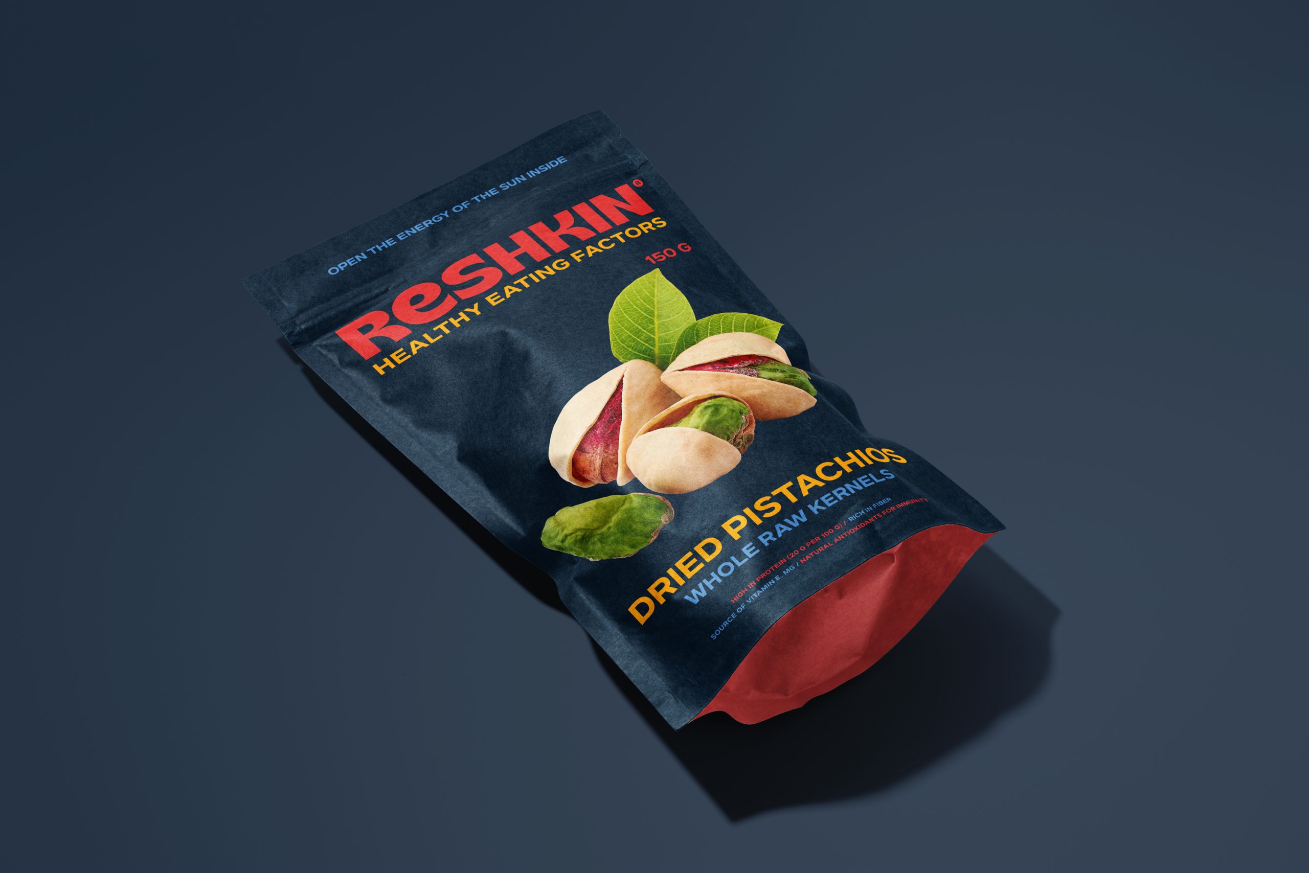
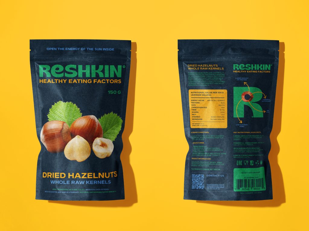
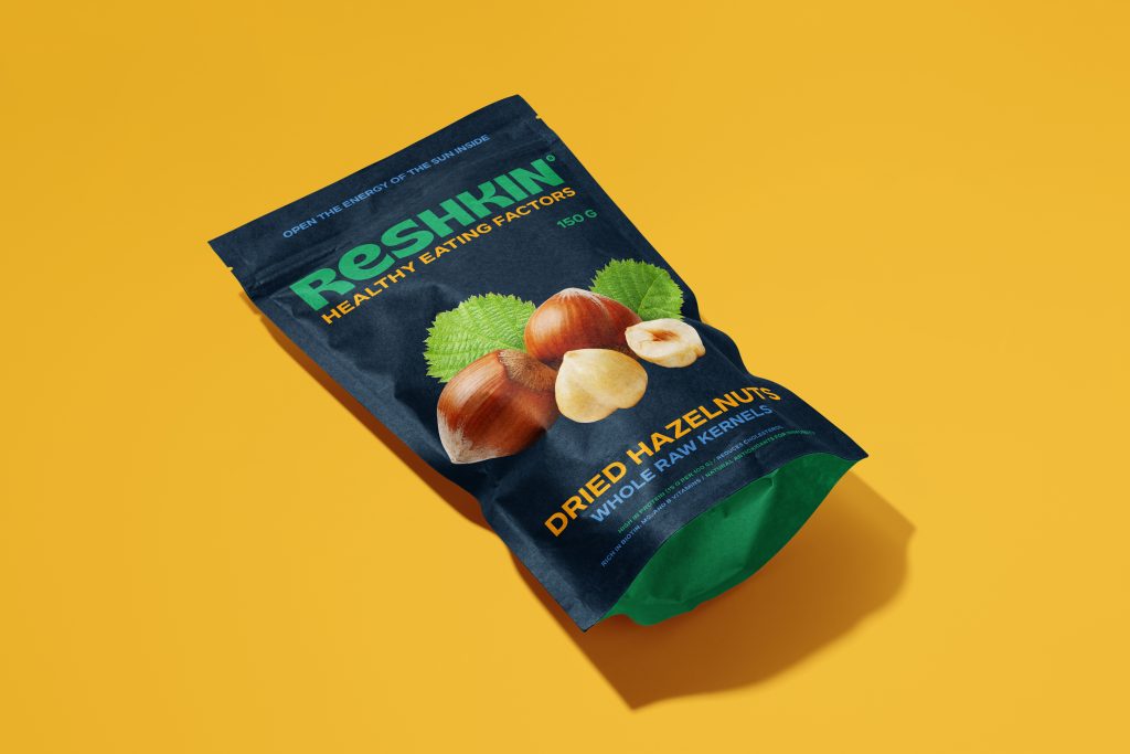
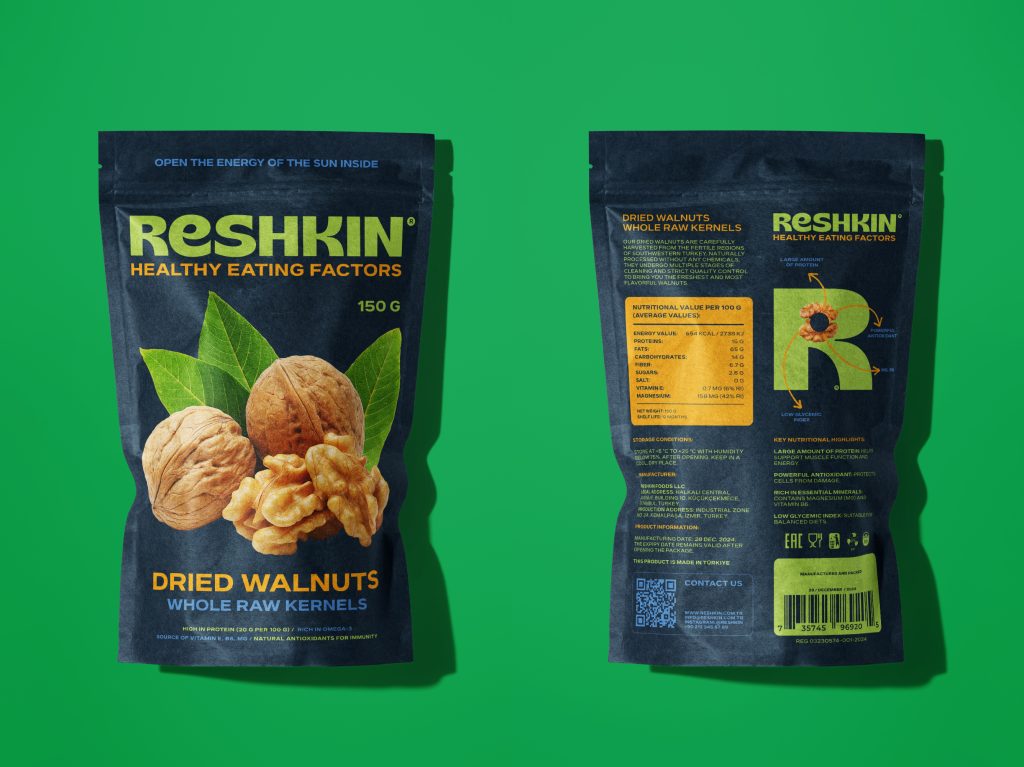
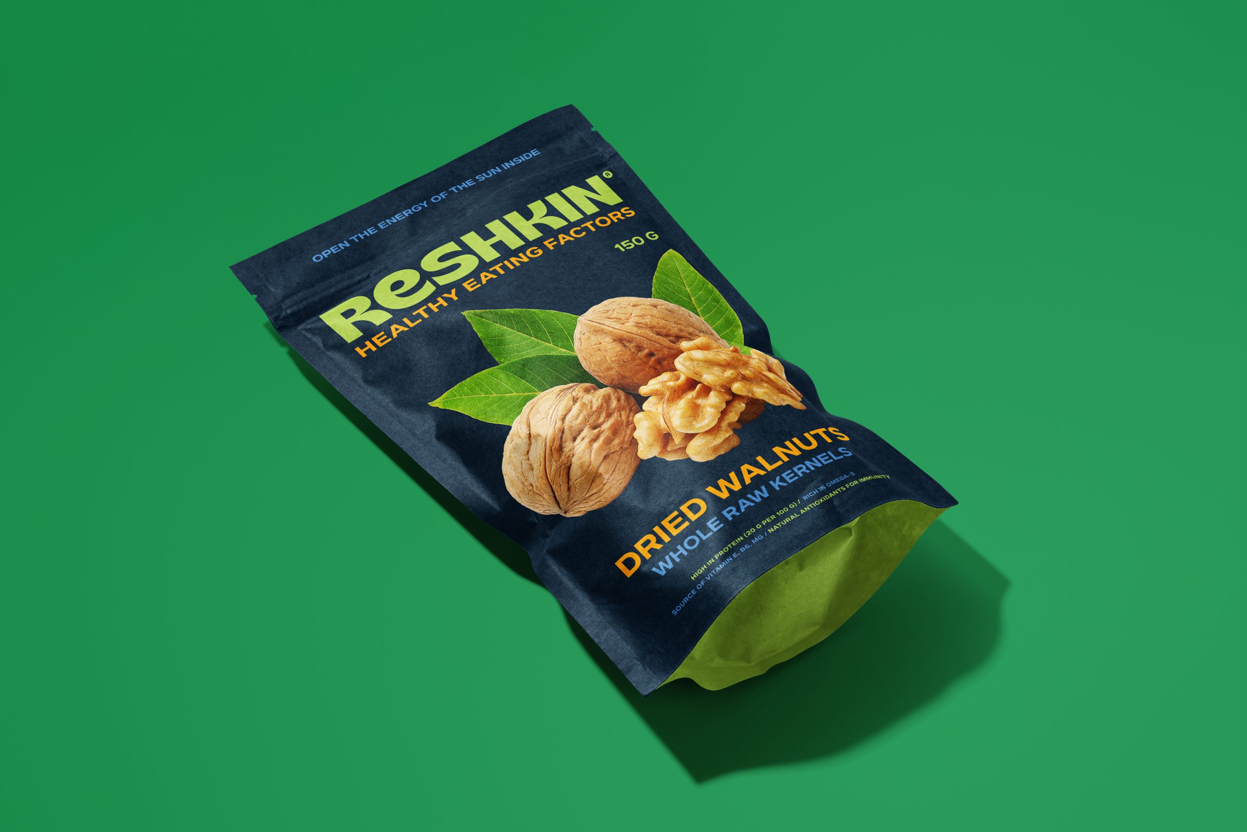
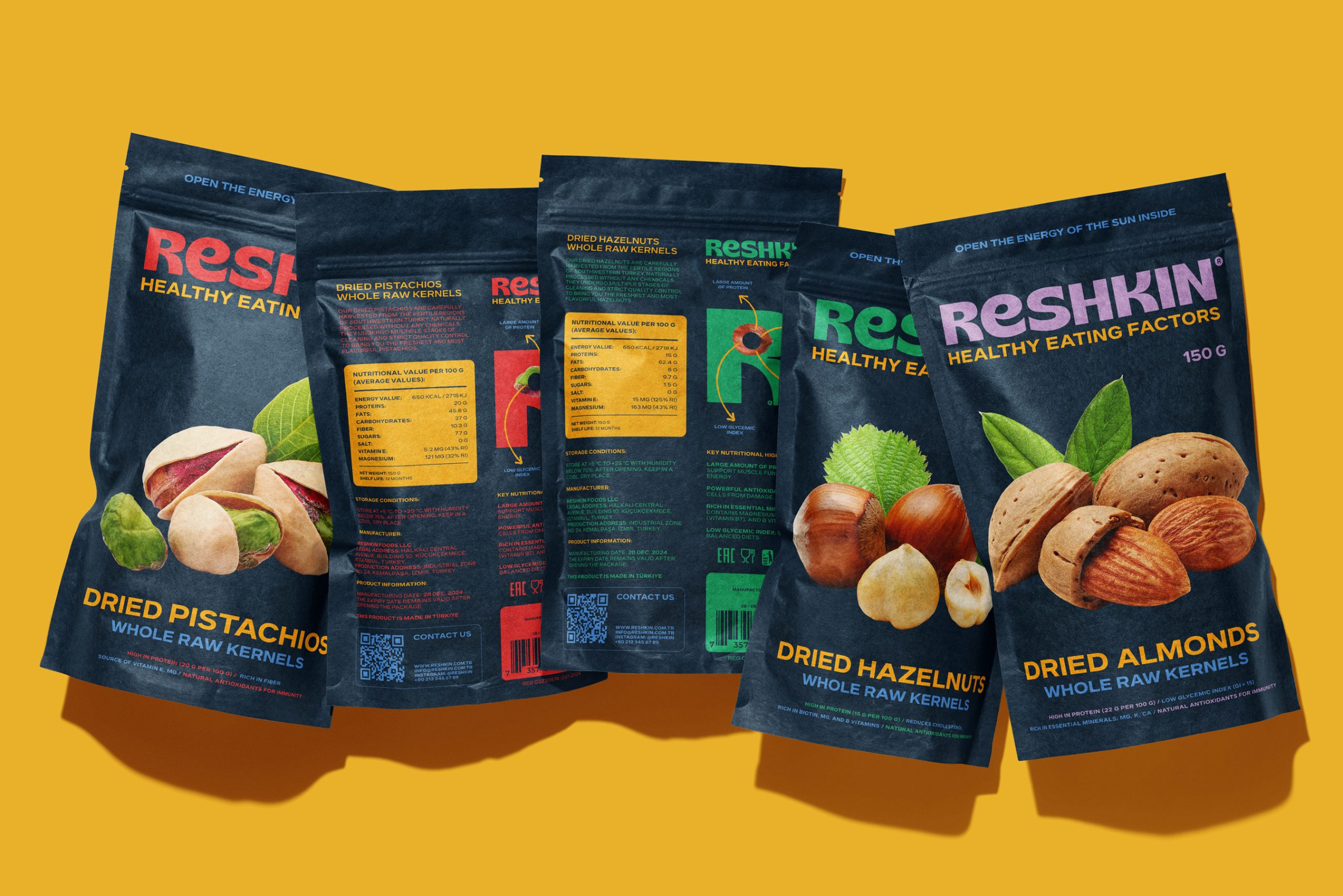
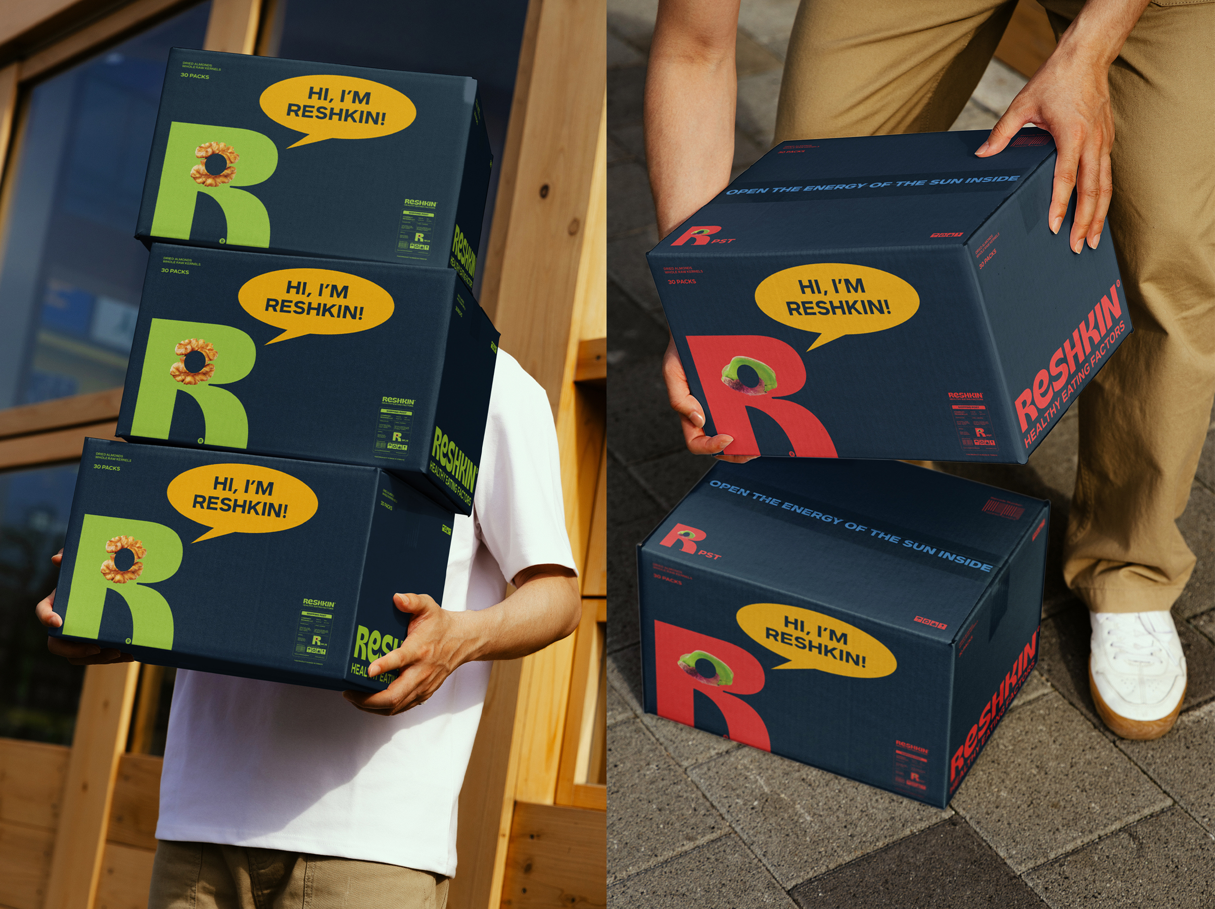
The identity is built around the letter “R,” which incorporates images of various nuts—emphasizing the product’s natural origin and the brand’s focus on health benefits. The primary packaging stands out with a dark background that contrasts against bright accent colors (red, green, purple, yellow), highlighting the freshness of the product and helping to distinguish different nut varieties in the lineup. The front panel prominently features the nuts, while the back provides concise information on ingredients and benefits.
The slogan “Open the Energy of the Sun Inside” reinforces the brand’s emphasis on natural goodness and health, setting a positive and dynamic tone for all communications. Additional elements (banners, branded vehicles, merchandise) expand this unified concept and create a memorable, friendly brand image both offline and online.


 Furt Goods
 Atiq Alam
 宏洛图品牌设计HONGLT
 Ampersand Creative
 Modern Theory
 Palashcc
 neo creative studio
 Axiniya Knyazeva
 Valérie Colace
 Anshuman
 Archi Jain
 DESIGN CONCEPTS
 Shapers Studio
 jamajkajakub
 tamara barakat
 Derrick Lin
 VincoStudio
 lisakaplina
 CreativeWise