
Mamatest
A Quieter Language for Women’s Diagnostics
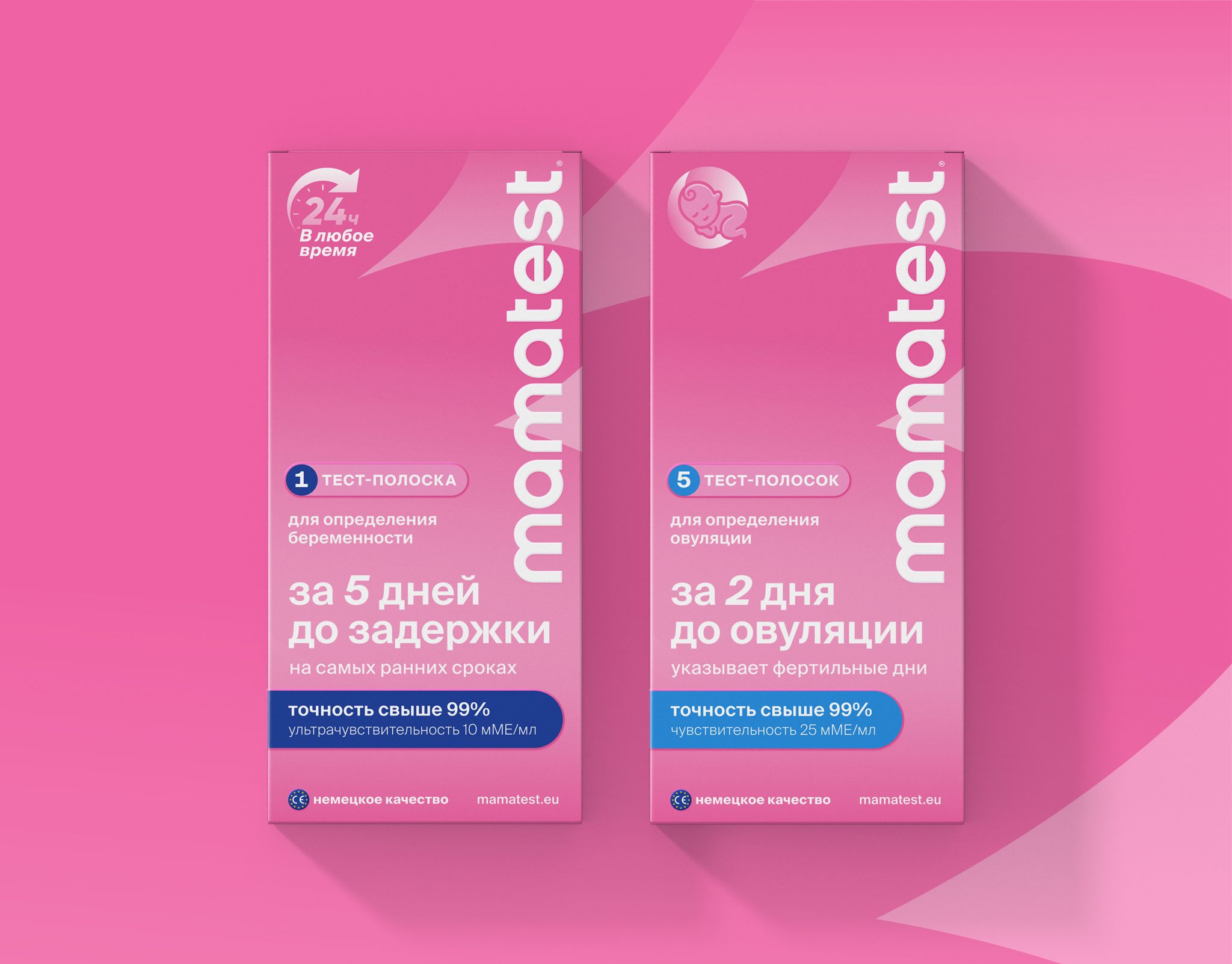
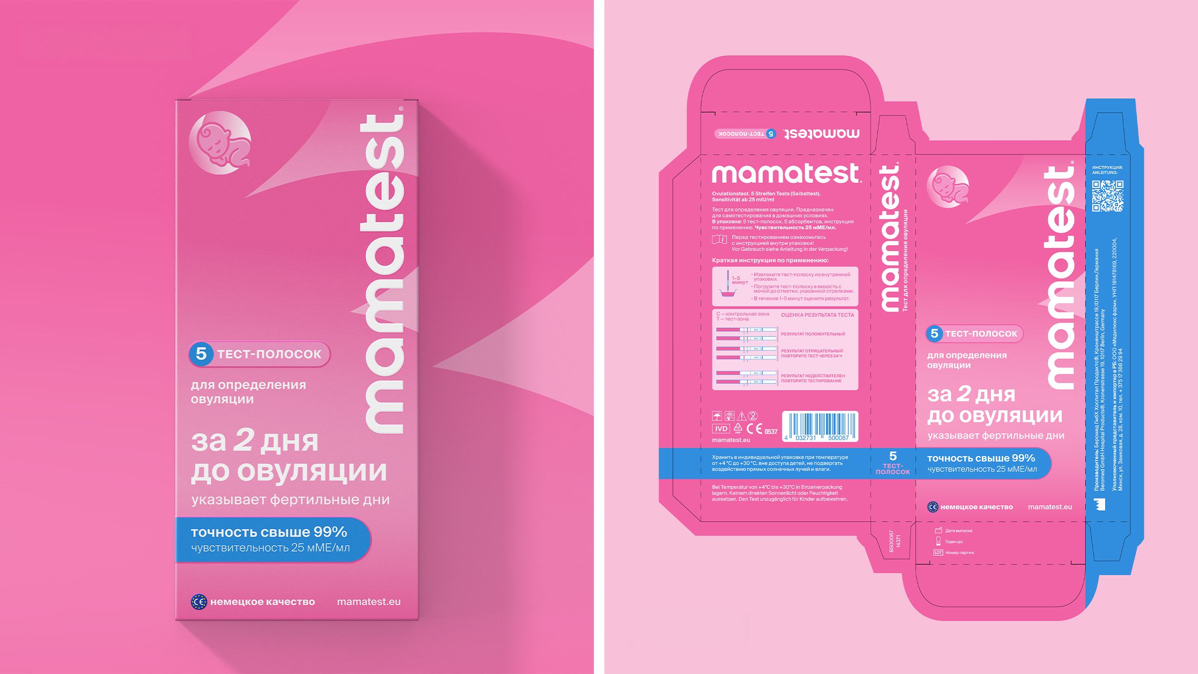
Mamatest is a German women’s health brand by Völker & Kruse GmbH (Hamburg), producing pregnancy and ovulation tests to EU medical standards in Berlin, Germany. We designed the brand identity and packaging system for its entry into the CIS market.
Medical packaging is built to be trusted, not to be looked at. Its visual code — clinical neutrals, technical sans, regulated hierarchies — is the product’s first promise of competence. Push against it too hard and the design becomes attractive but no longer credible: the object stops behaving like a medical product, and trust collapses before the box is even picked up. Our work sat on that exact line.
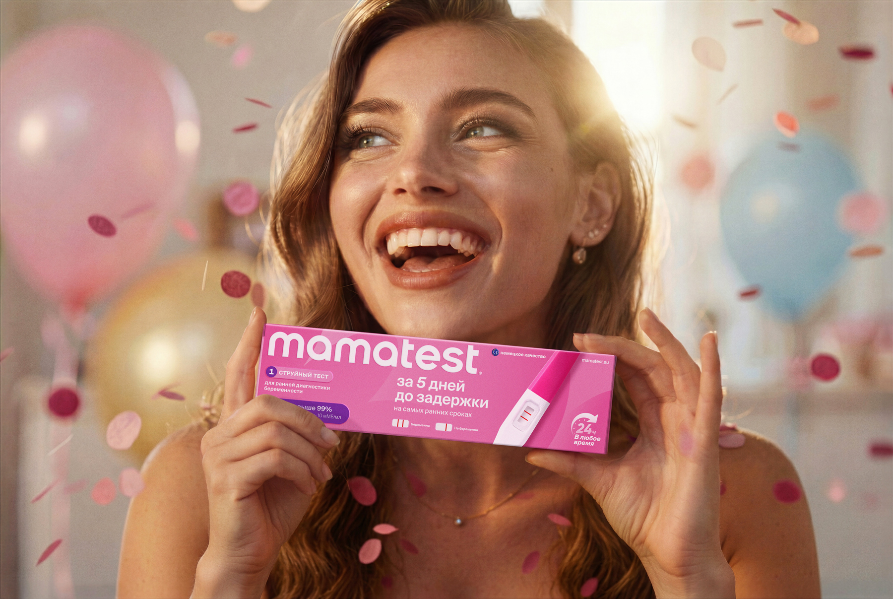
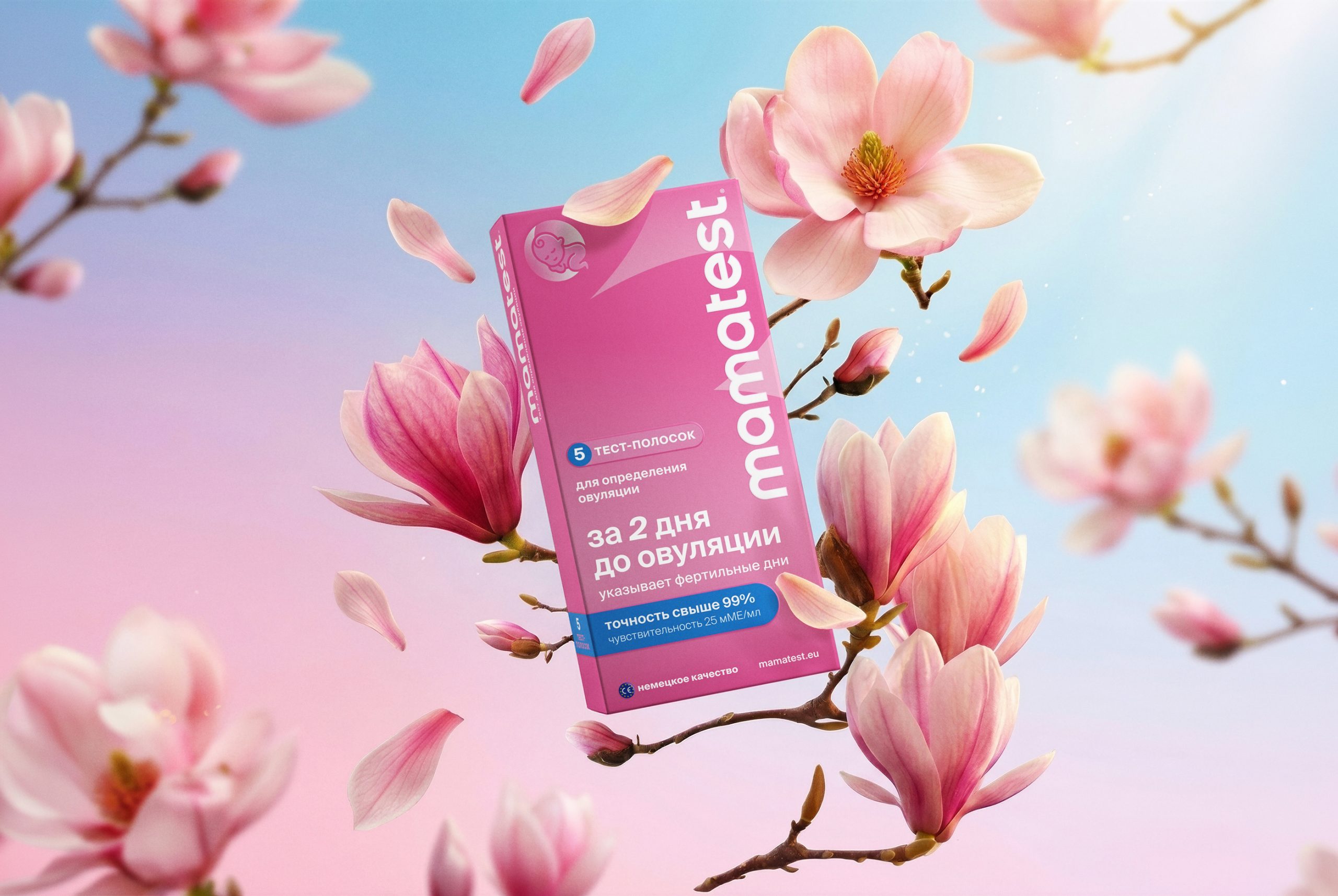
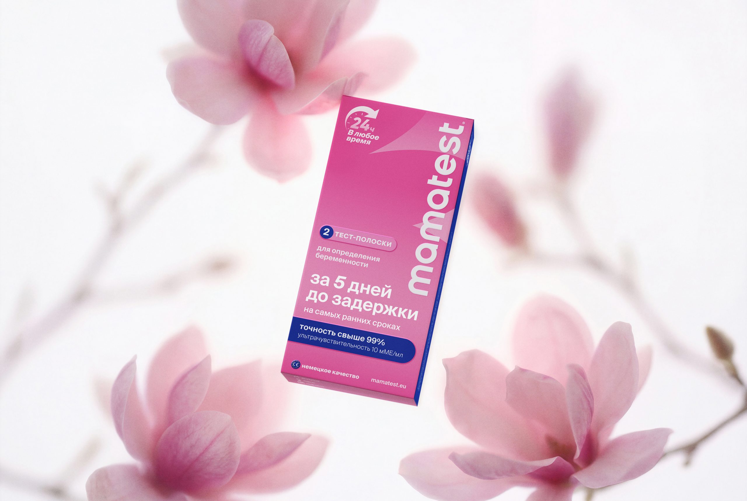
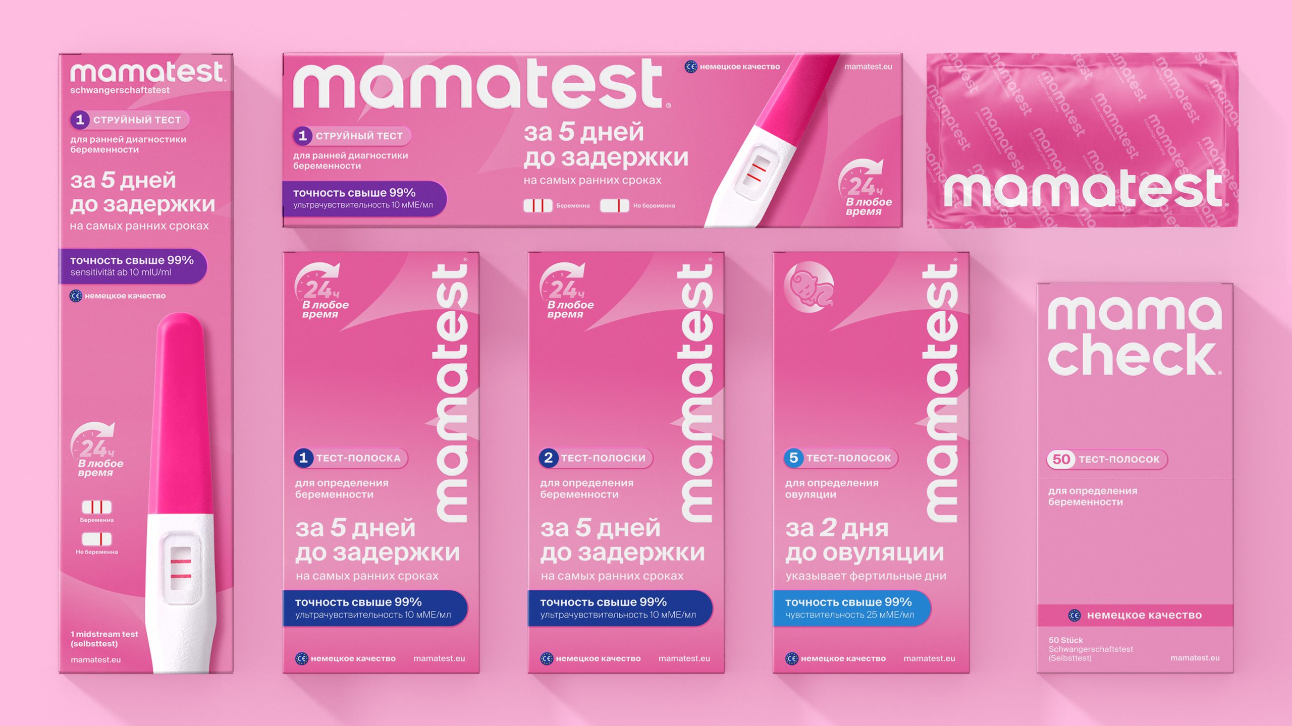
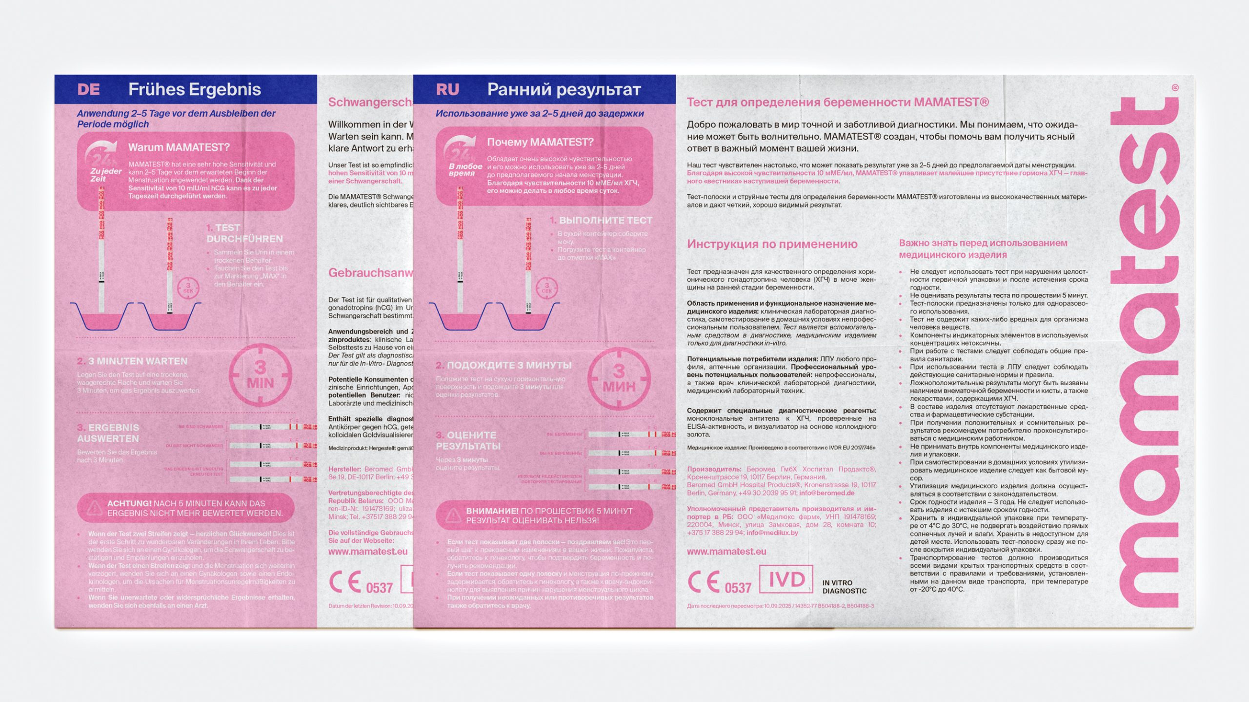
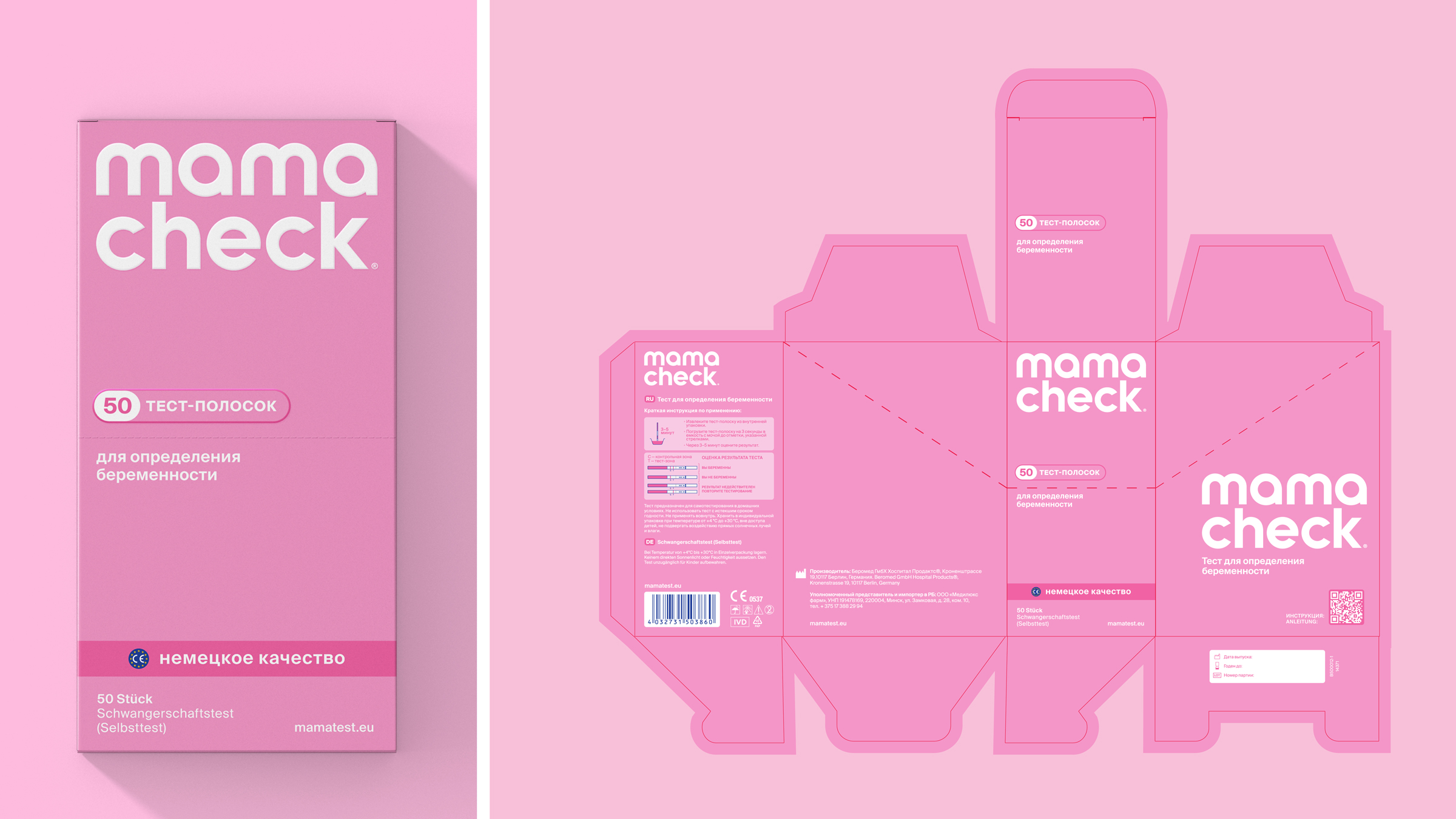
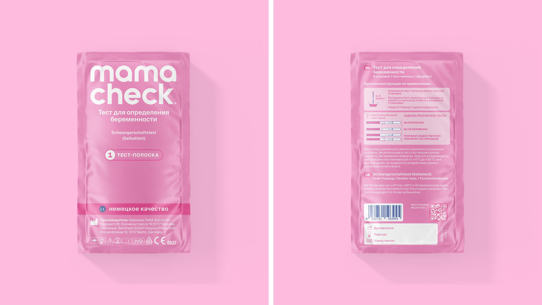
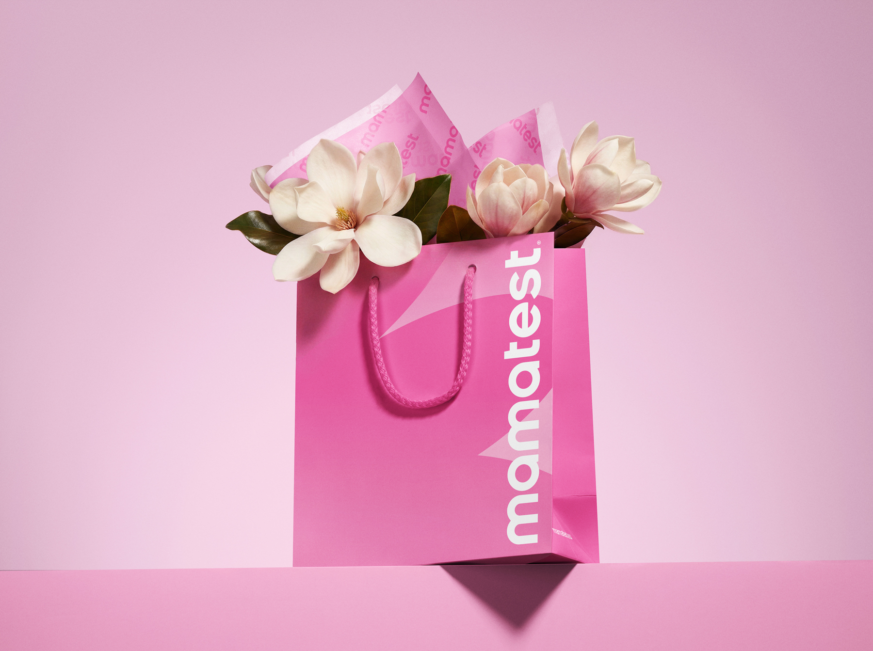
Mamatest is built as a system of two voices. The outer layer is unmistakably a brand: a single confident wordmark, a soft pastel architecture, three color-coded product families (test strips, midstream, ovulation), and a calm photographic world. The inner layer is unmistakably medical: original German manufacturer copy, EU IVD and CE marks, regulated instruction sets, full compliance for the CIS market. Cyrillic carries the message to the consumer; German signs the product. The two languages on the box are not a translation but a structure — origin on one side, conversation on the other — and the whole identity is organized around that split. The result is a packaging system that updates a conservative category without leaving it: modern enough to be chosen, medical enough to be trusted.
Typography follows the same logic. Suisse Int’l is used as a single functional system across the brand — its 18 weights and italics hold both the 6-point regulatory set inside the leaflet and the display scale of retail communication, in Latin and Cyrillic, without switching faces.


 MID-AIR STUDIO
 Heramb Arora
 monther al omari
 Tríona O'Donoghue • Design
 Cocoon Prague
 alchimistestudioParis
 hugo zapata
 Bonsanco Creative Studio
 parawaradesign
 UPRISE
 Brand Society
 Que Cálido Studio®
 Richest Branding Pvt. Ltd.
 STRATEDGY
 Shapers Studio
 Platon Ivantsov
 WPA Pinfold
 giselepereiradesign
 ShalaSketches
 05Creation
 Voit Studio
 SSTO
SSTO