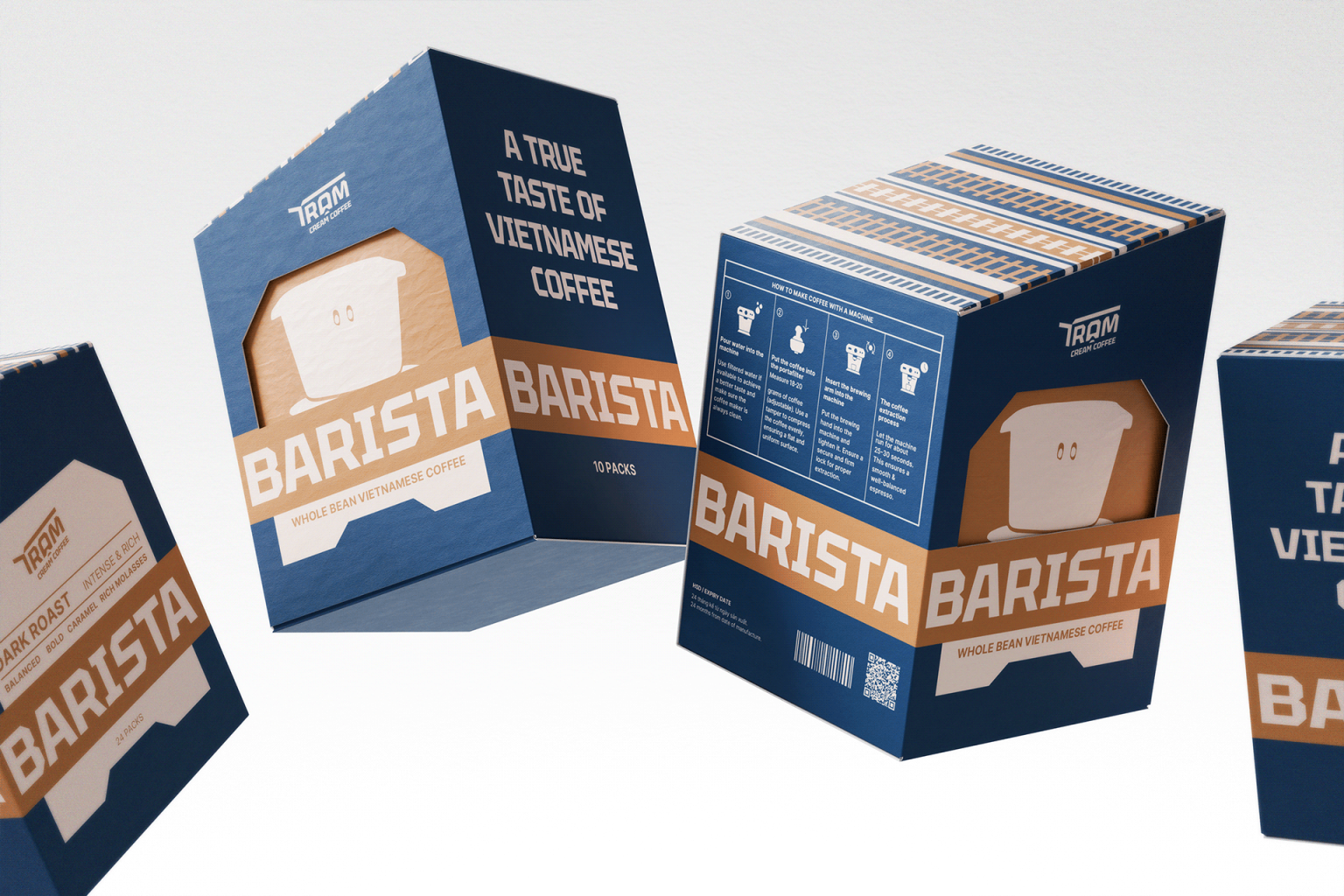

TRAM CREAM COFFEE | A pause in motion, a spark in the cup — Tram begins where time slows.
Branding & Visual Identity Design
In a world perpetually in motion, Tram Cream Coffee emerges as a gentle whisper amidst the rush: “Pause for a moment.” Not to interrupt, but to recharge — to gather inspiration for the road that lies ahead.
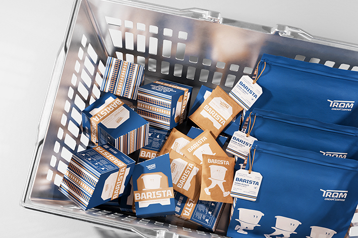
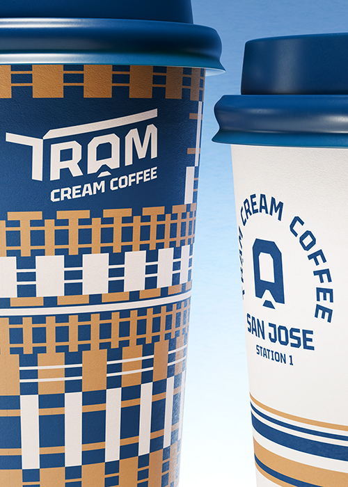
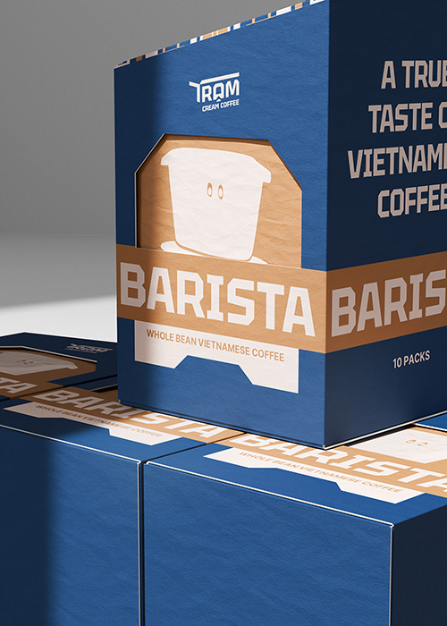
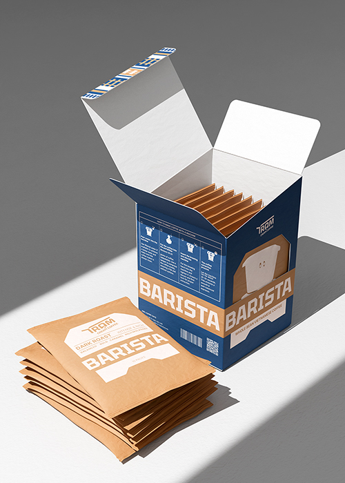
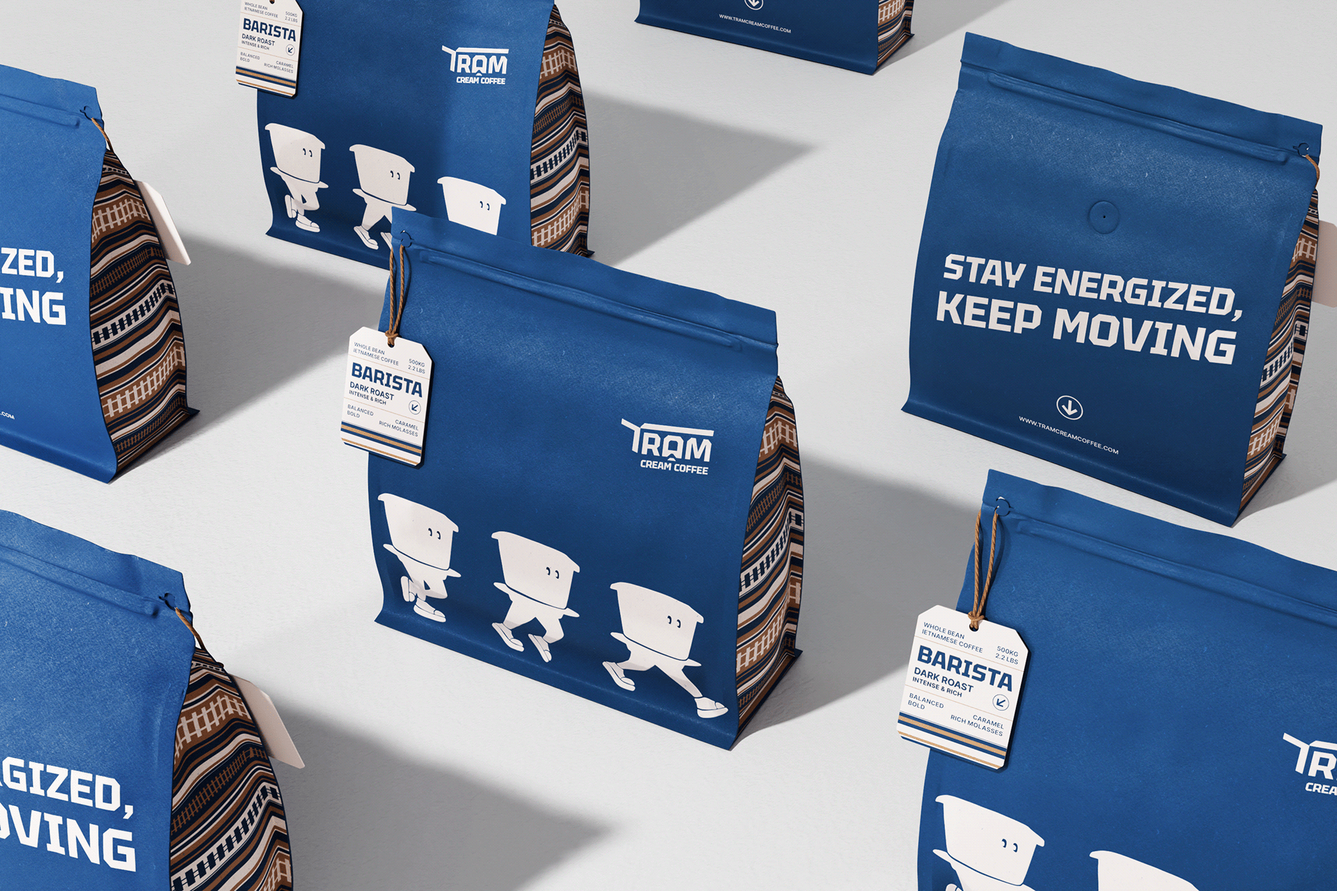
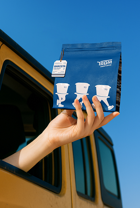
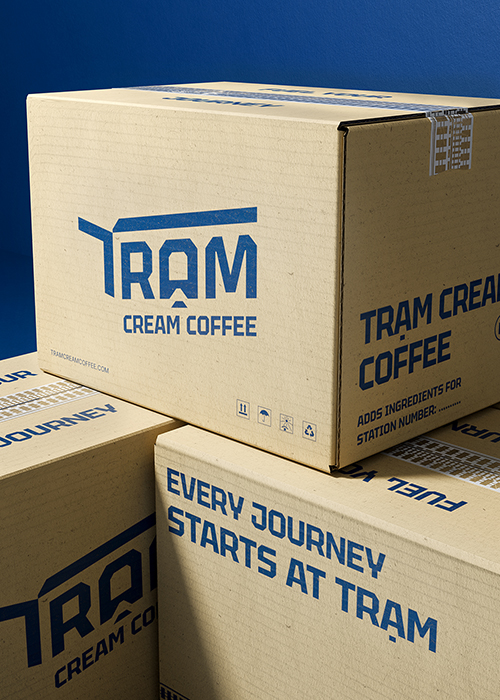
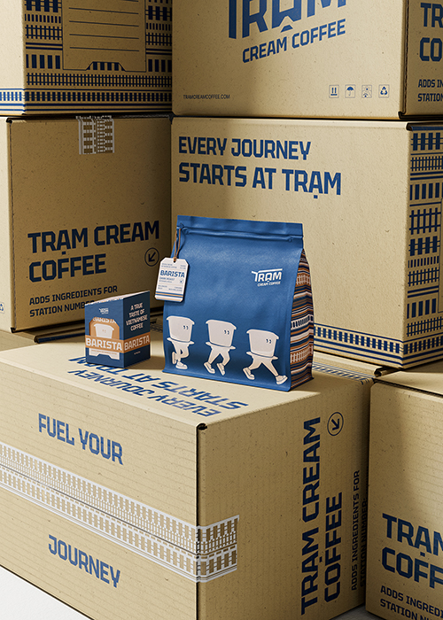
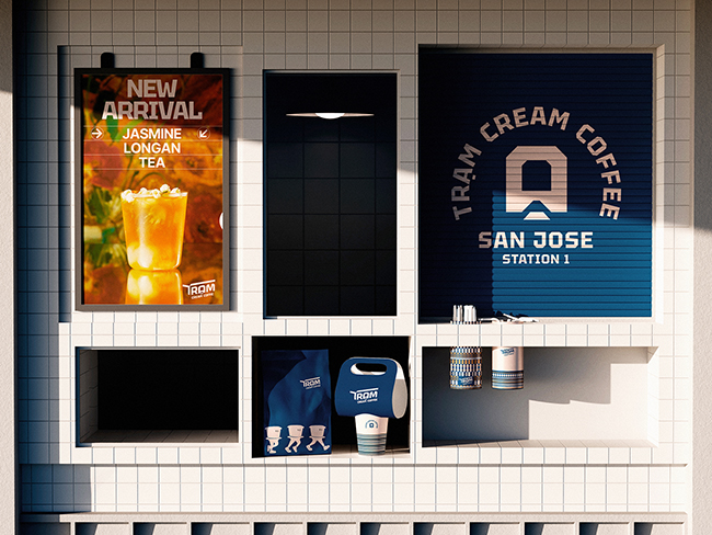
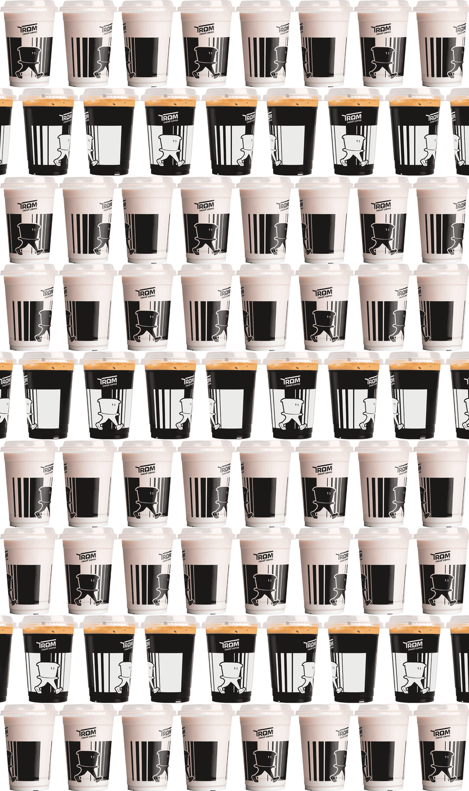
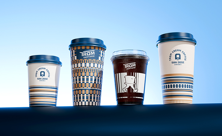
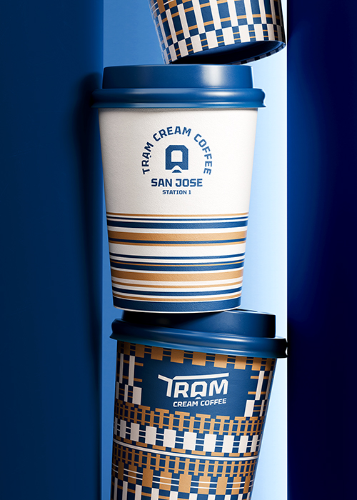
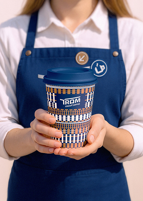
Tram draws its essence from the profound notion of a “station” — a place where strangers become fellow travelers, where the rhythms of life momentarily soften, allowing for emotional reconnection, physical rest, and sometimes, the quiet ignition of a new idea. With its visual language shaped by the arched roof of a train station, the intertwining tracks like veins of movement, and a walking Vietnamese phin filter as its mascot, Tram does not merely reference cultural memory — it reimagines it through a fresh, immersive aesthetic.
Bracom’s role in this project was not confined to design execution; we took on the mantle of storytellers, interpreters of culture, and curators of experience. Our process began with deep cultural research and competitor analysis, ensuring that the brand’s foundations were grounded not only in aesthetic trends but also in market insight and behavioral truths. We worked closely with the client to unearth the essence of Tram: not just what it looks like, but what it feels like to enter one of its spaces, to hold a cup with the Tram logo, to interact with its staff, and to become part of its narrative.
The challenges were multi-layered. How do we build a brand that is both distinctly Vietnamese yet universally relevant? How do we maintain consistency across future franchises while allowing for localized expression? And how do we create a design system that is immediately recognizable yet flexible enough to evolve over time?
Our answers lay in the synthesis of clarity and creativity. The identity system was meticulously developed to be modular, scalable, and easy to implement — whether in bustling urban locations or quaint neighborhood corners. From menu boards inspired by old railway departure signs, to uniform aprons featuring geometric rail patterns, every element was designed to be both practical and poetic. Typography choices reflected a blend of modern sans-serifs with subtle nods to vintage signage, while iconography was simplified to support intuitive navigation without losing character.
Hop on the next train to Tram — and rediscover your journey, one inspired pause at a time.
Let’s go.



 monther al omari
 Ximena Ureta Design Studio.
 vitoramockup
 Up-Brands
 Sophiagdotcom
 Peter said
 ayeidadezigns
 Tancybox
 宏洛图品牌设计HONGLT
 Modern Theory
 Dozen Agency
 Atiq Alam
 Olio Studio
 Ruchi S. Joshi
 mmdesign
 awaiskhadim
 Octasoft
 United Creatives Studio
 Kingdom & Sparrow
 Anastasia Bakhmatskaya
 CreativeWise
 Great and Golden