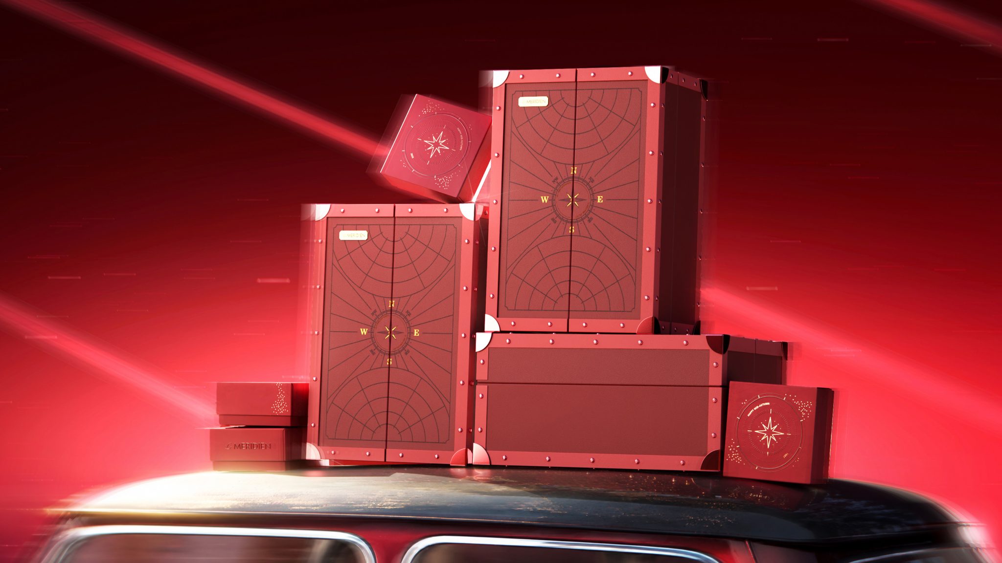

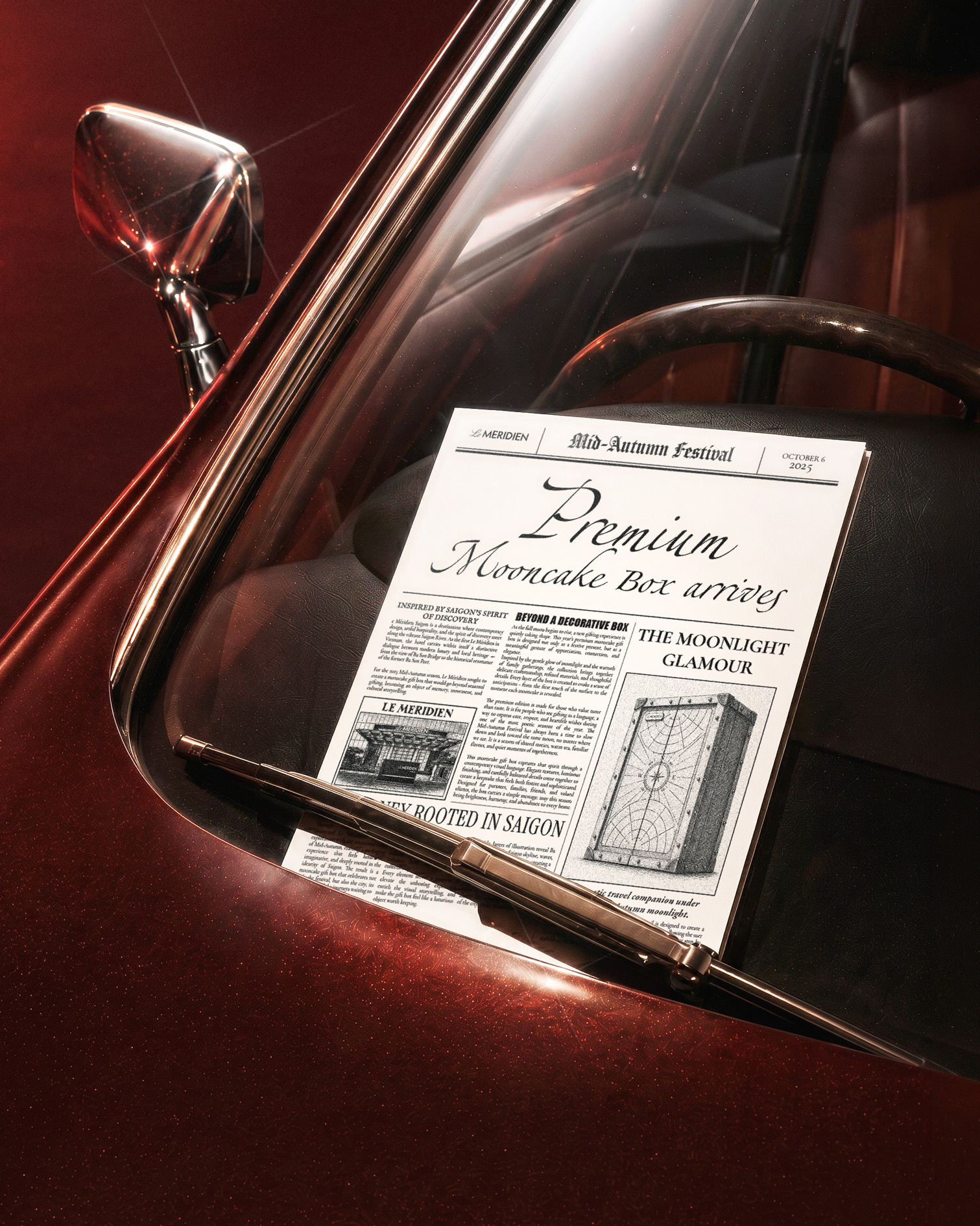
Le Méridien Saigon is a destination where contemporary design, artful hospitality, and the spirit of discovery meet along the vibrant Saigon River. As the first Le Méridien in Vietnam, the hotel carries within itself a distinctive dialogue between modern luxury and local heritage — from the view of Ba Son Bridge to the historical resonance of the former Ba Son Port. For the 2025 Mid-Autumn season, Le Méridien sought to create a mooncake gift box that would go beyond seasonal gifting, becoming an object of memory, movement, and cultural storytelling.
The challenge was to reinterpret Mid-Autumn through a more modern and innovative lens while still preserving the emotional warmth and symbolic richness of the festival. The packaging needed to feel premium, collectible, and visually striking for both loyal hotel guests and creative gift collectors. At the same time, it had to reflect a sense of national pride, drawing inspiration from Saigon’s landmarks, the full moon, the river, and the spirit of travel. More than a decorative box, the design was expected to offer an interactive experience — something users could open, display, explore, and keep as a meaningful object after the celebration.
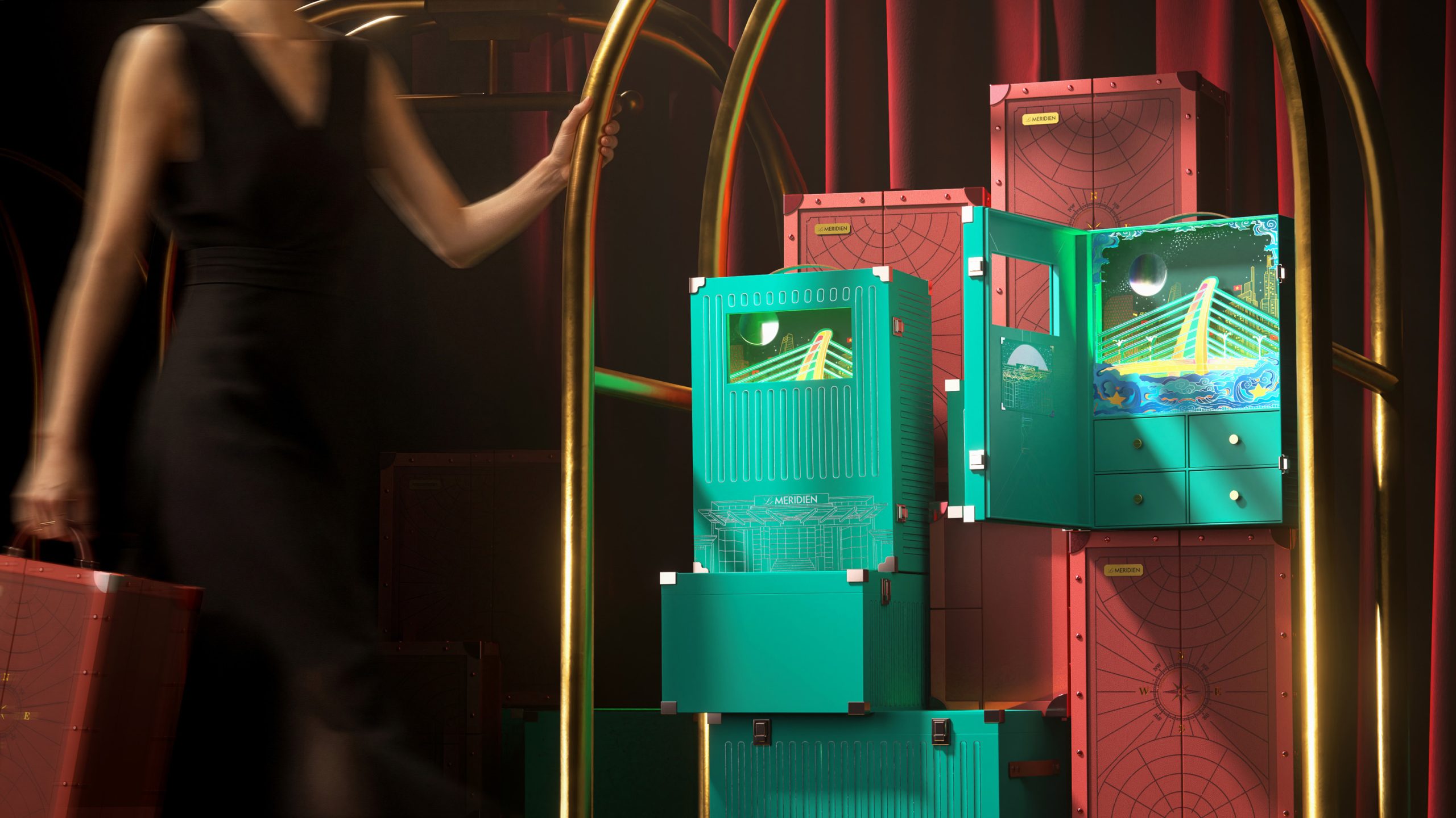
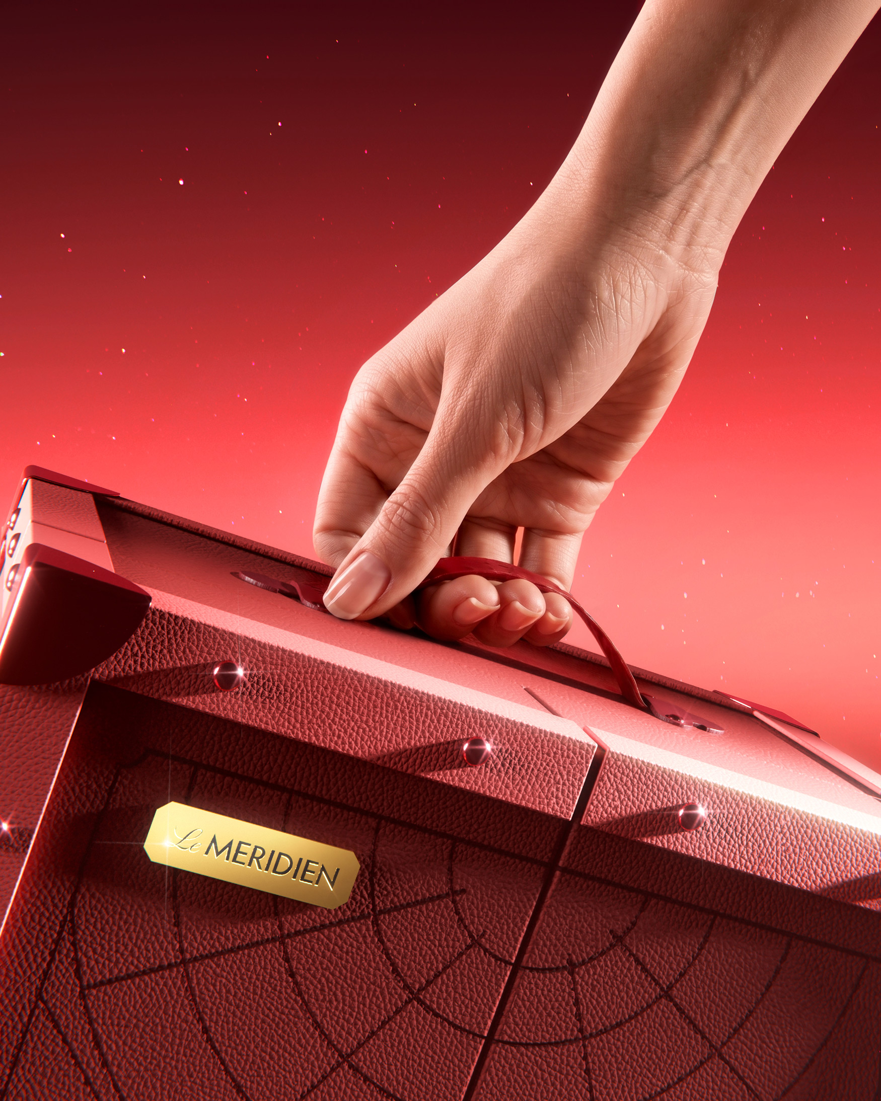
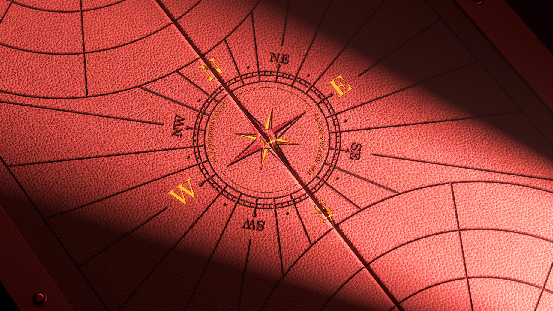
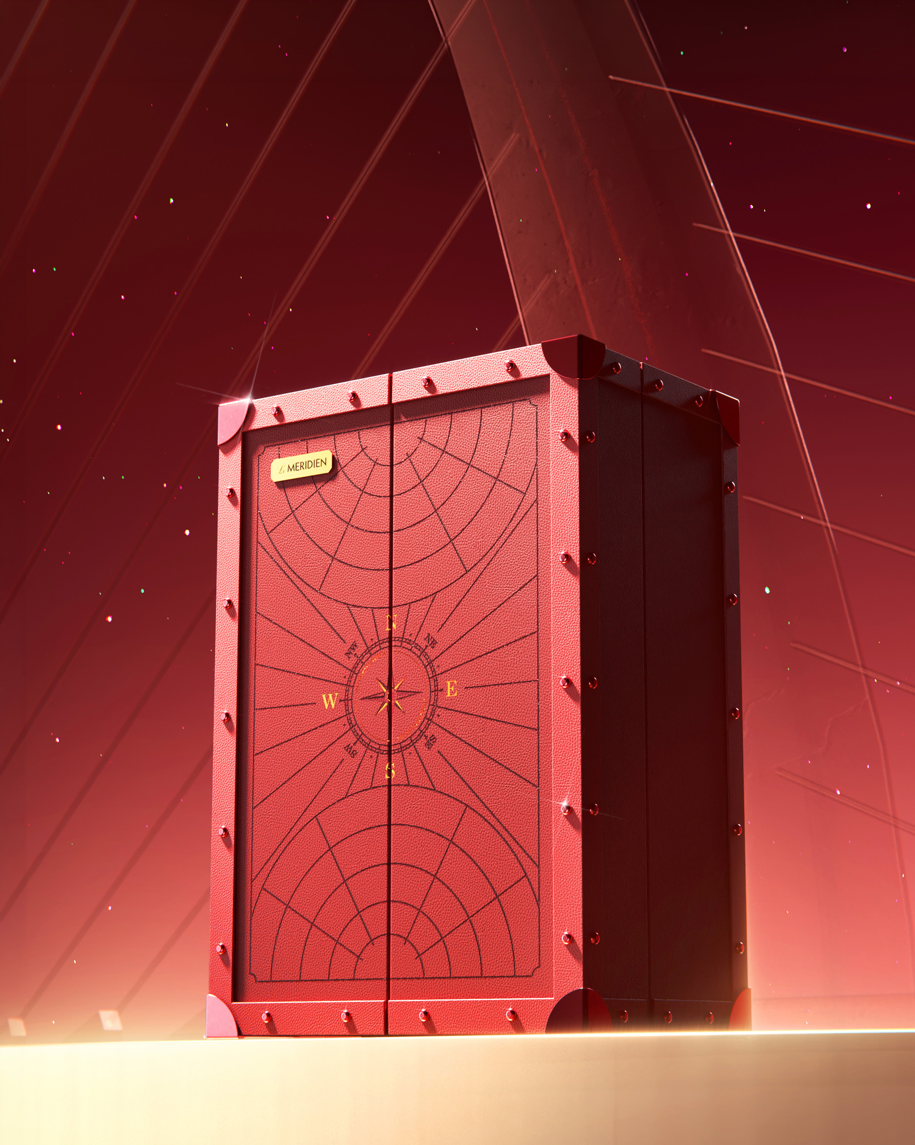
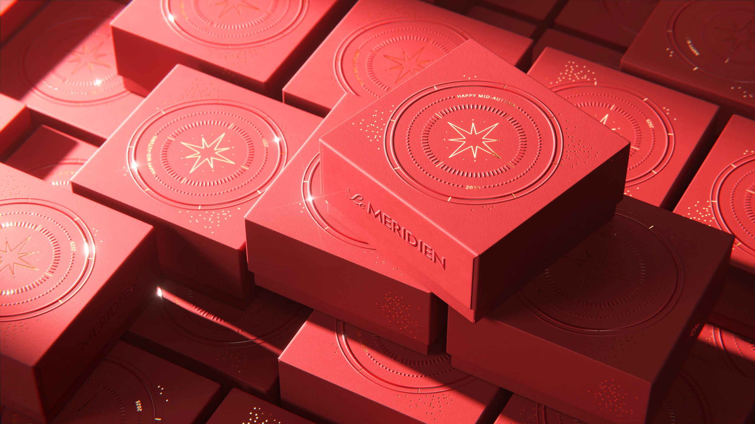
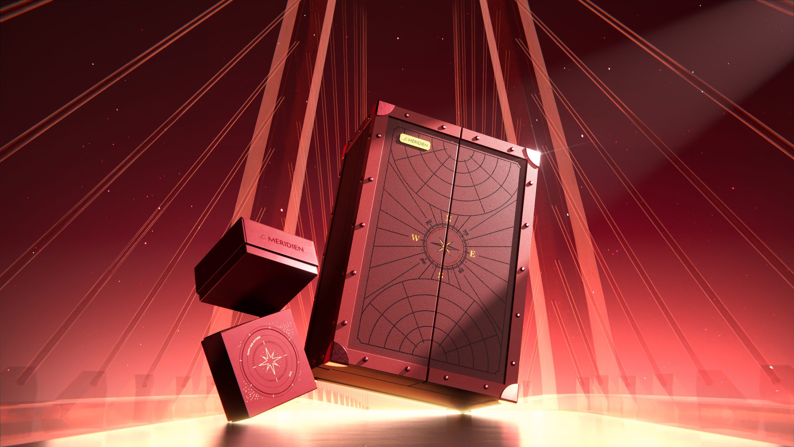
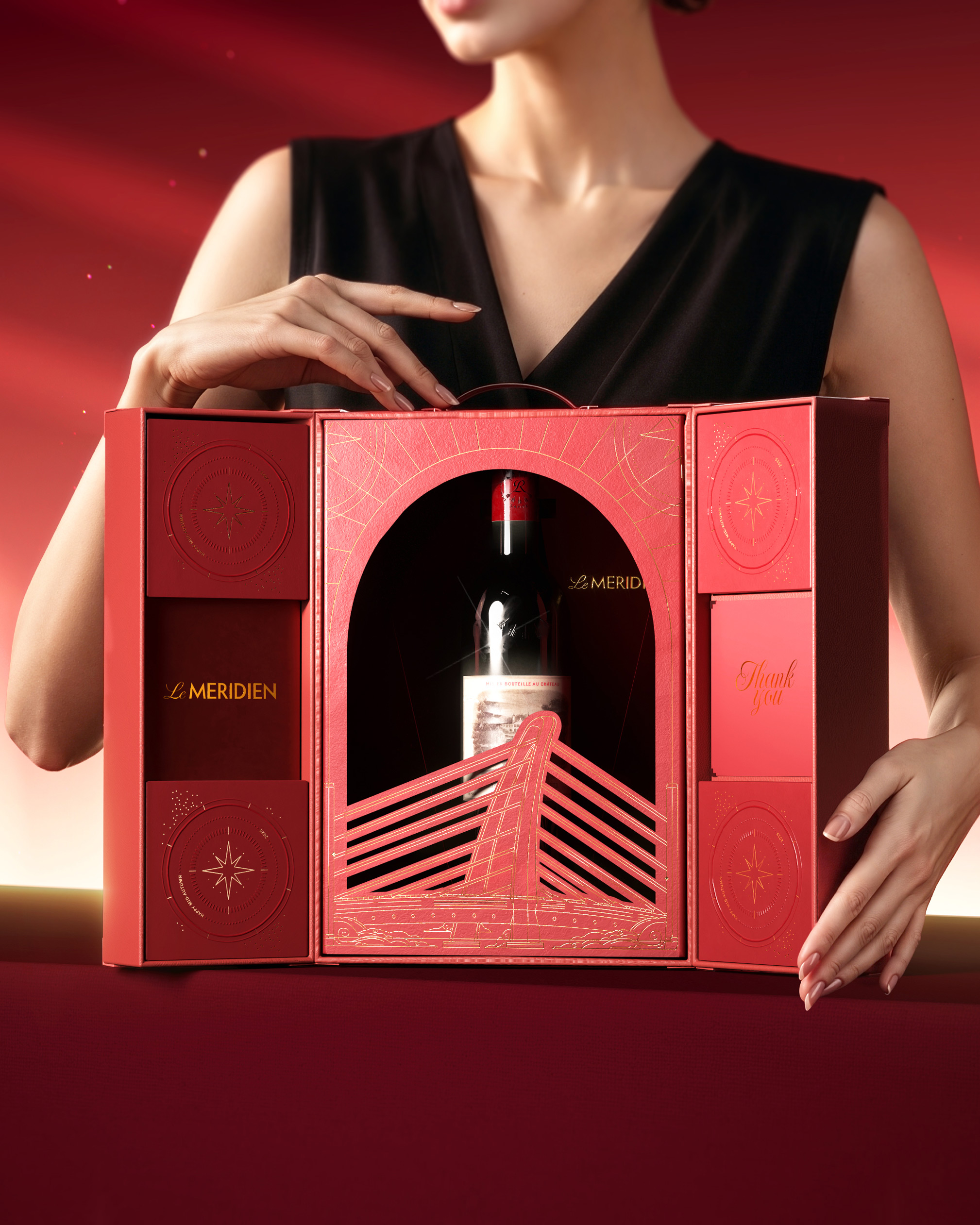
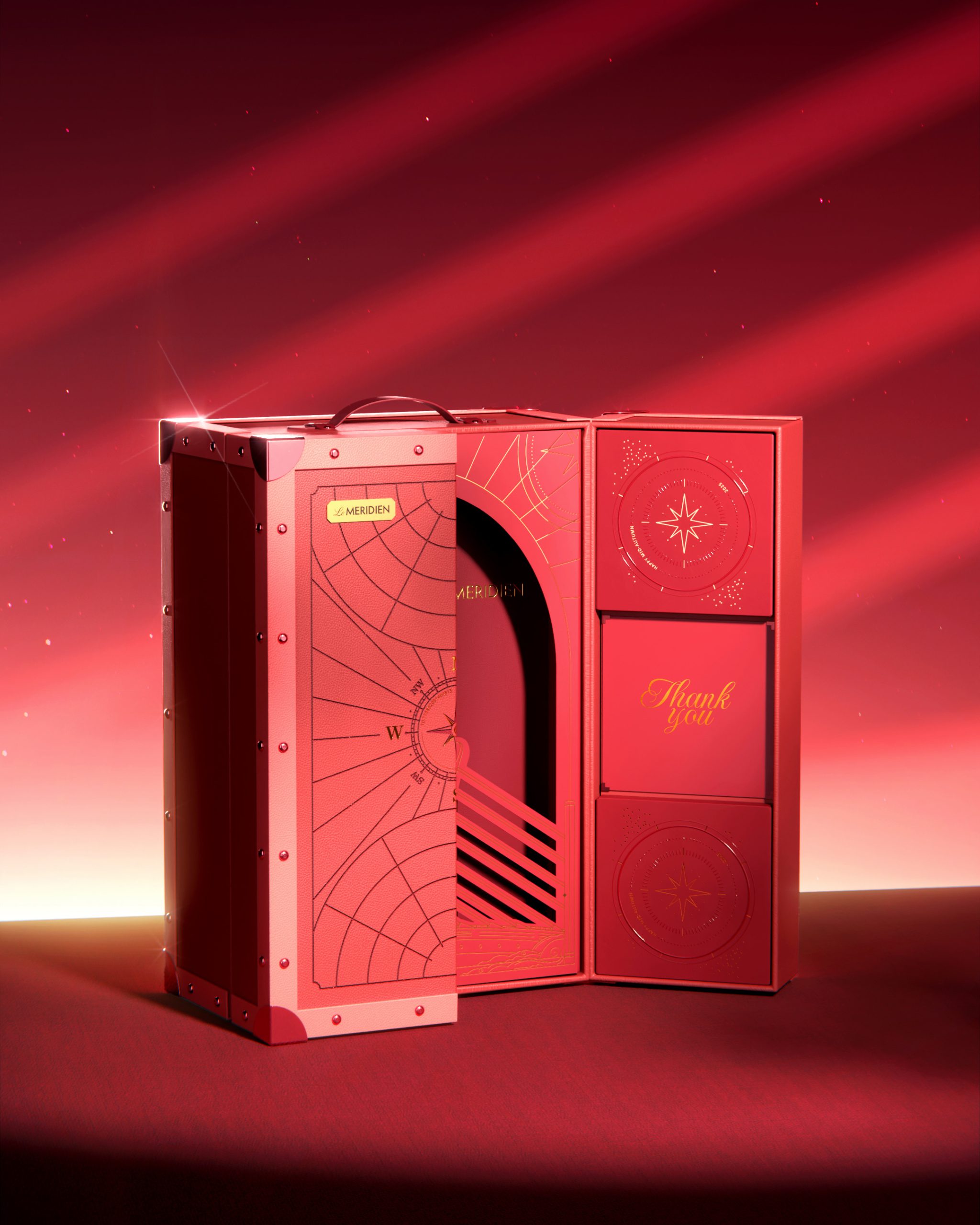
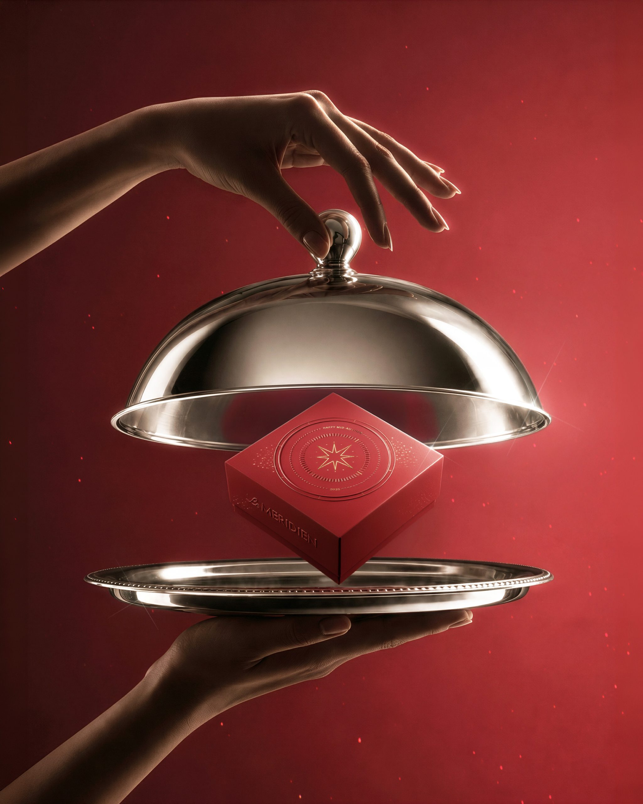
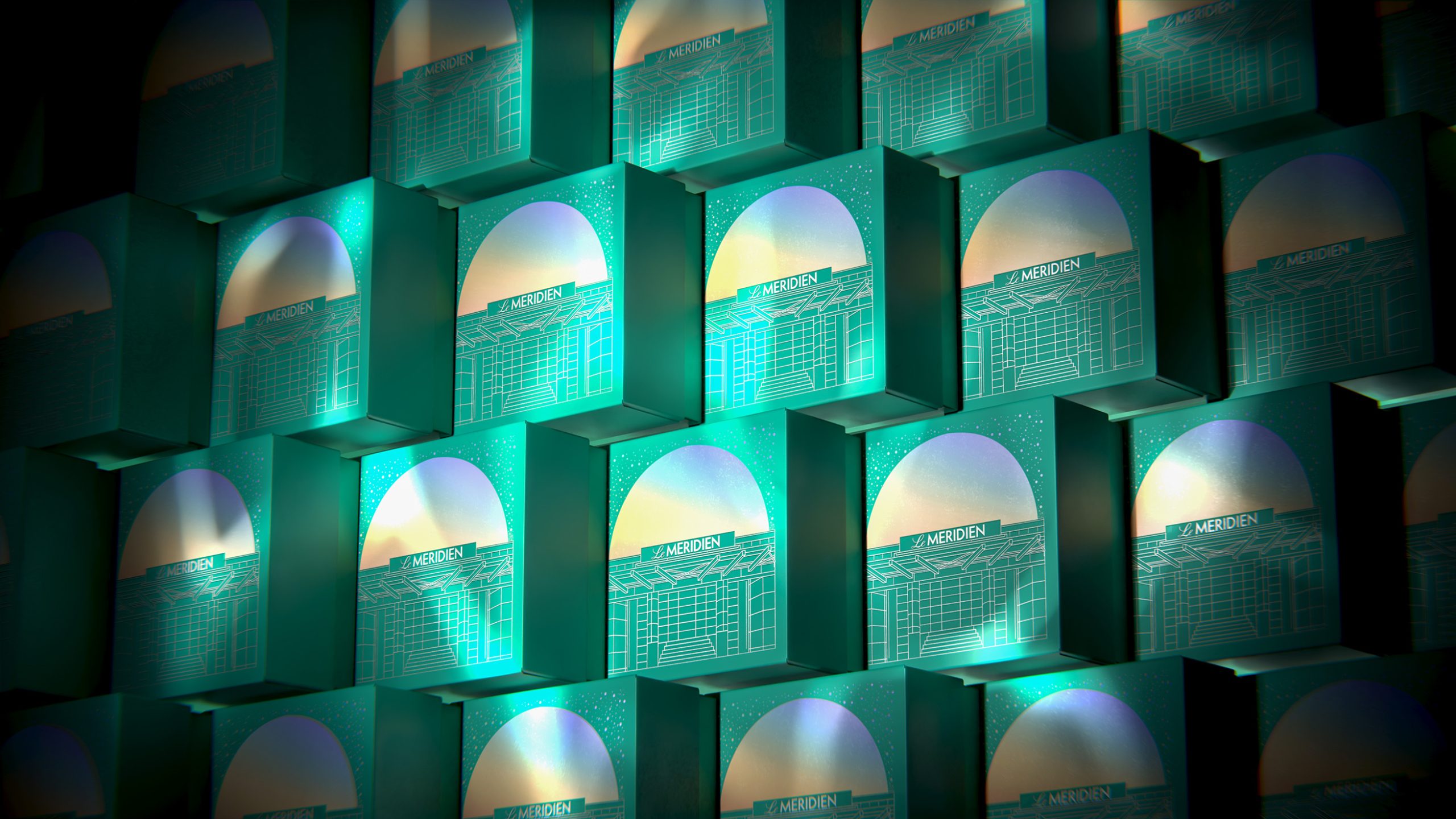
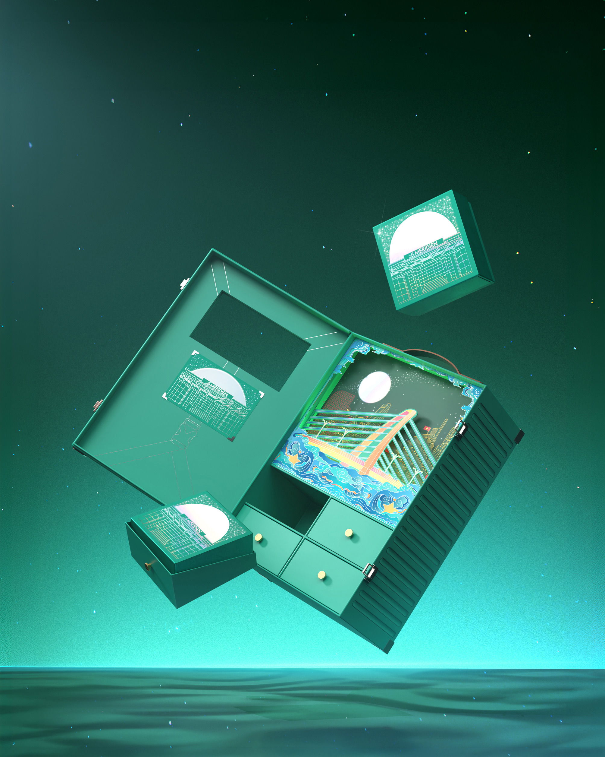
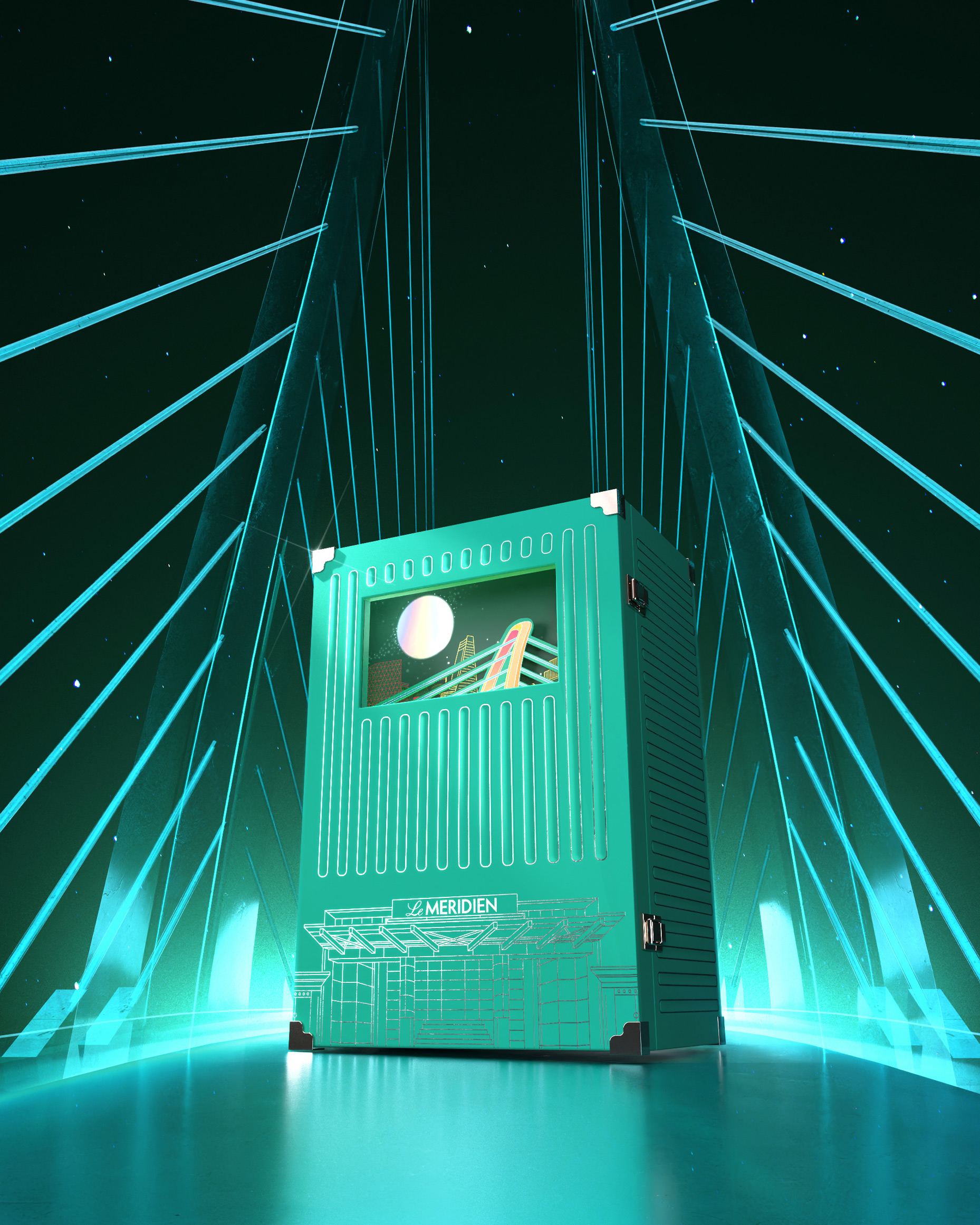
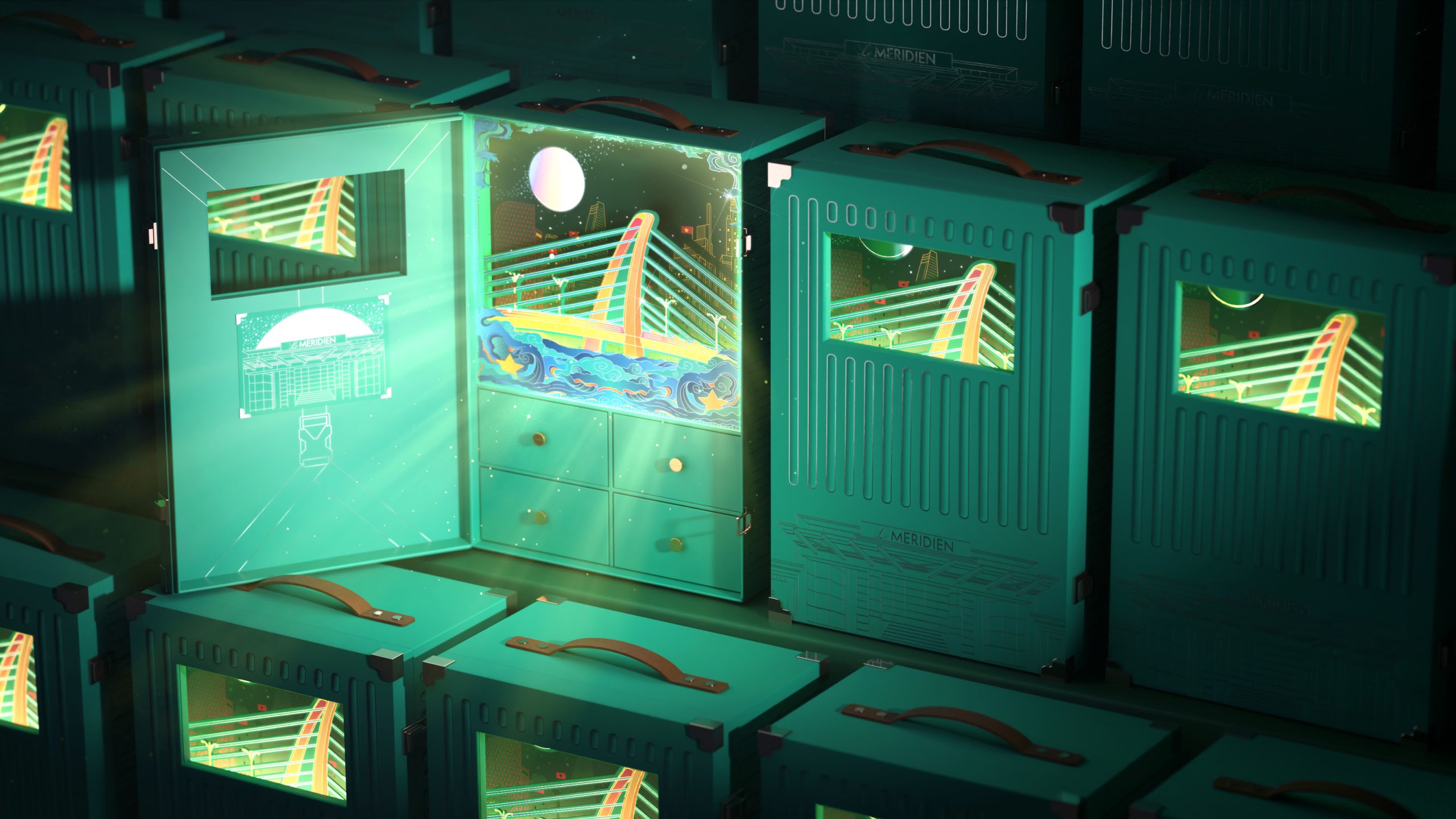
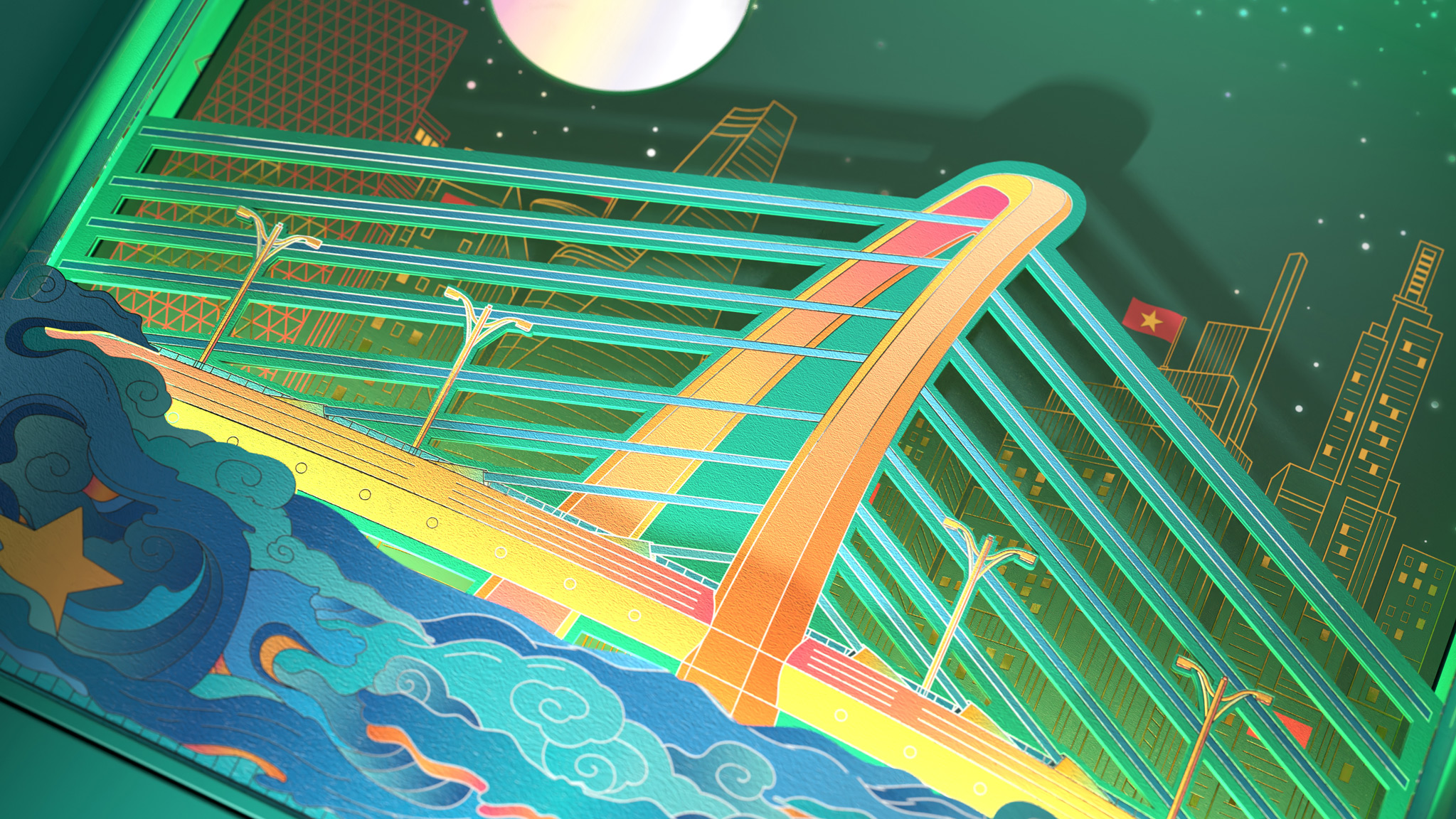
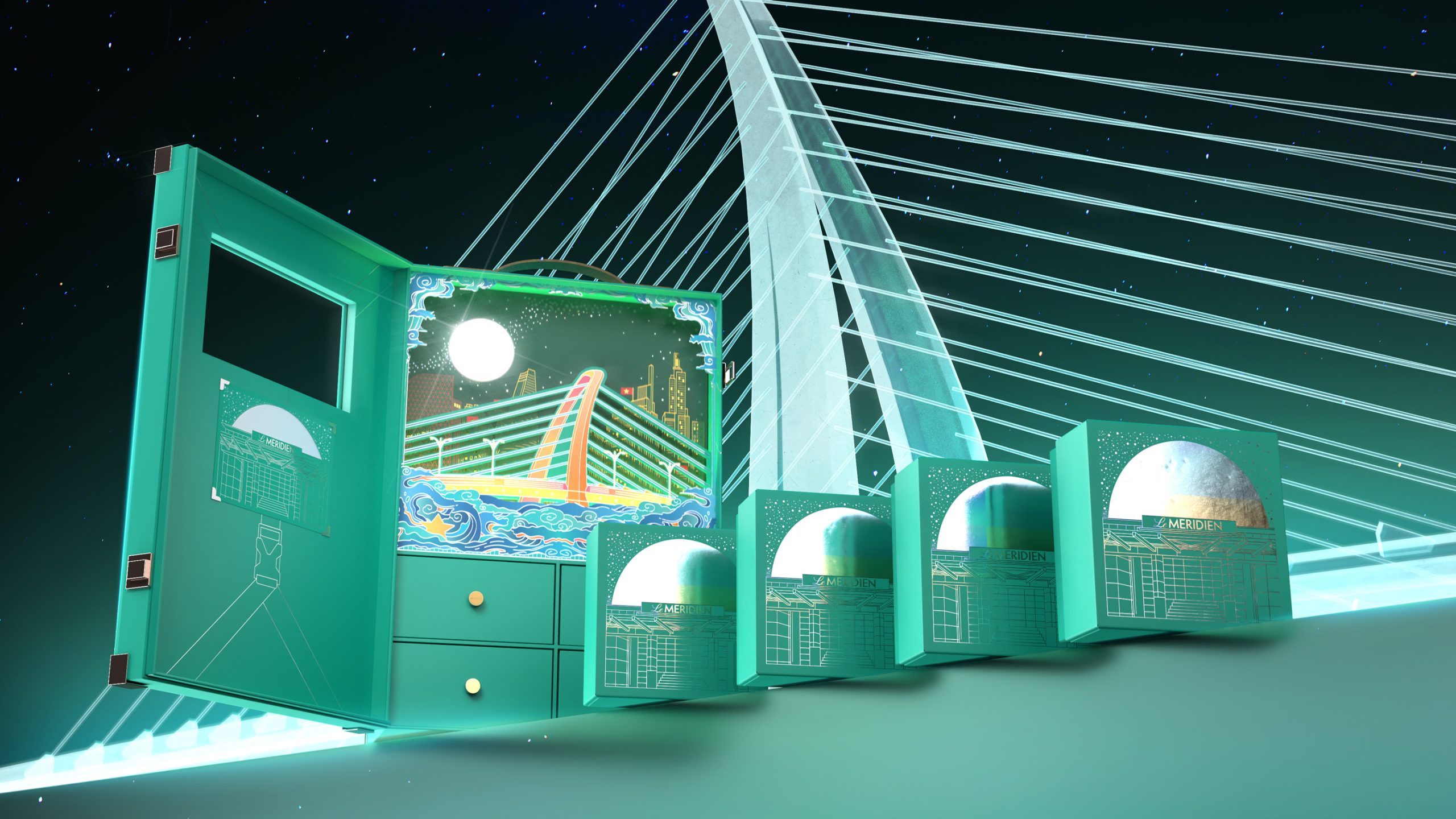
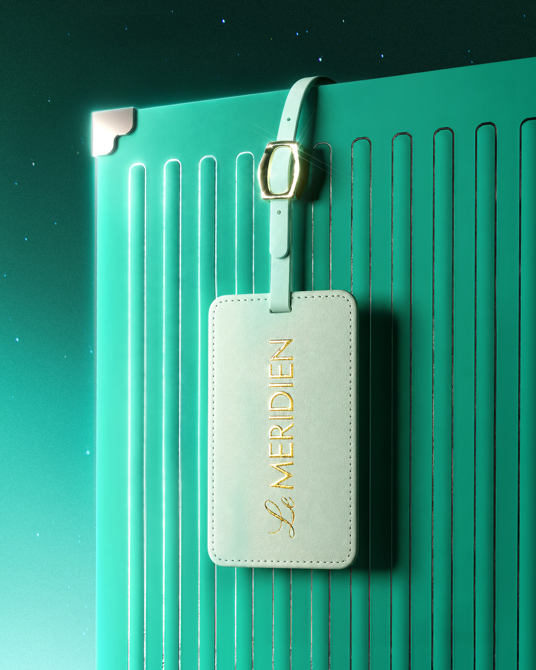
Bracom developed the concept of “The Magical Suitcase,” transforming the mooncake box into a poetic travel companion under the Mid-Autumn moonlight. Inspired by the idea of journeys, memories, and discoveries, the suitcase becomes a treasure chest carrying stories from the city. Inside, layers of illustration reveal Ba Son Bridge, the Saigon skyline, waves, stars, and the radiant moon, creating a theatrical scene that unfolds as the box opens. The structure combines drawers, compartments, display windows, handle details, metallic accents, and refined finishing techniques to enhance both functionality and collectability. Through this design, Bracom connected Le Méridien’s spirit of exploration with the emotional ritual of Mid-Autumn, crafting a packaging experience that feels luxurious, imaginative, and deeply rooted in the identity of Saigon.
Curator’s Insight
What stands out here is the restraint in how the narrative unfolds. Rather than printing the bridge and skyline flat across the surface, the studio staged them as a sequence, glimpsed first through a small window, then fully revealed once the case opens. That pacing turns the act of opening into the actual design moment, not just packaging falling away to reveal a product.
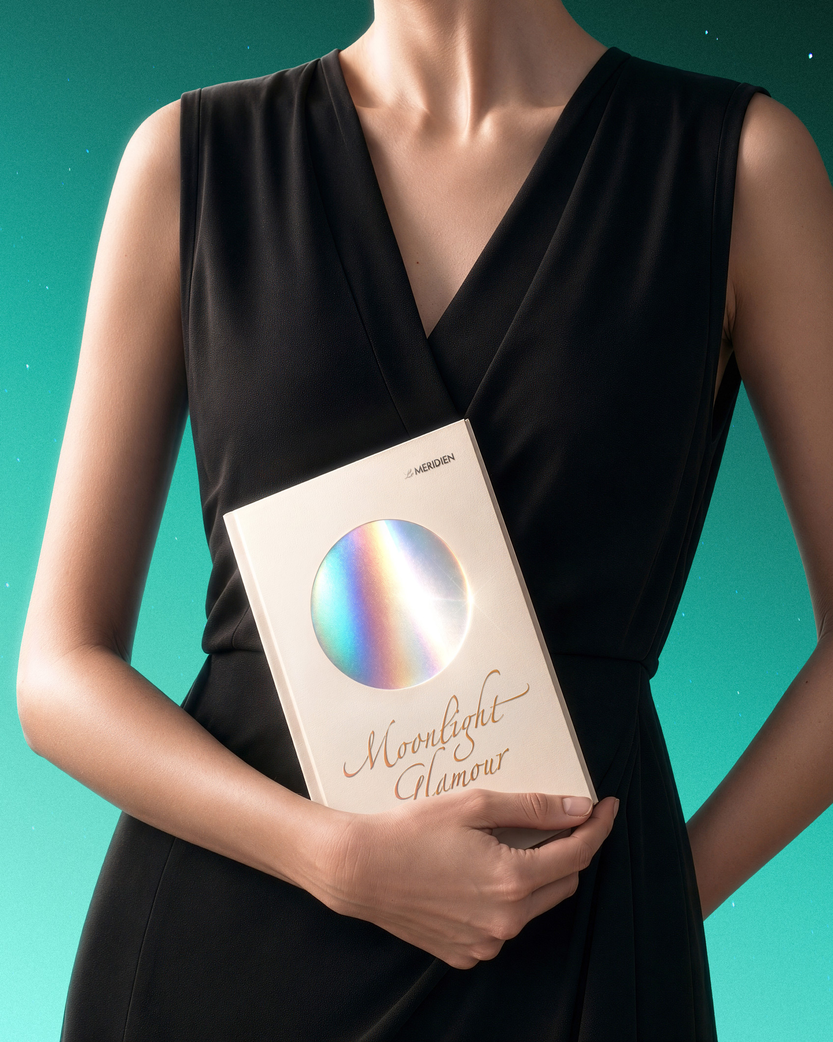
The two colorways also do more work than a simple seasonal variant. The red feels formal and ceremonial, suited to gifting and handover, while the green leans nocturnal and almost cinematic, like a city remembered rather than photographed. Having both within one system shows confidence in the concept rather than relying on a single hero shot.
It is also worth noting how much physical engineering sits underneath the illustration. Drawers, a fold-out frame, a riveted trunk edge, these are details that ask to be handled, not just looked at, which is a harder thing to pull off in mooncake packaging than it might appear.


 NEV
NEV Stefano Bracci
 Alina
Alina monther al omari
 Lizakjx
 JOAOMARCOSDESIGN
 alchimistestudioParis
 Harriet Neild
 octavio rojo
 宏洛图品牌设计HONGLT
 DESIGN CONCEPTS
 Alexander Skurihin
 Studio K95
 ARMBRAND
 Richa Rai
 houseoferas by Miti
 Agence des Coteaux
 Kushi Eaknath
 Ann Treasa
 Xiao Ning
 krrrrrllii
 babyage
 Deep
Deep