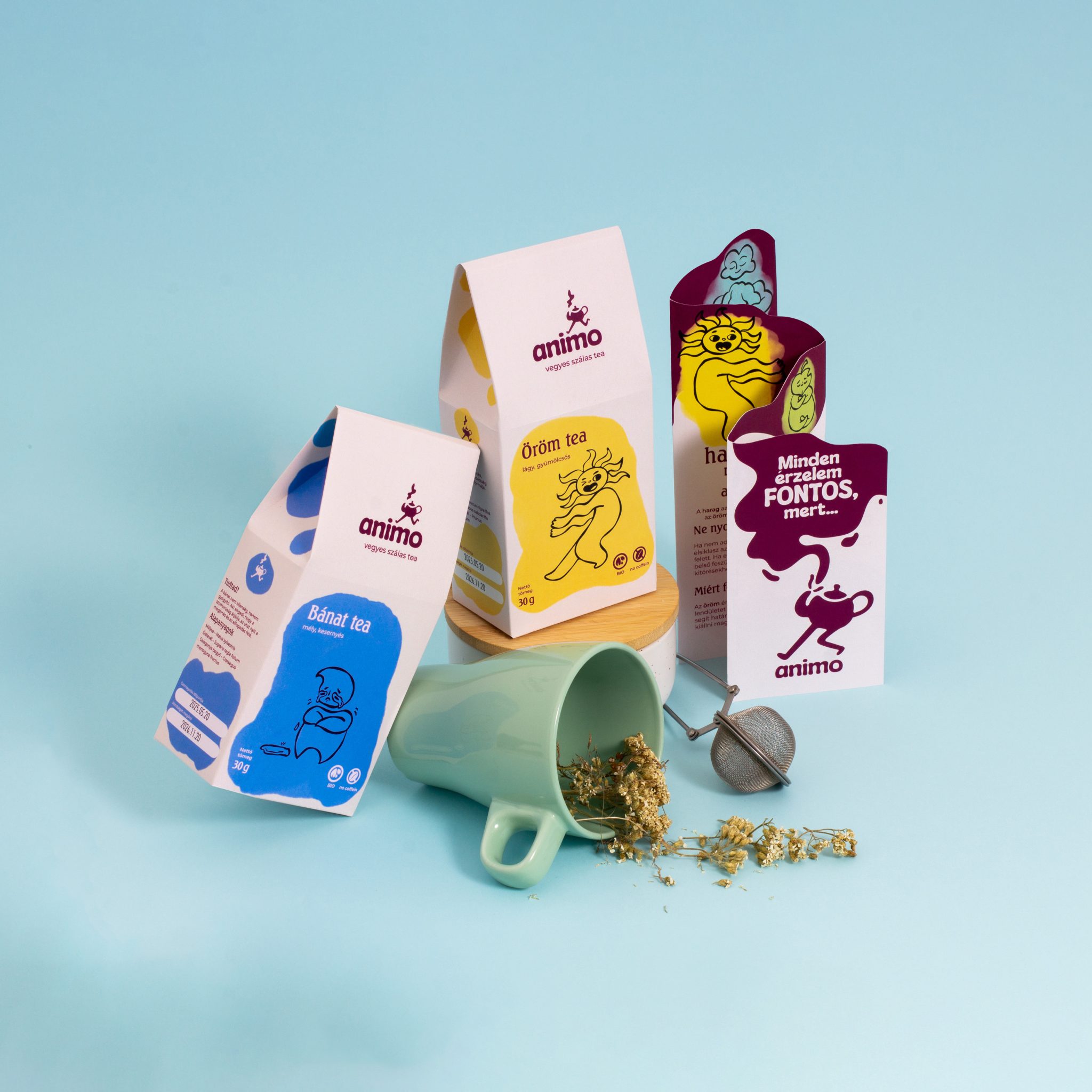

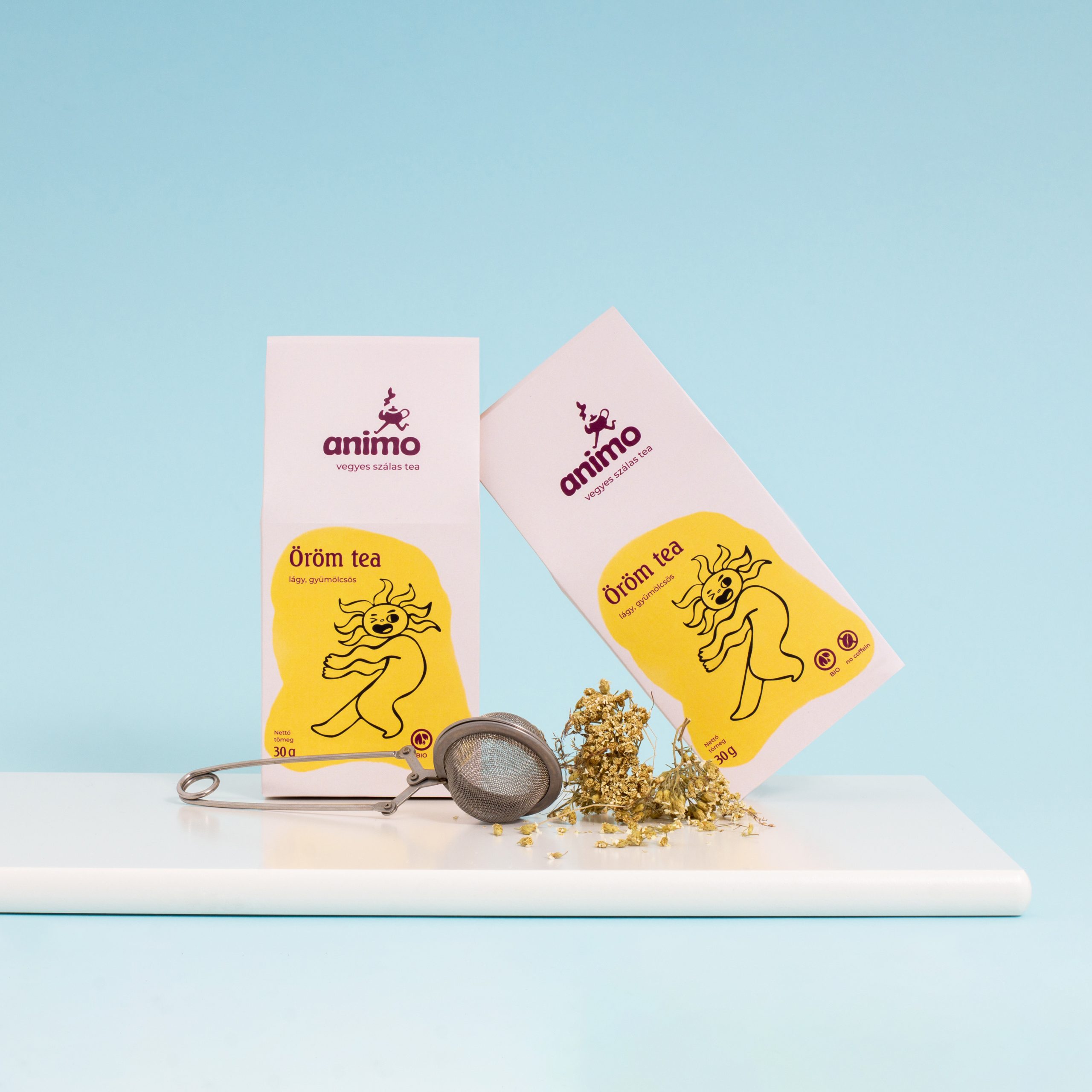
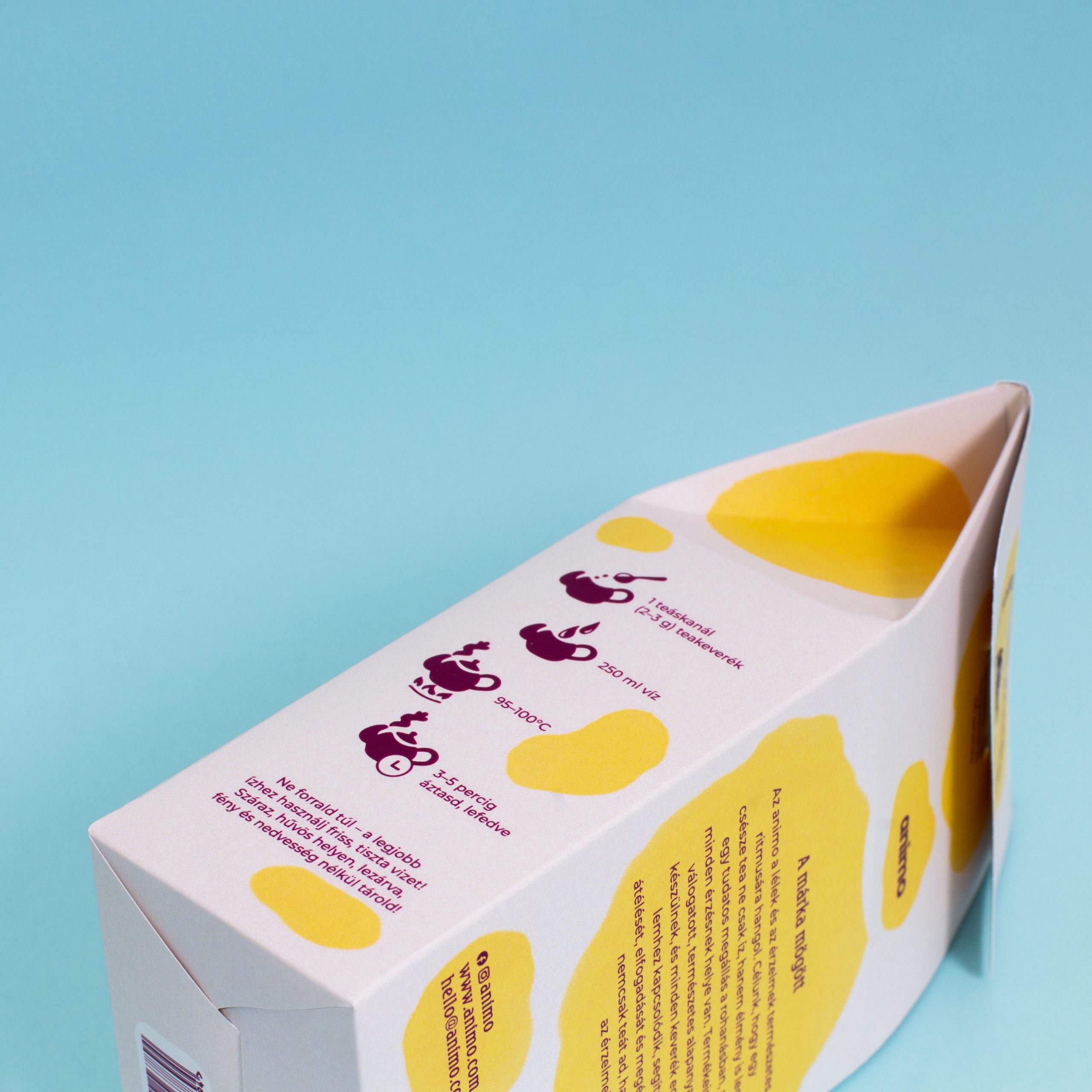
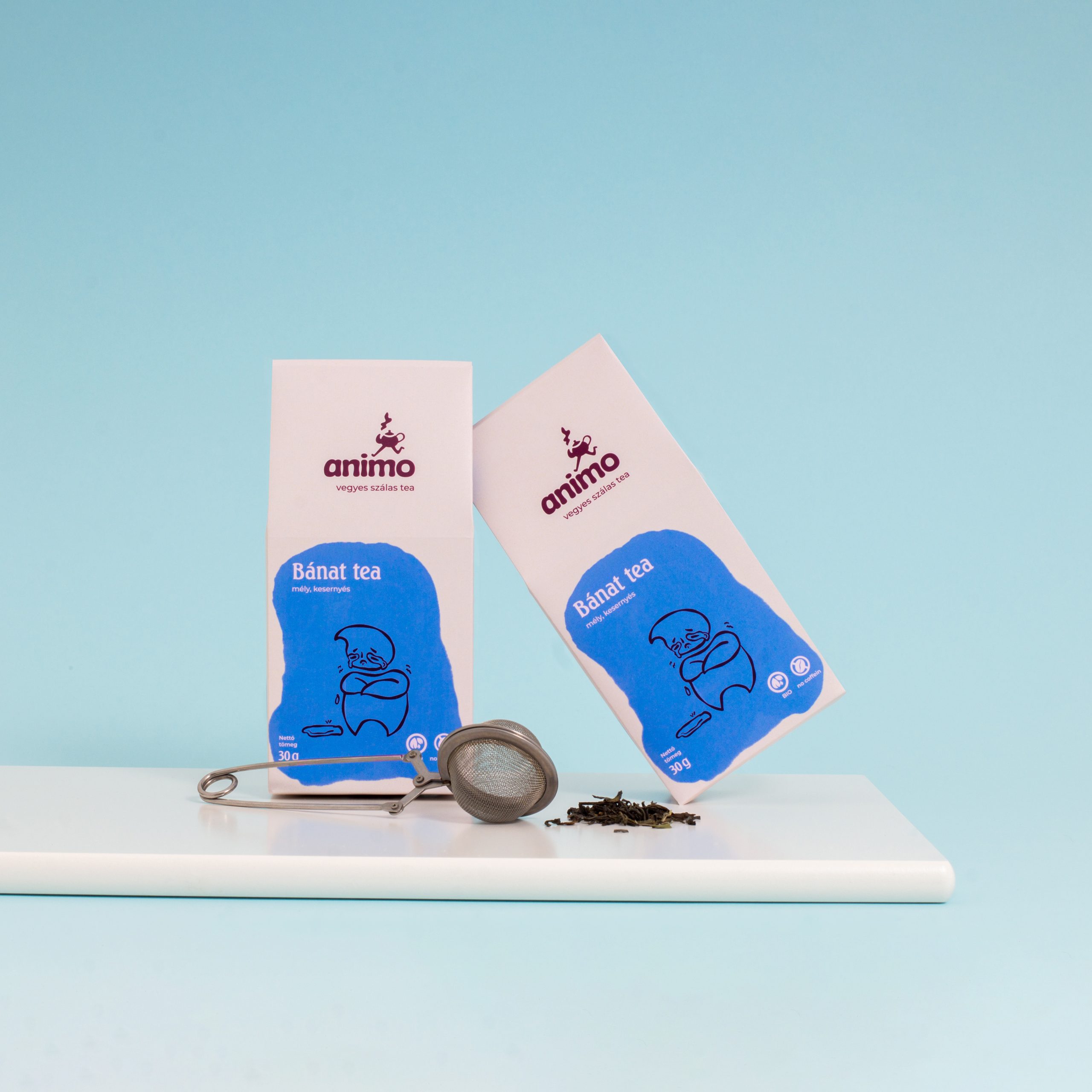
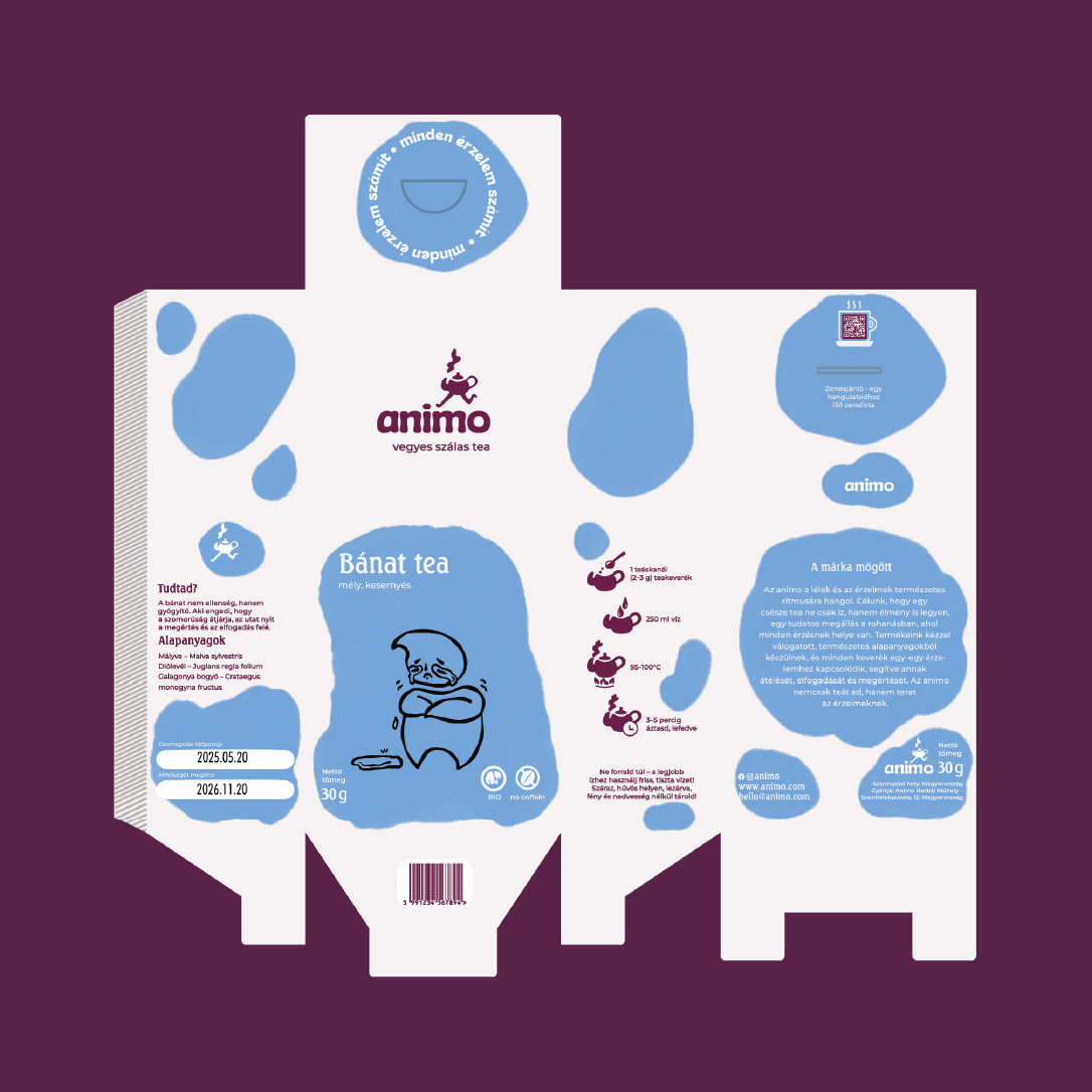
When designing the packaging, the primary goal was to ensure proper protection for the tea, while also making the product stand out from competitors through its shape, colors, and character illustrations. During the design process, I ensured that gluing was required only on one side, simplifying production.
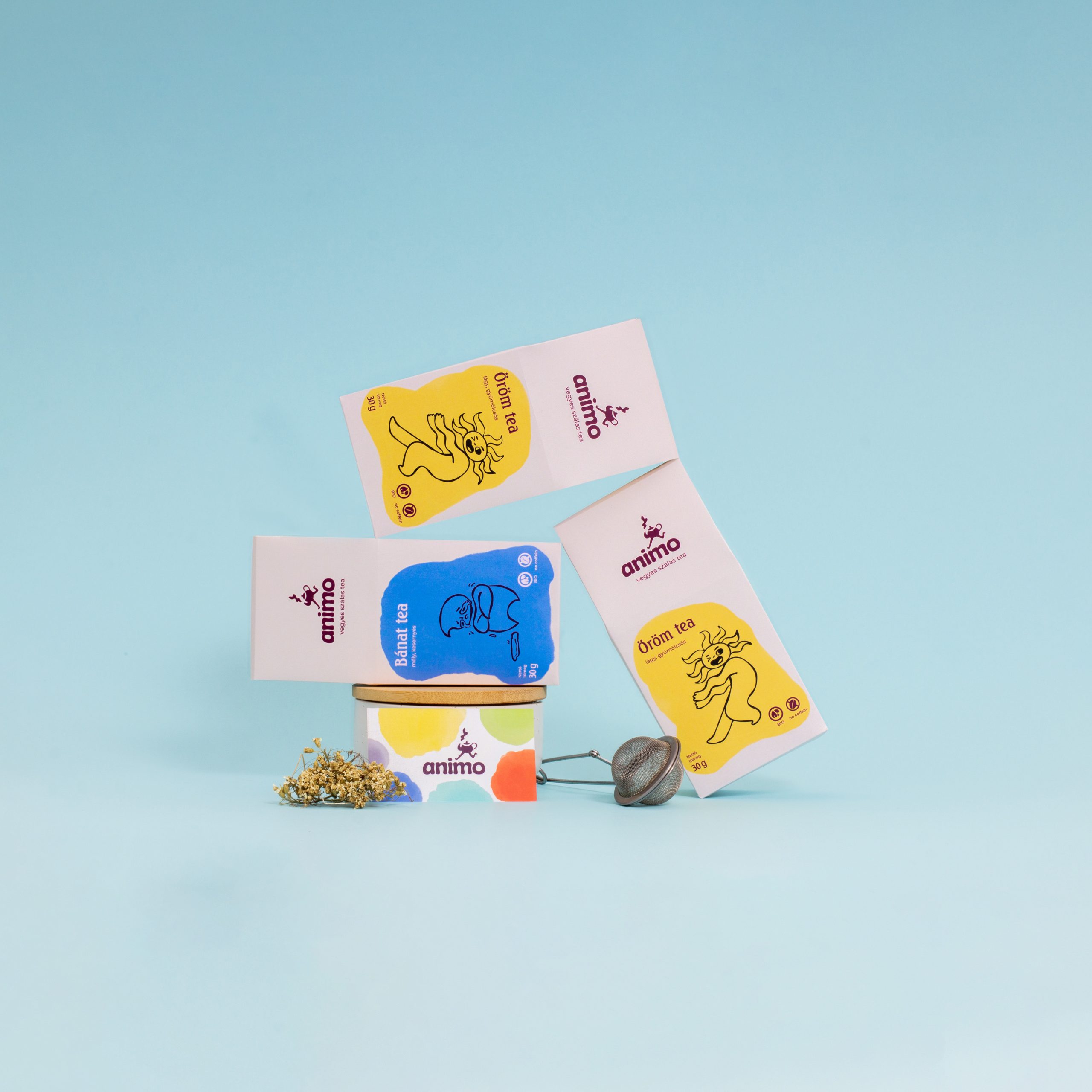
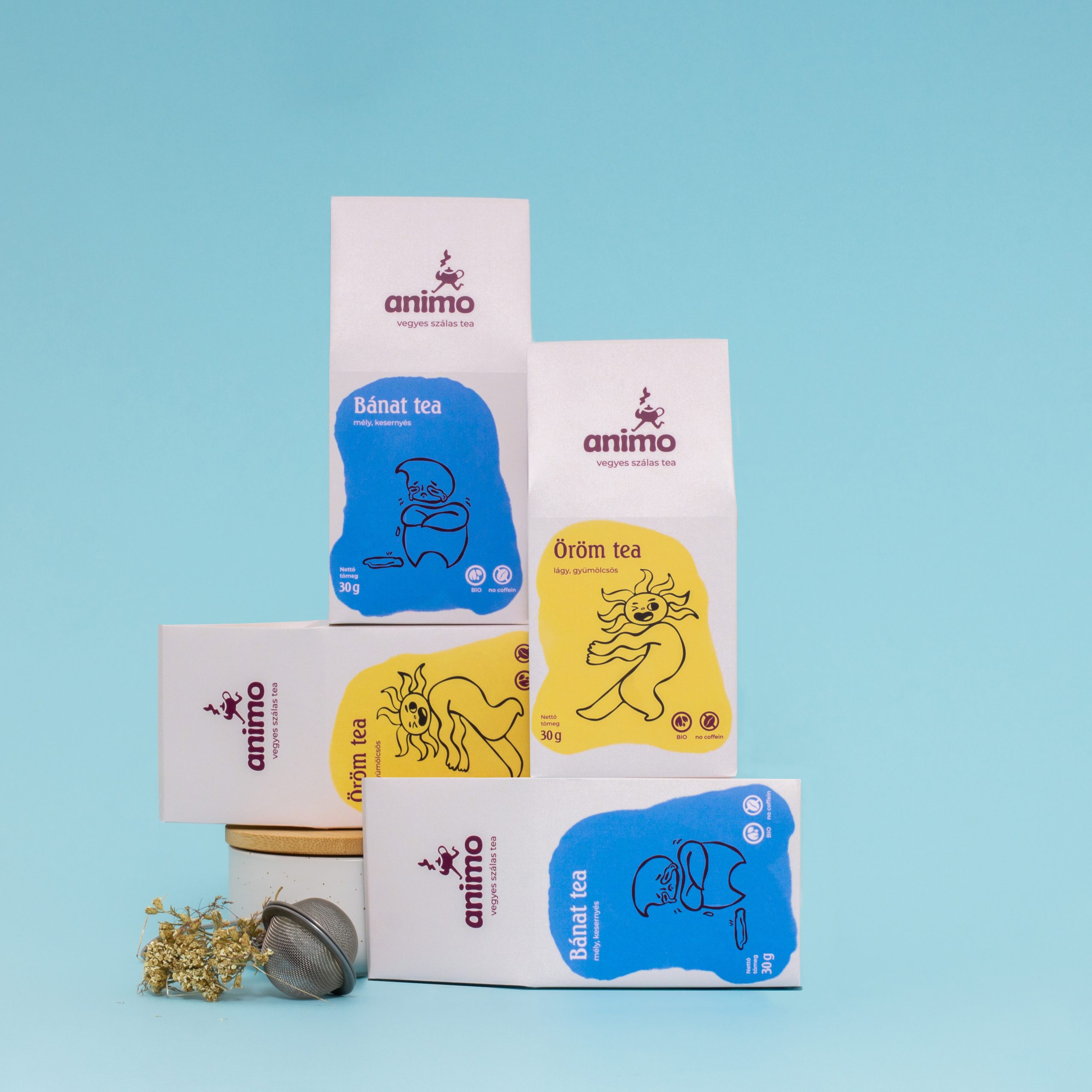
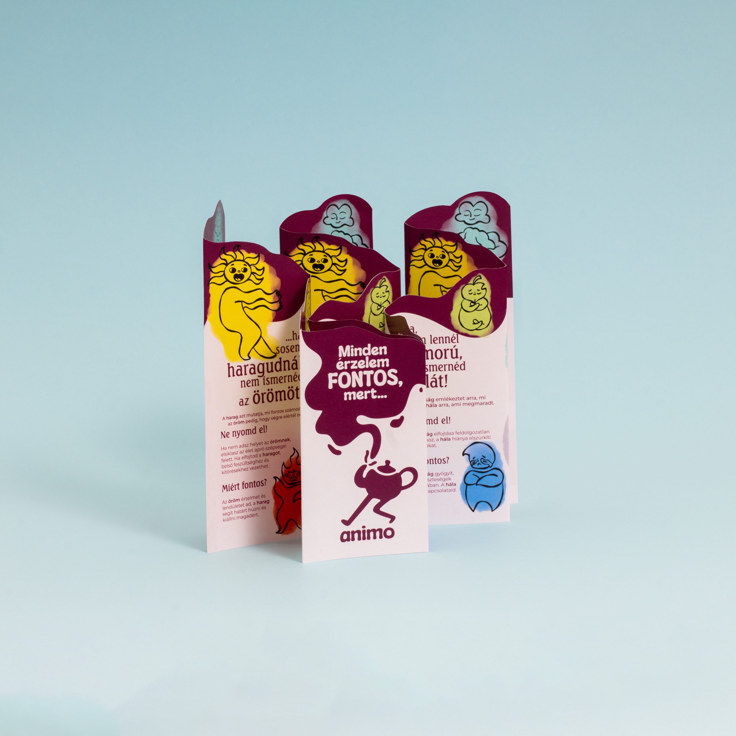
From the original six-member product line (Joy Tea, Anger Tea, Gratitude Tea, Sadness Tea, Calm Tea, and Anxiety Tea), I selected the two most commonly experienced emotions — joy and sadness. The illustrative elements play a prominent role: the simple yet easily distinguishable characters symbolizing emotions are meant to make these feelings more tangible and relatable.
From a design perspective, my aim was to create a cohesive visual identity while introducing a sense of dynamism through the shape and placement of color accents.
 Affogato Brand Design
 Backbar Studios
 hello ocean
 POSH FMCG BRANDING
 Luciana
 Valérie Colace
 marjusguza
 Z9BKAdsgn
 Lilith Sivolenko
 Daria Levina
 Masha Kulichkova
 monther al omari
 Yana Chernova
 Atiq Alam
 ezgidesignstudio
 Pips Marin
 Antonia Skaraki
 Ezi Brand Design
 Kanishka Chhajer
 Zachary Kent
 SOT B&D
 Normal studio
 Garry Veda