
ABOUT
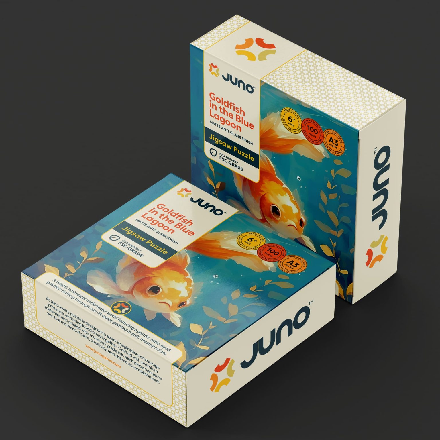
Juno is a puzzle brand designed to elevate puzzles from functional games into emotionally engaging, thoughtfully crafted experiences. The project aimed to create a packaging system that could appeal to different age groups while maintaining a cohesive brand identity.
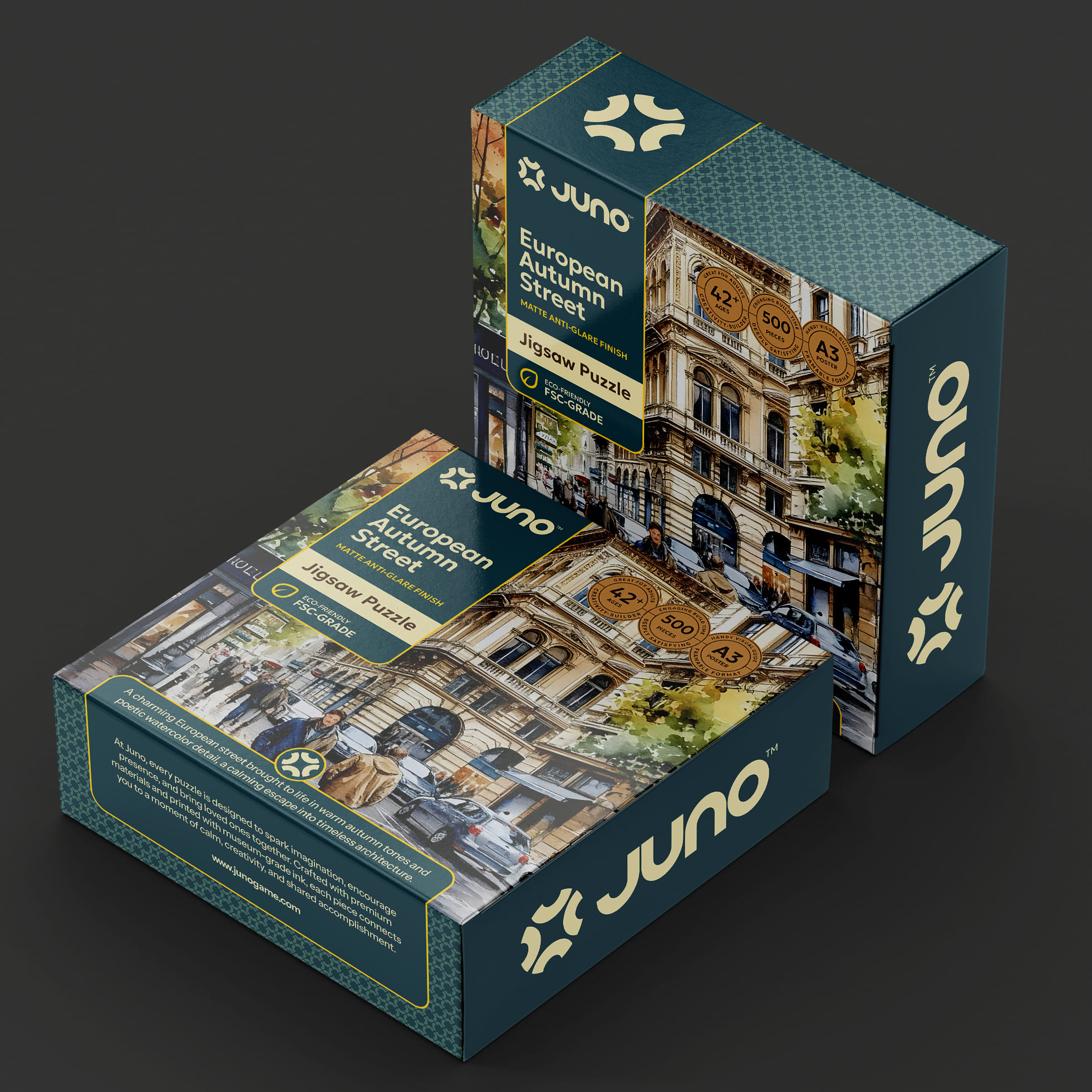
Rather than treating all puzzles as a single audience category, Juno was envisioned as a multi-generational brand—one that supports playful exploration for younger users and calm, mindful engagement for adults. The packaging needed to communicate this distinction clearly while remaining unified under one visual language.
SOLUTION
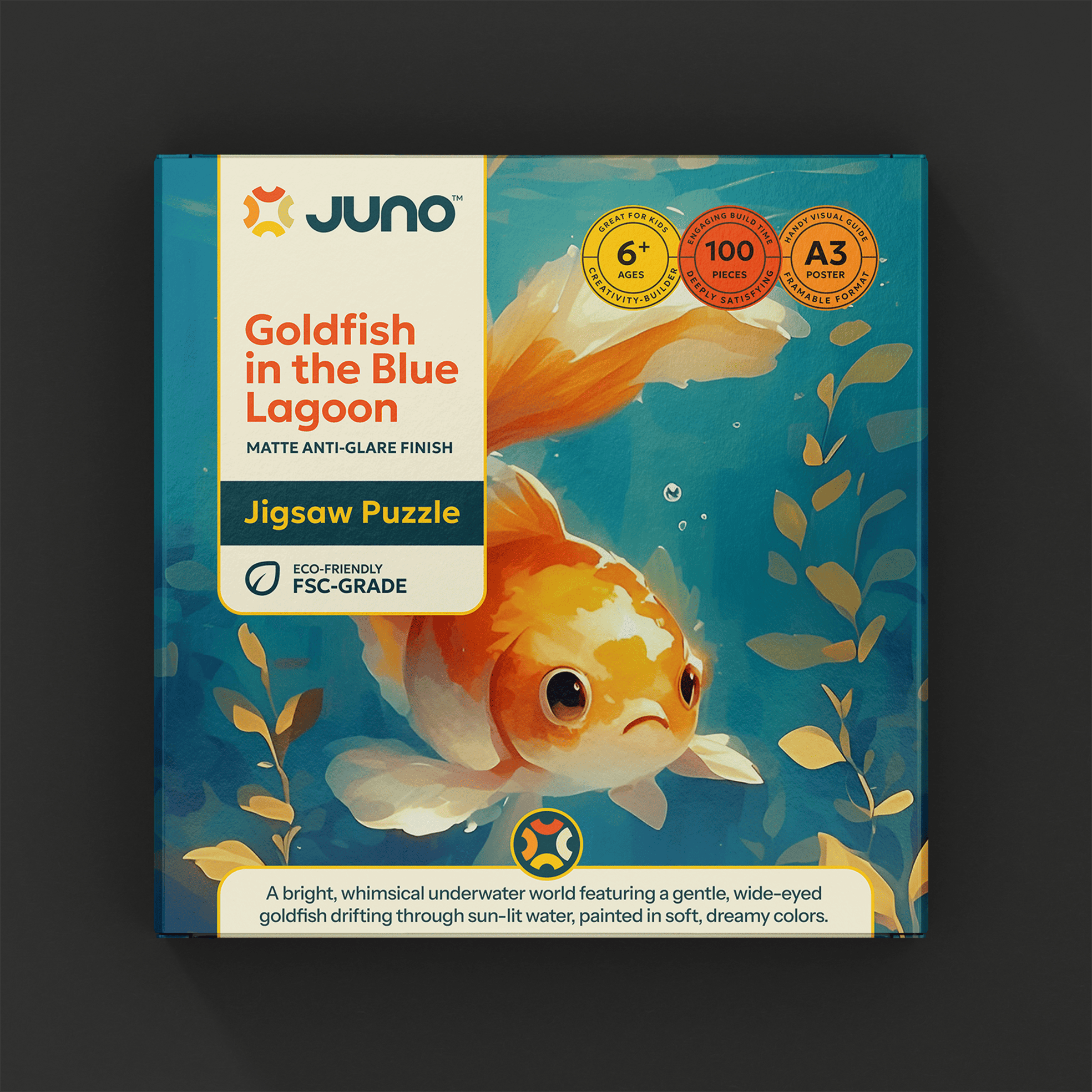
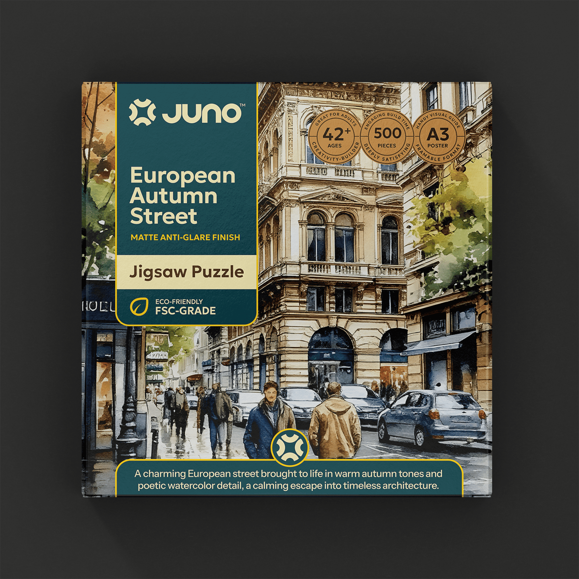
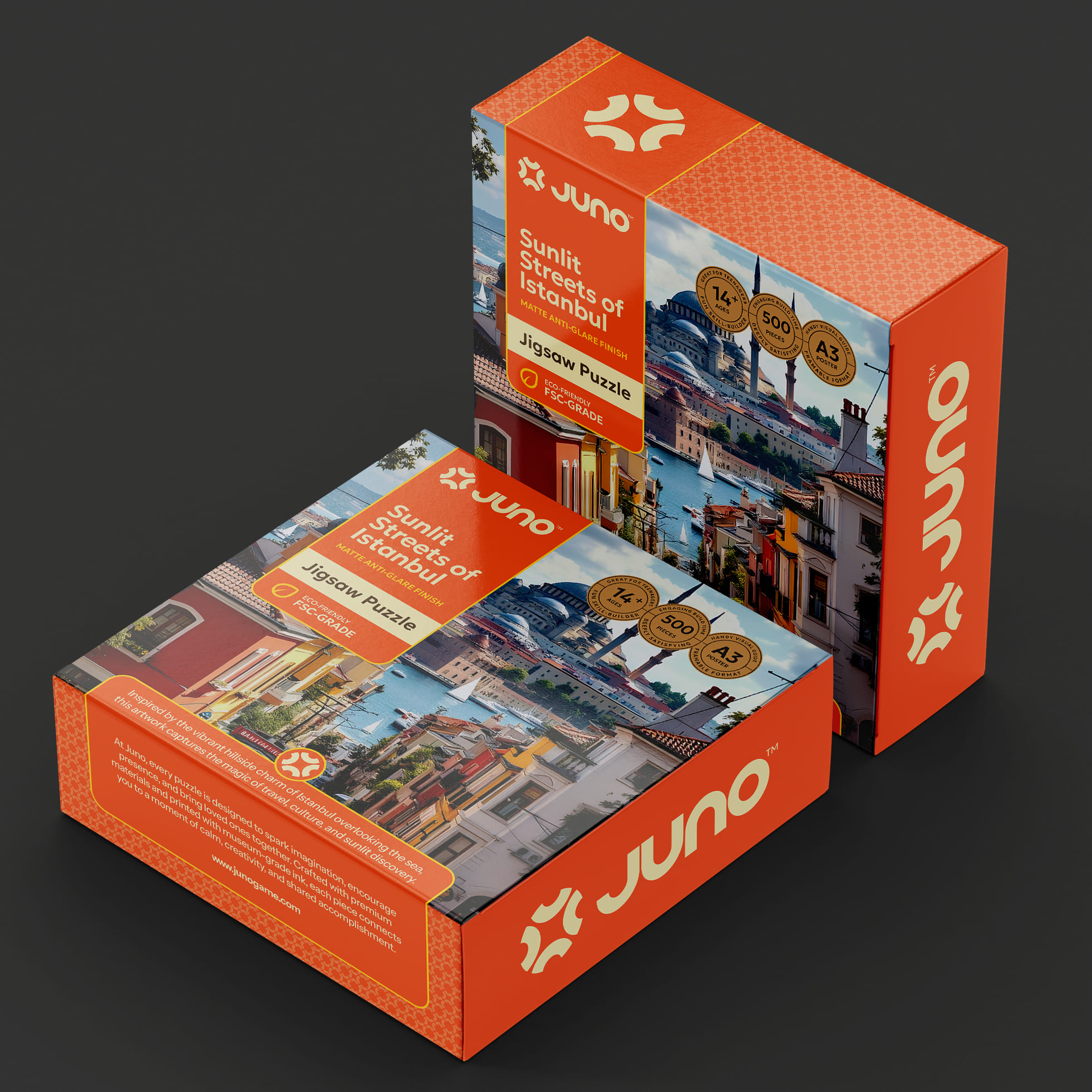
The packaging system was developed around an artwork-first design approach, where illustration serves as the primary emotional trigger. Each puzzle edition features full-bleed artwork that invites immersion before functional details are introduced.
To support different audiences, the system uses distinct color palettes as an age-based cue:
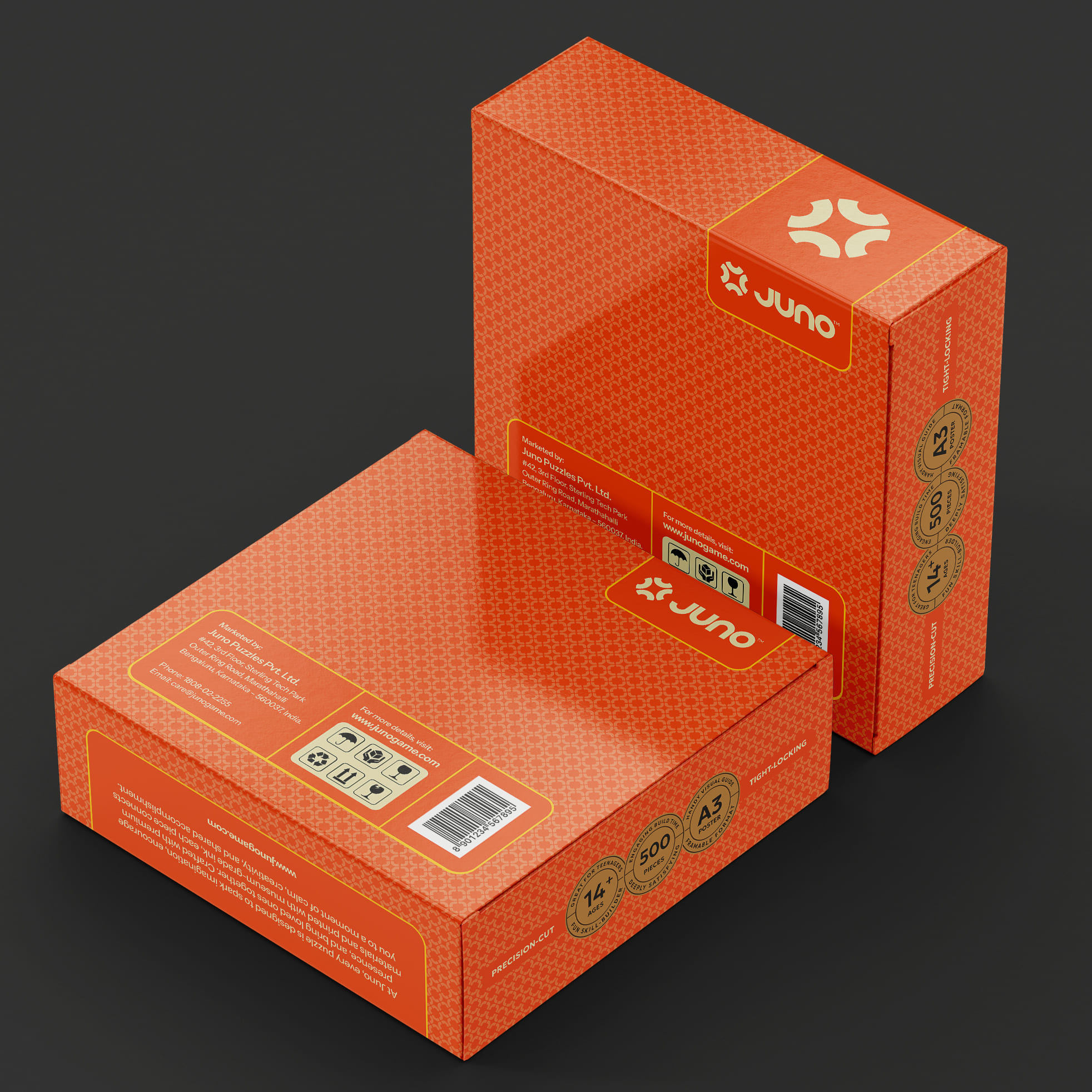
Orange editions are designed for younger users, using warmer, energetic tones that signal playfulness, curiosity, and approachability.
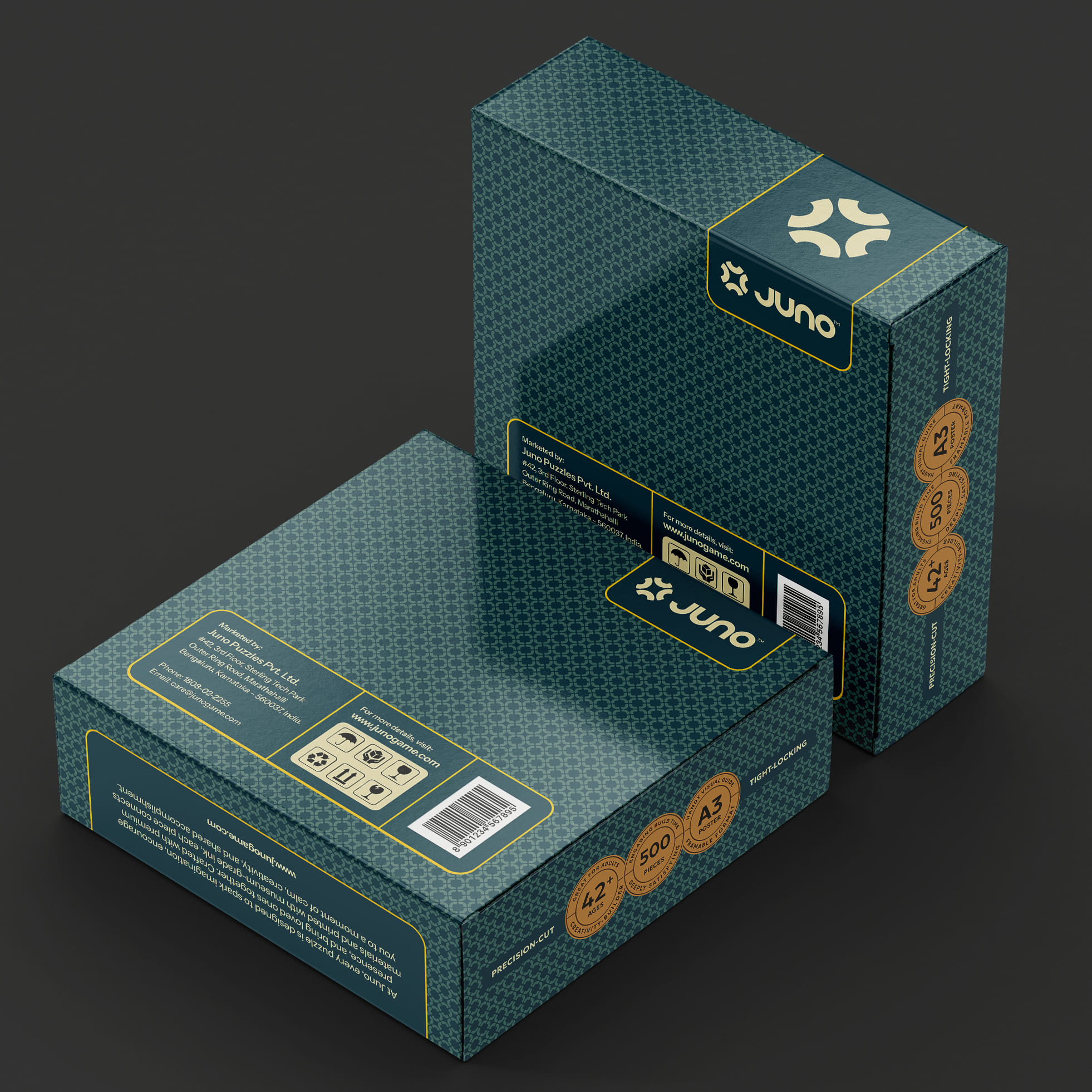
Teal green editions are intended for adult audiences, employing deeper, calmer hues that convey refinement, focus, and a more contemplative experience.
This color differentiation allows immediate audience recognition without fragmenting the brand.
A structured information frame overlays the artwork to present key details such as puzzle name, age group, and piece count. This ensures clarity and ease of navigation while preserving the emotional impact of the illustration. The frame remains consistent across all editions, reinforcing brand recognition and system continuity.
Material and finish choices were intentionally restrained. Matte surfaces, controlled contrast, and subtle pattern detailing enhance tactility and perceived quality, avoiding excessive gloss or visual noise. The Juno wordmark and symbol are treated as modular elements, subtly referencing the idea of puzzle pieces coming together and enabling the system to scale across future releases.
RESULT
The final packaging system allows Juno to speak to multiple age groups through color, tone, and artwork while maintaining a unified brand identity. Younger audiences are drawn in through warmth and vibrancy, while adult users experience a calmer, more premium expression—both supported by the same structural logic.
The design transforms the puzzle into a lifestyle object that feels intentional, gift-worthy, and collectible. By using design to guide perception rather than relying on category clichés, the packaging enables a young brand to compete with established players through emotional clarity, visual cohesion, and perceived value.
PROJECT DETAILS
Brand: Juno
Category: Puzzle Packaging
Design Studio: Creative Branding Agency (CBA™)
Scope: Brand identity, packaging design, visual system


 NEV
NEV Stefano Bracci
 Alina
Alina monther al omari
 Lizakjx
 JOAOMARCOSDESIGN
 alchimistestudioParis
 Harriet Neild
 octavio rojo
 宏洛图品牌设计HONGLT
 DESIGN CONCEPTS
 Alexander Skurihin
 Studio K95
 ARMBRAND
 Richa Rai
 houseoferas by Miti
 Agence des Coteaux
 Kushi Eaknath
 Ann Treasa
 Xiao Ning
 krrrrrllii
 babyage
 Deep
Deep