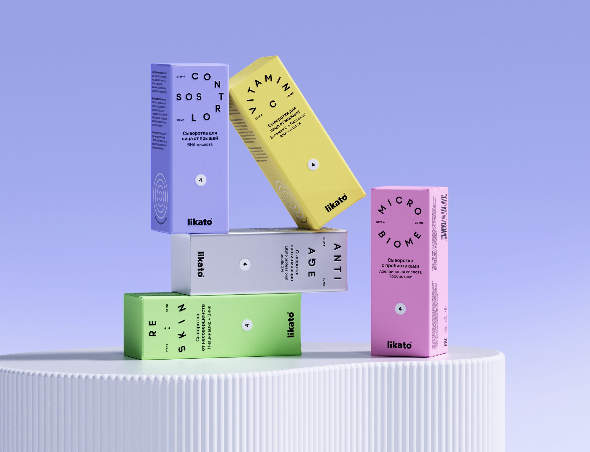

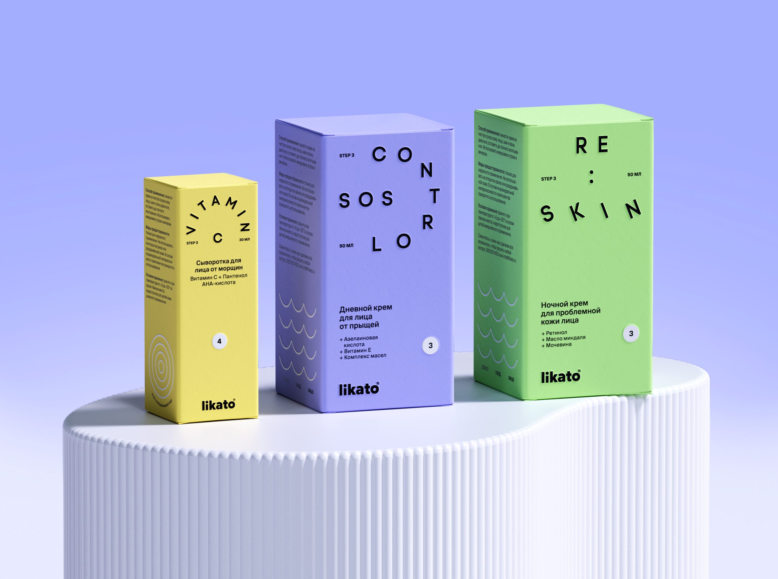
Packaging Line Design Concept for LIKATO brand.
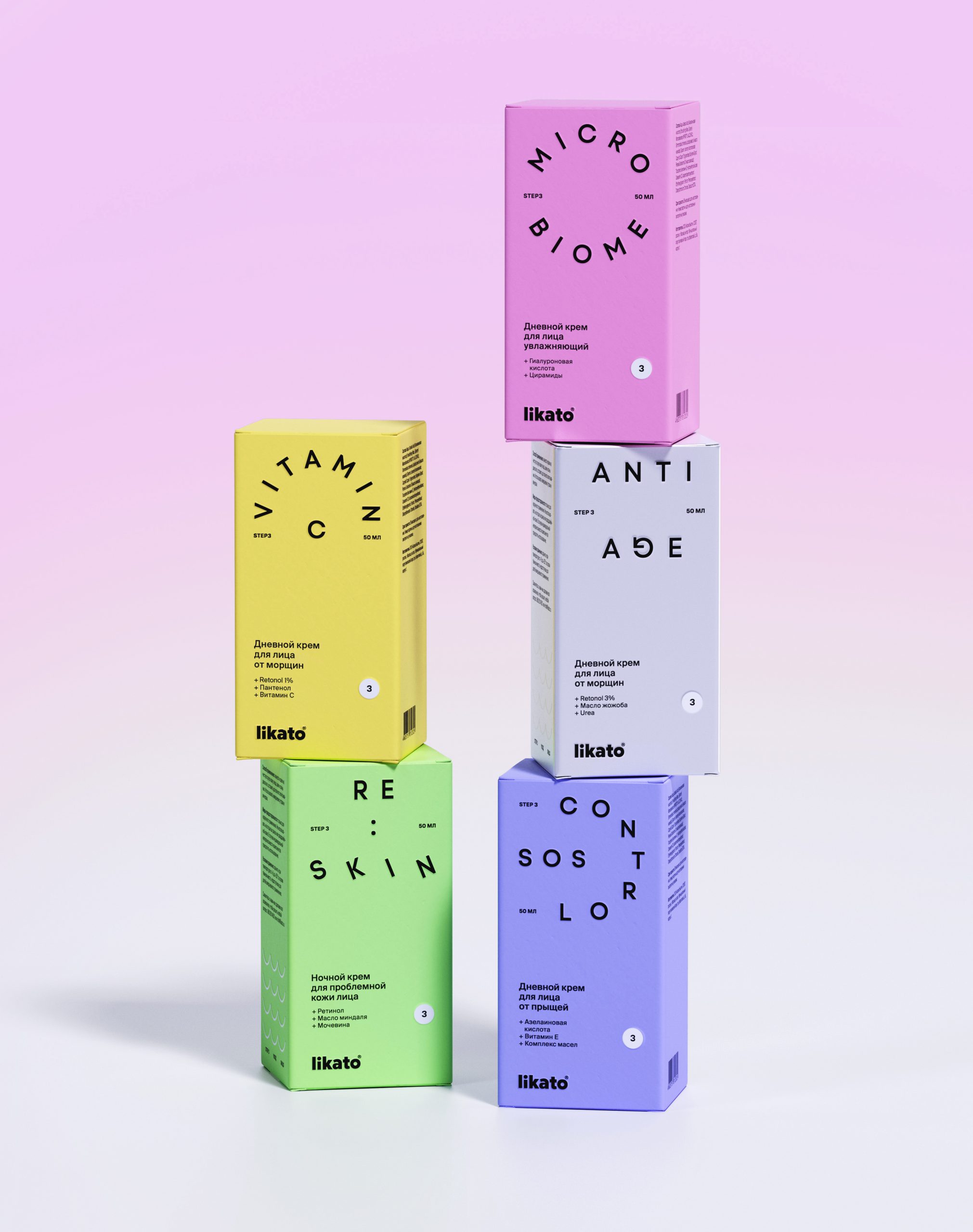
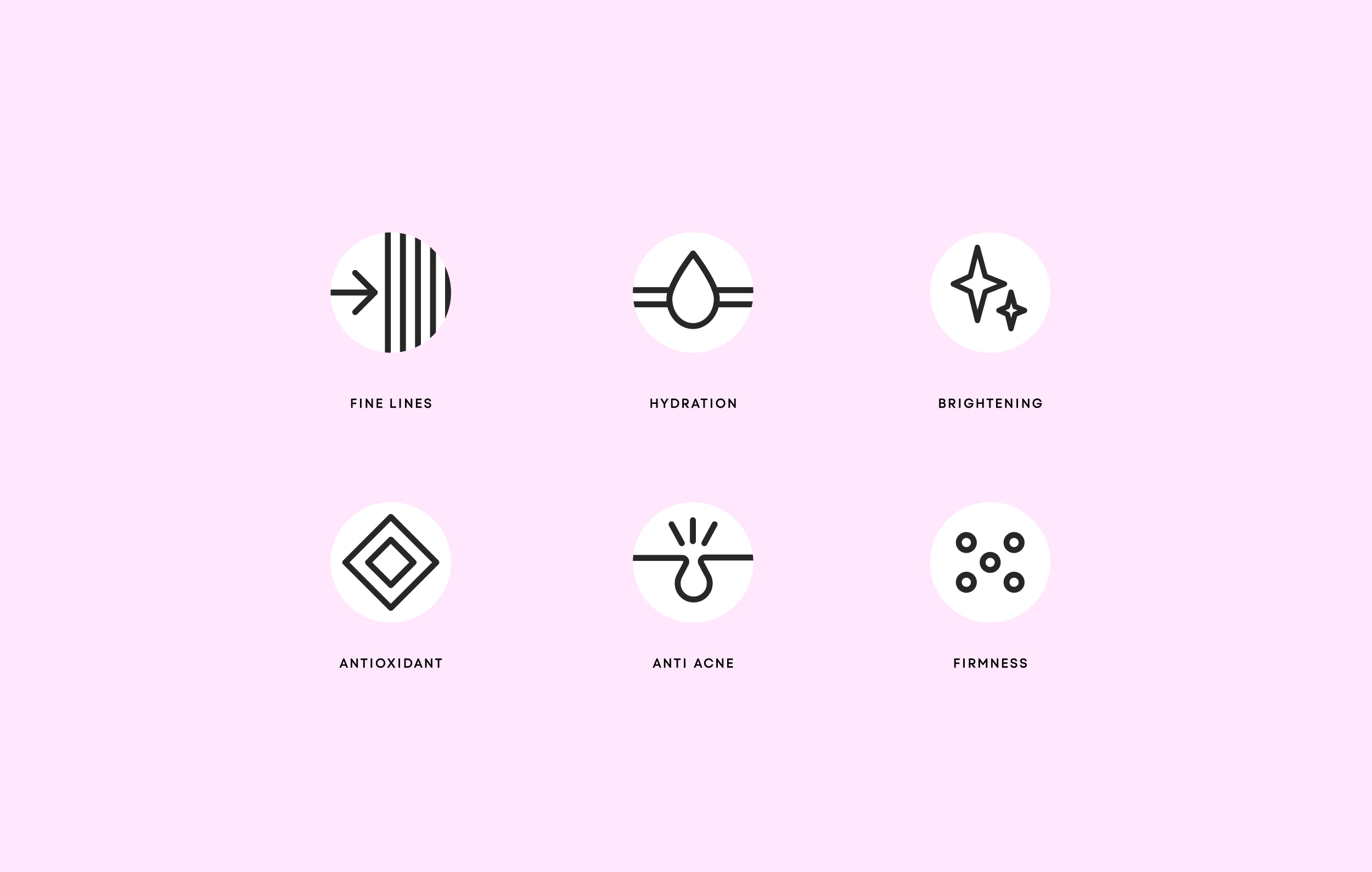
The core objective was to develop a unified, flexible, and scalable visual system that could seamlessly extend across multiple product lines. At the same time, it was essential to preserve the LIKATO brand DNA and integrate the existing logo, while refreshing the visual language to feel more modern, fresh, and relevant.
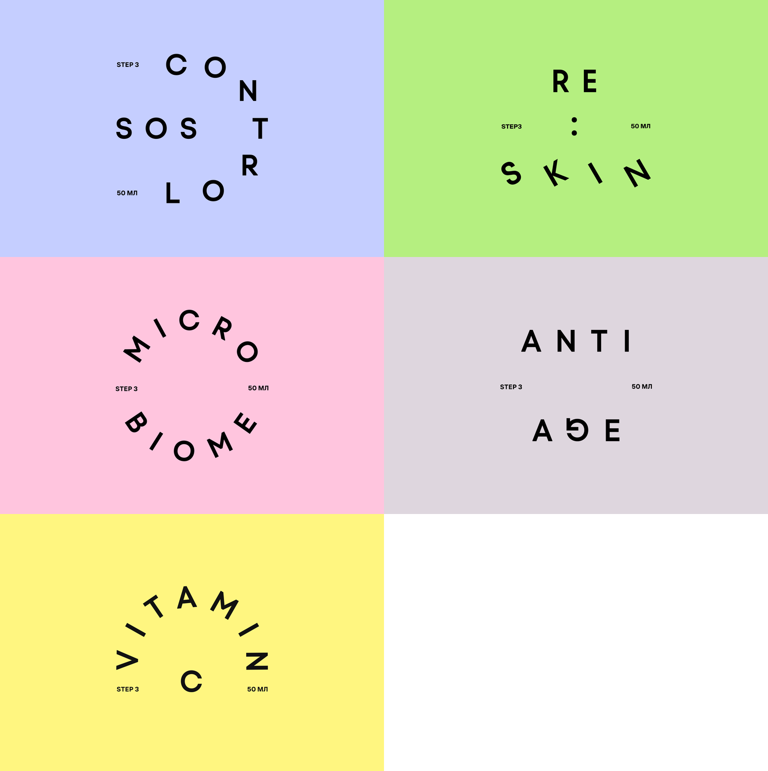
The concept is built around an emotional and friendly tone. Playful, distinctive typography gives each line its own character, while a clear structure based on bold accents and generous negative space creates rhythm, clarity, and strong shelf impact.
The result is a cohesive visual system that scales effortlessly, stands out on the shelf, and strengthens brand recognition.






 Derrick Lin
 monther al omari
 43oz
43oz lilyz design23
 Modern Theory
 Eighteen Brand Studio
 Bhumika Singh
 MohamedMashaly
 Pixels Studio
 Gulya
Gulya UPRISE
 Lizaveta Kharitonyuk
 Bonsanco Creative Studio
 DesignRepublic
 GIRAFA STUDIO
 PiotrWisniewski
 Sophiagdotcom
 CreativeWise
 SoreThumbStudio®
 Modern World Studio
 Palashcc
 Valérie Colace