
Dragonfly Wine – ReBranding & Label Design
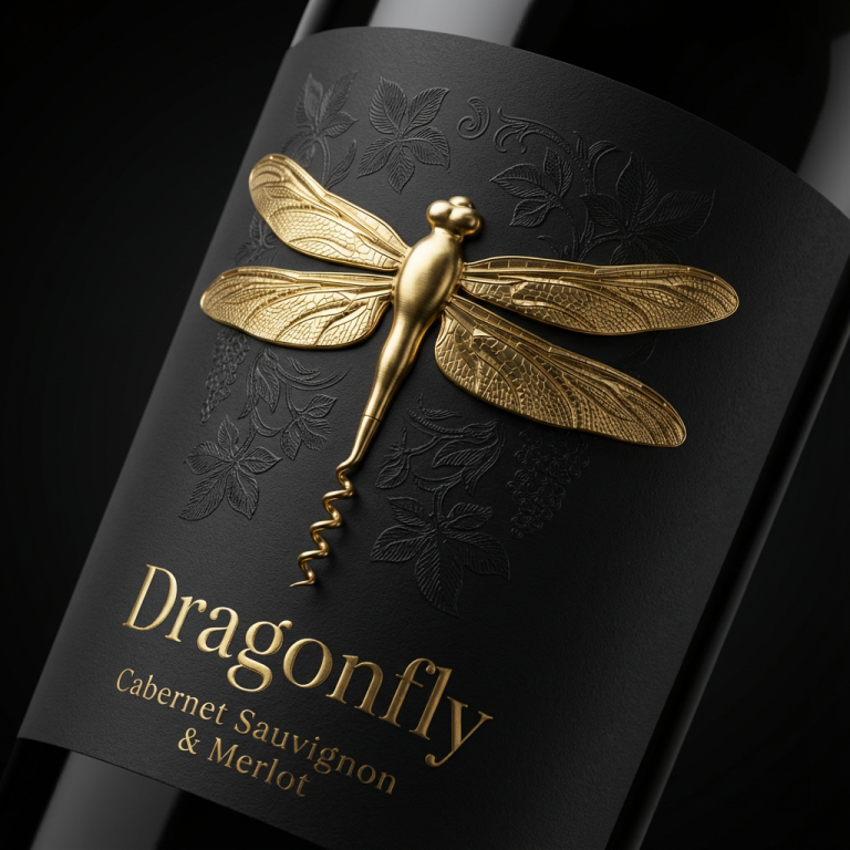
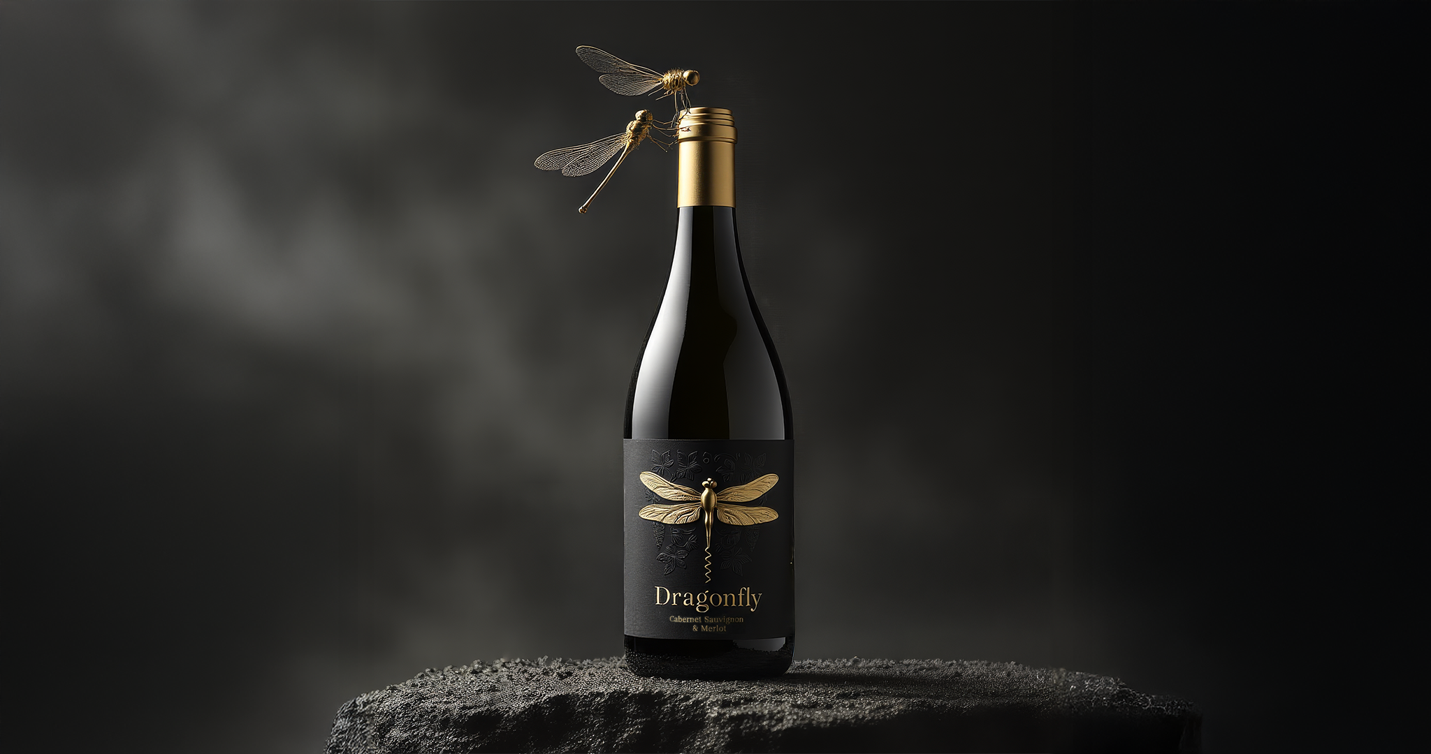
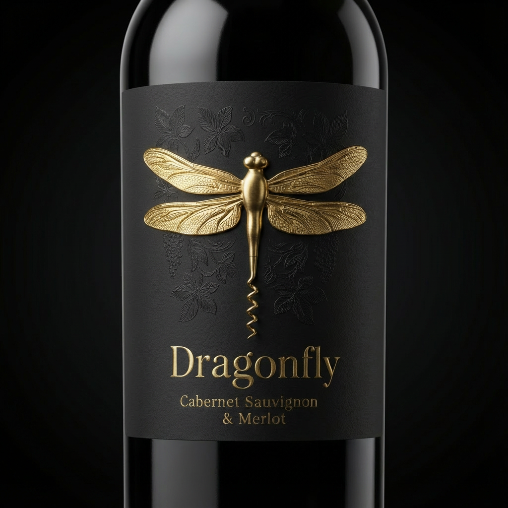
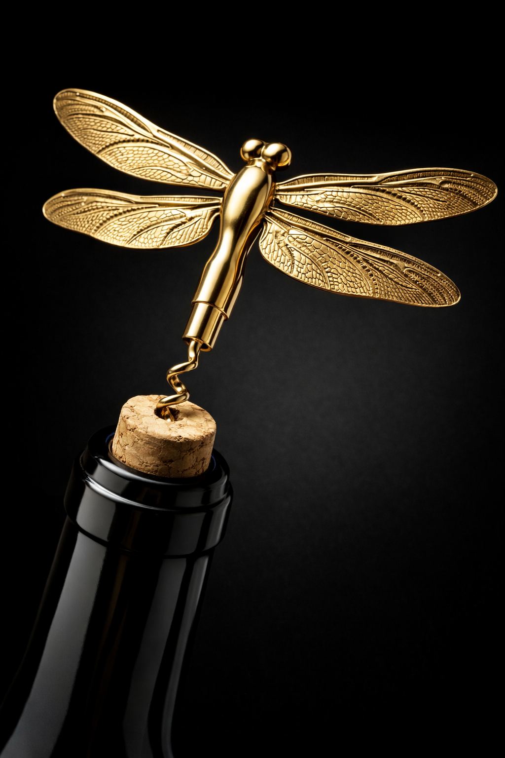
Dragonfly Wine explores how a brand symbol can evolve into a functional design element and become part of the wine ritual itself. The central idea is built around the dragonfly icon, whose tail is stylized into the shape of a corkscrew, transforming a natural form into a refined tool.
This transformation elevates the dragonfly from a decorative graphic into a meaningful brand signature. The symbol no longer exists only on the label but actively participates in the opening of the bottle, creating a direct connection between identity and experience. The corkscrew form adds a layer of elegance and purpose, turning the act of opening wine into a ritual guided by the brand icon.
The visual language focuses on contrast and restraint. A matte black label is combined with a sculptural golden dragonfly emblem, allowing the icon to stand as the hero element. Subtle botanical textures support the concept without competing with the symbol, reinforcing the idea of nature interpreted through craftsmanship.
This concept demonstrates how packaging can extend beyond aesthetics and become an object of interaction — where graphic design, symbolism, and functionality merge to create a distinctive and memorable wine brand experience.
 Packagenius / Erhan Ozden
 NEV
NEV Stefano Bracci
 Alina
Alina monther al omari
 Lizakjx
 JOAOMARCOSDESIGN
 alchimistestudioParis
 Harriet Neild
 octavio rojo
 宏洛图品牌设计HONGLT
 DESIGN CONCEPTS
 Alexander Skurihin
 Studio K95
 ARMBRAND
 Richa Rai
 houseoferas by Miti
 Agence des Coteaux
 Kushi Eaknath
 Ann Treasa
 Xiao Ning
 krrrrrllii
 babyage
 Deep
Deep