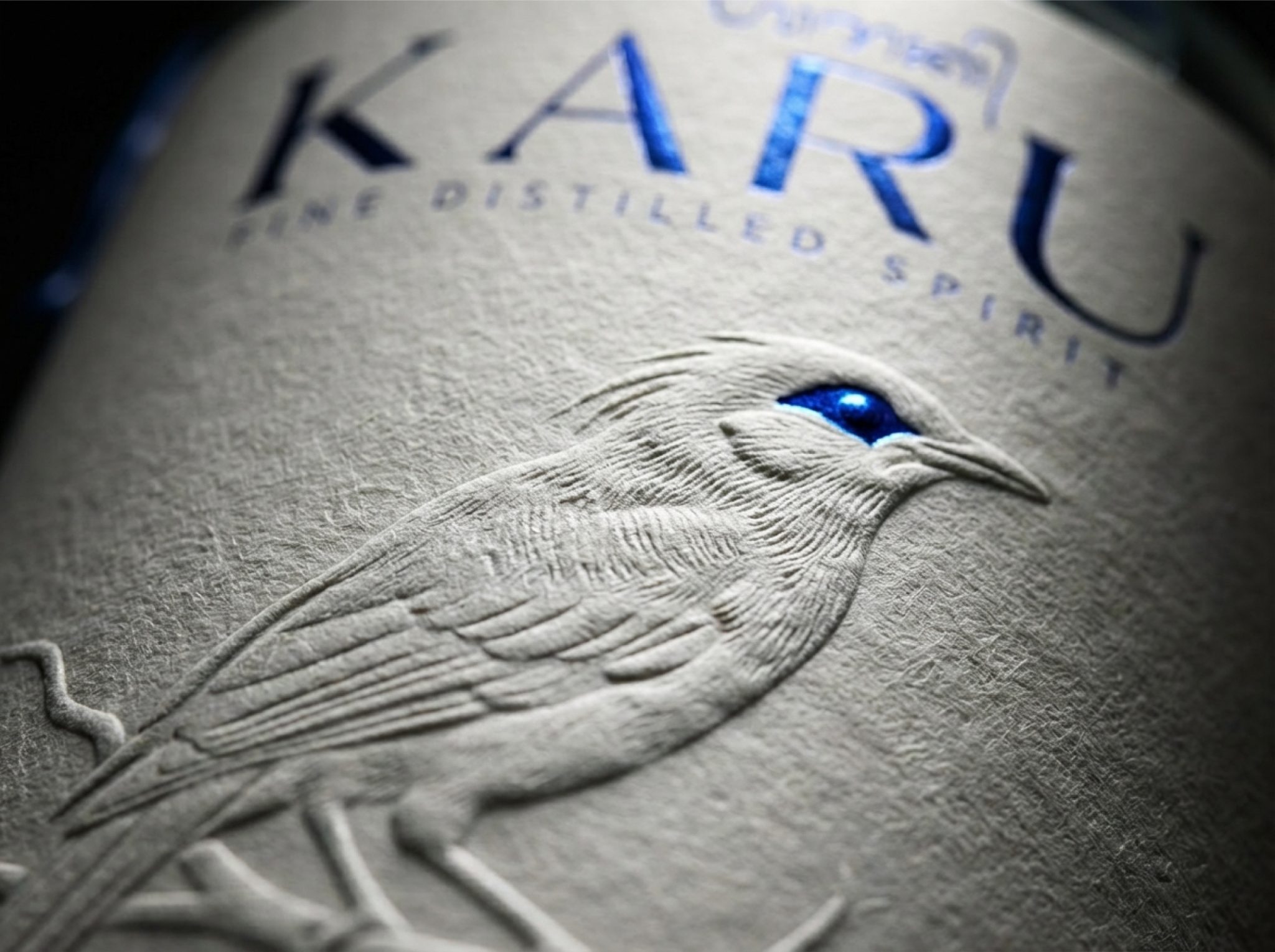

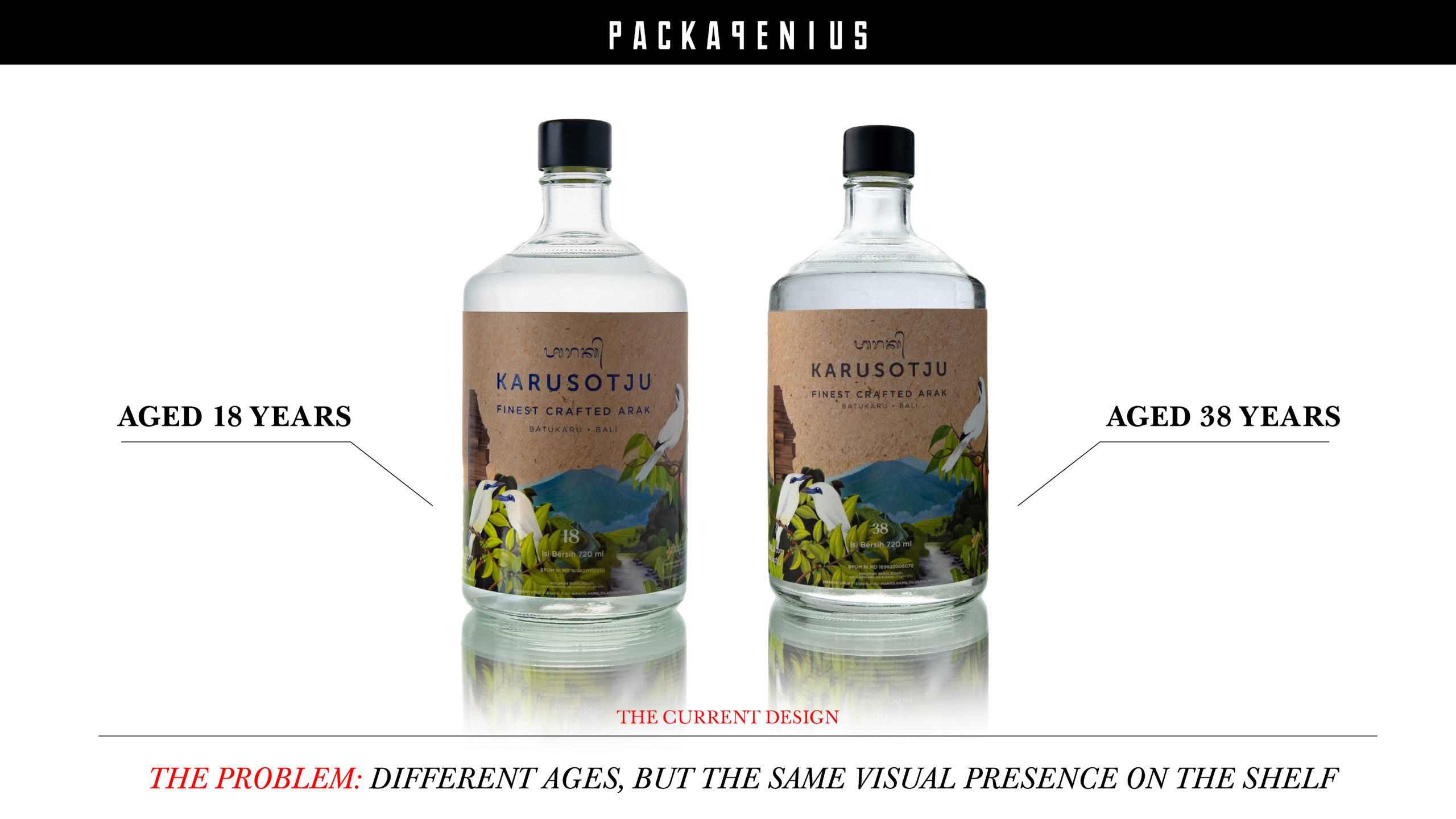
This concept redesign for the Balinese Arak brand KARUSOTJU explores the power of simplification by focusing on the brand’s most distinctive symbol: the Jalak Bali bird.
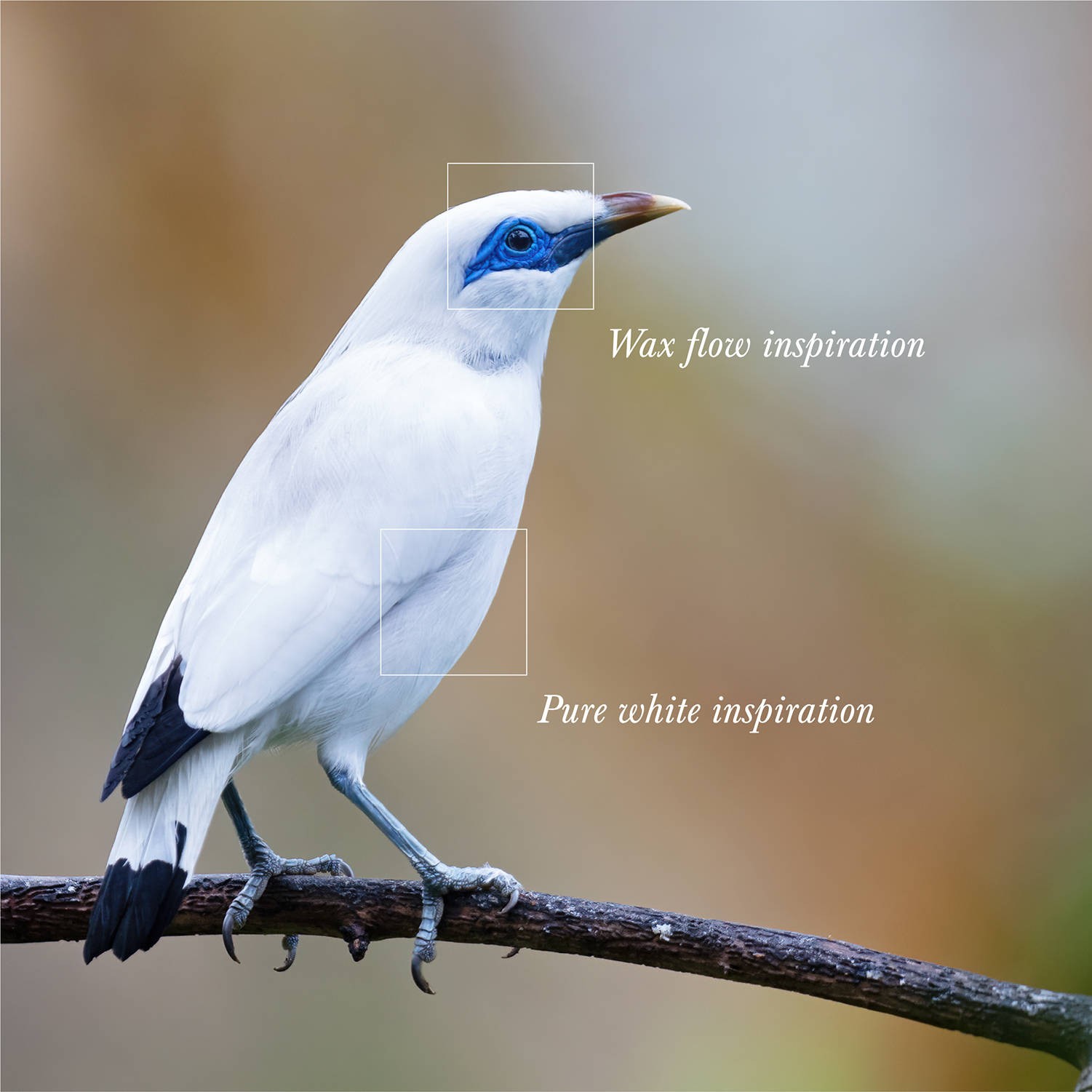
The design removes visual noise and allows the embossed bird illustration to become the central element of the label. Inspired by the purity of Bali’s natural water sources and the bird’s iconic white feathers, the label adopts a clean white textured paper that reveals the illustration through subtle embossing and light interaction.
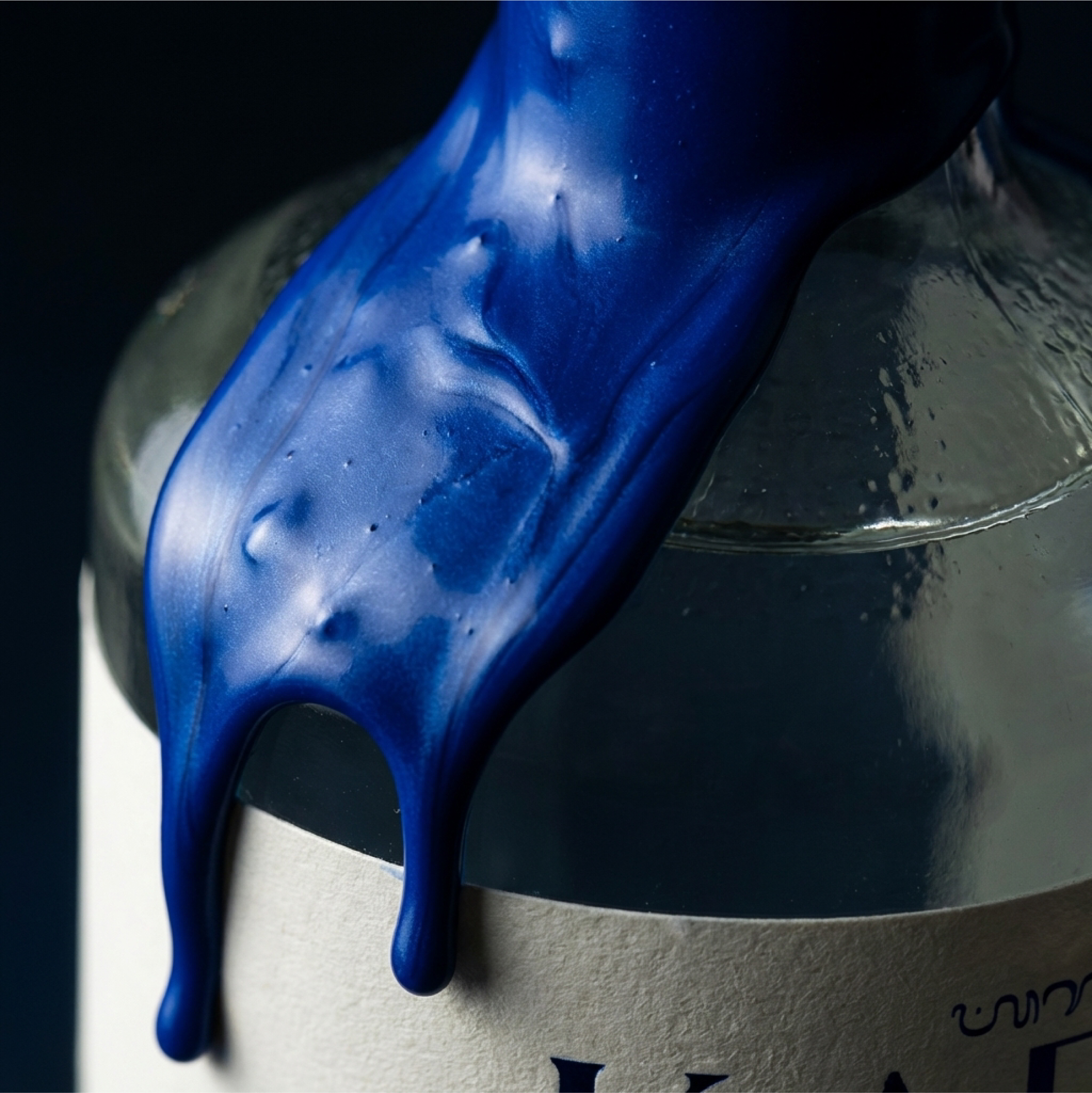
A distinctive metallic blue accent around the bird’s eye becomes the signature detail of the brand. This element continues beyond the label and transforms into the flowing wax seal on the bottle neck, creating a visual connection between illustration and packaging.
To enhance shelf presence and communicate aging in a premium way, two material expressions were developed: a pure white embossed edition and a gold foil edition. Both versions elevate the age statement while maintaining a minimal and refined visual language.



 Packagenius / Erhan Ozden
 NEV
NEV Stefano Bracci
 Alina
Alina monther al omari
 Lizakjx
 JOAOMARCOSDESIGN
 alchimistestudioParis
 Harriet Neild
 octavio rojo
 宏洛图品牌设计HONGLT
 DESIGN CONCEPTS
 Alexander Skurihin
 Studio K95
 ARMBRAND
 Richa Rai
 houseoferas by Miti
 Agence des Coteaux
 Kushi Eaknath
 Ann Treasa
 Xiao Ning
 krrrrrllii
 babyage
 Deep
Deep