AQVARANCH – Where Branding Meets the Sky’s Essence
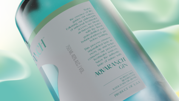
At AQVARANCH, we believe that every drop of water holds a story of its own, a story that intertwines with the vast skies above. Inspired by the graceful form of water drops and the mesmerizing gradients of the sky, our label design encapsulates the very essence of our brand.
The label design is inspired by the elegance of water drops and the ever-changing gradients of the sky.
The brand proudly uses air harvesting technology to collect pure water directly from the sky. That’s why the abstract water drop shapes on our label are the hero element, adorned with gradients that pay homage to the boundless beauty of the heavens.
WHERE ARTISTRY MEETS NATURE
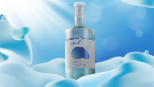
Our label design is a tribute to elegance of water drops and the ever-changing hues of the sky. The abstract water drop shapes not only evoke the purity of water but also mirror the natural beauty of a vibrant sunset or the serene colors of dawn. These gradients reflect our deep connection to the environment.
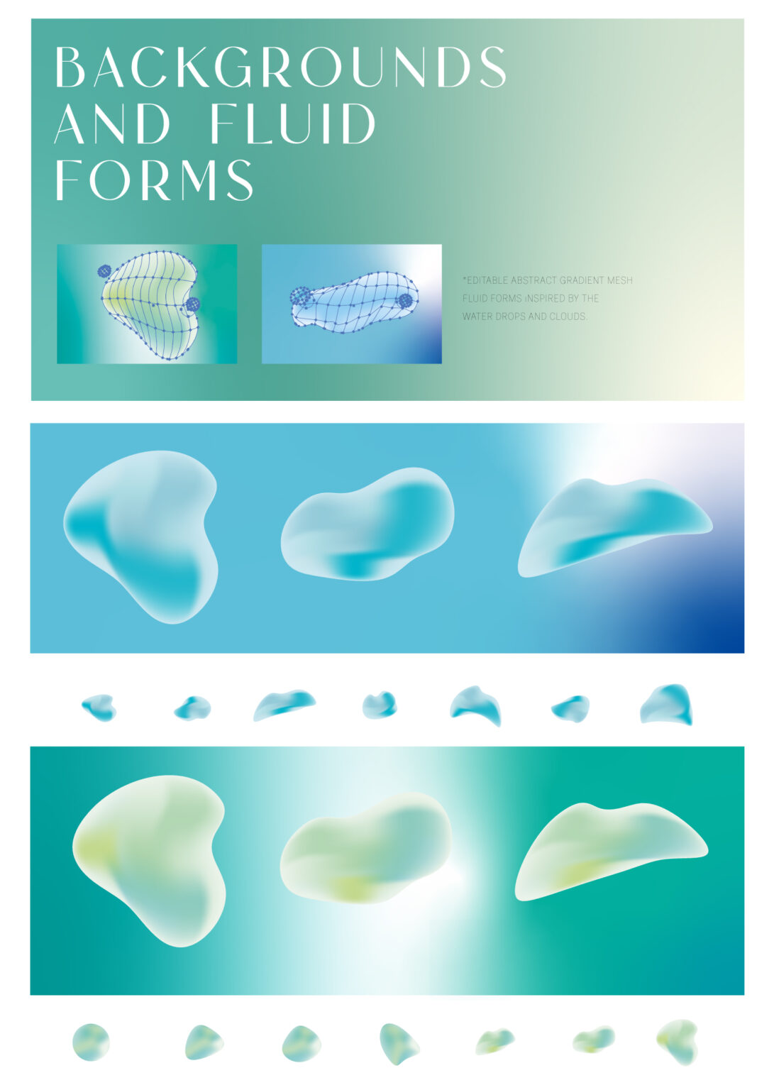
Inspired by the phenomenon of water vapor condensing into tiny droplets as you ascend higher into the sky, eventually forming clouds, we at AQVARANCH have harnessed this concept for our design world. We’ve replicated abstract droplet shapes on our front label using blur effects and gradient mesh techniques, creating various versions and crafting a dreamy sky ambience.
Through this approach, we’ve seamlessly integrated the brand’s visual communication with refreshing colors, setting it apart and making a distinctive mark in the cocktail world.
Curator’s Insight
The use of a water drop on the label as the central theme is symbolic and acts as a visual promise to consumers that what’s inside the bottle is as clear and clean as a freshly fallen raindrop.


