This project aims to create a square tin for cajeta, responding to the growing demand for traditional products that offer great taste and an attractive presentation in the confectionery market. Consumers want to enjoy the authentic flavor of cajeta while having packaging that keeps it fresh, is easy to store, and looks appealing.
Choosing a square tin meets several needs. First, it provides excellent protection against moisture and light, helping to preserve the product’s quality. Additionally, its shape allows for easy stacking and storage, both in stores and at home. The tin is also reusable and recyclable, supporting environmental sustainability.
An attractive design that reflects Mexican culture seeks to connect with consumers by highlighting the tradition of cajeta. At the same time, its modern and practical style makes the product appealing to both local and international markets.
Material and Aesthetics
The square tin will be made of sturdy yet lightweight metal, ideal for protecting the contents and ensuring durability. The exterior will feature a glossy finish with engraved details representing Mexican cultural elements, adding an artisanal and authentic touch. Additionally, vibrant colors and traditional motifs will emphasize the product’s identity and draw consumer attention.
Product Design
The design of the square tin for cajeta focuses on both functionality and aesthetics. Durable materials will be used to protect the contents from moisture and light. The square shape allows for efficient storage and easy stacking, benefiting both retailers and consumers.
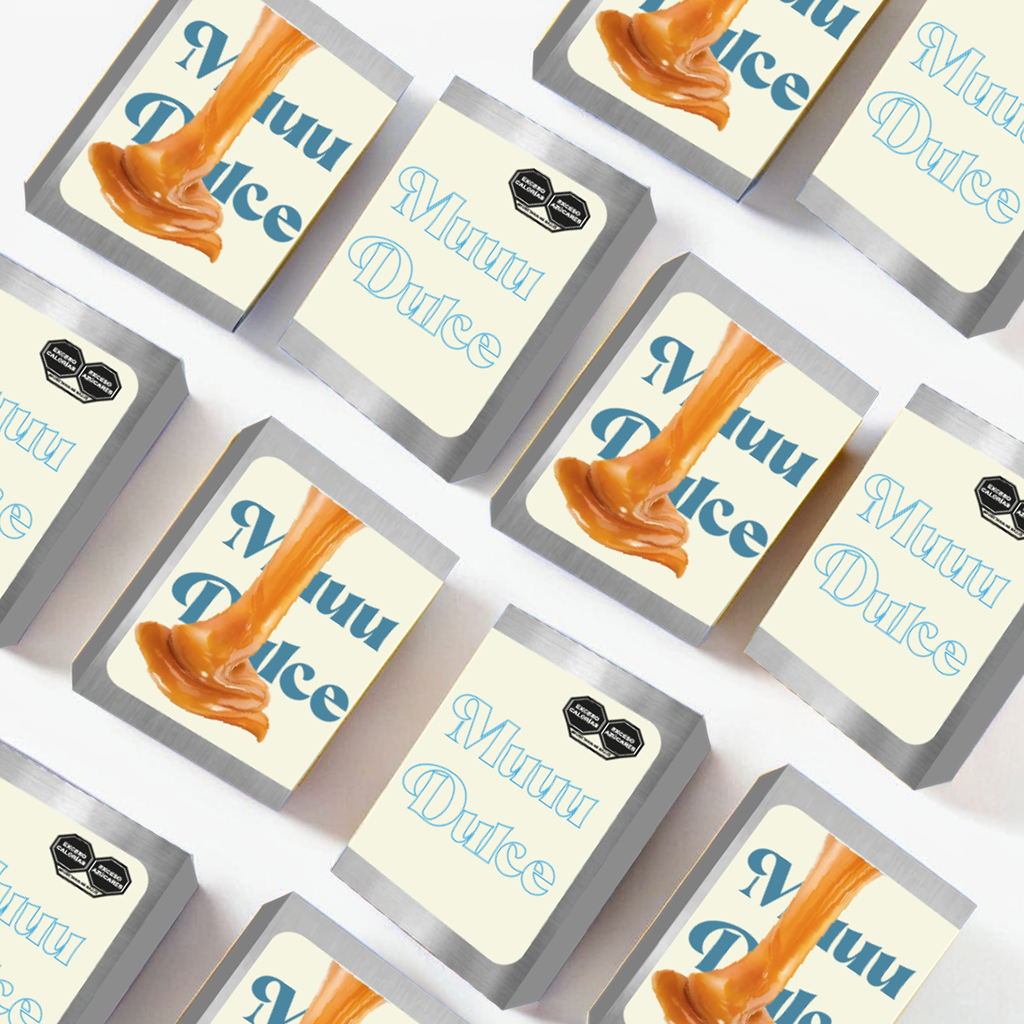
The exterior of the tin will feature a visually striking design that highlights Mexican tradition, using blue, brown, and beige tones along with graphic elements that evoke the history and culture of cajeta. Furthermore, the packaging will be reusable and recyclable, promoting sustainability and environmental awareness.
Inside, a protective coating will be applied to maintain the product’s freshness and prevent any alteration in its flavor or texture. A hermetic sealing system will also be considered to ensure the product’s quality for a longer period.
Justification of Label Elements
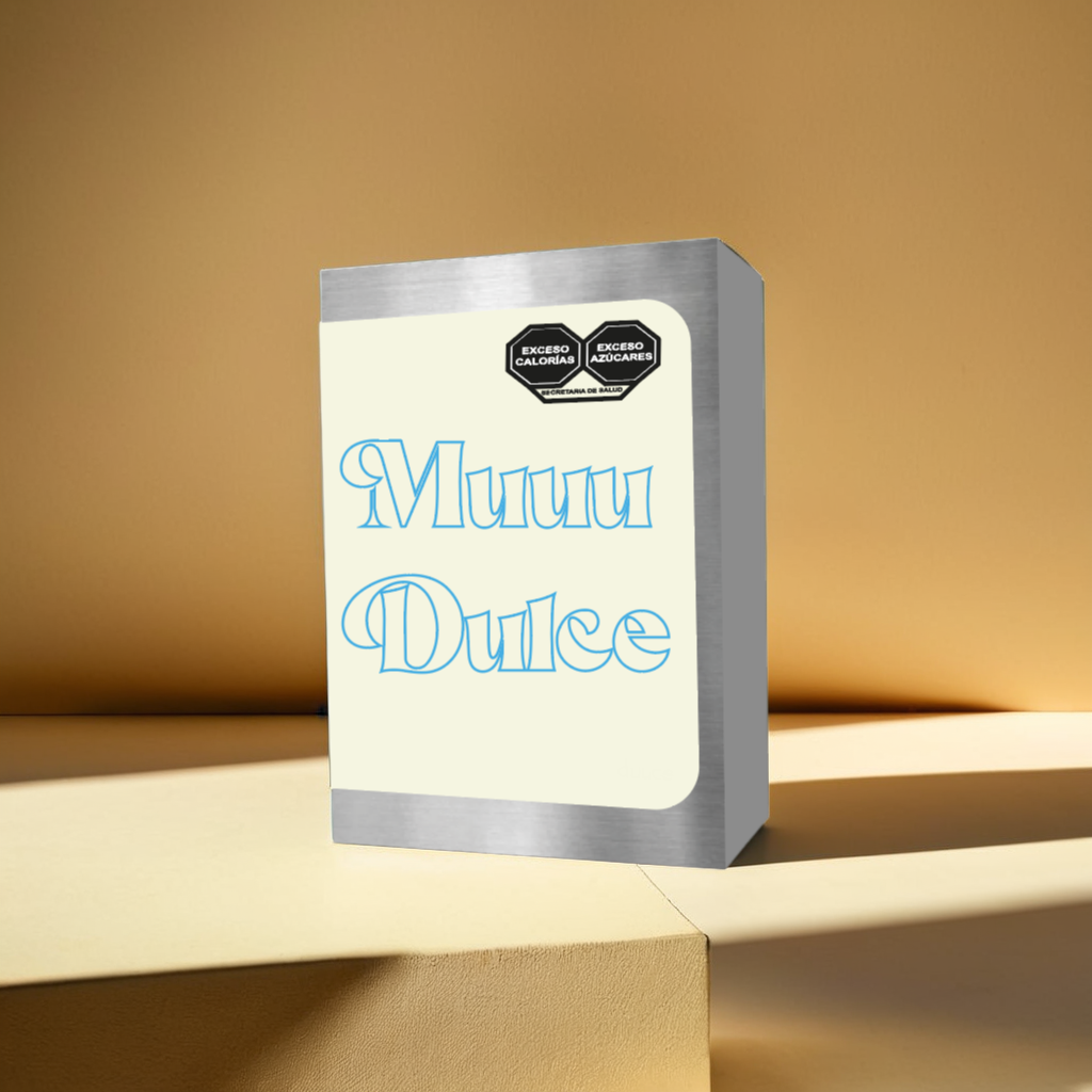
Use of Soft Colors and Eye-Catching Typography
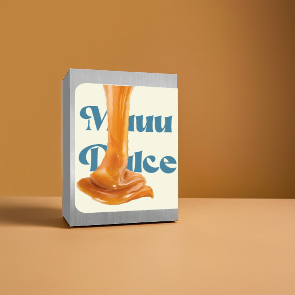
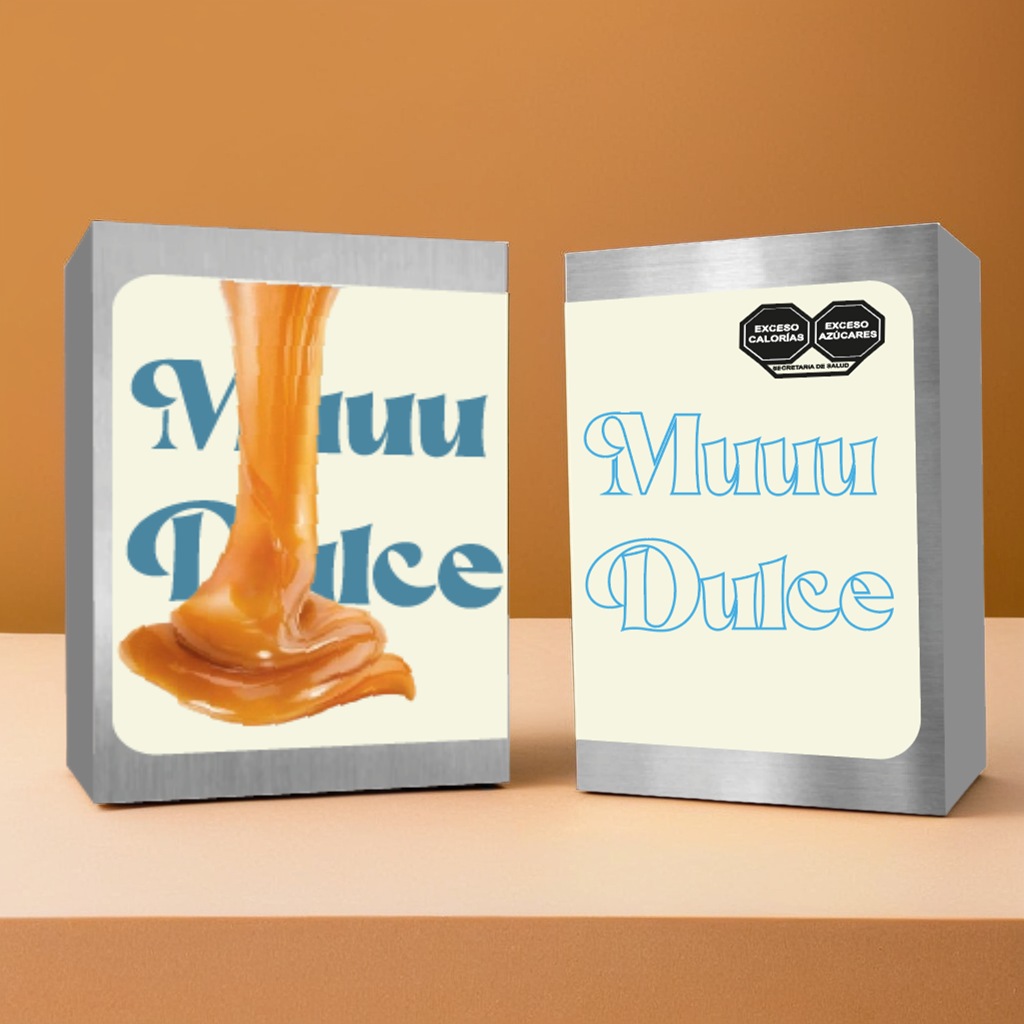
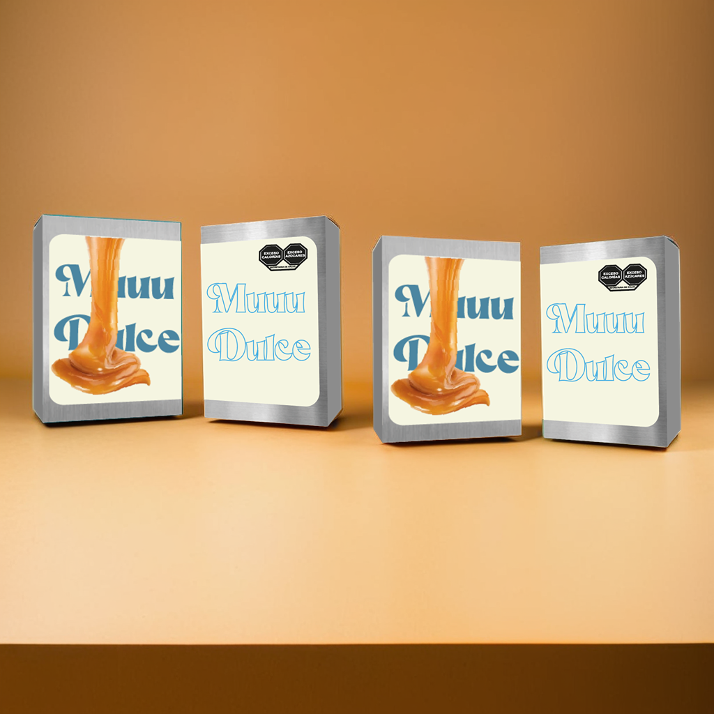
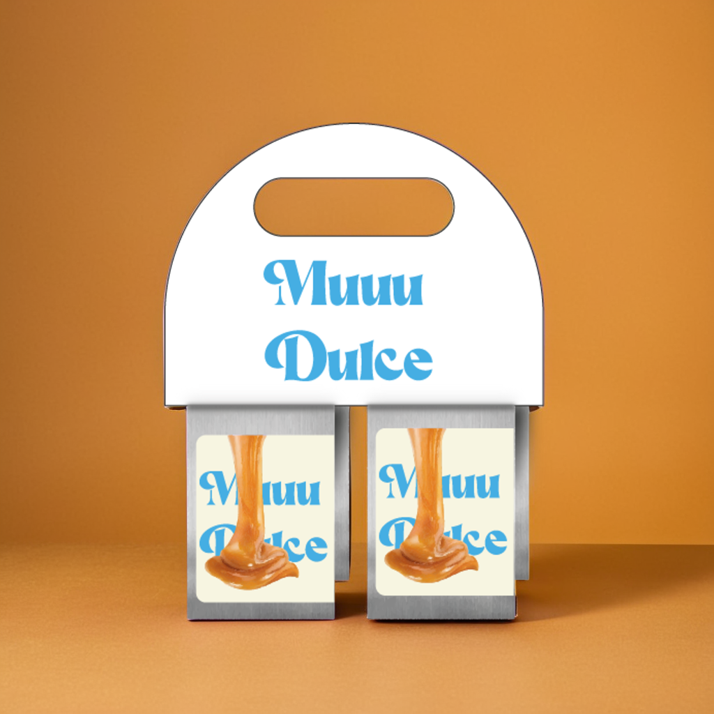
The combination of soft colors conveys a sense of warmth and tradition, associated with artisanal and high-quality products.
The typography, in blue tones and a decorative style, reinforces the concept of sweetness and delicacy, creating a friendly and attractive appeal for consumers.
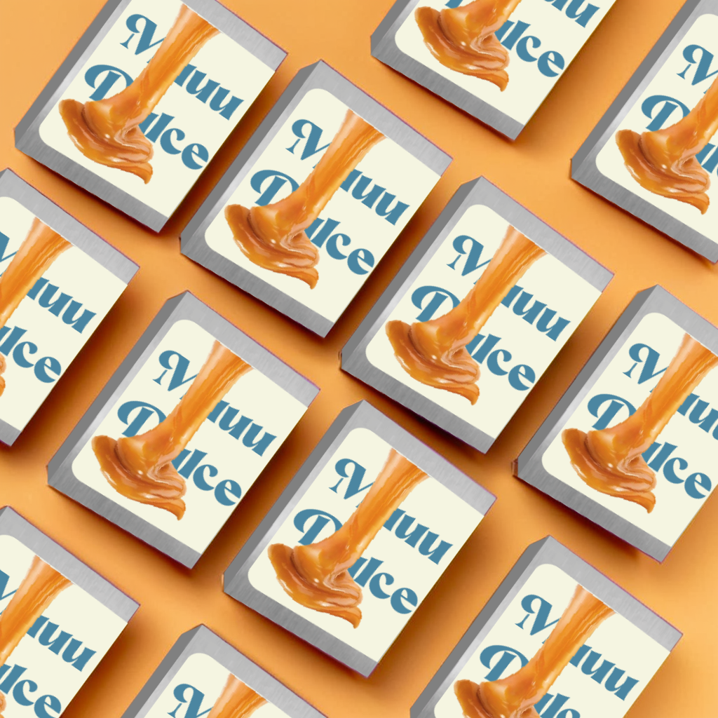
Image of Cajeta Dripping
A visual representation of thick and glossy cajeta effectively communicates the product’s creaminess and quality.
The dripping effect evokes a sense of abundance and indulgence, making it more desirable to consumers.
The image also serves an informative function by showcasing the product in its natural state, helping consumers easily identify it.
The design strikes a balance between aesthetics and functionality, ensuring that the packaging effectively communicates both the brand’s visual identity and the product’s characteristics in a clear and appealing way.