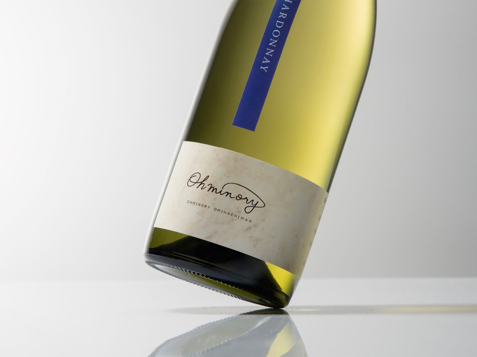

We developed a brand concept around the copy “Farming and living—taste it,” positioning the wine as an agricultural product that embodies the growers’ daily work. Although wine itself contains no soil, it is created through farming—cultivating vines and standing on the earth. We sought to express this subtle “scent of soil” through design.
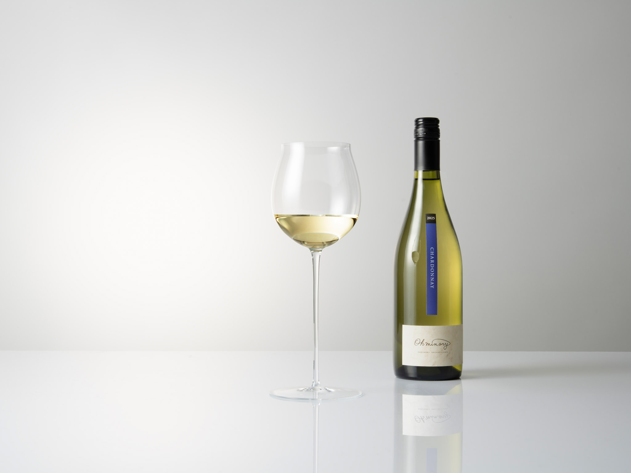
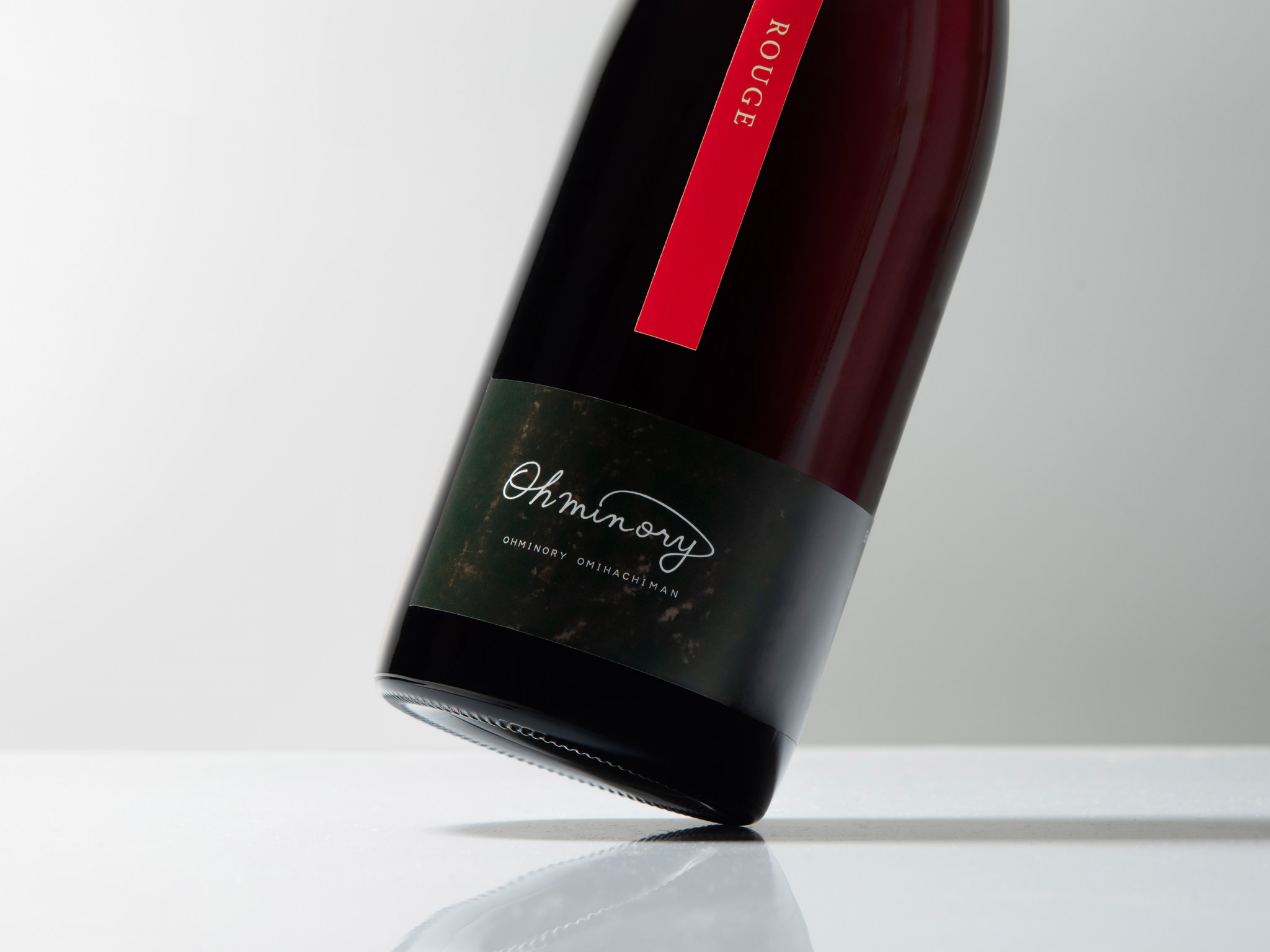
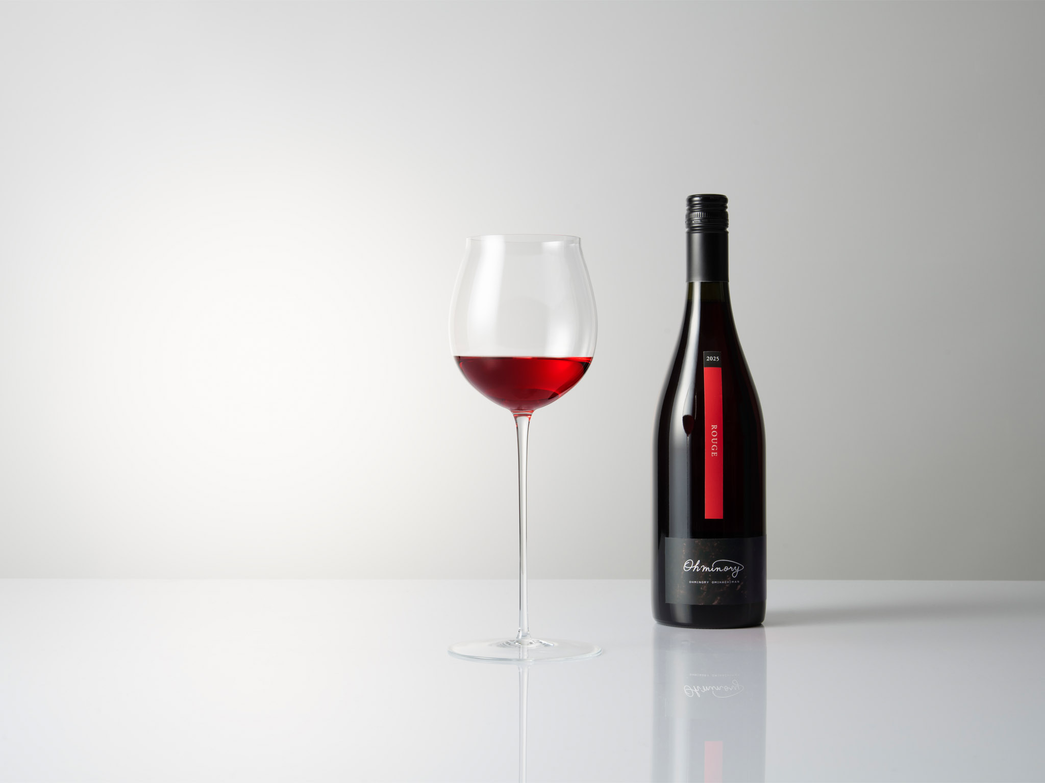
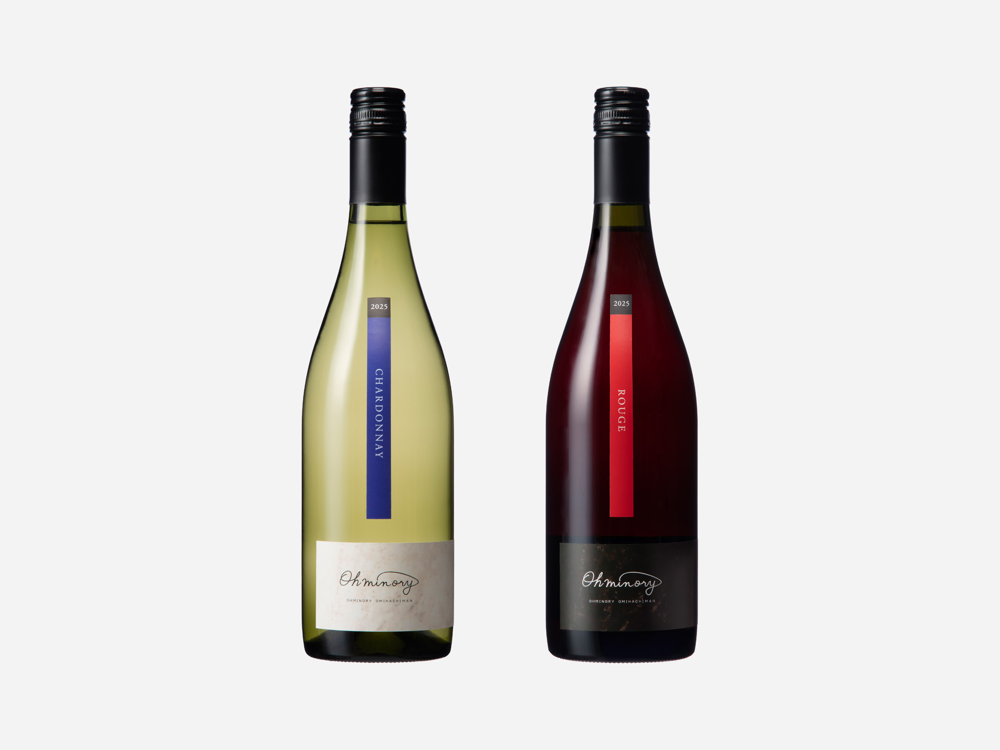
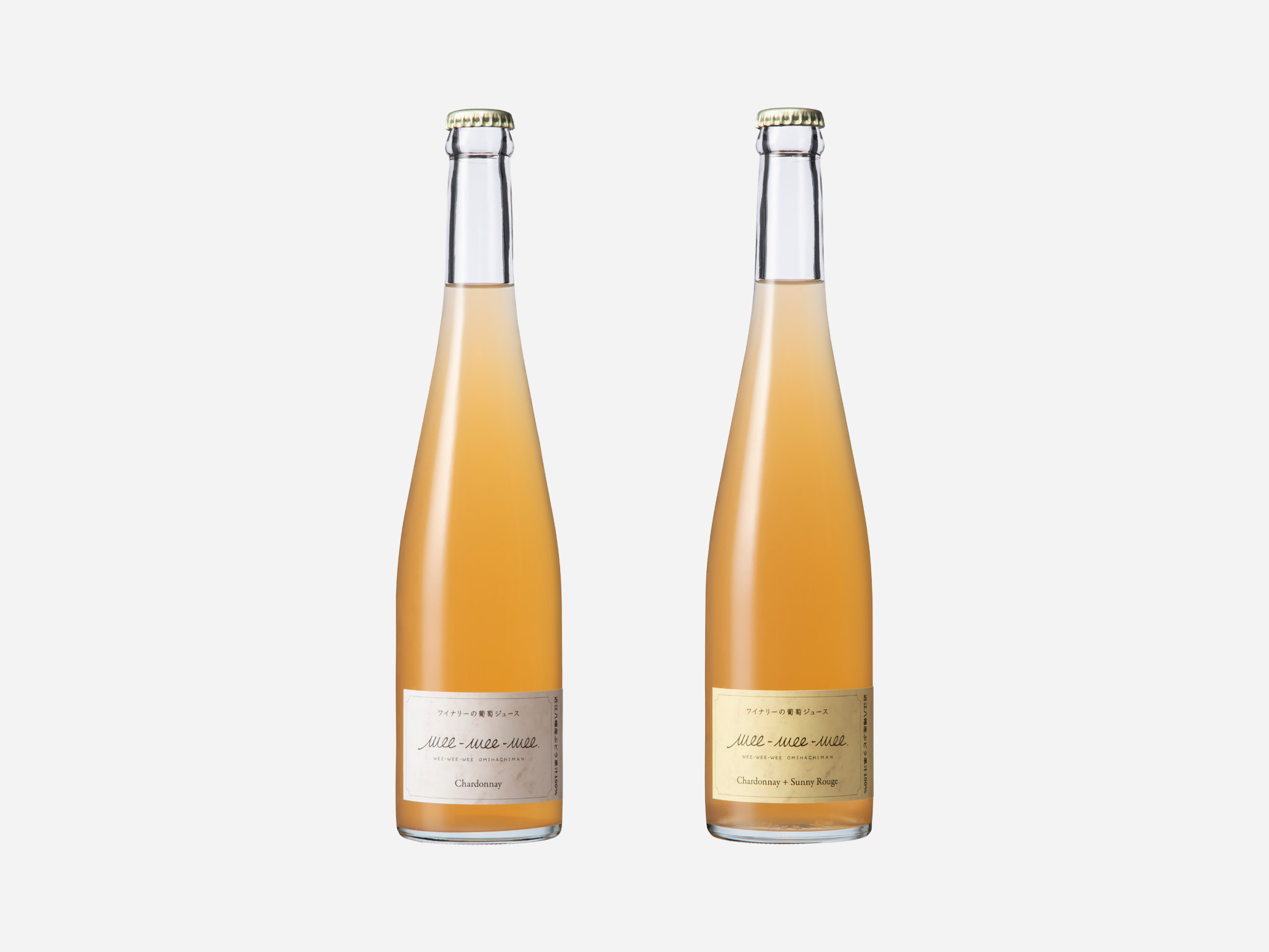
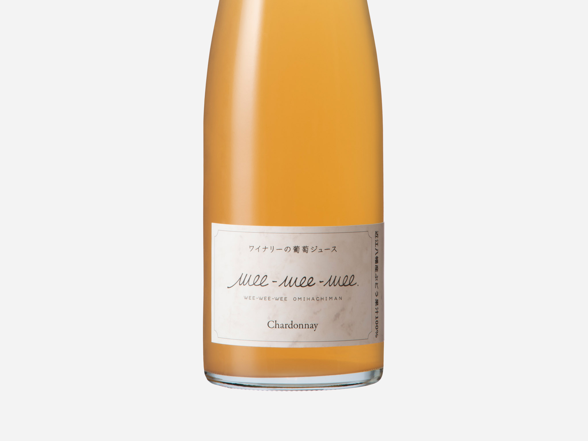
To achieve this, sheets of durable washi paper were buried in the vineyard’s soil. When unearthed, the stains, tears, and patterns formed by soil and bacteria were incorporated into the label design. The label consists of two elements: a horizontal label featuring textures created by the farm’s soil, and a vertical colored label extending upward, representing grape varieties and the character of the wine, creating a strong visual contrast.
While maintaining a simple and refined appearance suitable for the dining table, the design allows the quiet presence of the vineyard’s soil to be felt. We believe this approach represents an appropriate form of etiquette for a rare Japanese wine produced entirely from estate-grown grapes in Omihachiman.
 Derrick Lin
 VincoStudio
 lisakaplina
 CreativeWise
 alchimistestudioParis
 Adriana Adamo
 tauqueer
 MAISON D'IDÉE Prague
 Pixels Studio
 Atchayaa
 DESIGN CONCEPTS
 hello ocean
 monther al omari
 the Labelmaker
 alamgirbrands
 kat bres
 Vantablack Studio
 GruppoSaida
 studiorevv
 grafisercreative
 Kate Reichel
 UPRISE