

Design Concept
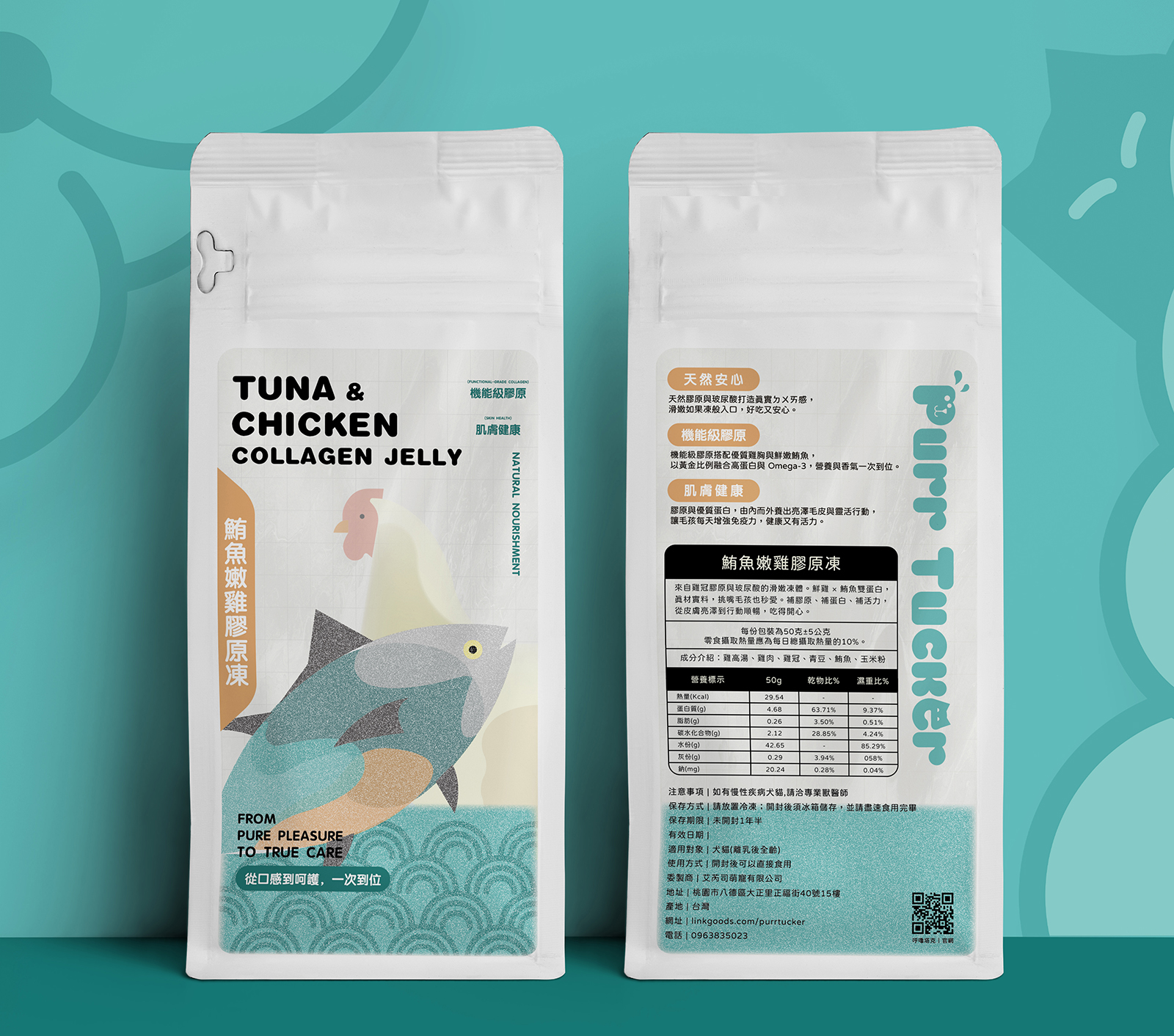
This collagen jelly series is built around the core idea of Emotional Connection × Ingredient Recognition. Through a clear visual hierarchy and warm illustration language, the packaging allows pet owners to instantly understand key ingredients and nutritional focus at first glance, establishing intuitive trust.
The visual system continues Purrtastic’s signature balance between friendliness and professionalism—playful yet refined, avoiding both excessive realism and childish cartooning. By preserving recognizable whole-food ingredients and brand identity, the design feels younger, approachable, and reassuring.
Illustrations are developed from simplified silhouettes of whole ingredients such as goat milk, fish, and chicken, reconstructed with geometric forms and layered color blocks. This abstraction avoids literal imagery while enhancing visual longevity and reinforcing a sense of safety and nutritional integrity.
Stylistically, the design sits between the gentle linework of Japanese comics and the bold color blocking of American illustration, achieving harmony between warmth and structure. The result is packaging that stands out clearly on shelves and e-commerce platforms without appearing juvenile.
Layout design emphasizes generous white space and systemized information blocks. The front highlights product name and core imagery, while the back presents nutrition and product details in clear lists and tables. Carefully considered typography, spacing, and hierarchy ensure the packaging remains emotionally inviting while maintaining the rational clarity expected of functional, food-grade products.


 monther al omari
 Ximena Ureta Design Studio.
 vitoramockup
 Up-Brands
 Sophiagdotcom
 Peter said
 ayeidadezigns
 Tancybox
 宏洛图品牌设计HONGLT
 Modern Theory
 Dozen Agency
 Atiq Alam
 Olio Studio
 Ruchi S. Joshi
 mmdesign
 awaiskhadim
 Octasoft
 United Creatives Studio
 Kingdom & Sparrow
 Anastasia Bakhmatskaya
 CreativeWise
 Great and Golden