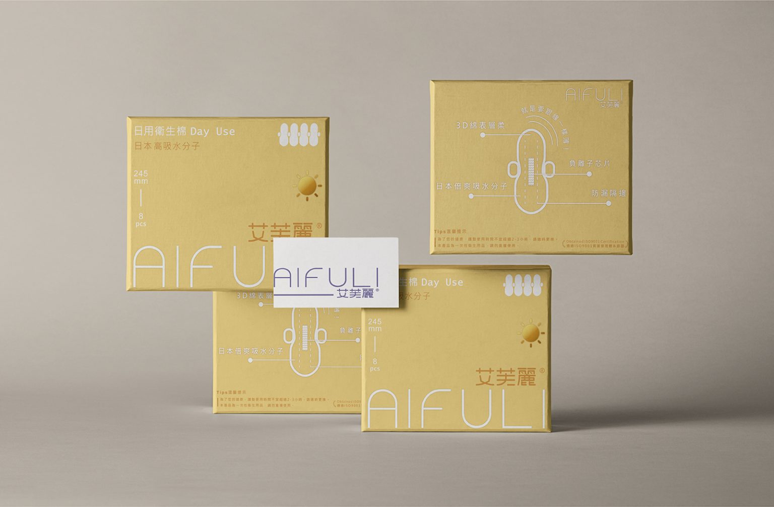

Problems & Insights
Through field research across department stores, drugstores, convenience stores, and a survey of 300 respondents, we identified key issues in the feminine care market:
Most sanitary napkin packaging relies on strong color contrasts and decorative visuals, creating overwhelming shelf impact and visual fatigue.
Many women feel self-conscious when purchasing sanitary products and prefer them to be discreet, often requiring additional bags to conceal the purchase.
While functionality is the primary purchase driver, consumers remain open to trying new brands.
During menstruation, physical and emotional sensitivity increases. Overly colorful or decorative packaging fails to empathize with this state, weakening trust in claimed benefits.
Survey results show clear preferences: 68% favor minimal design, 21% modern fashion, and only 3% prefer bold or decorative styles—indicating a strong demand for clean, inclusive aesthetics beyond gender stereotypes.
With 90% of the population being right-handed, we found that key product information on existing packaging is often blocked by the hand when picked up, reducing purchase intent by up to 45% at second glance.
Design Solution & Execution
In response, we adopted a reverse-thinking approach to reframe sanitary products as calm, discreet, and inclusive care items rather than overtly gendered necessities.
Minimal Visual Strategy
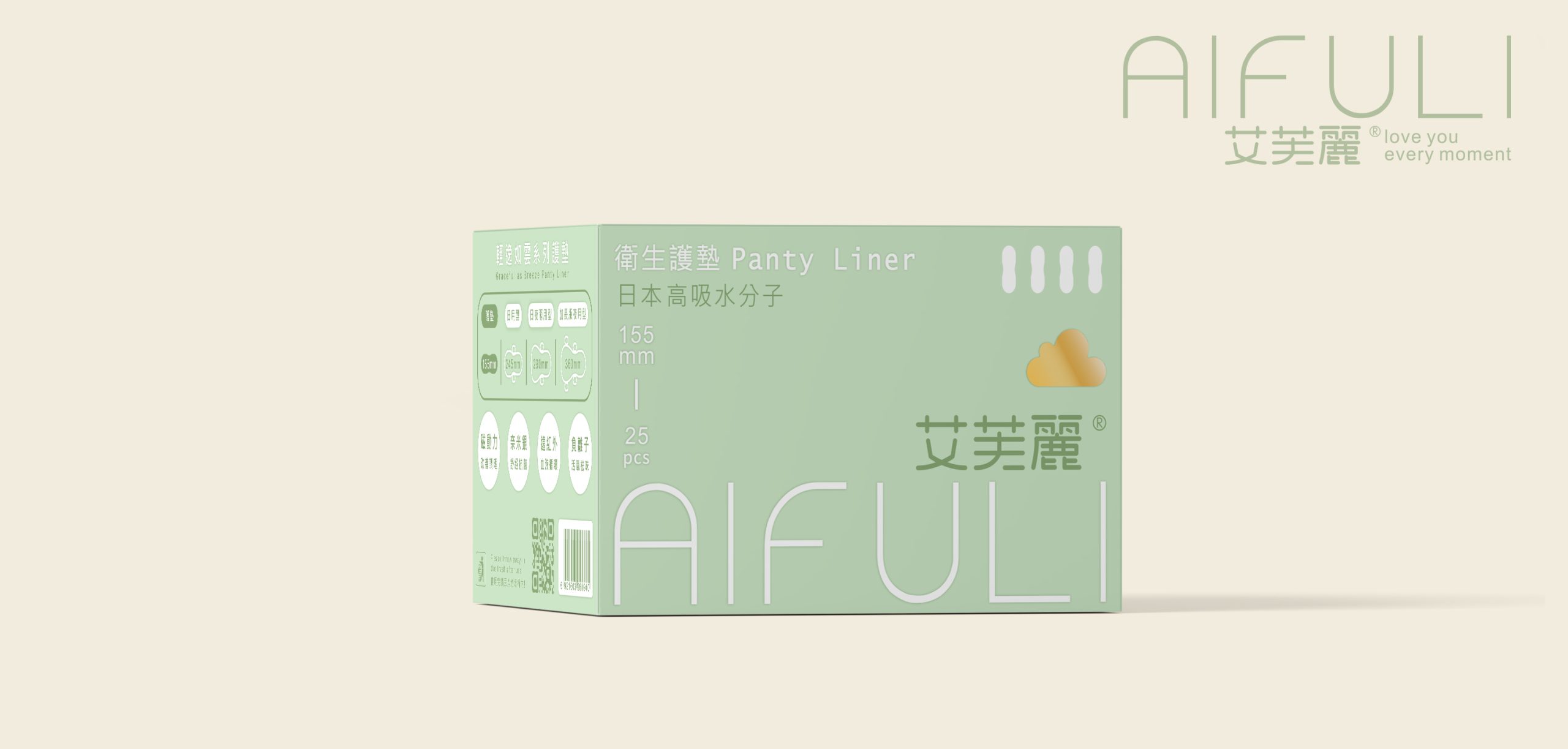
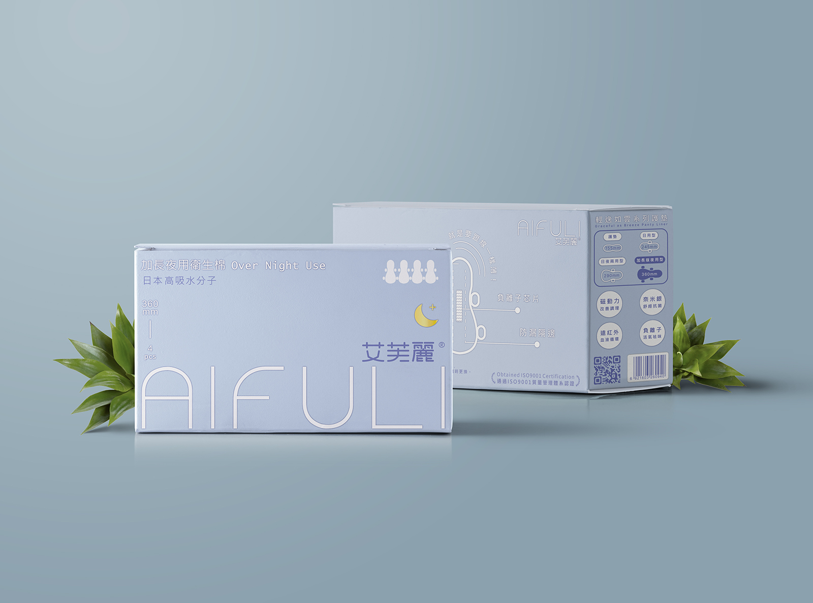
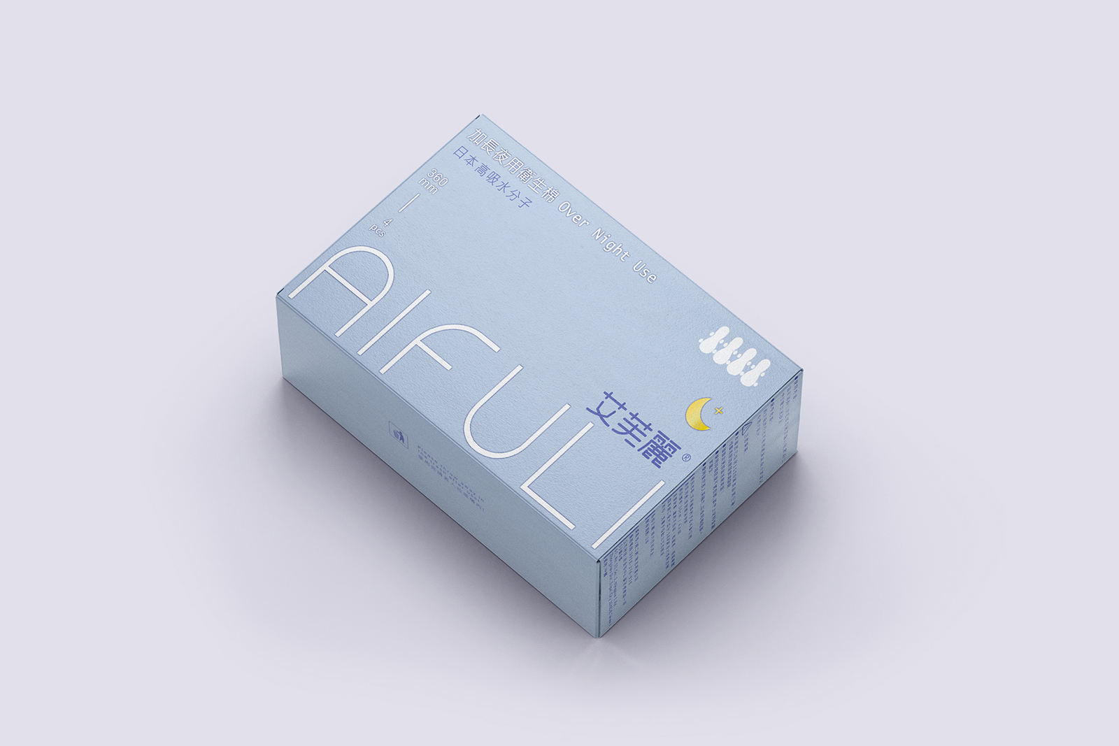
We replaced high-contrast visuals with a soft, minimal design system using restrained color palettes, icons, and structured layouts to differentiate product lines while reducing shelf noise.
Discreet & Gender-Inclusive Appearance
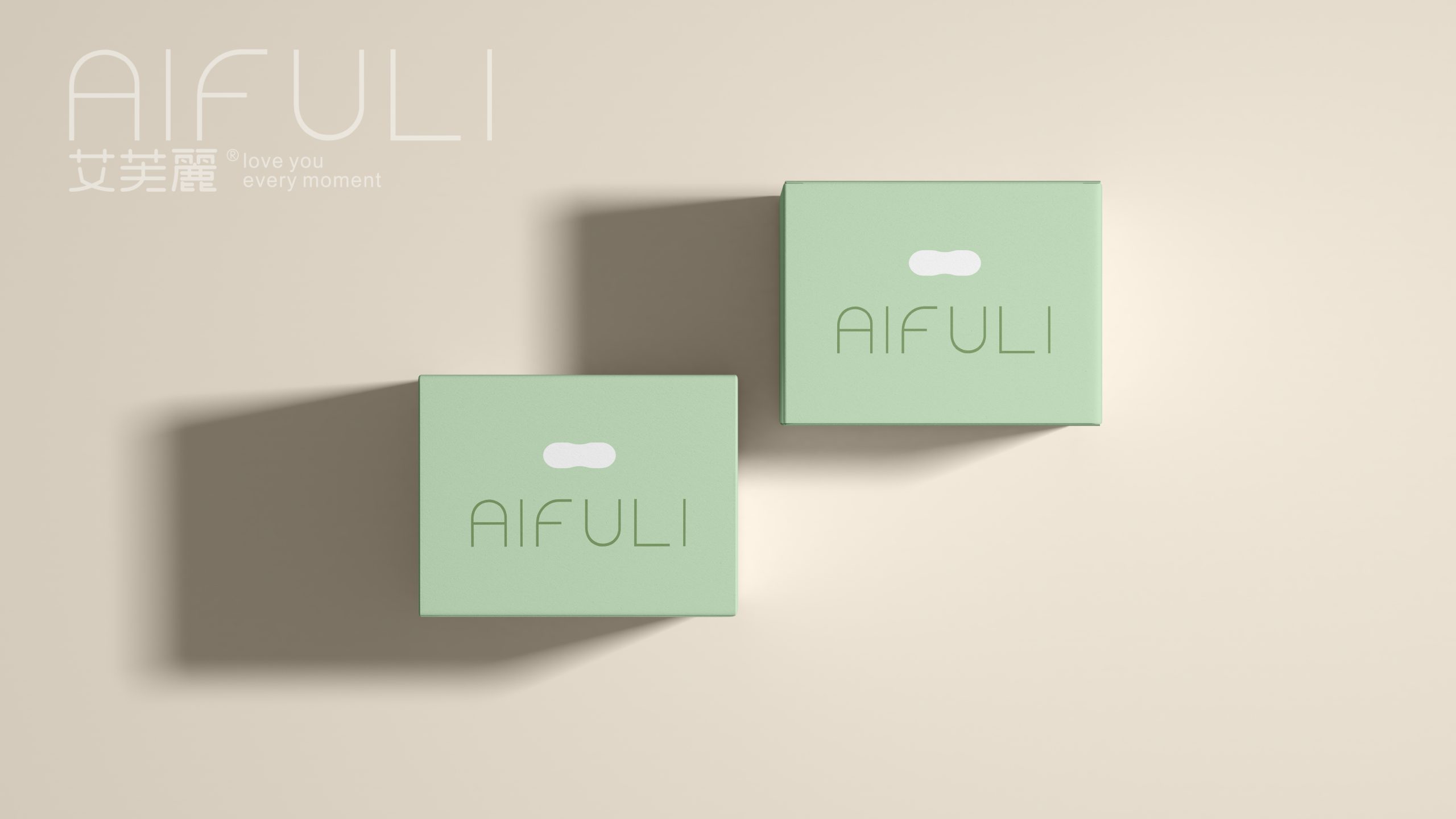
Abstract line-based silhouettes subtly reference the product form without literal depiction, elevating the packaging to resemble personal care or wellness products—reducing psychological pressure during purchase.
Emotionally Empathetic Color Design
Softer tones and balanced compositions were chosen to support emotional comfort, allowing consumers to intuitively connect with the product’s intended benefits.
Human-Centered Ergonomic Layout
Key features and series distinctions were repositioned to the left side of the package, ensuring immediate visibility when held in the right hand, improving clarity, usability, and purchase confidence.

 United Creatives Studio
 Kingdom & Sparrow
 Anastasia Bakhmatskaya
 CreativeWise
 Great and Golden
 Ximena Ureta Design Studio.
 Sorted Branding
 Lisa Sirbaugh Creative
 vitoramockup
 YQIAN
YQIAN Navegante
 Anastasia Cherepanova | xtramez
 Polaris Designs
 pavlyai
 Milena Kocharyan
 monther al omari
 Mohamed sherif midoo
 DESIGN CONCEPTS
 mmdesign
 markcreativestudio
 Rosario Lo Iacono