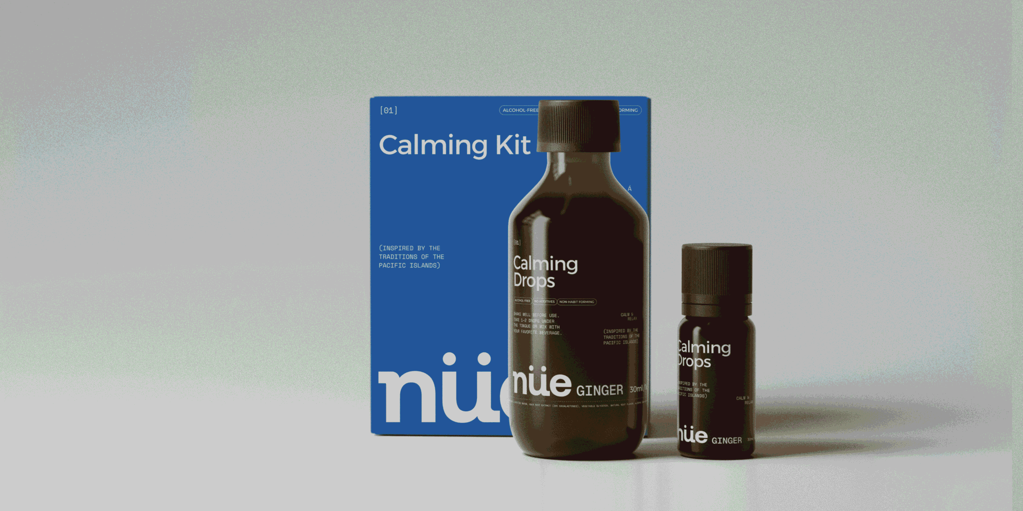

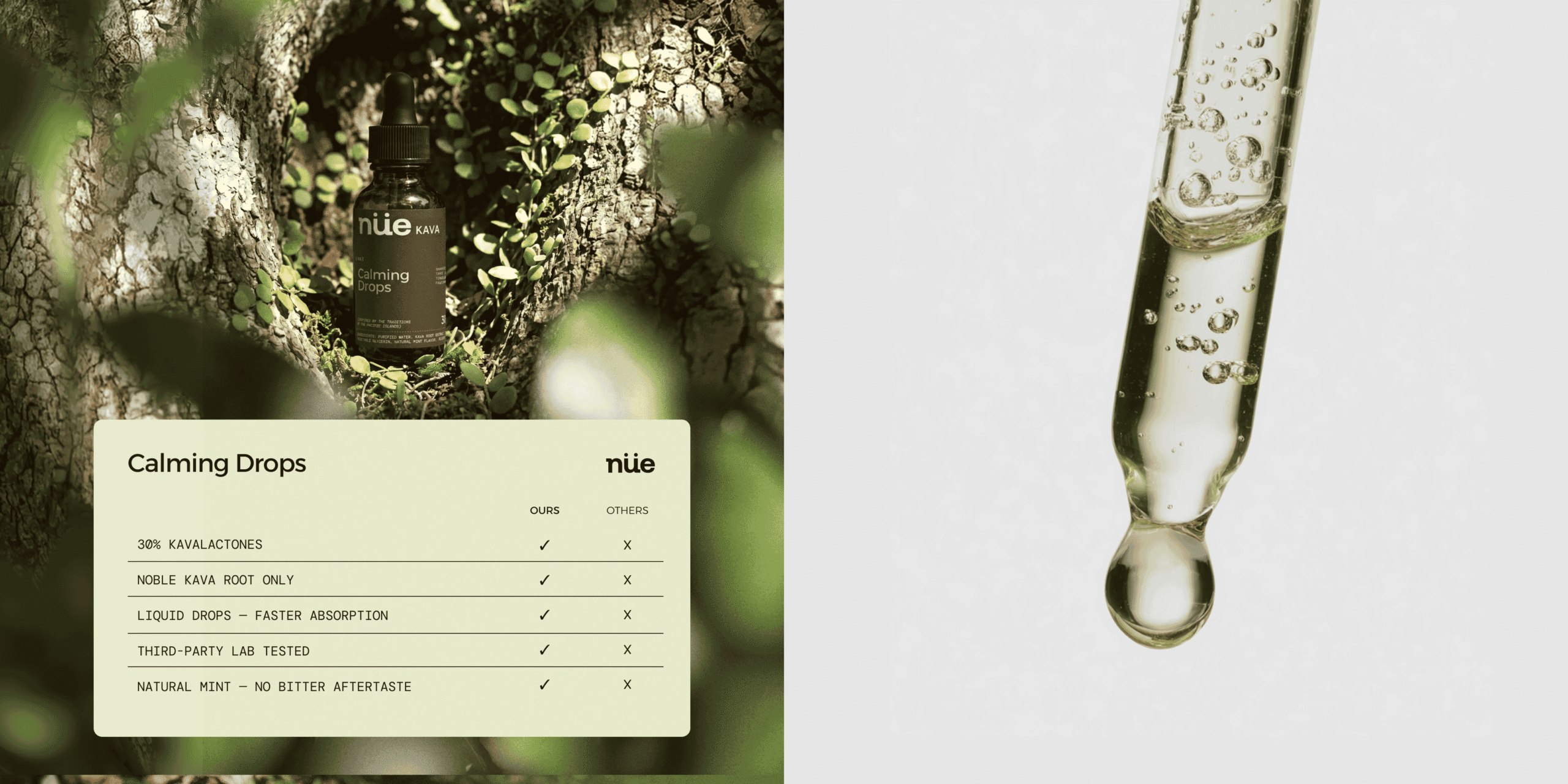
Nüe is a conceptual wellness brand created around the idea of making supplements feel simpler and more approachable. The range includes different formats and formulas, from calming drops and relaxation elixirs to powders and gummies, each designed around a specific everyday need.
We wanted the brand to feel trustworthy and considered, but not overly clinical. Wellness packaging often sits at one of two extremes: very pharmaceutical or very “natural.” With Nüe, we explored something in between.
The packaging started with a simple question: how can someone understand what a product is for almost immediately?
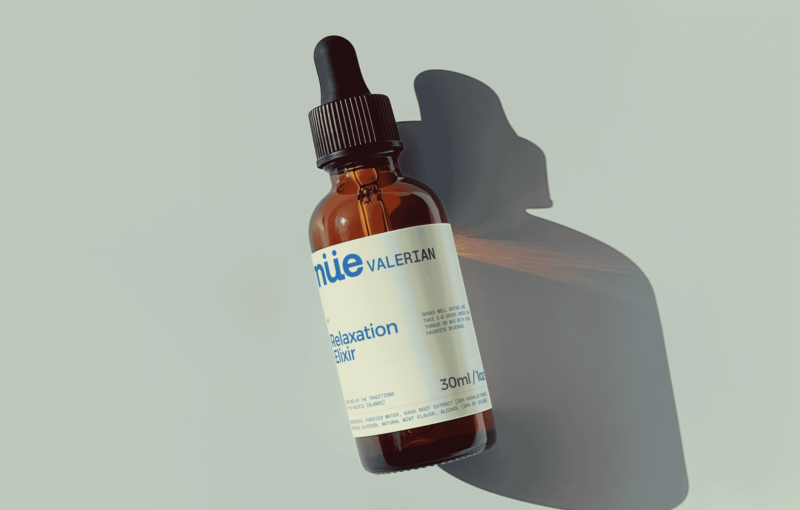
That led us to keep the front of pack intentionally straightforward. The product name and function come first, supported by a clear typographic hierarchy and plenty of breathing room. Blue became a key part of the identity, bringing energy to an otherwise restrained palette of whites, neutrals and amber glass.
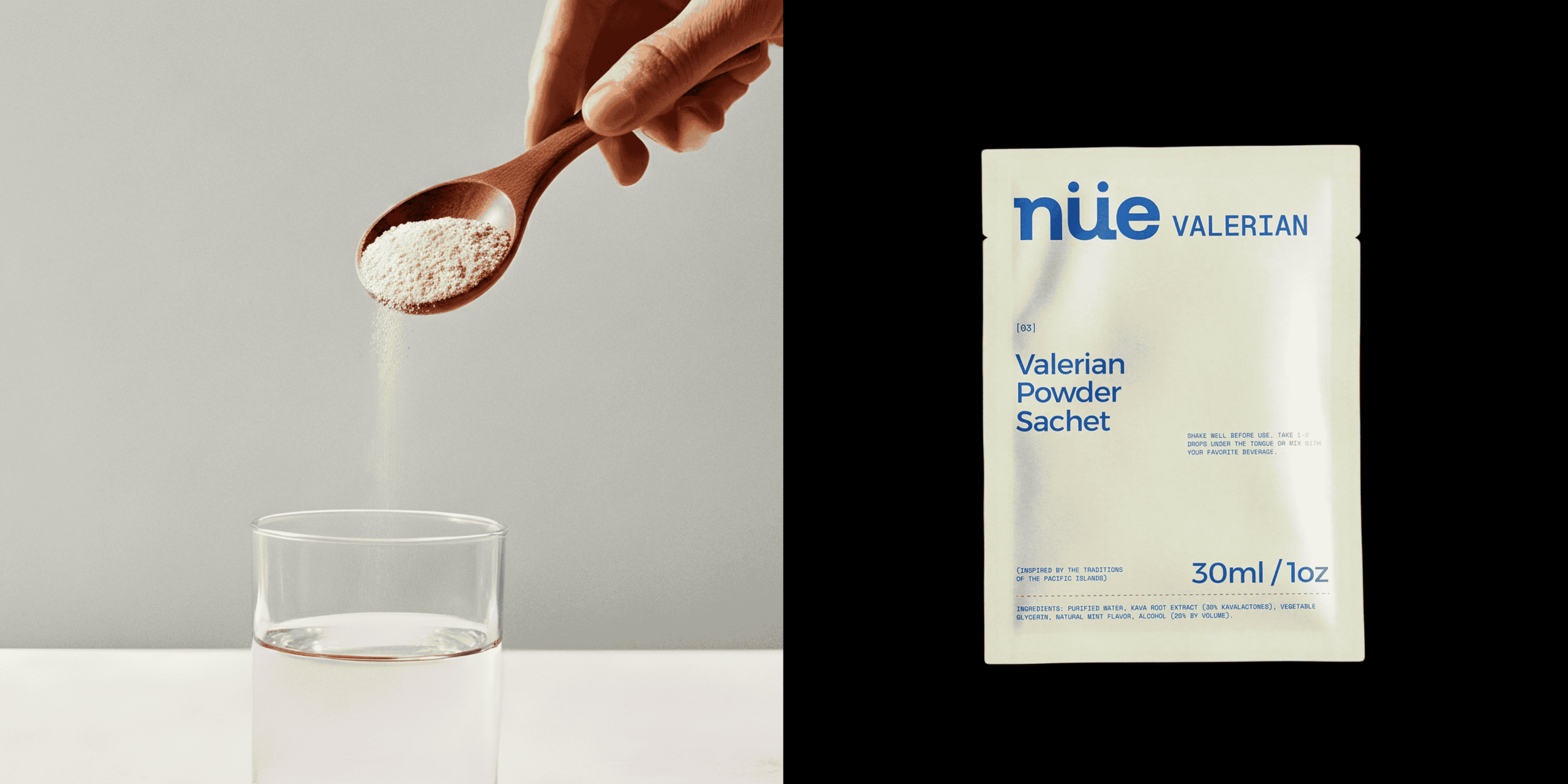
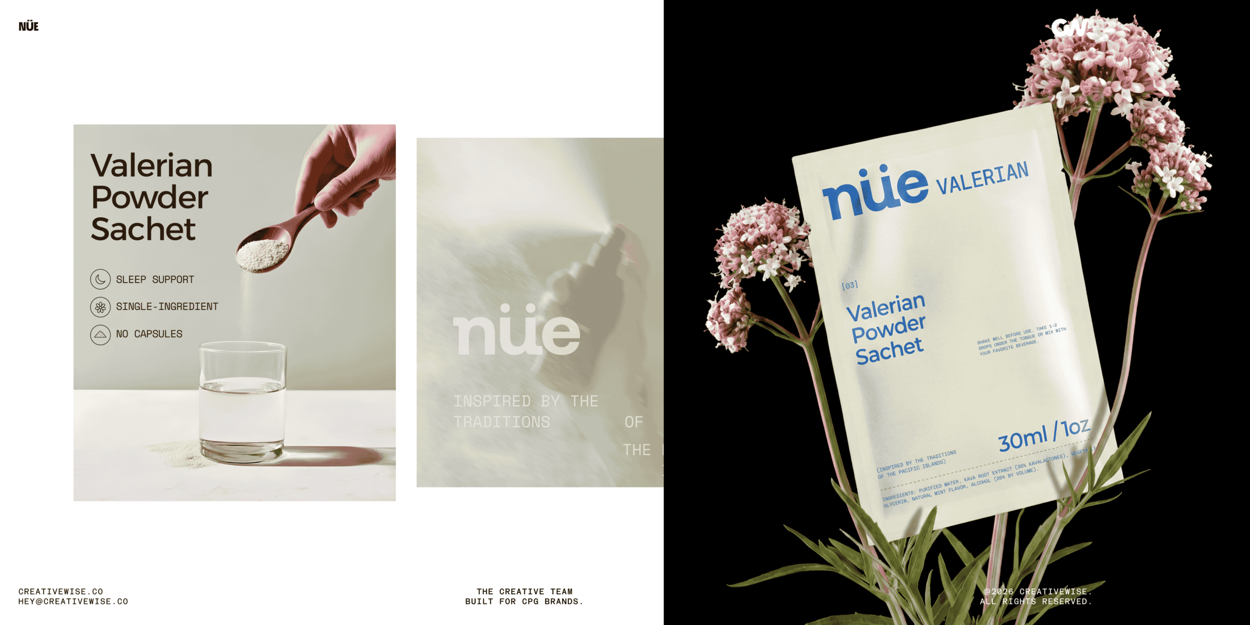
As the range grew, the challenge was making very different products still feel like they belonged together. A dropper bottle, a sachet and a gummy pouch needed to speak the same language without simply repeating the same layout.
Rather than creating one fixed template, we developed a flexible set of rules for the range. Typography, logo placement, information hierarchy and color create consistency, while each format has enough freedom to work on its own.
The amber bottles give the more botanical products a familiar, functional feel, while the brighter blue packaging helps other products stand out. Small details, such as the oversized product naming and simple ingredient references, make the system easy to recognize across the different SKUs.
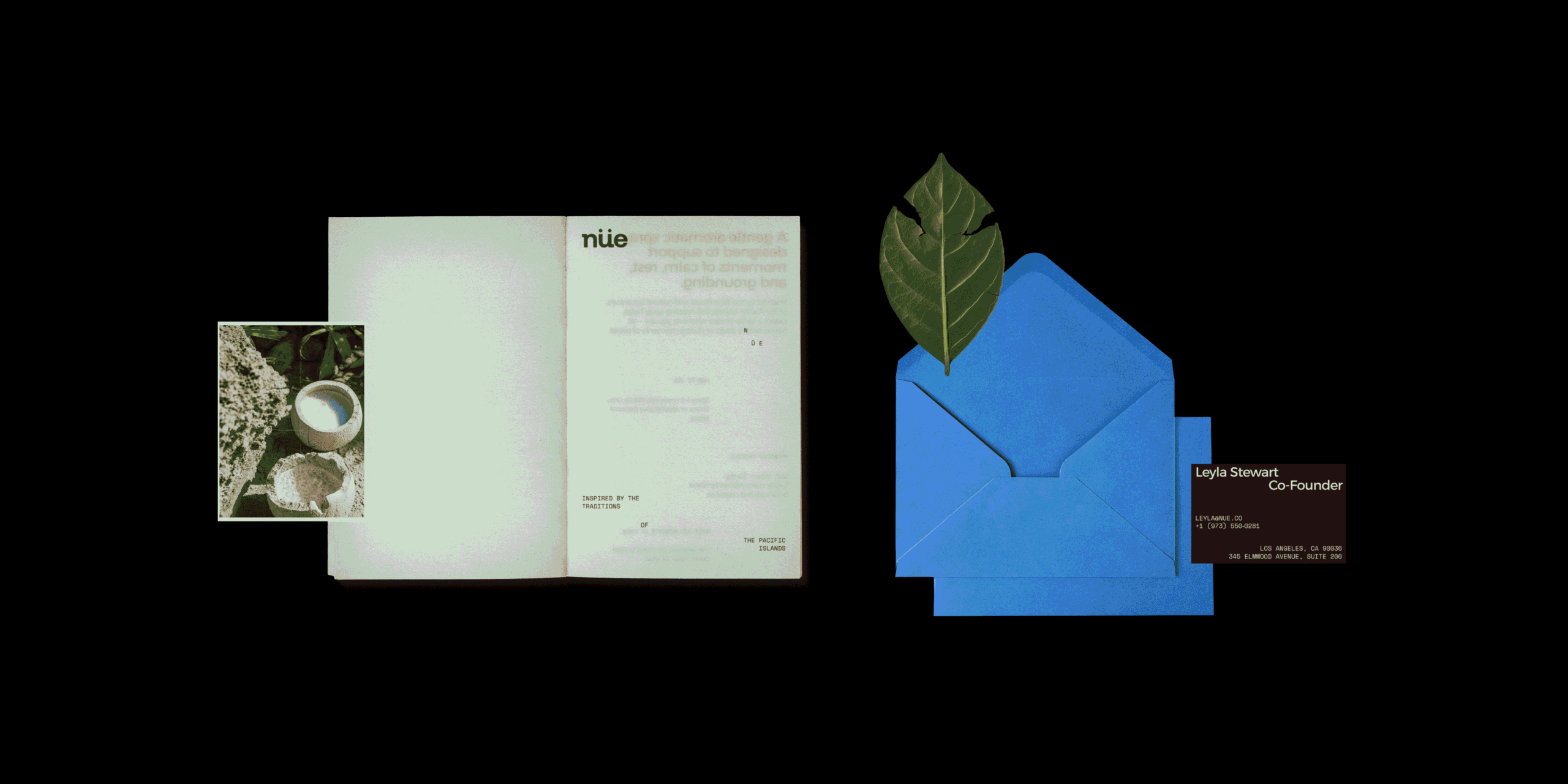
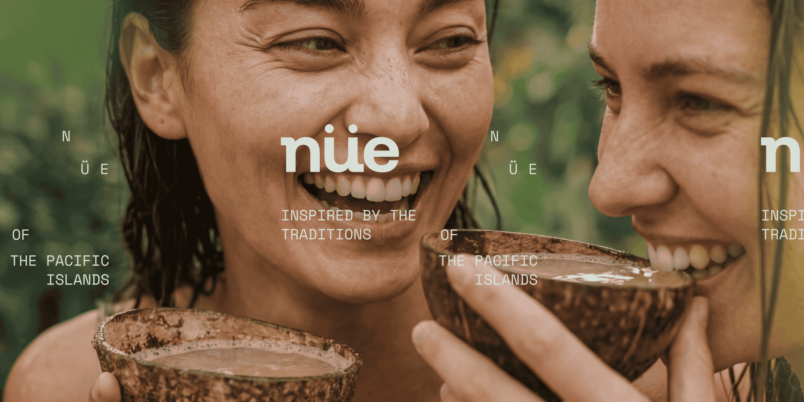
We also thought about how the packaging would live outside the shelf. The photography mixes clean product shots with ingredients, hands and everyday moments, making the brand feel more human and less like a traditional supplement company.
The project was built from the range out, rather than starting with a single hero product. We tested the identity across bottles, droppers, sachets, boxes and pouches early in the process to make sure it could stretch naturally.
The layouts are deliberately minimal, so small changes in scale, color and composition can do more of the work.
The final concept gives Nüe a recognizable packaging family without making every product look the same. It feels clean and functional, but still warm enough for a wellness brand.
Most importantly, the system leaves room to grow. New formulas and formats can be added without having to reinvent the identity each time.




 Studio Zak
 Ander Sanchez
 Atipus
 Widarto Impact
 hovski
 Ohmybrand
 Rauf Karaev
 Hooperstudio
 La Nube de Ideas
 Modern Theory
 Akim Melnik Design Studio
 preflightcreative
 Seyf El Haq Menouer
 Badraddine Attik
 Samriddhi Ravi
 Alessandro Ammaturo
 Amblr Studio
 vladlenalevit
 Sis Tsarukyan
 monther al omari
 alchimistestudioParis
 designsbysukaina
 About House of Ta
 Amjad Battal