The Jiudou brand is a wellness-focused health brand rooted in natural herbal principles and holistic nourishment.
Visually, the brand balances refined craftsmanship with the timeless spirit of traditional botanicals, reinterpreted through a clean, modern lens. This approach preserves the depth and authenticity of herbal culture while introducing a youthful, professional appeal—encouraging younger generations to embrace wellness earlier, and resonating equally with high-end and professional audiences.
The result is a brand expression that feels natural yet contemporary, premium yet approachable, delivering both distinctive functionality and enduring aesthetic value.
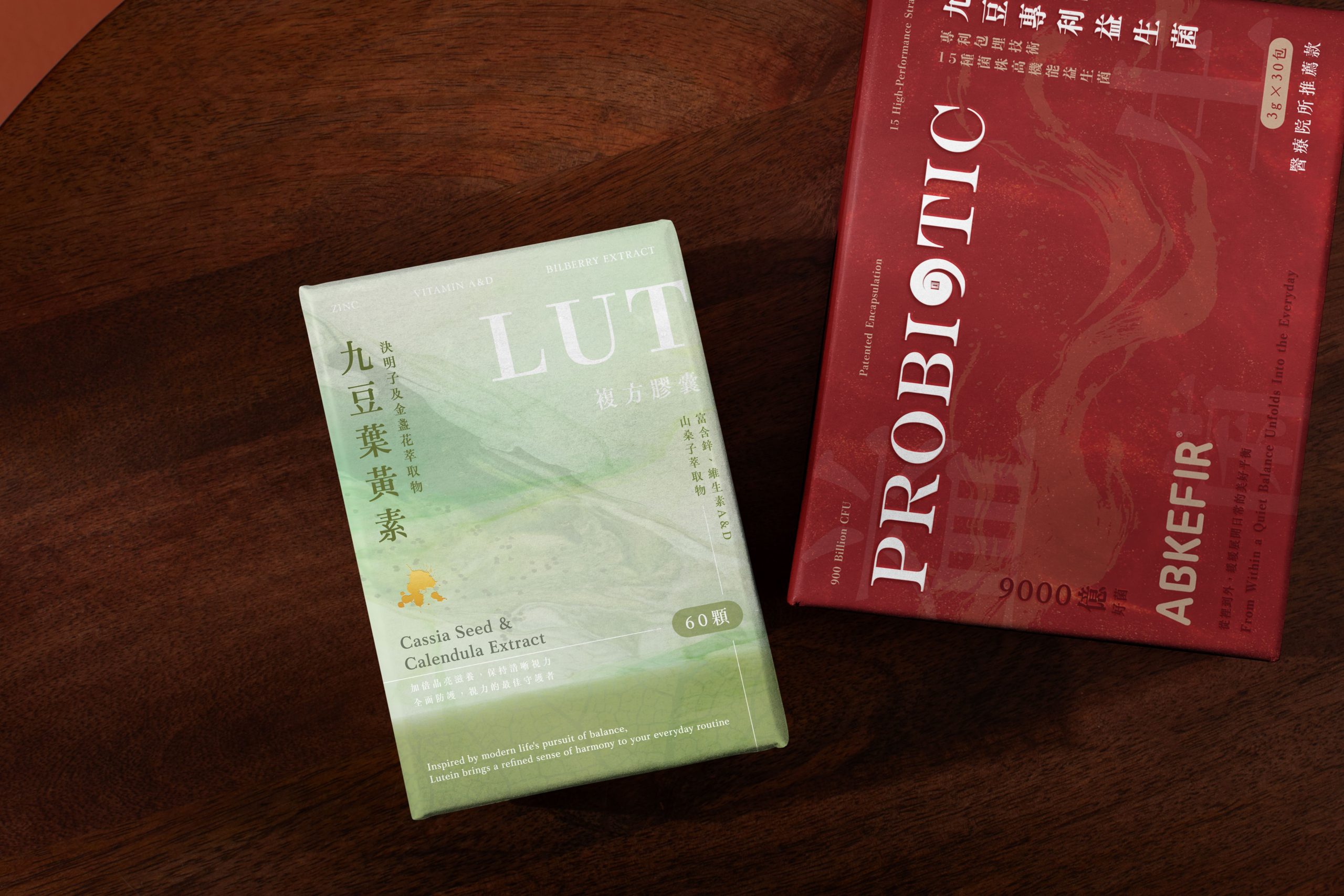
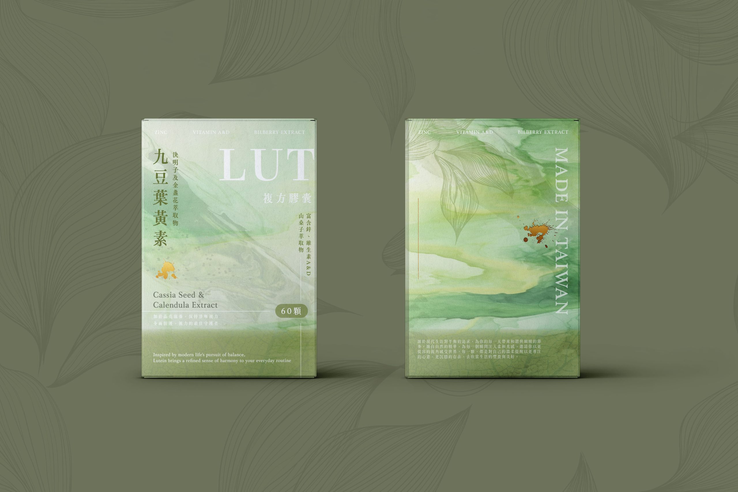
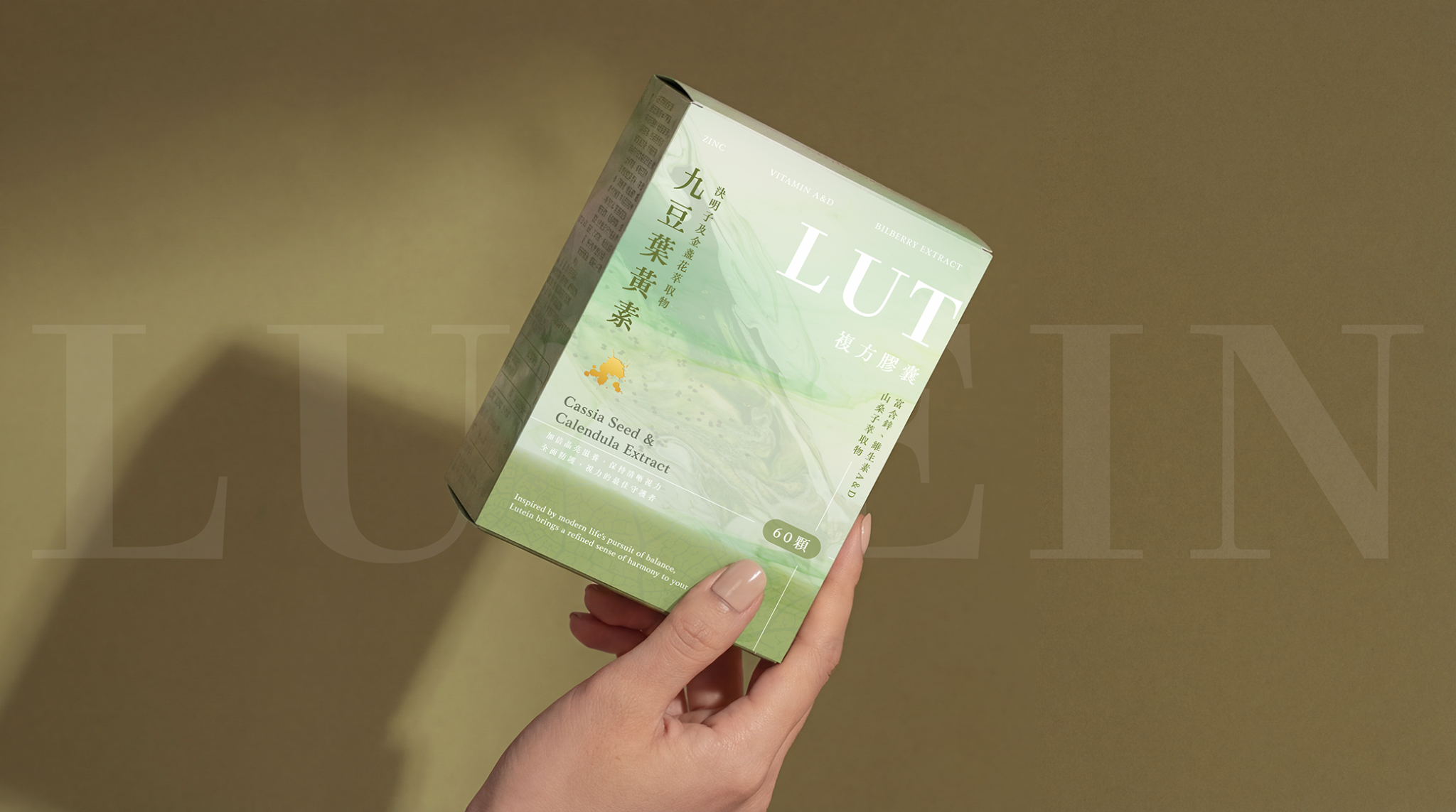
This Lutein product is conceptually rooted in the I Ching hexagram Yi (Mountain–Thunder Nourishment), symbolizing self-cultivation, balance, and herbal nourishment. Visually, it draws from the Five Elements philosophy, where the eyes correspond to “Wood,” represented by green—reflecting how vision absorbs light like a living tree, perceiving the world while mirroring internal harmony.
1. Chromatic Layers: The Rhythm of Gradual Wellness
The background features a soft gradient dye, shifting from light to deep tones—evoking health unfolding progressively within the body, and qi flowing between nature and the human form. This layered effect balances organic warmth with scientific clarity, like the body breathing in sync with the universe.
2. Cross-Panel Typography: A Timeline of Care
The word LUTEIN spans across two panels horizontally, symbolizing protection across past, present, and future. Gold-foiled ink splashes accent the typography, with gold representing clarity and crystallization—elevating lutein’s visual significance with a refined, premium tone.
3. Subtle Narratives: Veins, Botanicals, and Hidden Text
Leaf vein lines and faintly revealed Chinese characters for “lutein” echo traces found in nature. These understated details reference herbal nourishment and quietly reinforce the product name, creating depth that reveals itself over time.
4. Ergonomics Meets Information
Side panels follow natural hand-grip ergonomics, presenting key ingredients through intuitive icons. This ensures clarity, trust, and professionalism—where aesthetic elegance and functional communication coexist.
5. Visual Climax on the Back Panel
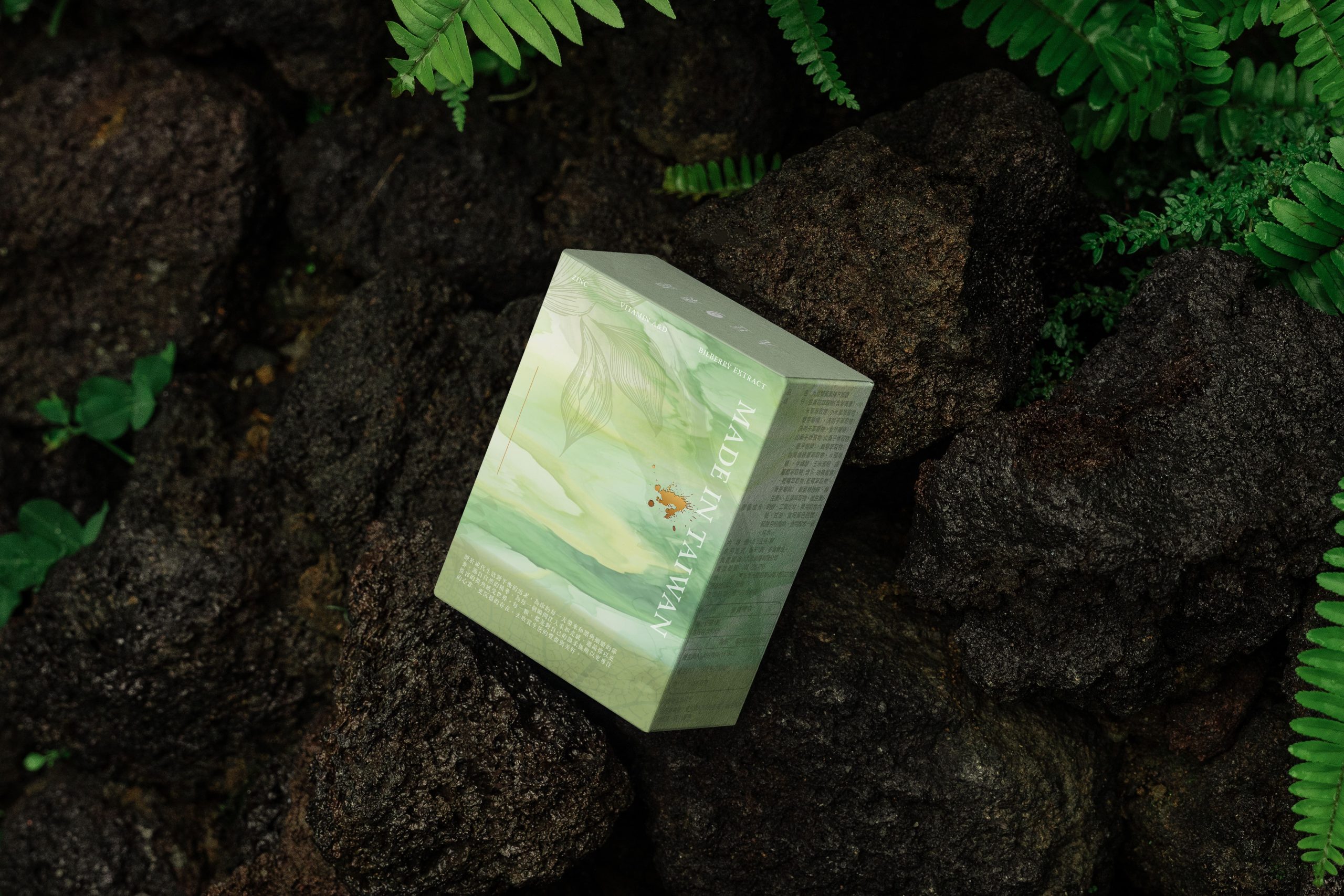
The reverse side combines deep ink textures, leaf veins, gold foil, and MADE IN TAIWAN to create an emotional high point—symbolizing a moment of refocus between the eyes and the world. It represents transformation, vitality, and the culmination of Jiudou Chaifang’s herbal philosophy.
Overall Tone
This packaging unites:
Natural gentleness × New-Chinese order × Youthful perception × Herbal strength.
Through wood-toned palettes, layered dyes, leaf structures, gold detailing, and airy composition, it transforms the idea of “the eyes as windows to the soul” into a tangible visual language.
Lutein becomes not merely a supplement, but a daily ritual of visual renewal—where wellness is seen, felt, and trusted.