

A new identity for Vinya Llarga, Maria Rigol Ordi’s first wine after years devoted to cava.
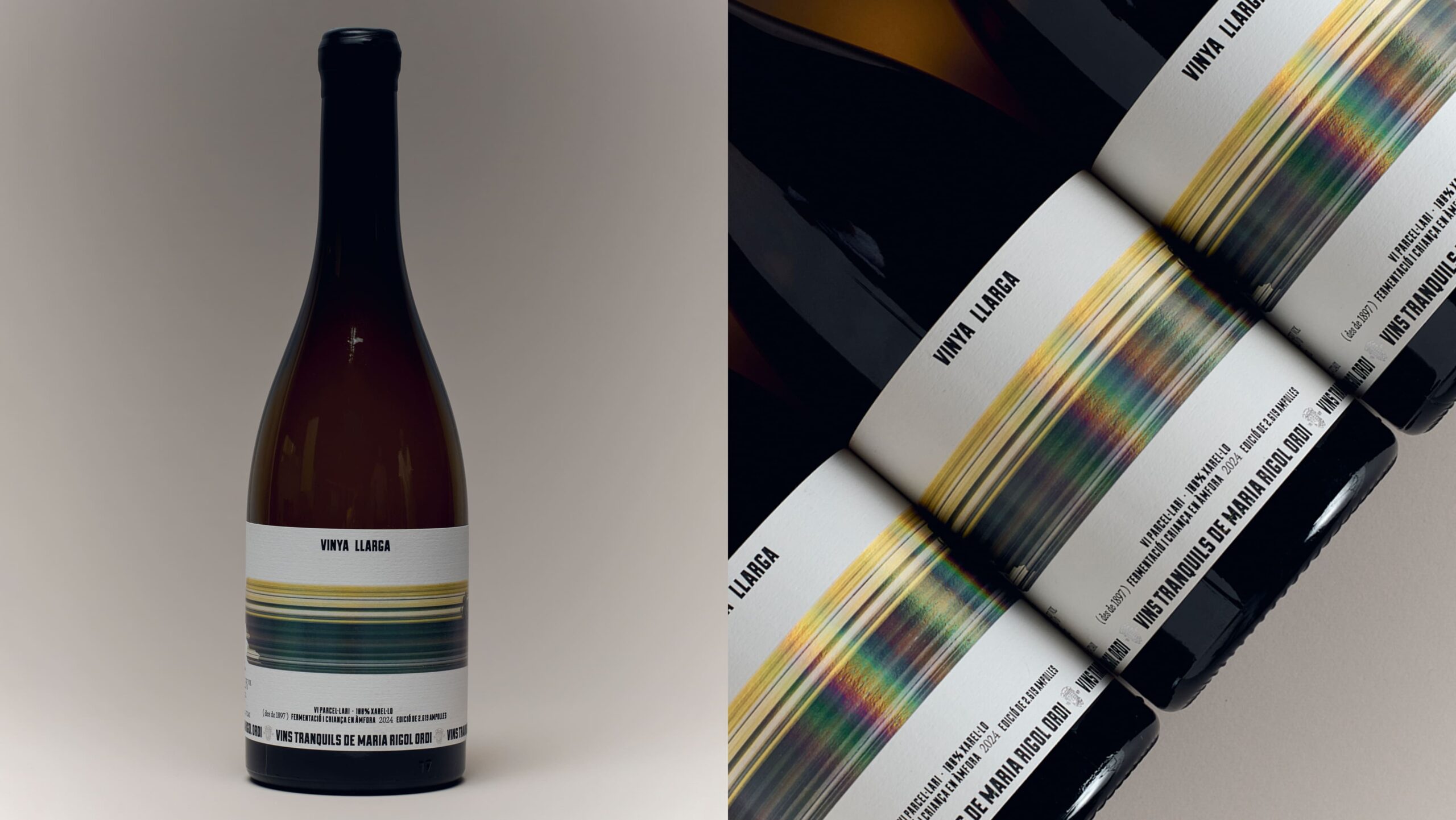
We took the name as our starting point, letting it stretch across the bottle and turn the label into its main character. Bold color and a wax-sealed capsule bring a playful edge to a wine rooted in tradition.
Photos by Marc G. Camps
Curator’s Insight
Stretching a wordmark until it becomes the label’s main visual event is a specific typographic bet, and it works because the letterforms stay legible under distortion rather than collapsing into pure pattern. That restraint matters. A lot of identity work treats extreme type-stretching as decoration, here it functions as the primary brand asset, doing the job that an illustration or icon usually carries on a wine label.
The horizontal banded illustration underneath is the more technically interesting choice. It reads first as a scan line or signal glitch, then resolves into a vine form as your eye moves right. That sequencing mirrors how the wine itself is positioned on the back label as a parcel-specific bottling, so the artwork is not just texture, it is a visual translation of terrain into signal, land data rendered as an interrupted image rather than a literal illustration of vines or hills.
Pairing that flat, screen-like graphic language with a wax-dipped capsule is a deliberate register clash. Wax finishing usually signals heritage and hand-craft, glitch imagery usually signals something more contemporary or digital. Putting both on the same bottle lets the label carry two claims at once, a producer with history since 1897, and a first release into still wine that wants to look forward rather than lean on legacy cues alone.


 Derrick Lin
 Biaa
Biaa Petitmoulin Studio
 White Bear Studio
 Eva Chistyakova
 monther al omari
 alchimistestudioParis
 oneandother
 bloomburo
 helocrene
 Shapers Studio
 Denver Design
 Aidearte
 andrew.huerta
 softmachine
 airobtq
 Buzz & Co.
 Ruby
Ruby themythographer
 IDNB Inc.
 viktorflr
 Zenpack
 Wessam Hussien