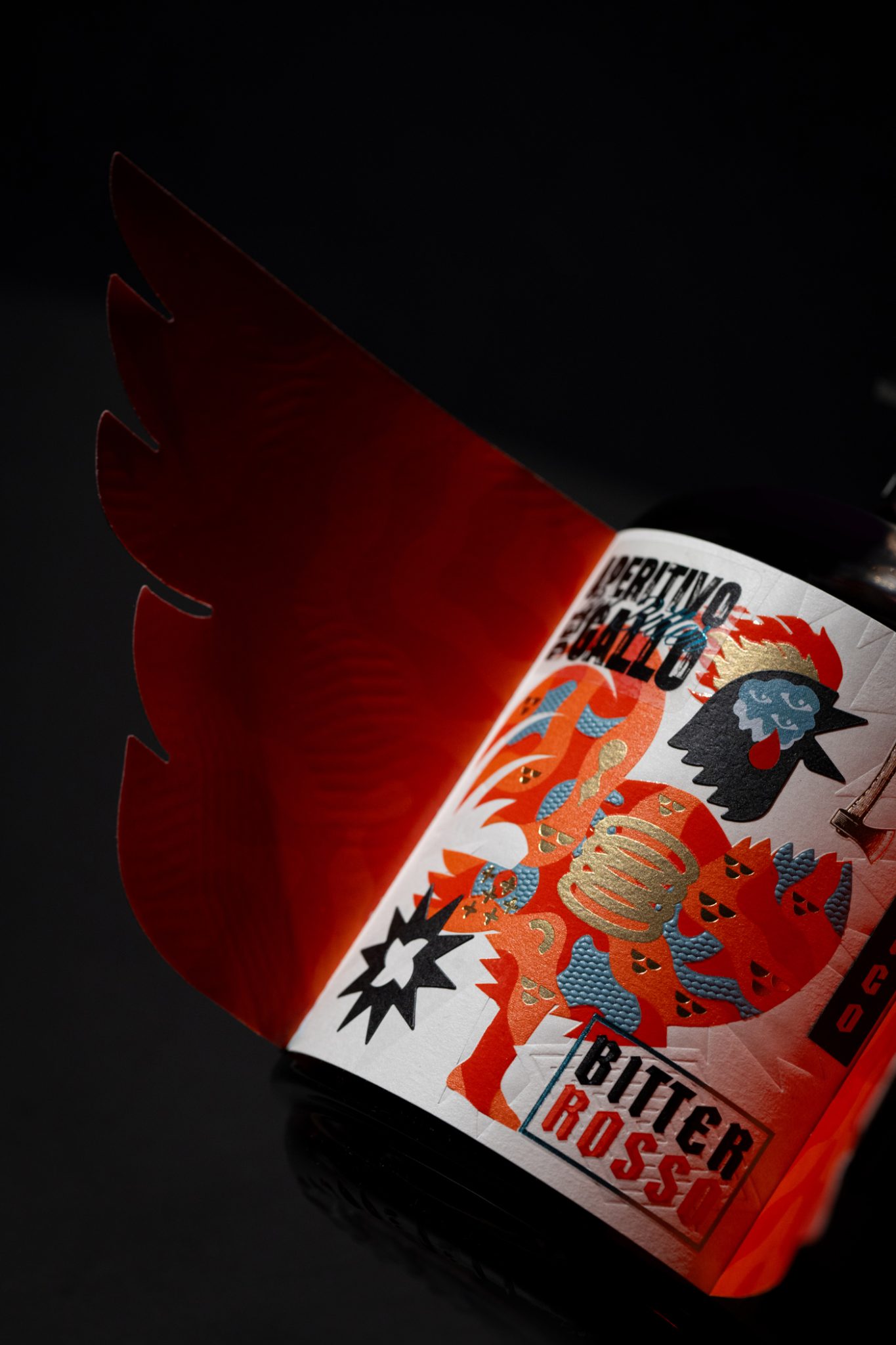

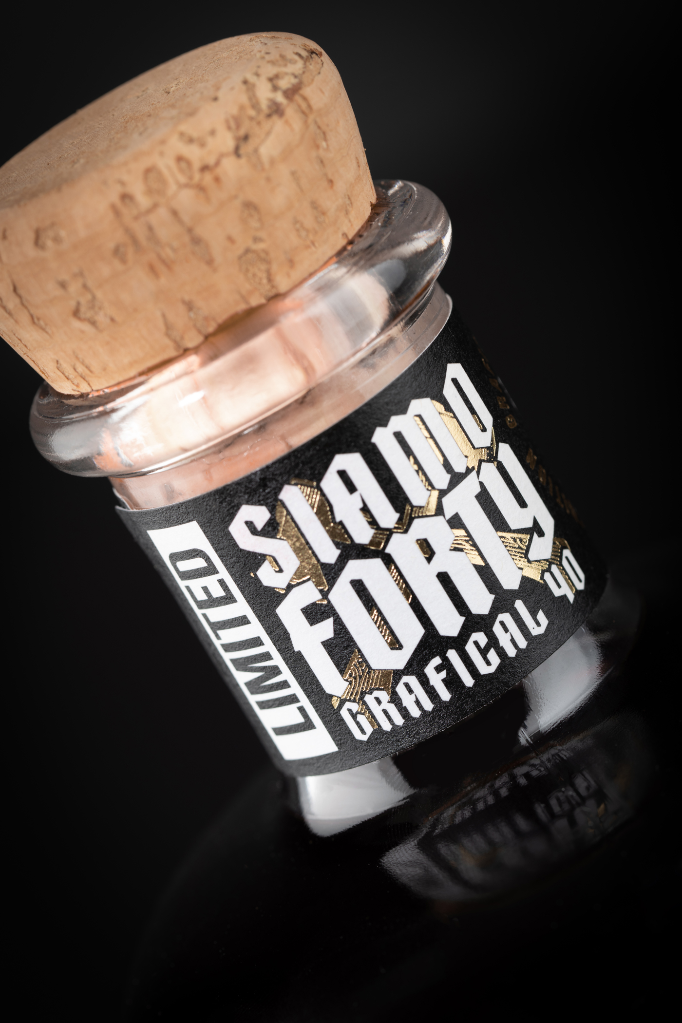
This week’s Curator’s Insight explores the 40th Anniversary label design of Aperitivo del Gallo, crafted by Dario Frattaruolo.
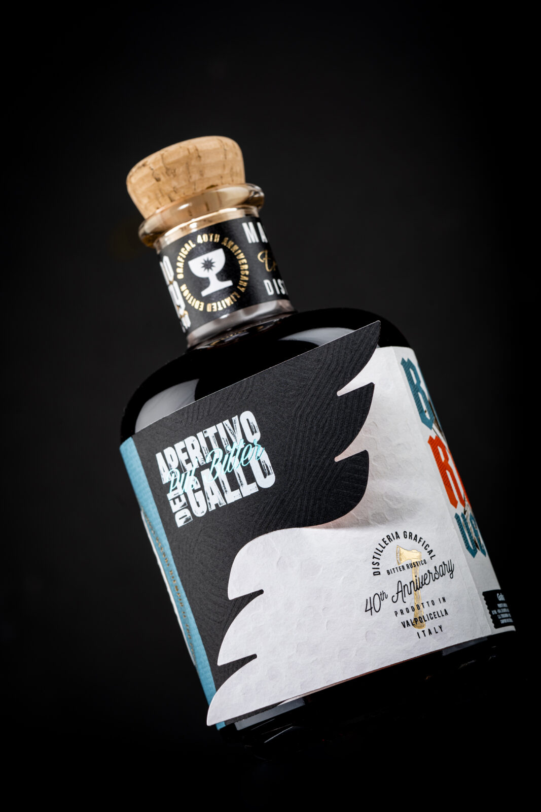
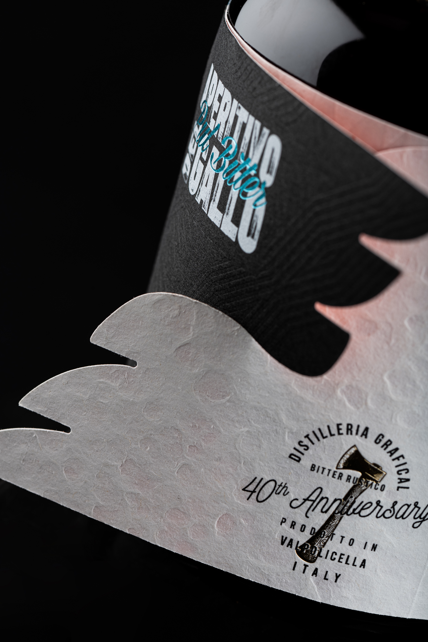
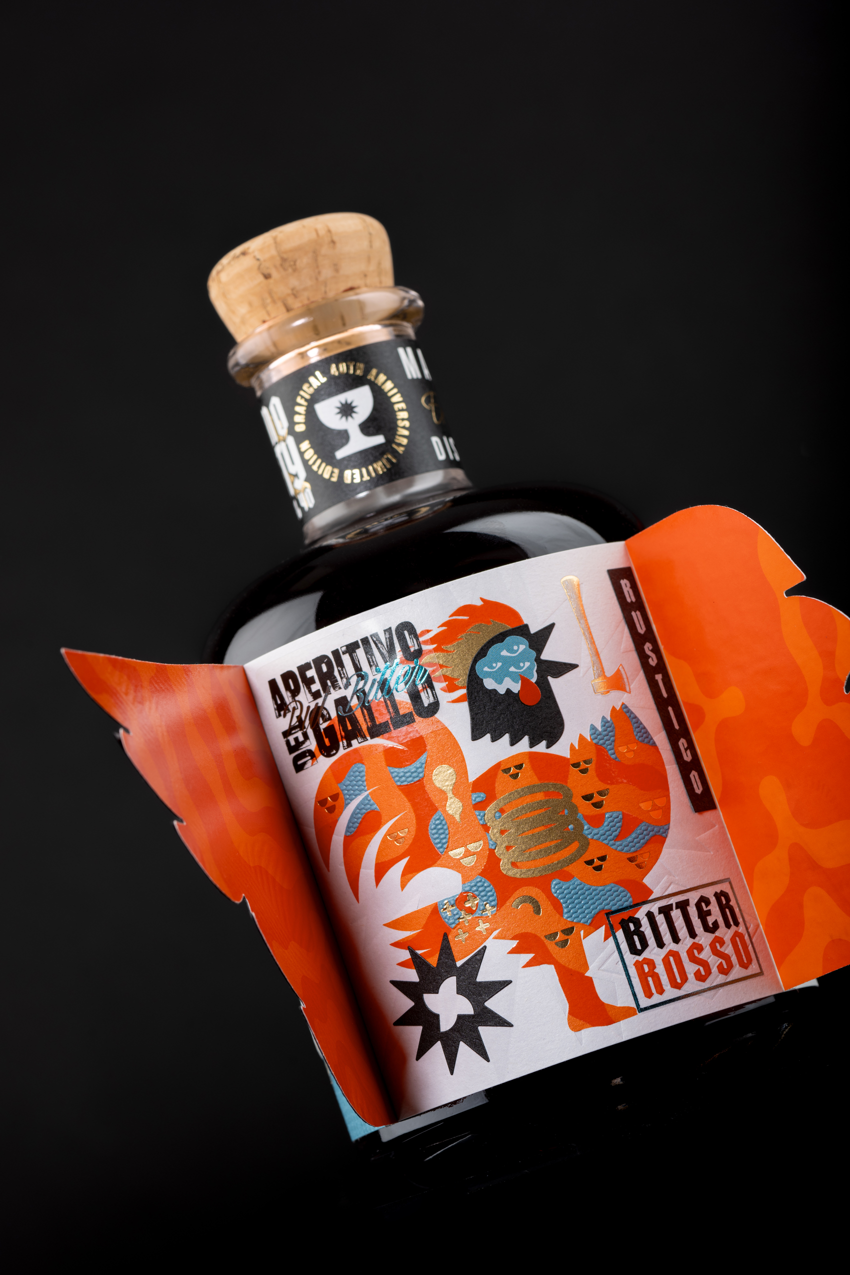
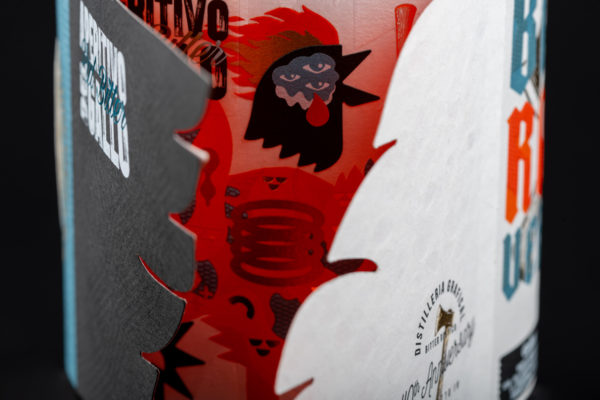
This bitter rosso packaging stands out through its structural approach, treating the label as an interactive component rather than a static surface. The lateral flaps extend beyond traditional label boundaries, creating a layered composition that changes depending on how the bottle is handled. This introduces a sense of movement and variability, allowing the visual identity to shift with user interaction.
The illustration adopts a bold, graphic style with simplified shapes and fragmented forms. The rooster motif is rendered in a deconstructed manner, giving it a sense of rhythm and visual energy. Despite its playful appearance, the composition maintains control through careful balance and alignment, preventing it from feeling chaotic.
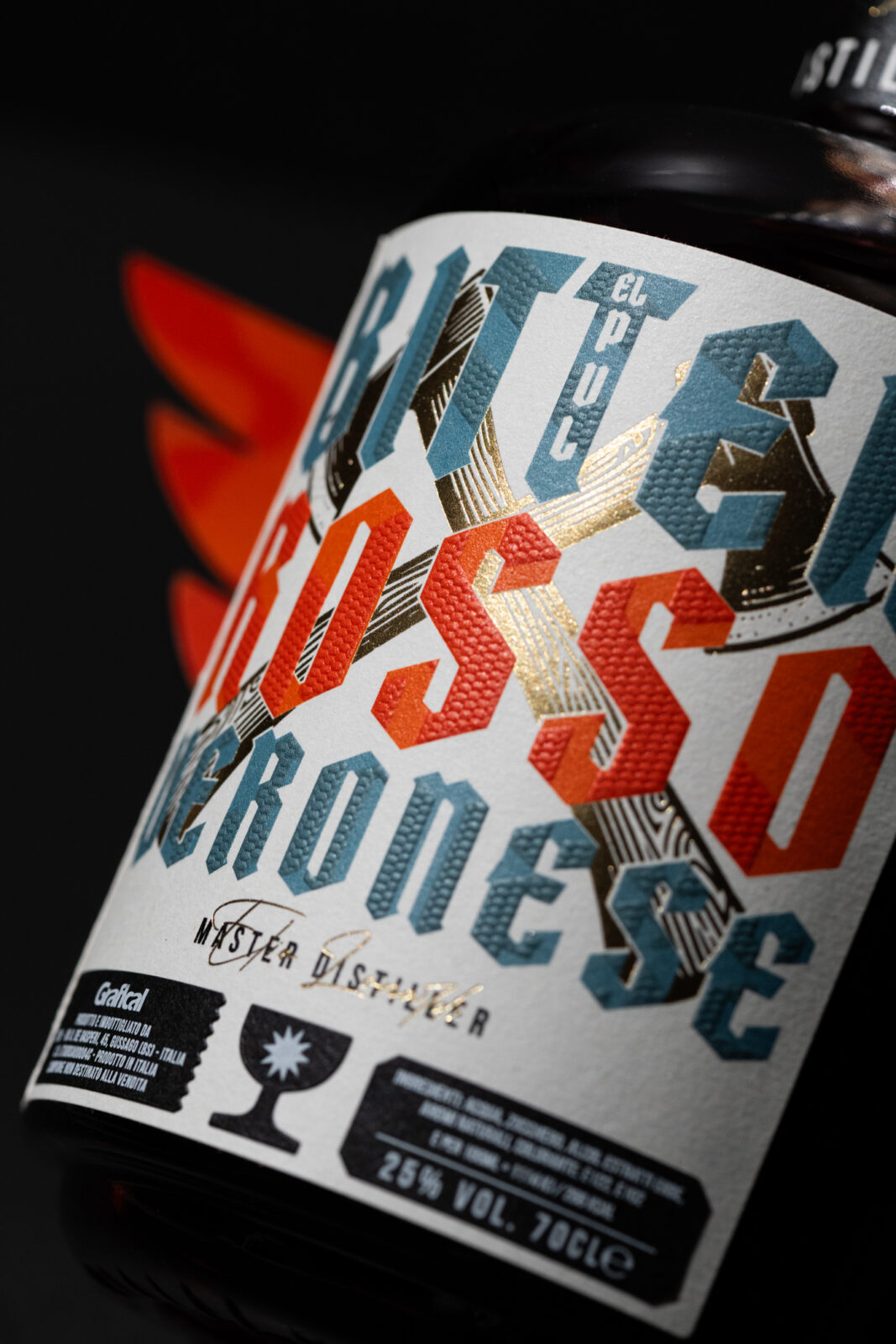
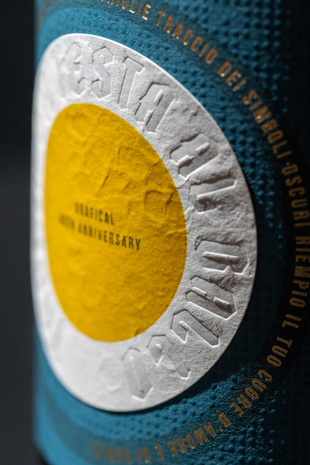
Color plays a central role in shelf impact. The strong orange contrasts sharply with the dark bottle, ensuring high visibility. Accents of blue and metallic tones add depth and hierarchy, guiding the viewer’s attention across the label. The contrast between matte and reflective elements further enhances the tactile and visual experience.
Typography is integrated as part of the overall composition rather than treated as a separate layer. The varied orientations and placements contribute to the dynamic feel of the design while maintaining legibility.
 Affogato Brand Design
 Backbar Studios
 hello ocean
 POSH FMCG BRANDING
 Luciana
 Valérie Colace
 marjusguza
 Z9BKAdsgn
 Lilith Sivolenko
 Daria Levina
 Masha Kulichkova
 monther al omari
 Yana Chernova
 Atiq Alam
 ezgidesignstudio
 Pips Marin
 Antonia Skaraki
 Ezi Brand Design
 Kanishka Chhajer
 Zachary Kent
 SOT B&D
 Normal studio
 Garry Veda