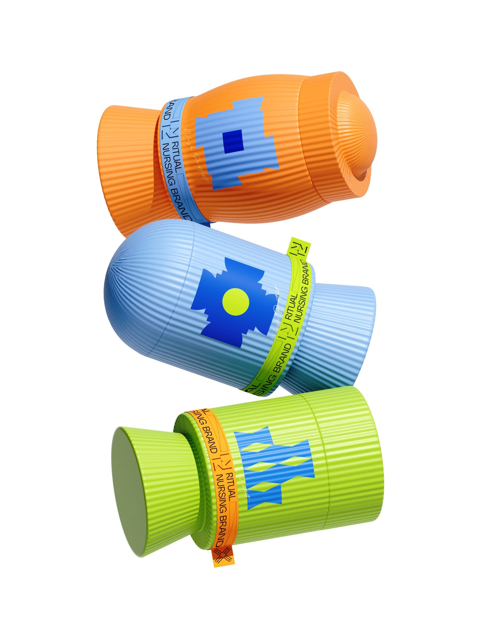

In this Curator’s Insight, we take a look at The LIMM Botanical Fragrance Set designed by Hellocean.
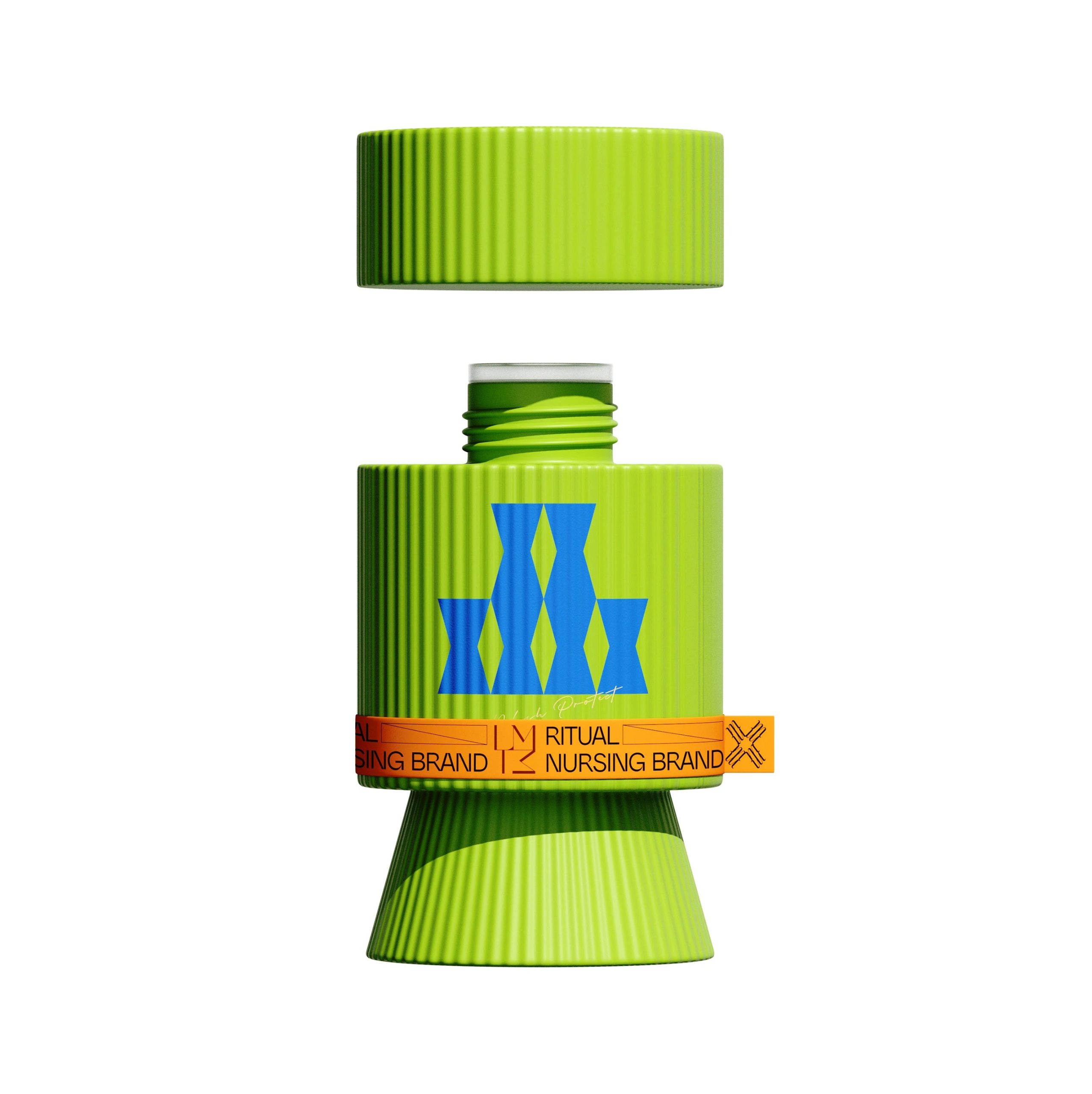
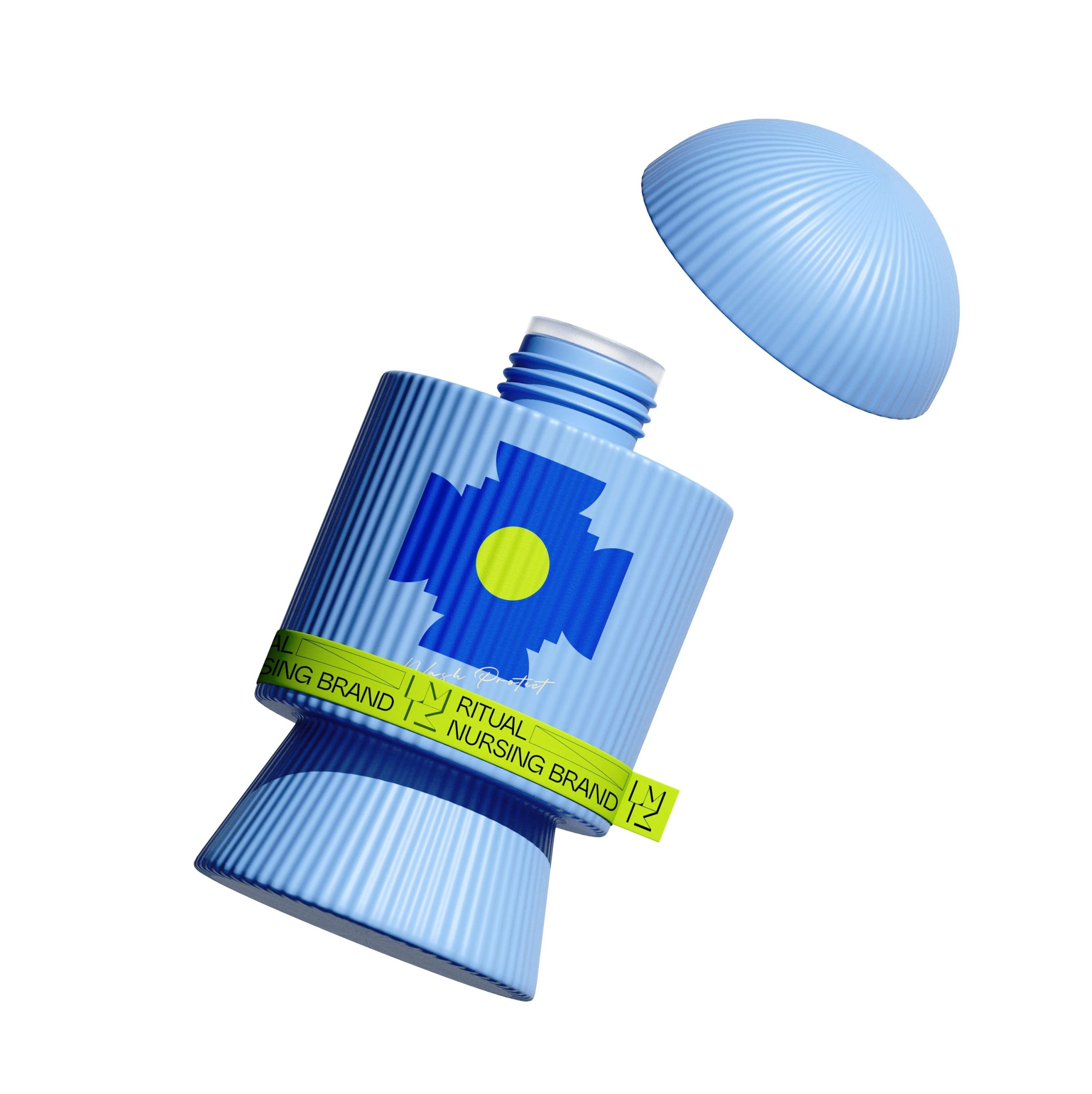
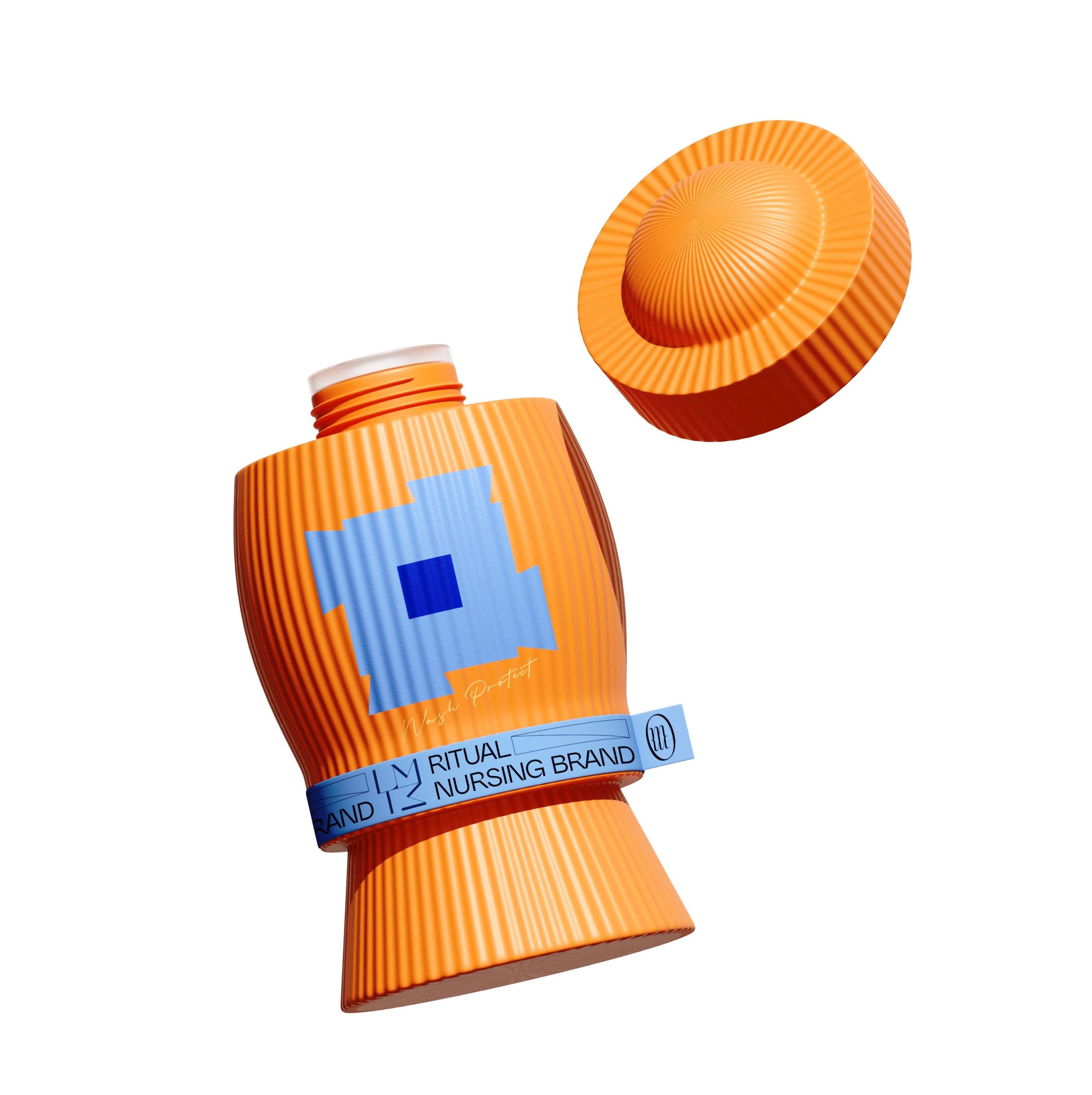
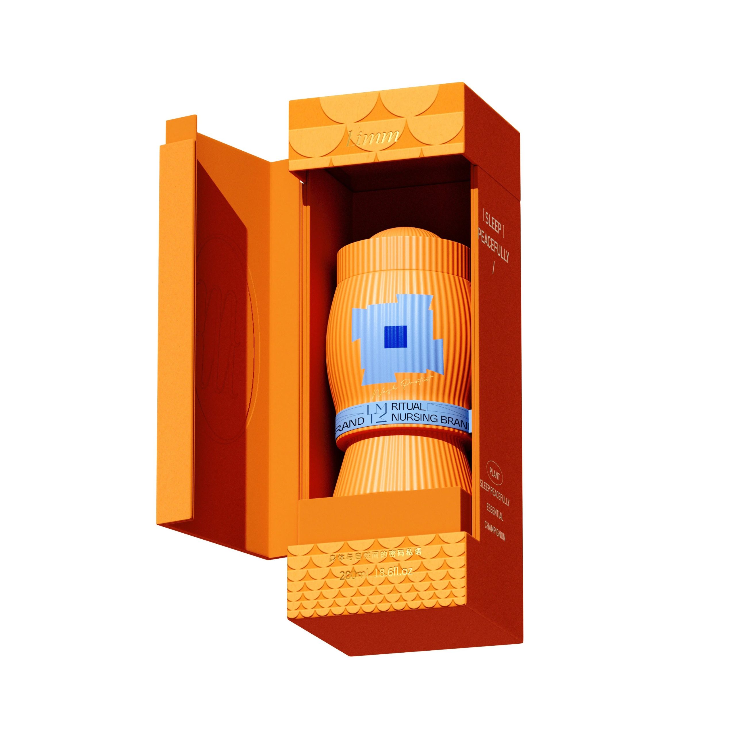
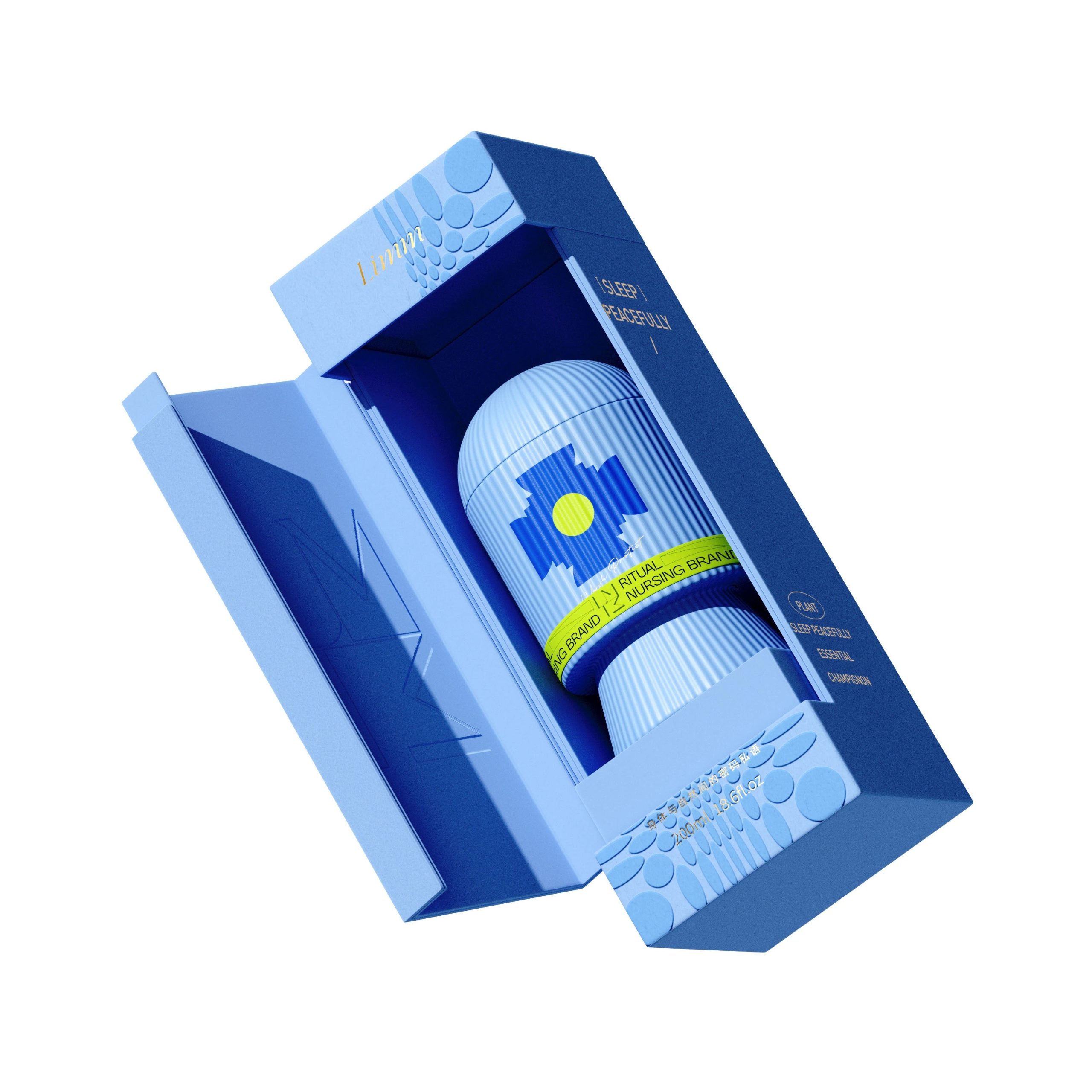
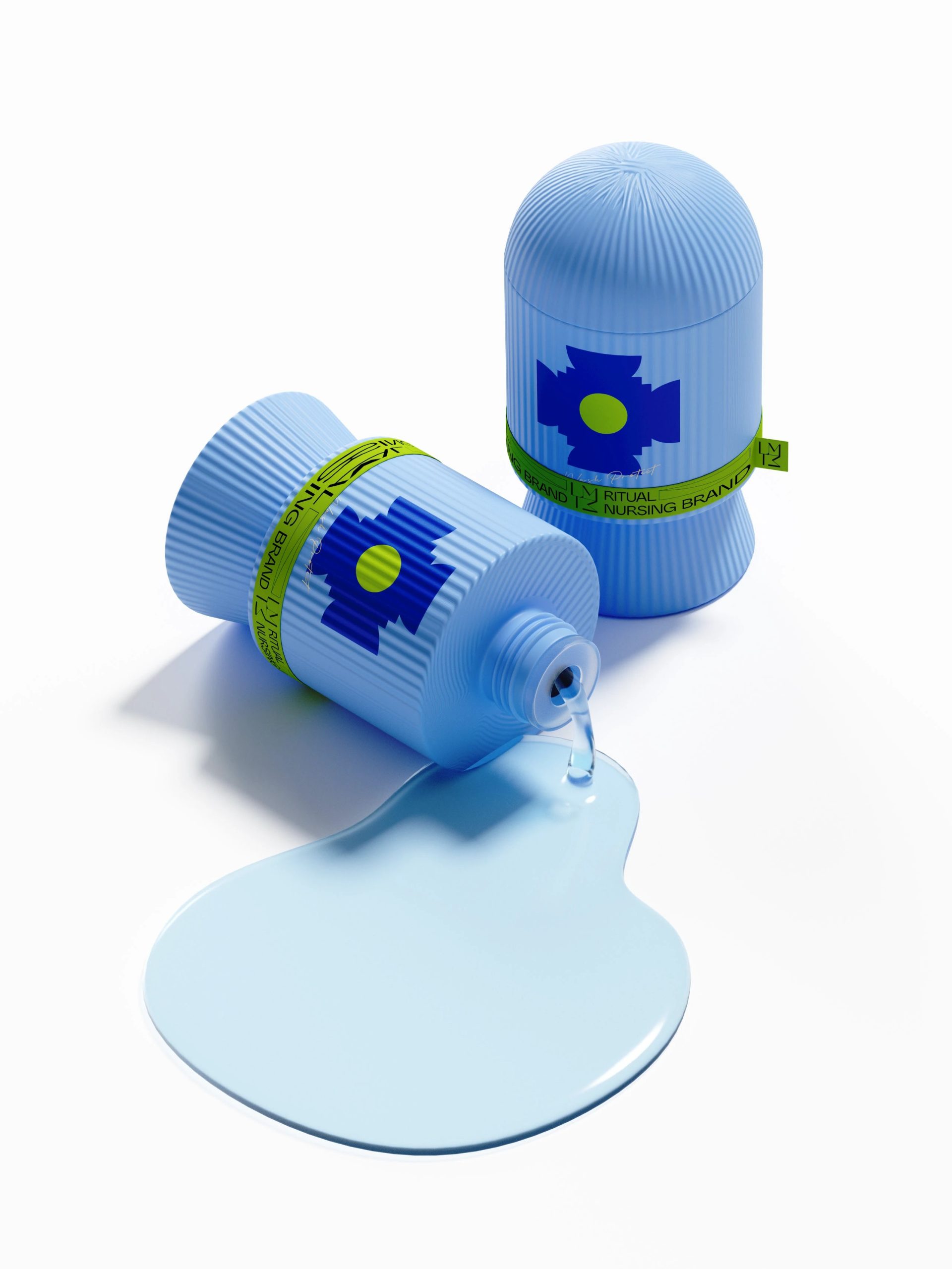
The LIMM Botanical Fragrance Set feels less like a typical fragrance product and more like a small design object meant to live on a shelf. The bottle shape is especially distinctive. Instead of the usual elegant perfume silhouette, Hellocean created a chunky, sculptural form with deep vertical ridges. This texture gives the bottle a tactile personality—it almost feels architectural, like a miniature column or carved artifact. In retail environments filled with smooth, glossy perfume bottles, that ribbed surface instantly creates contrast and visual curiosity.
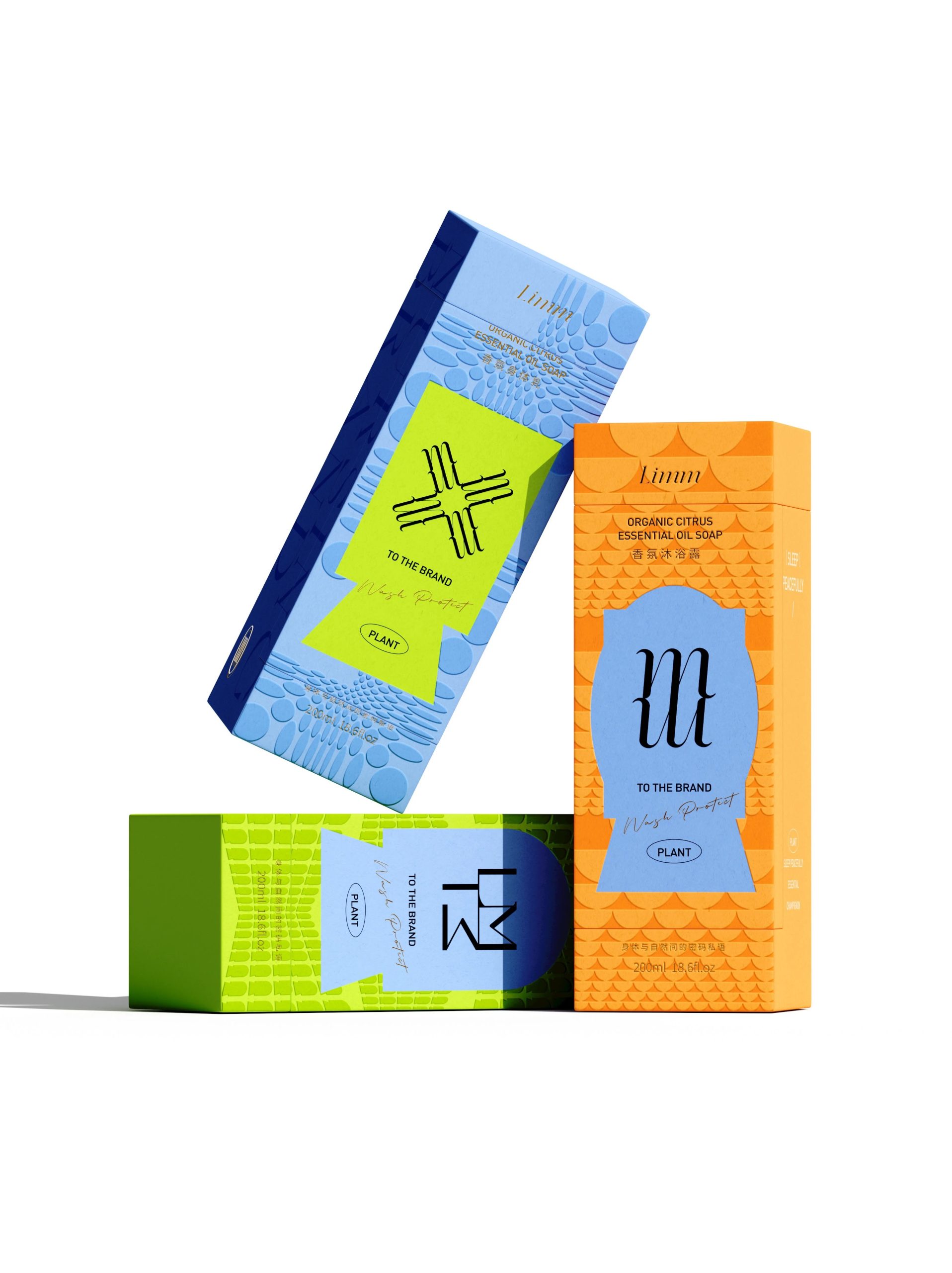
The color strategy is another clever move. Bright citrus orange, lime green, and cool blue collide in a way that feels bold and optimistic. Many botanical fragrance brands lean heavily into earthy tones, beige labels, or muted greens to communicate “natural.” LIMM does the opposite. The palette feels energetic and modern, suggesting plants and vitality without being predictable. It hints that botanical products can still feel playful, graphic, and contemporary.
The geometric icons on the bottles also stand out. Instead of literal leaves, flowers, or plants, the designers use abstract symbols. These shapes almost resemble digital pixels or tribal emblems. This approach subtly bridges two worlds: nature and modern culture. It feels like a botanical brand designed for a generation raised on graphic interfaces and visual icons rather than traditional botanical illustrations.
One particularly interesting detail is the band wrapping around the bottle, which reads almost like a ceremonial ribbon or seal. This small element does more than decorate the bottle—it visually “anchors” the shape and introduces a storytelling cue. It gives the impression that the bottle contains something precious, almost like a ritual object rather than just soap or fragrance.
The outer packaging adds another layer of visual rhythm through patterned surfaces. Instead of flat color blocks, the boxes use repeating shapes that create depth when light hits them. These subtle textures make the packaging feel more premium while still maintaining a graphic, contemporary style.
The presentation box is also worth noting. Opening it feels theatrical, almost like unveiling a small sculpture. The fragrance bottle sits upright inside a structured interior frame, turning the act of unboxing into a moment of discovery. This is important because fragrance is an emotional product—designers who create a ritual around opening the package are essentially extending the brand experience beyond the scent itself.



 Hashem Gerashi
 monther al omari
 Emi Renzi
 Bonsanco Creative Studio
 Isha
Isha Confetti Design Studio
 Luks Piekut | Wytrawny
 TOGNOLLO STUDIO
 Svea Bode
 Valérie Colace
 宏洛图品牌设计HONGLUOTU
 Toolstika
 Marta Wasilewska
 Heramb Arora
 Hakob
Hakob Nadya Chunikhina
 Elodie Clarke
 MID-AIR STUDIO
 Tríona O'Donoghue • Design
 Cocoon Prague
 alchimistestudioParis
 hugo zapata