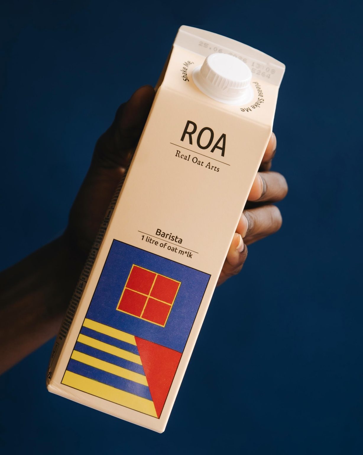

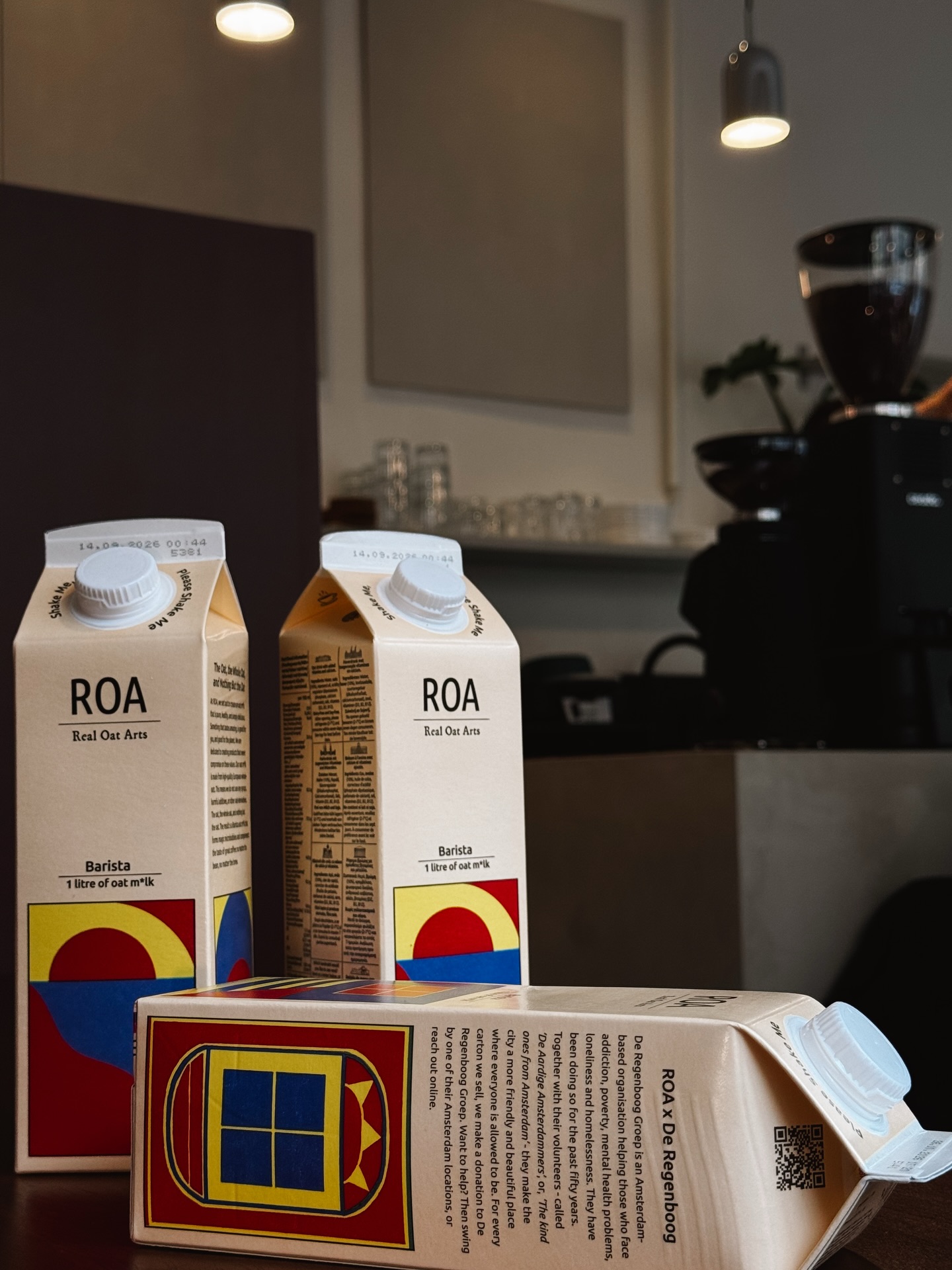
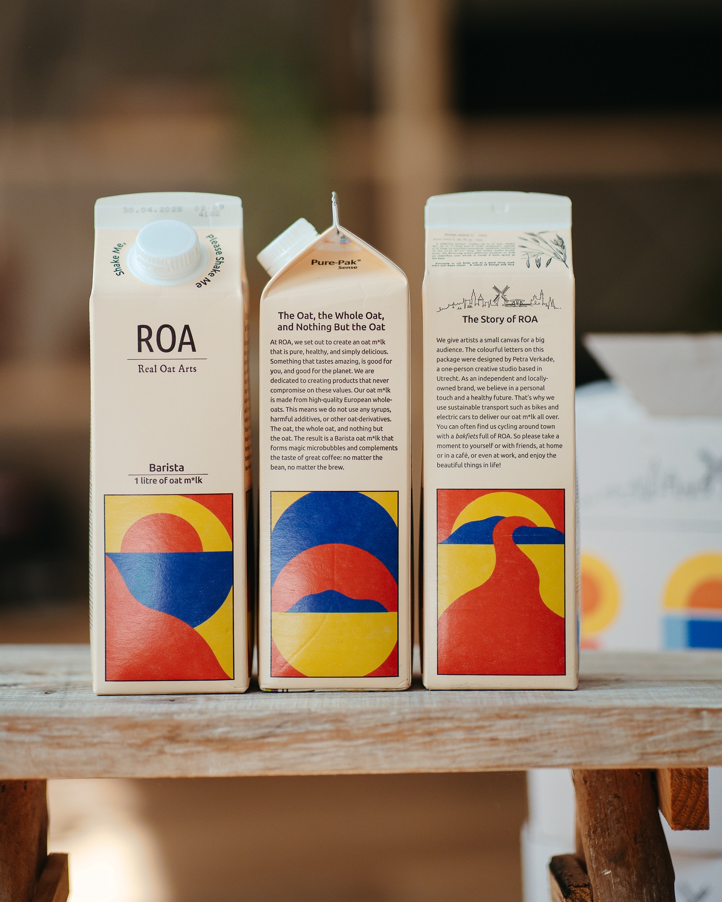
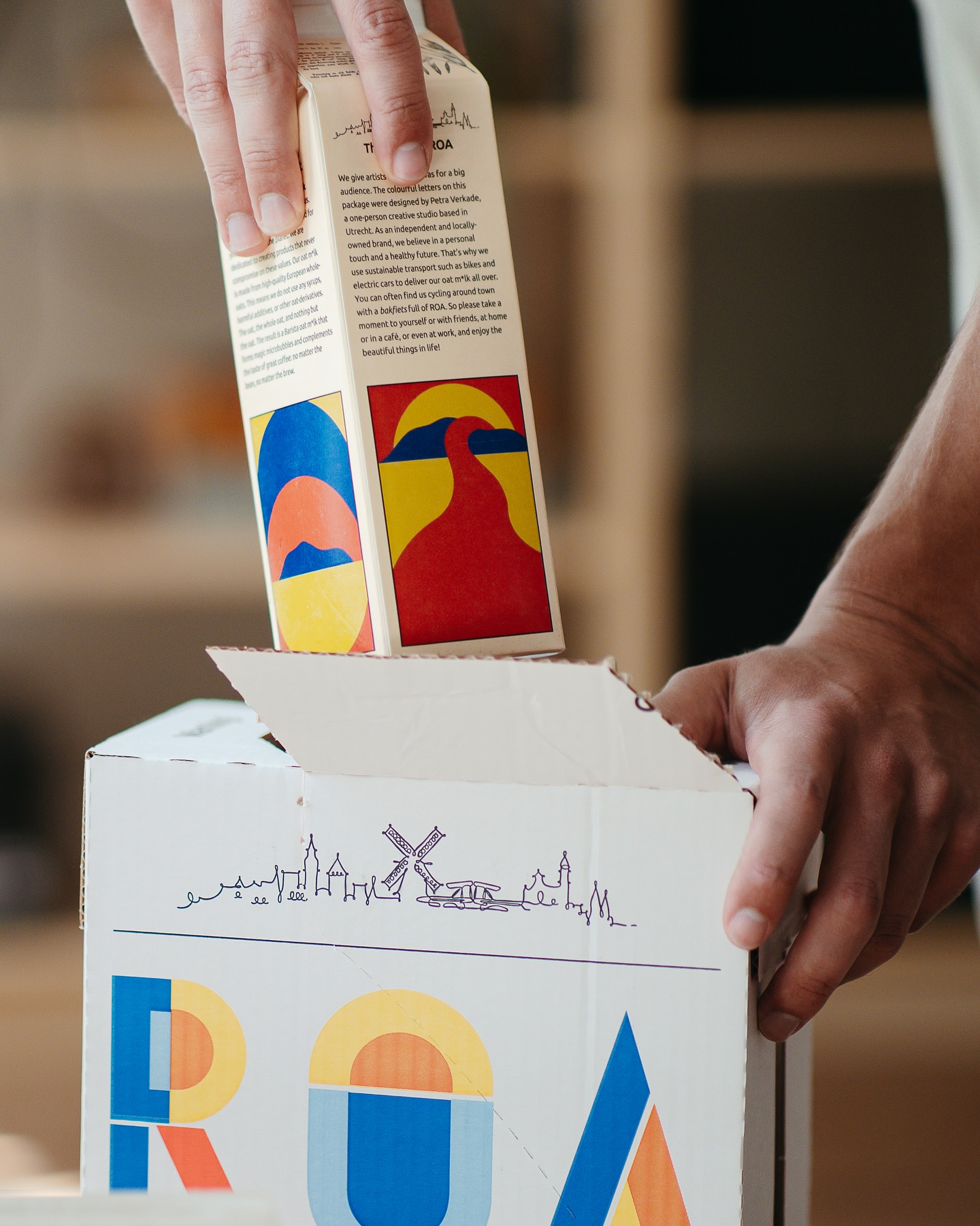
In this edition of Curator’s Insight, we take a look at Petra Verkade‘s packaging design for ROA Barista.
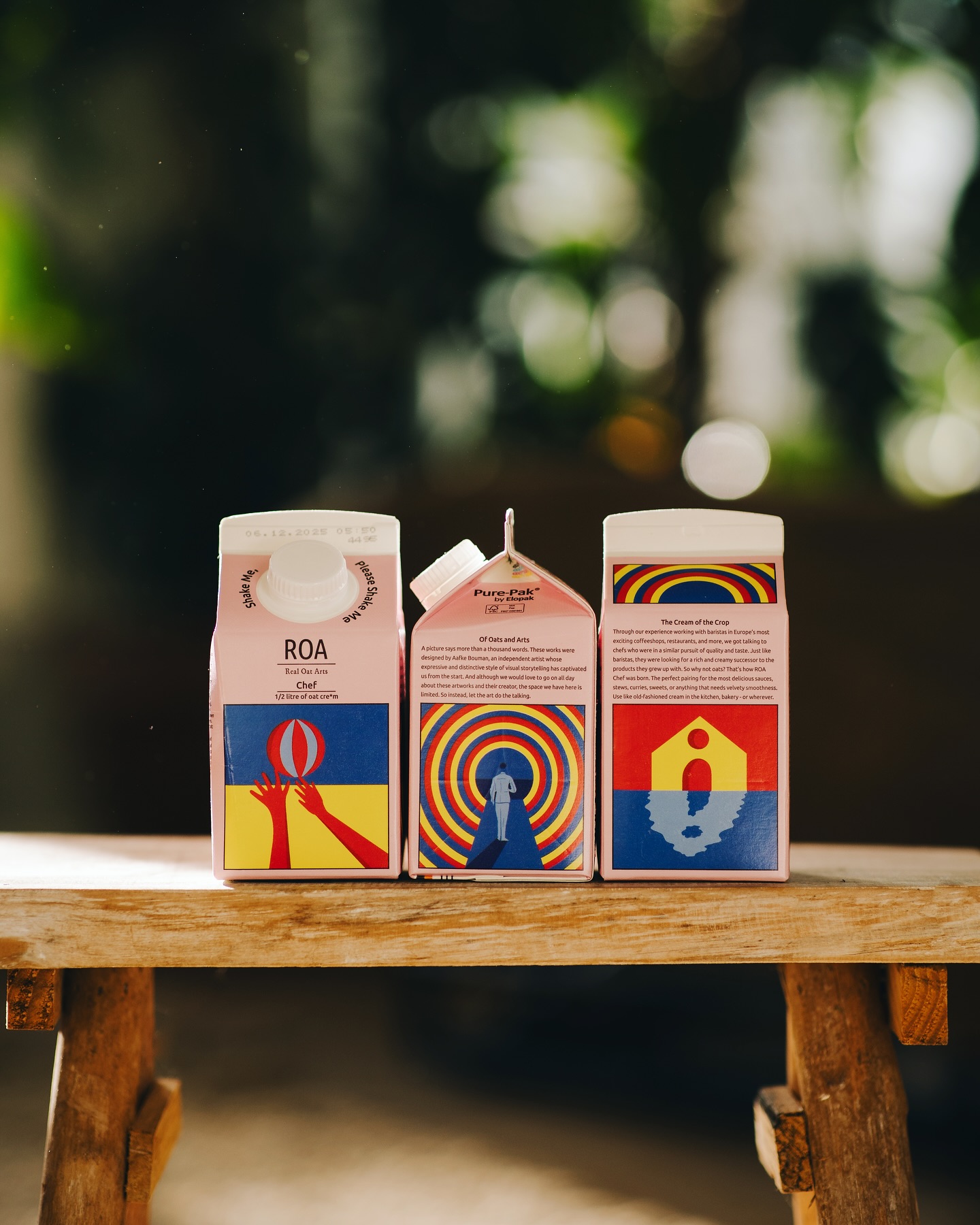
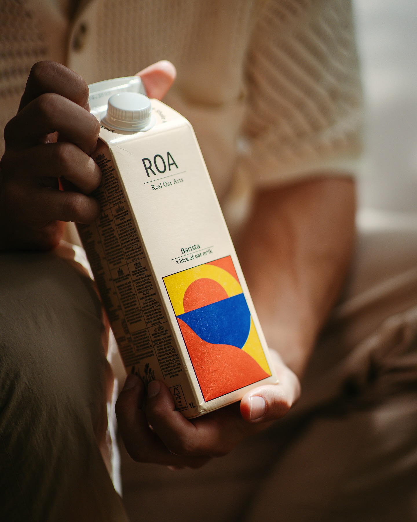
From a distance, it looks like a simple, almost retro abstract artwork. But the clever part? It’s quietly doing double duty. The shapes aren’t just “nice visuals”, they feel like landscapes, sunrises, hills… and at the same time, they subtly echo the letters R, O, and A. Not in a literal, obvious way, but in a “wait… is that intentional?” kind of way. That slow realization is what makes it sticky. It rewards attention, which most packaging completely fails to do.
The use of risograph texture is where things get a bit rebellious (in a good way). In a world of ultra-clean, overly polished packaging, this slightly imperfect, grainy finish feels human. Almost like the pack has been printed, not manufactured. That’s a big emotional shift. It makes the product feel crafted, not processed—exactly what you want for oat milk trying to signal purity and honesty.
What’s also interesting is the restraint. The top half is almost clinical—minimal type, lots of breathing space, very “I’m a serious product.” Then boom, the bottom half drops this bold, warm, almost artistic explosion. That contrast creates balance: logic on top, emotion below. It’s basically saying, “Yes, we’re functional… but we’ve got soul.”
Another underrated move: the artwork sits in a framed box rather than bleeding edge-to-edge. That makes it feel like a collectible print rather than decoration. Subconsciously, it elevates the value…like you’re holding a small piece of art, not just a drink carton. And let’s be honest, that’s exactly how you get people to keep the pack or at least hesitate before tossing it.
 Lizaveta Kharitonyuk
 Bonsanco Creative Studio
 DesignRepublic
 GIRAFA STUDIO
 PiotrWisniewski
 Sophiagdotcom
 monther al omari
 CreativeWise
 Modern Theory
 SoreThumbStudio®
 Modern World Studio
 Palashcc
 Valérie Colace
 andreamarinnn
 Chochoi Creative
 Hi estudio
 bachir bachchar
 Aferdini
 AUN BRANDS
 vitoramockup
 InterWish
 ash123456
 Studiotaketwo