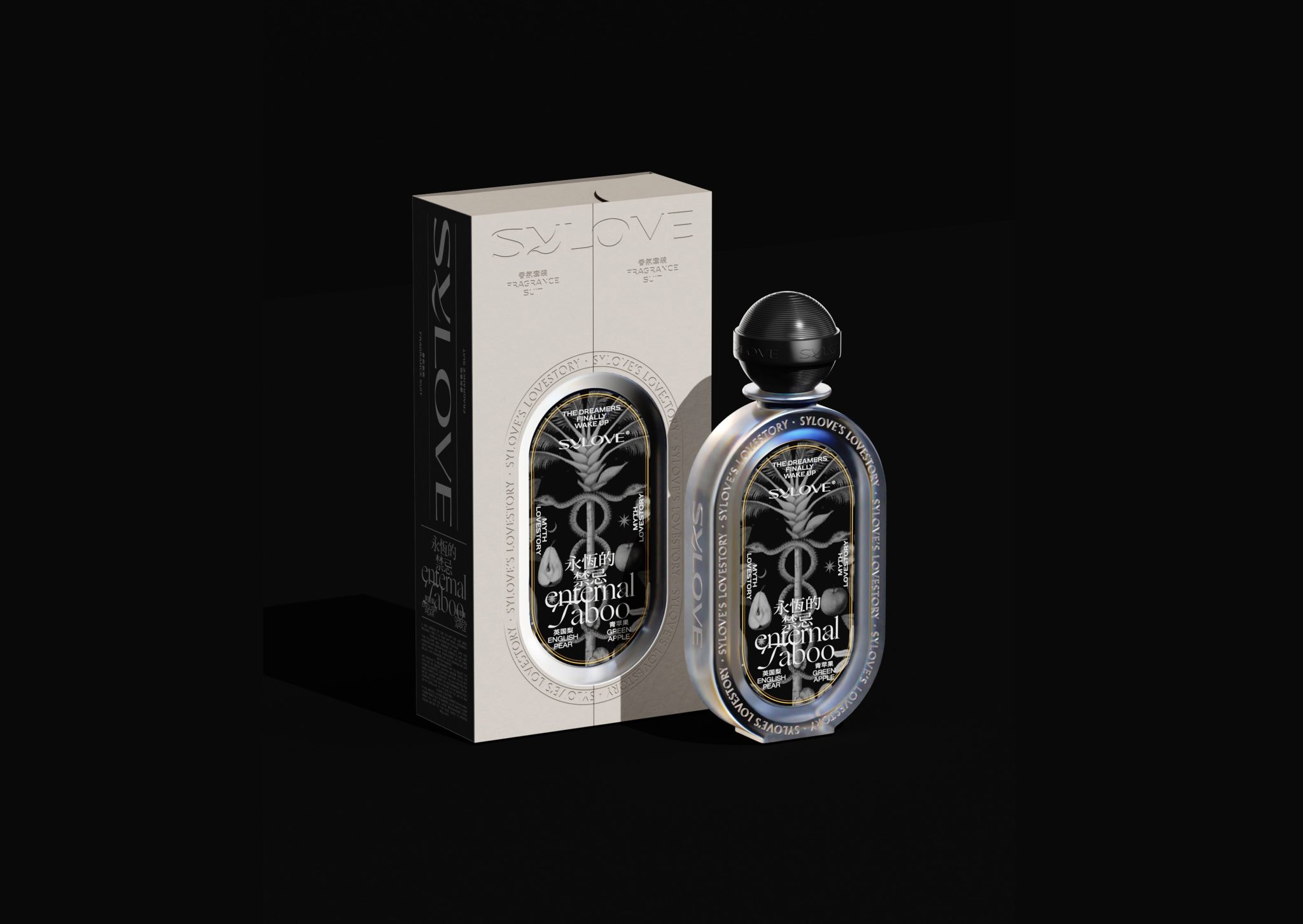

希洛—禁忌香水设计
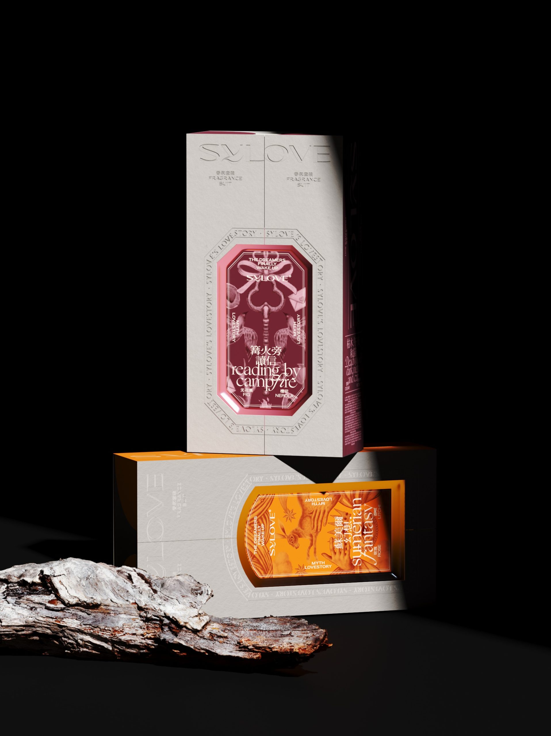
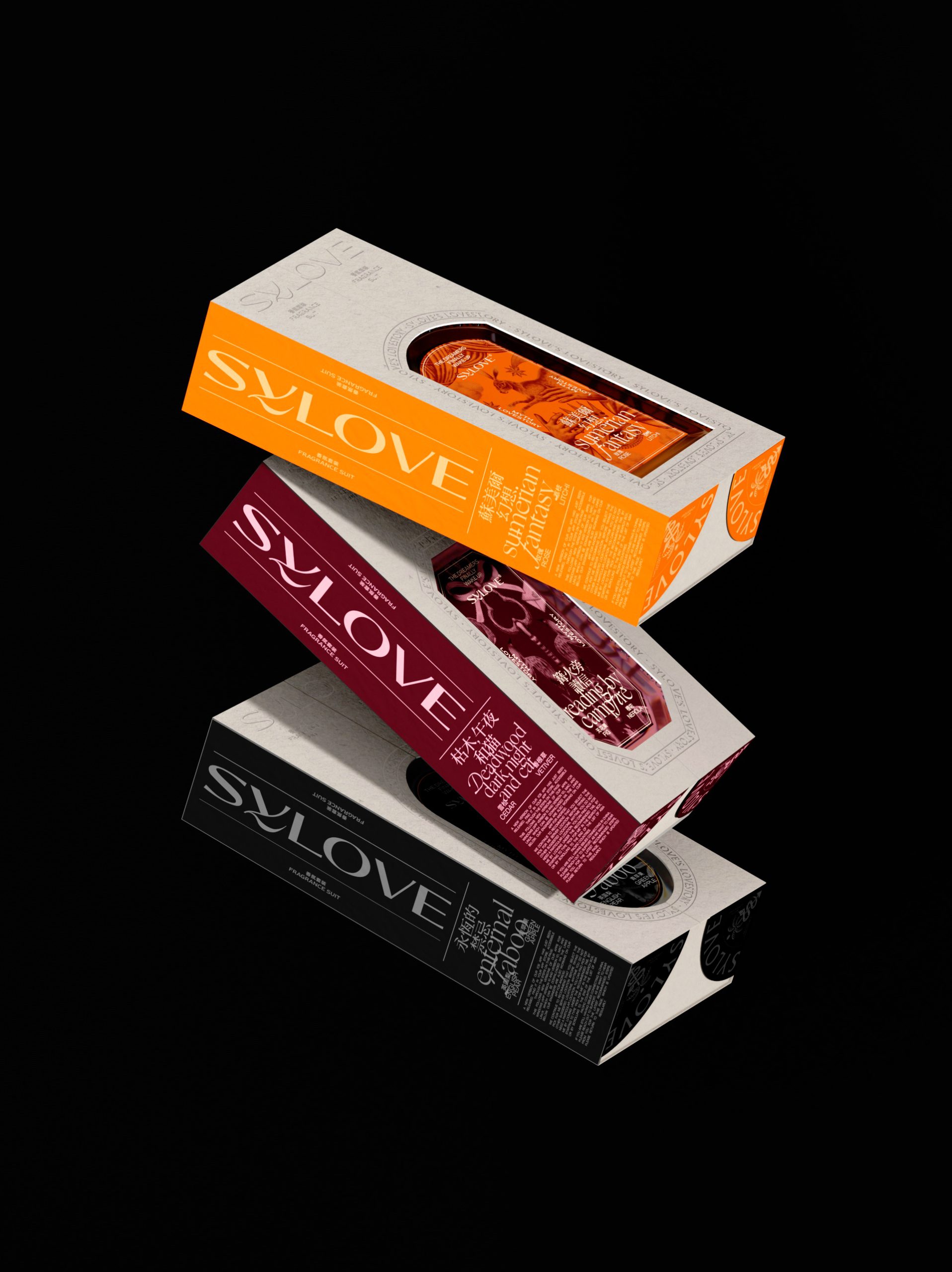
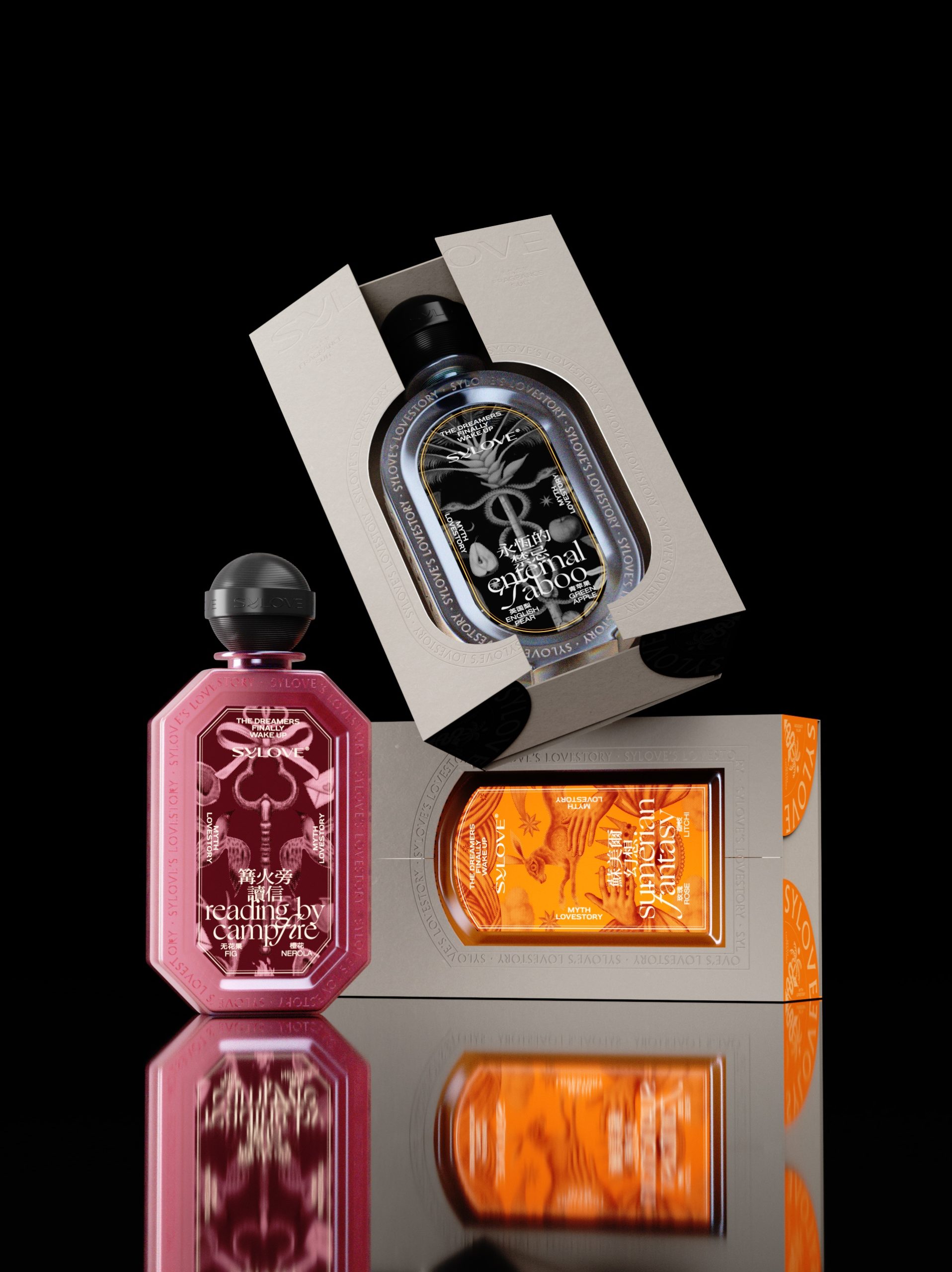
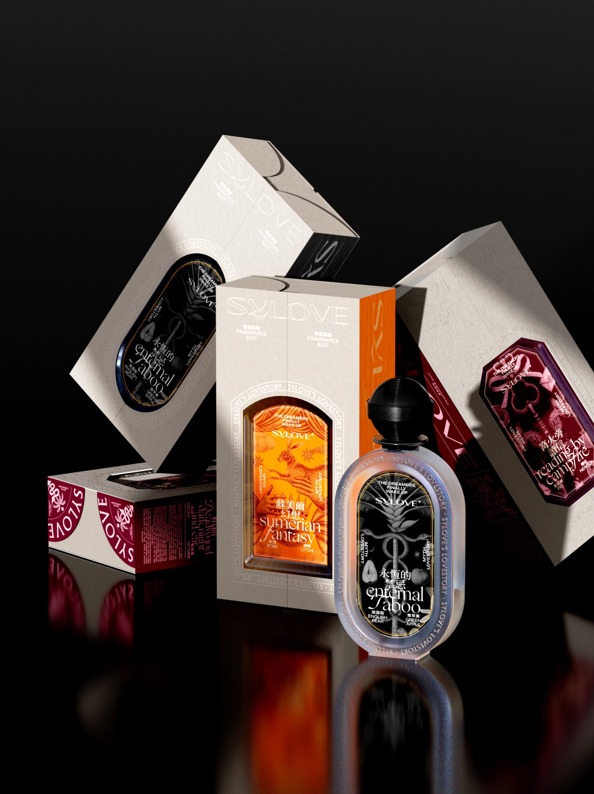
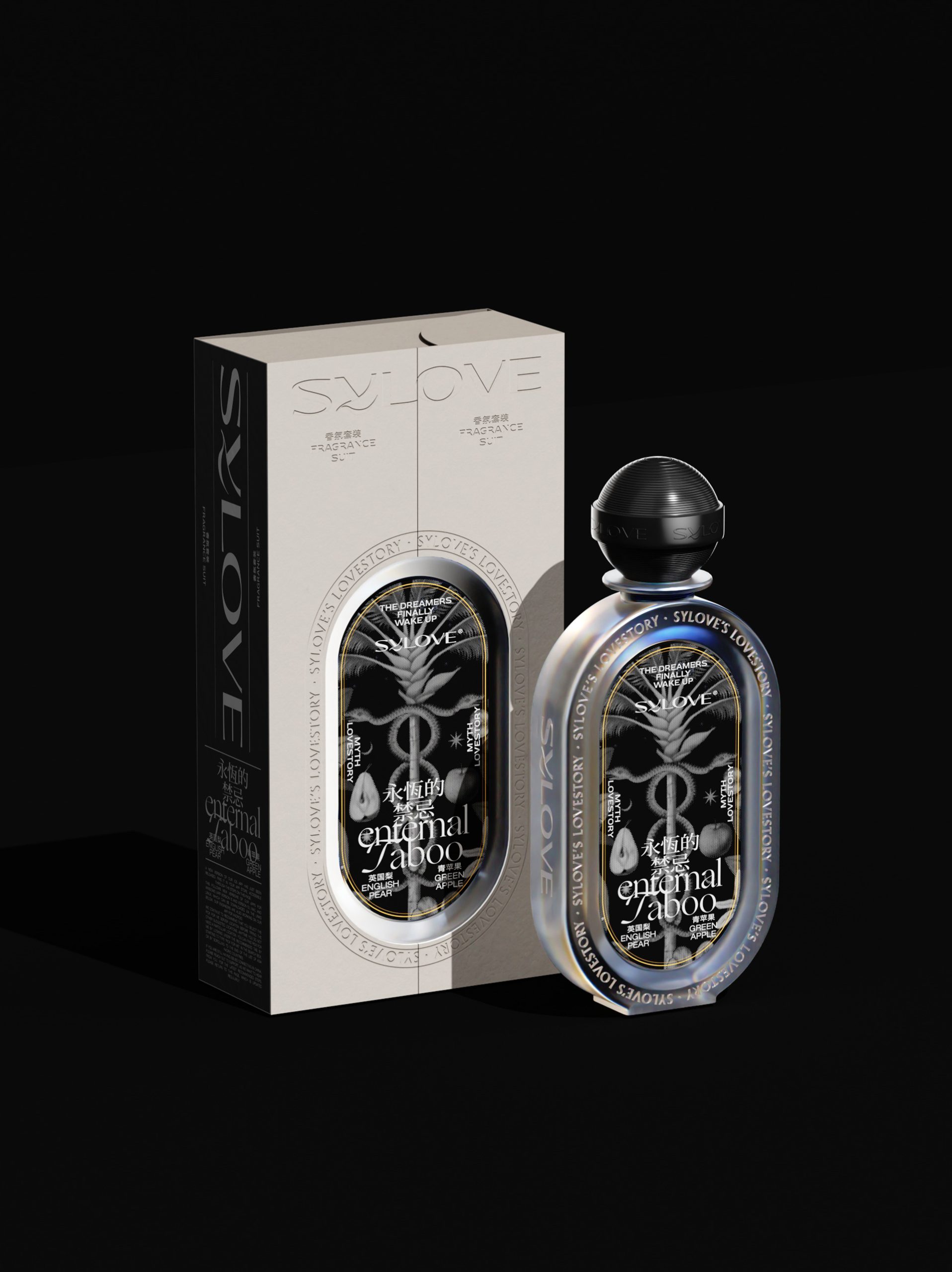
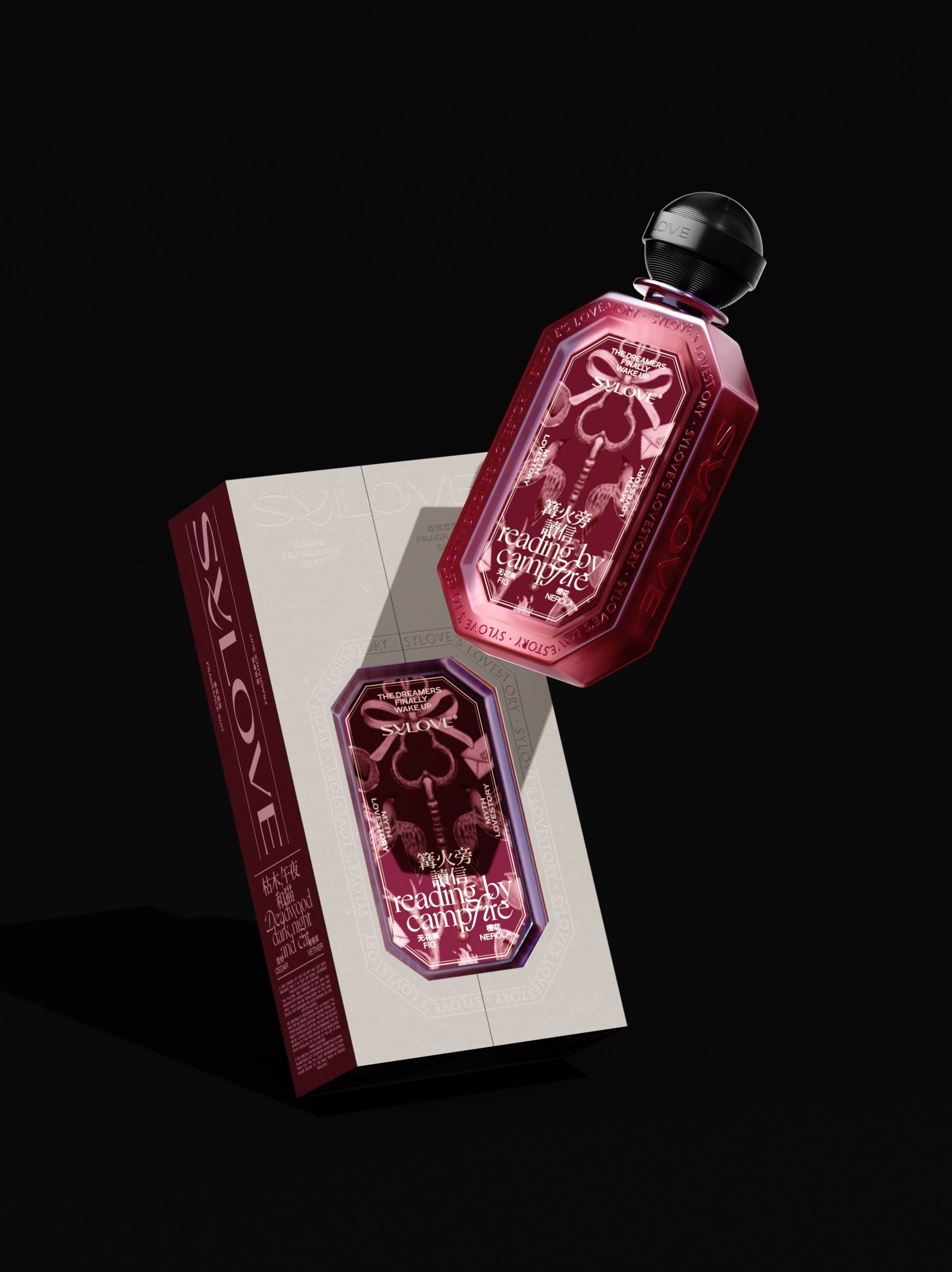
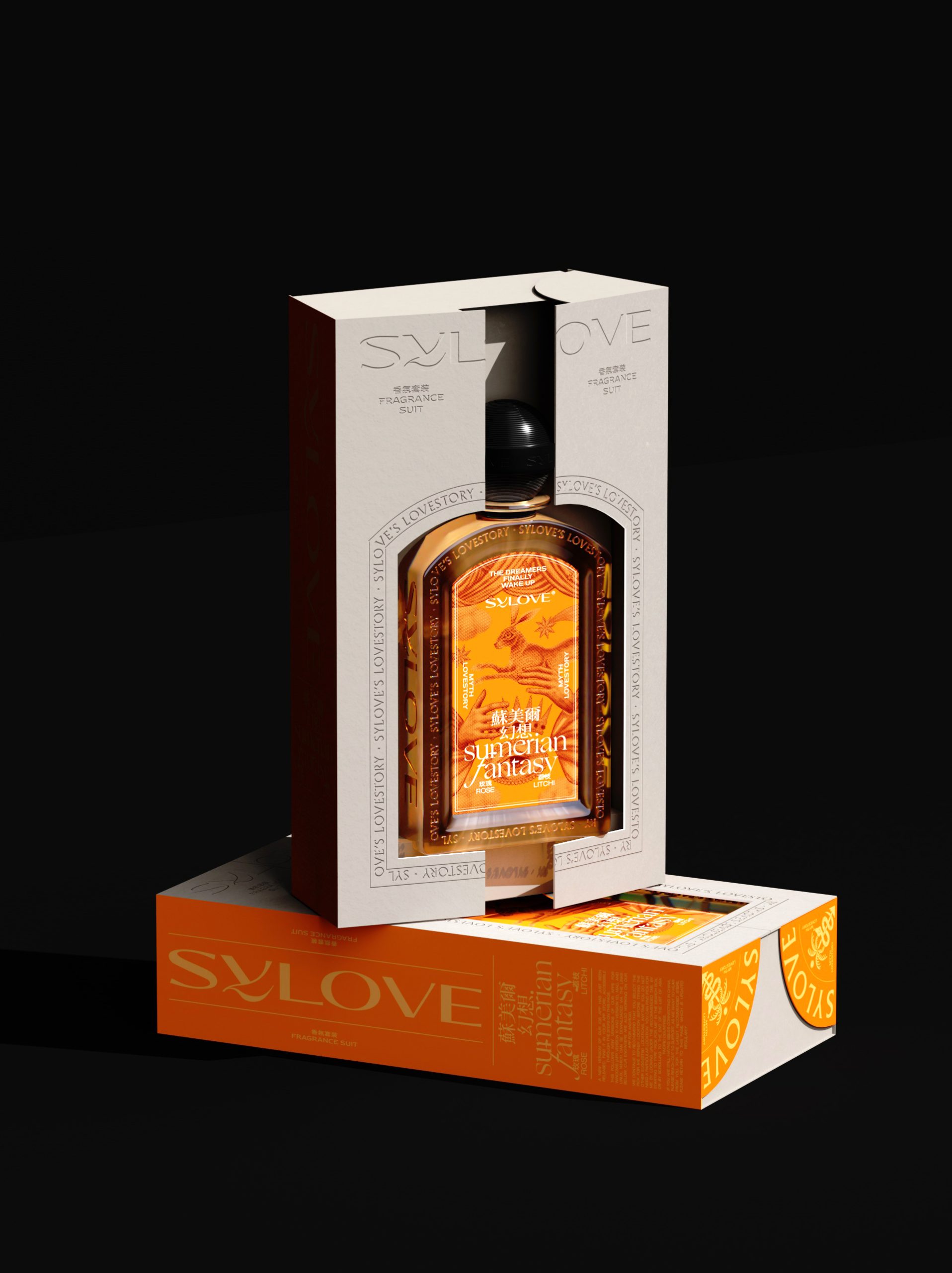
“Xiluo – Forbidden Perfume” is conceived as a bold exploration of desire and restraint through design. The packaging embraces a minimalist yet provocative aesthetic, balancing soft, skin-like textures with sharp structural contrasts to evoke tension between purity and taboo. A muted, sensual color palette reinforces intimacy, while subtle material finishes suggest touch and warmth, elevating the tactile experience. Typography is deliberately understated, allowing the form and surface to carry the narrative. The overall concept positions the fragrance as an object of quiet intrigue, where branding is less about overt expression and more about eliciting curiosity, emotion, and a lingering sense of mystery.
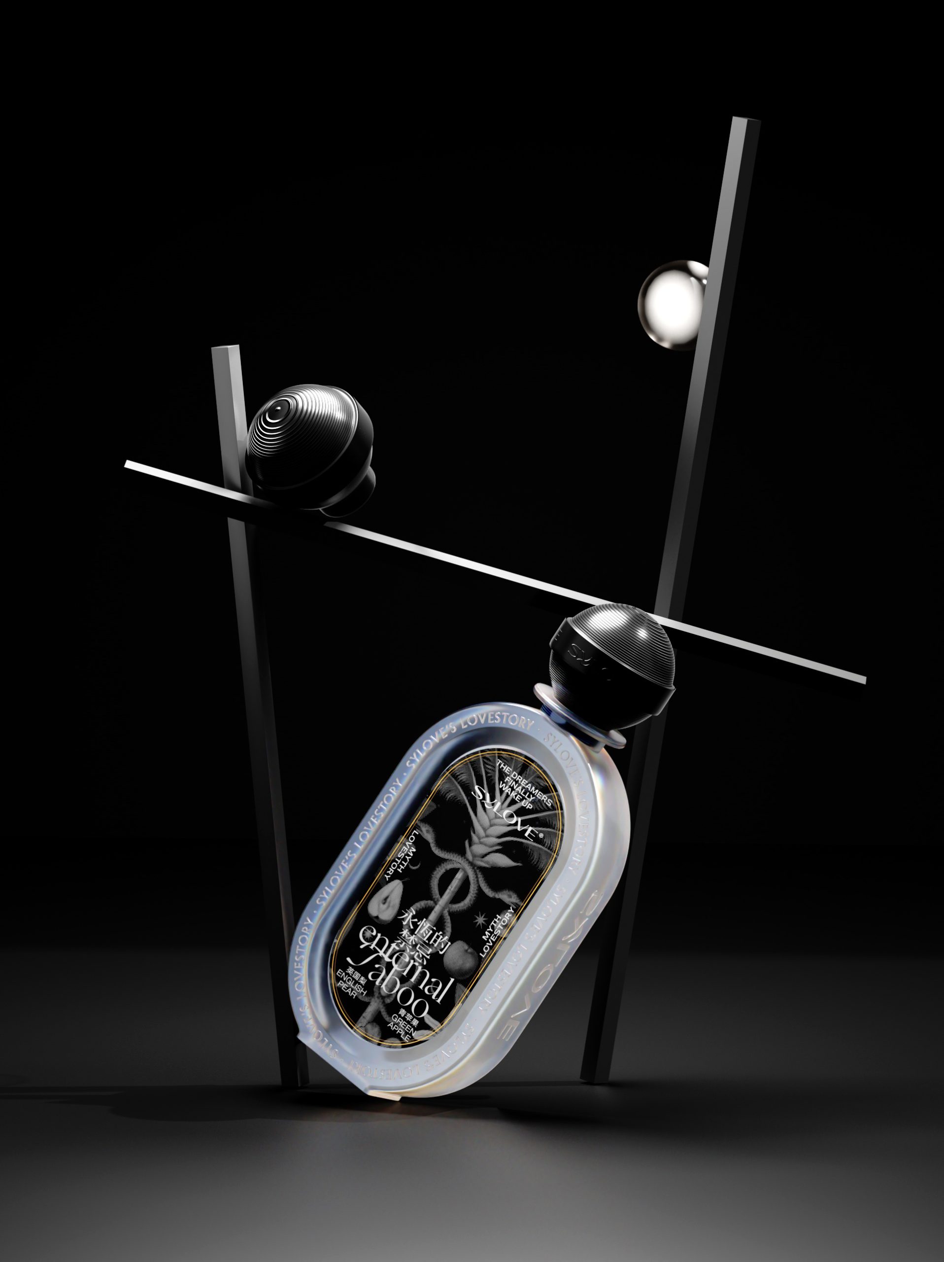
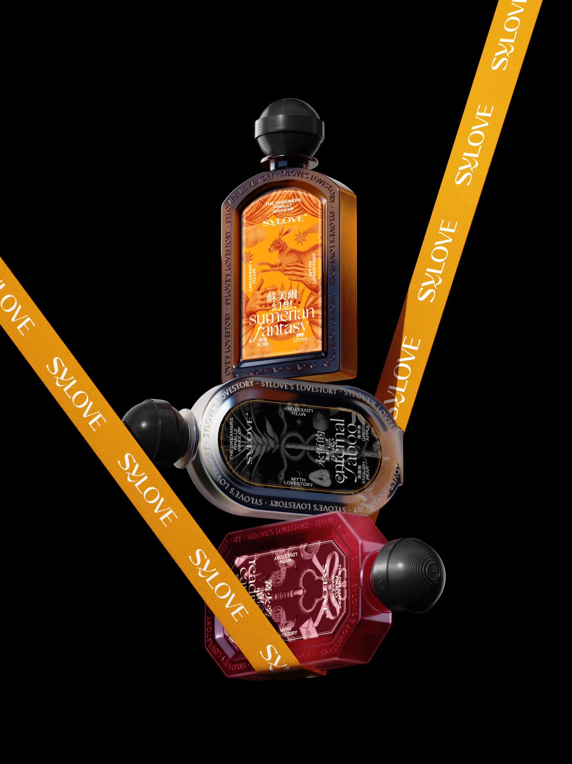
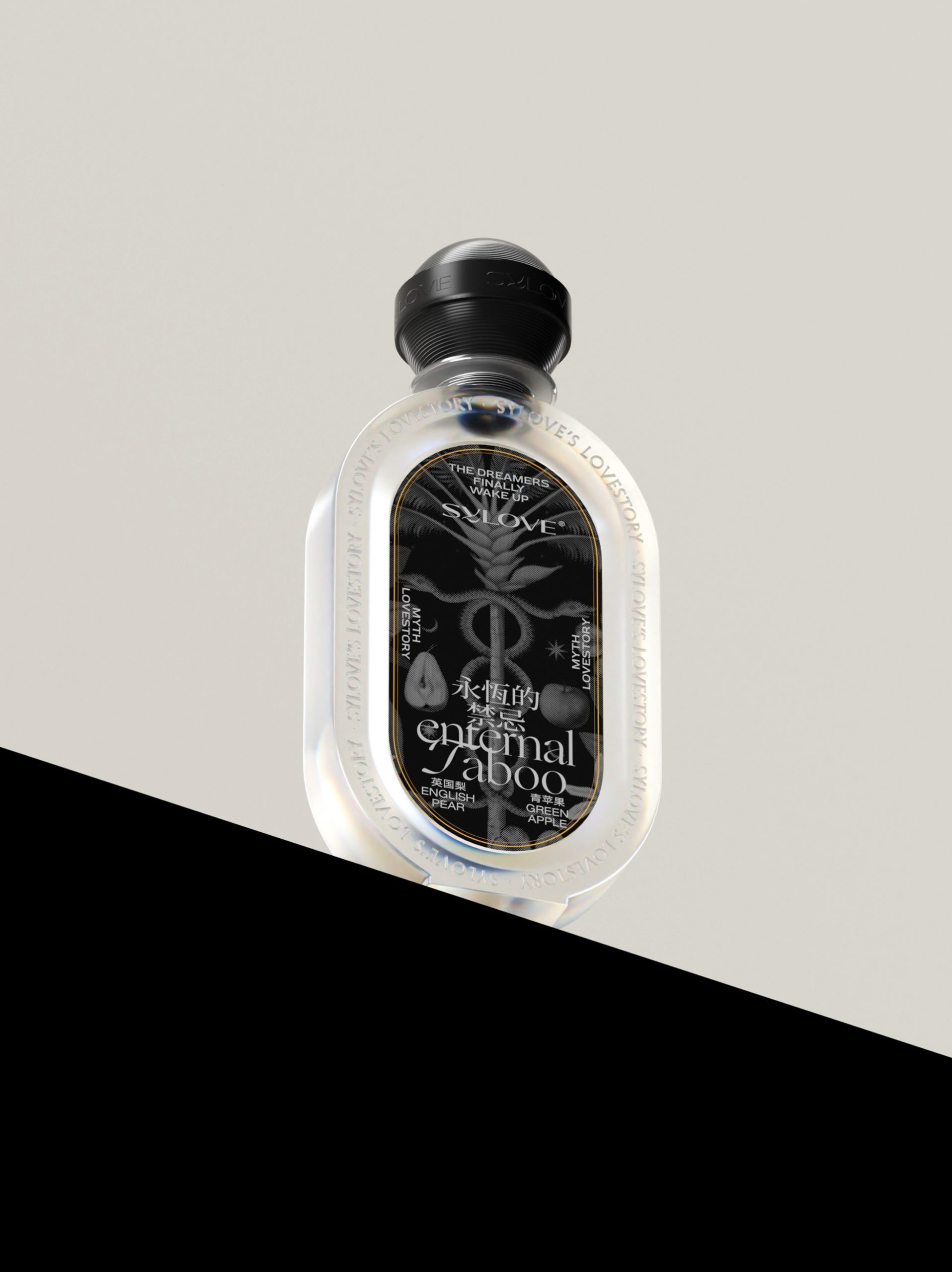
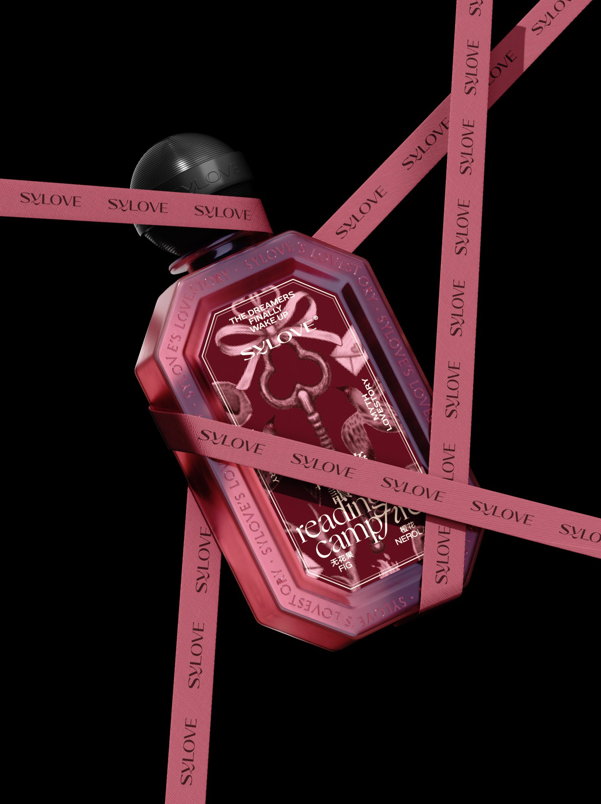
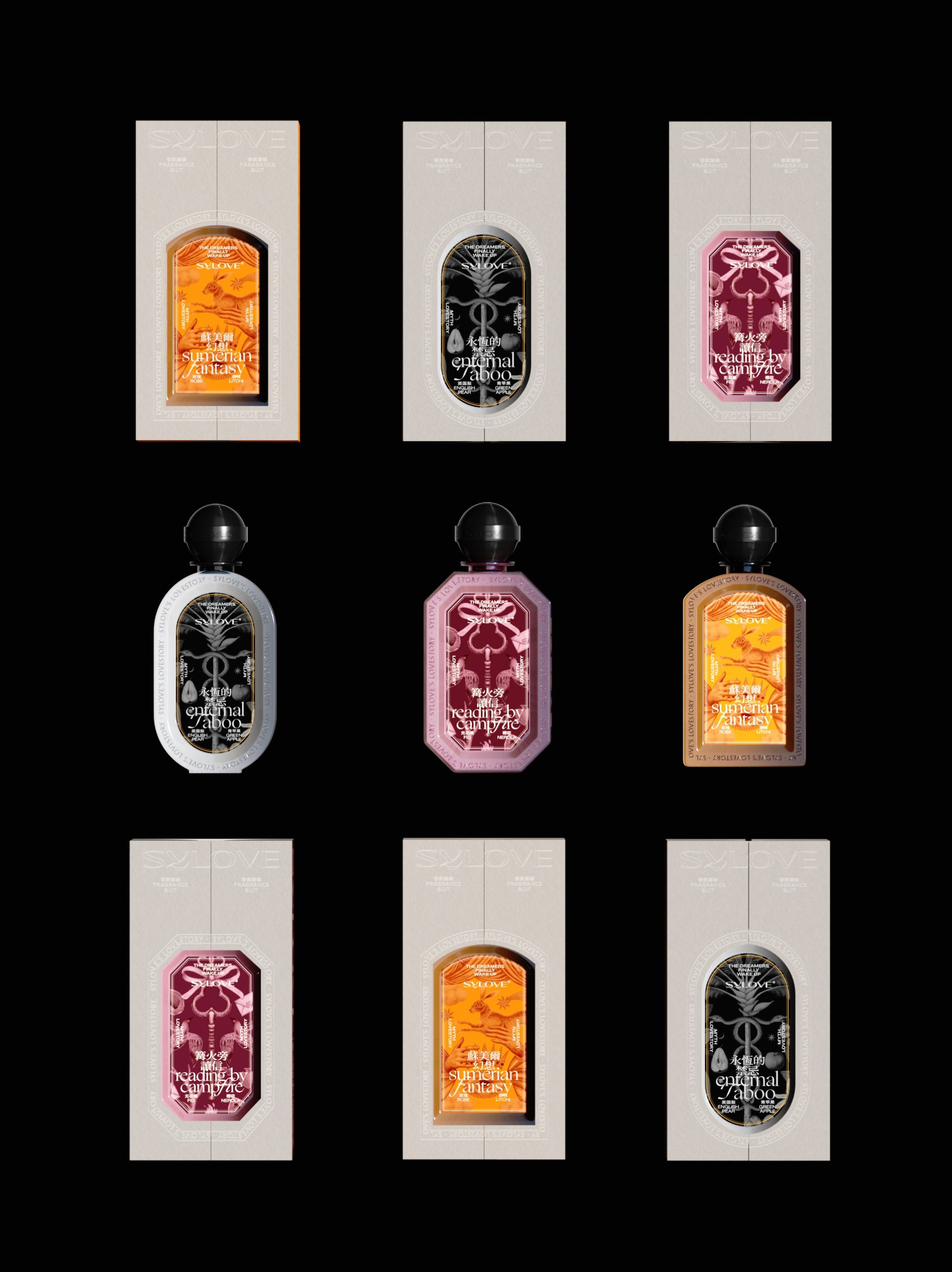
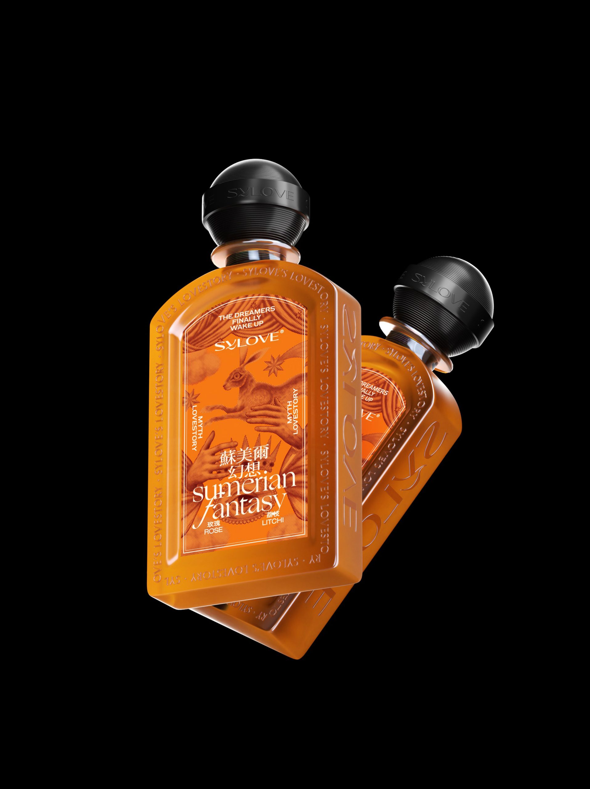
The Bottle Architecture Each bottle has its own silhouette language — the oval, the hexagonal, the rectangular — yet that black ribbed spherical cap ties everything together like a signature punctuation mark. It’s almost like a wax seal on a letter.
The Label as a World What’s genuinely wild is how the labels feel like album covers rather than perfume labels. The gothic botanical illustrations on “Eternal Taboo,” the ancient Mesopotamian figures on “Sumerian Fantasy” — these aren’t decorations, they’re narratives. The bilingual Chinese-English typography isn’t just practical, it’s a cultural statement — proudly Chinese but globally fluent.
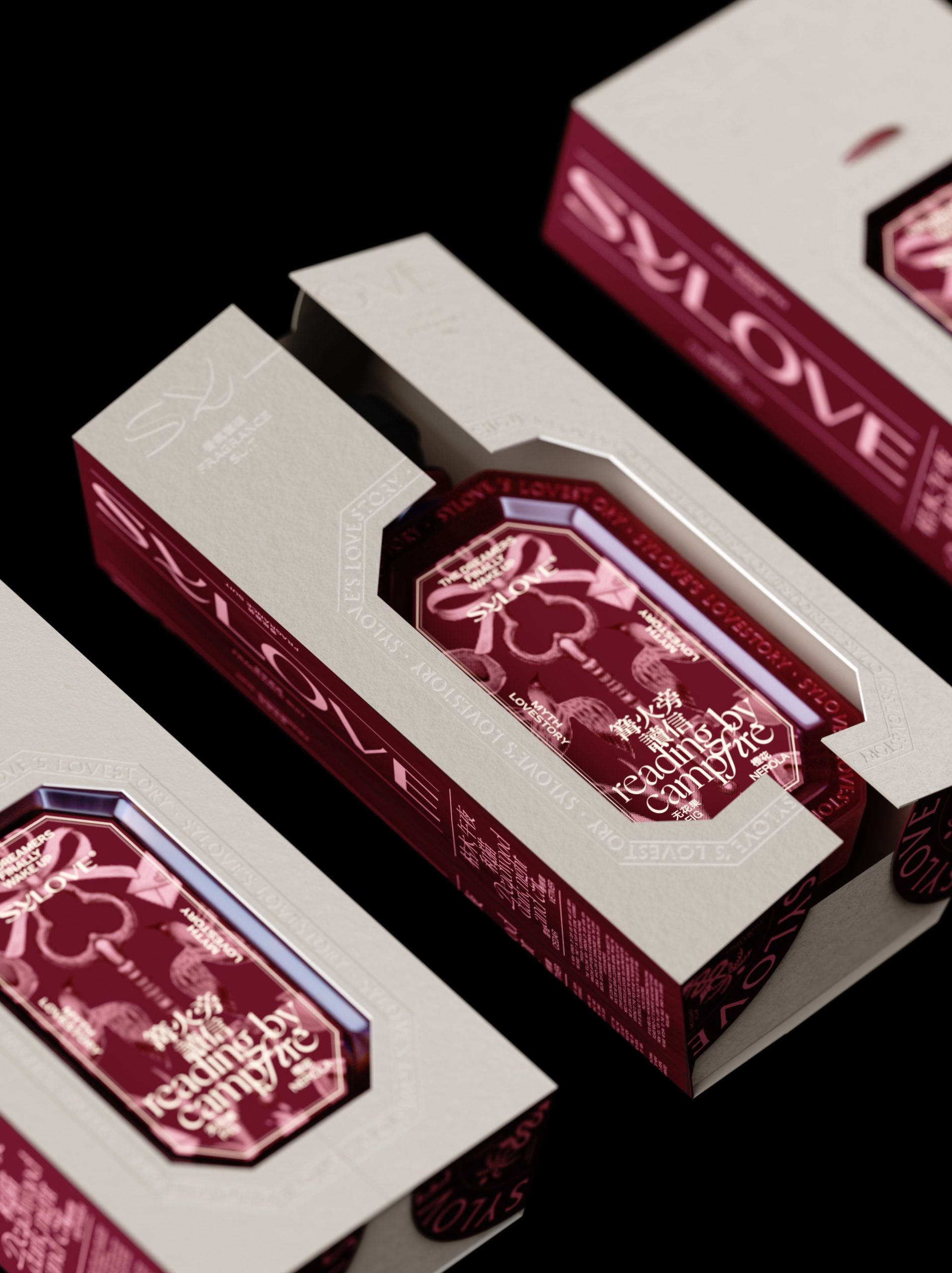
The Box is Doing Heavy Lifting The cream-and-bold-color box combination is smarter than it looks. The cream acts as a “breathing space” that makes the saturated label colors punch even harder. That die-cut window reveals, like unwrapping a story before you even open it.
 Derrick Lin
 monther al omari
 43oz
43oz lilyz design23
 Modern Theory
 Eighteen Brand Studio
 Bhumika Singh
 MohamedMashaly
 Pixels Studio
 Gulya
Gulya UPRISE
 Lizaveta Kharitonyuk
 Bonsanco Creative Studio
 DesignRepublic
 GIRAFA STUDIO
 PiotrWisniewski
 Sophiagdotcom
 CreativeWise
 SoreThumbStudio®
 Modern World Studio
 Palashcc
 Valérie Colace