

Burbuar is more than just a gin; it is a liquid testament to time, craftsmanship, and the quiet mastery of 42 years of maturation. This limited-edition project (only 50 bottles produced) was designed to reflect the transition of a classic London Dry Gin into a complex, aged spirit that rivals the finest whiskies and cognacs.
The Design Concept
The visual identity of Burbuar is built around the concept of “Stillness and Depth.” The amber hue of the 42-year-old gin is the hero of the composition, visible through a minimalist, heavy-bottomed glass bottle that exudes stability and luxury.
Key Design Features:
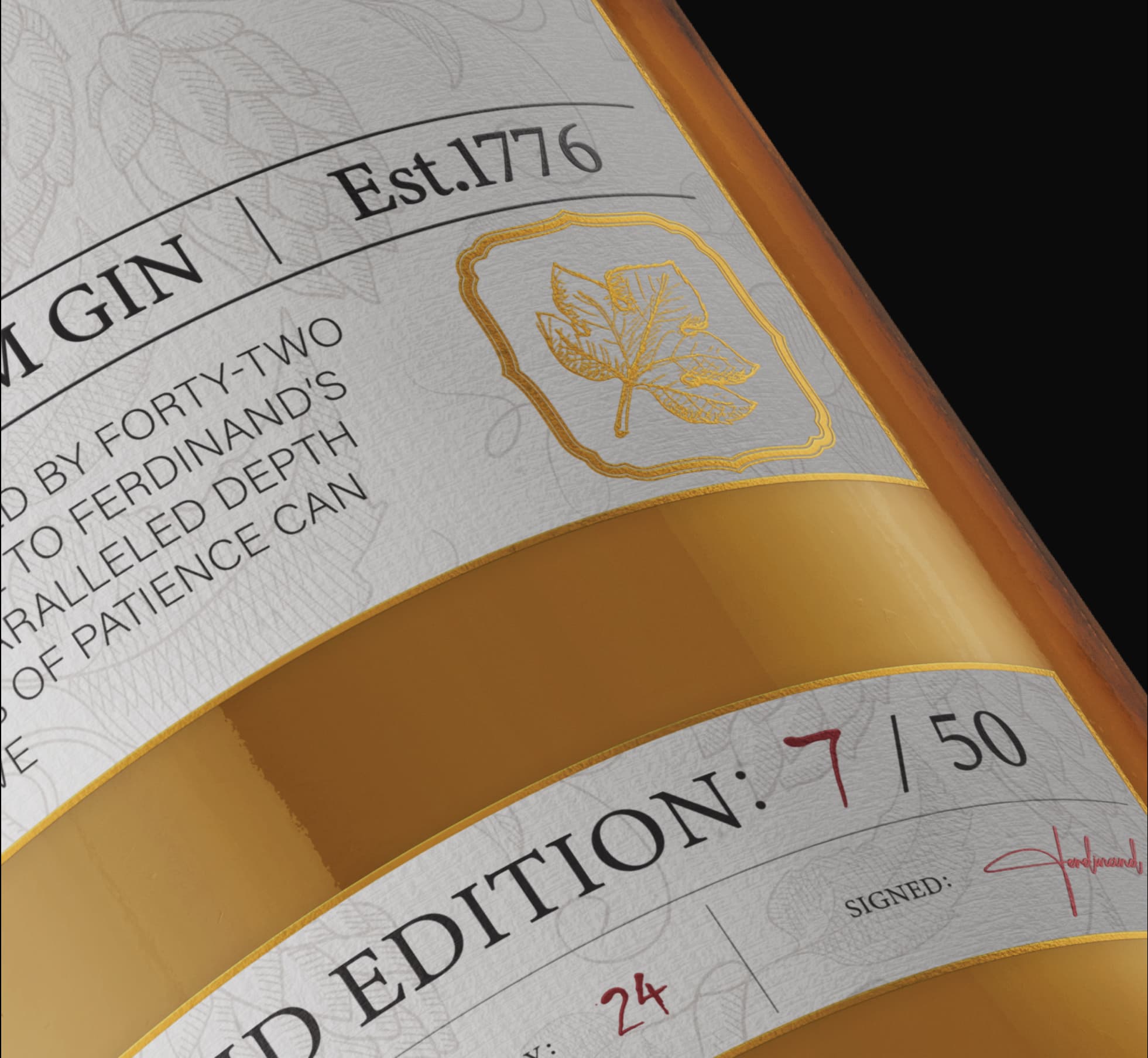
The Label: We used a high-texture, off-white cotton paper that mimics the tactile feel of an antique manuscript. The background features a subtle, hand-drawn botanical illustration of hops and herbs, nodding to the spirit’s organic origins.
Typography: The brand name “Burbuar” is executed in a bespoke, flowing gold-foil script. It creates a striking contrast against the structured, serif typography used for the technical details (London, Premium Gin, Est. 1776).
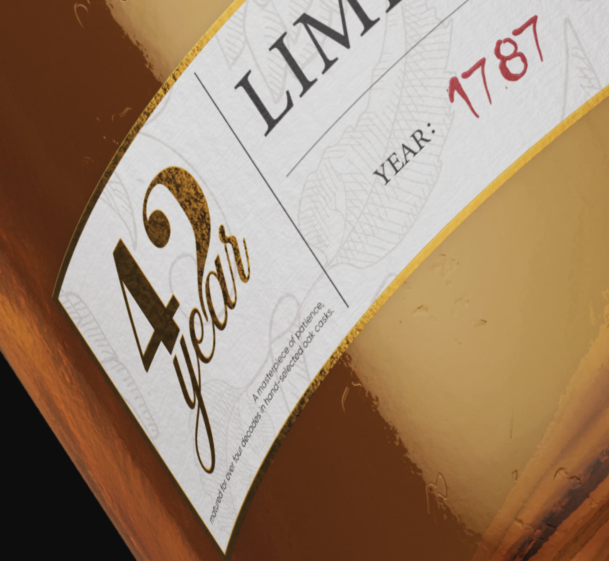
Hand-Finished Details: To emphasize the exclusivity, each label features a “Limited Edition” numbering (e.g., 7/50) and a handwritten signature from the master distiller. The deep red ink used for the year (1787) and day (24) adds a personal, human touch to the industrial precision of the design.
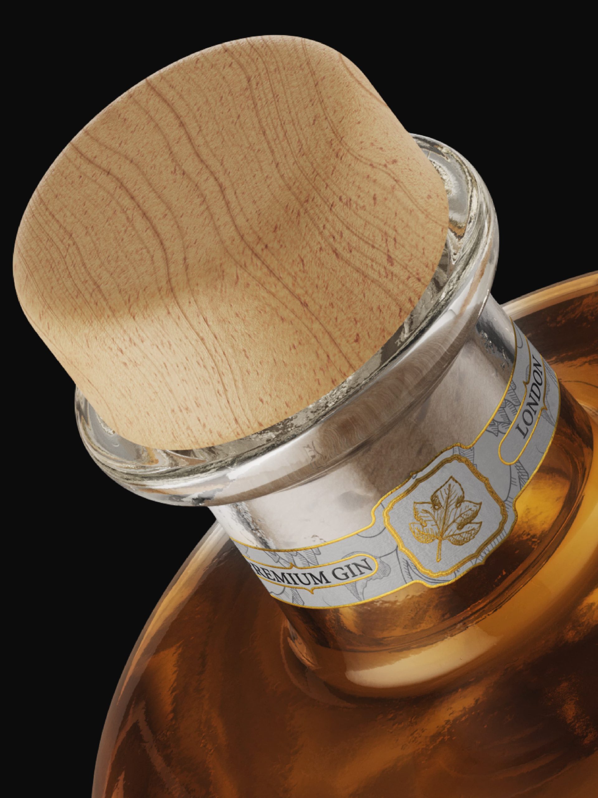
The Closure: A natural wooden cork with a raw grain finish was chosen to represent the oak casks where the gin rested for over four decades.
The “42 Years” Seal: On the bottom left, the age statement is proudly displayed in a bold, weathered gold font, serving as a seal of quality and patience.



 Derrick Lin
 Biaa
Biaa Petitmoulin Studio
 White Bear Studio
 Eva Chistyakova
 monther al omari
 Atipus
 alchimistestudioParis
 oneandother
 bloomburo
 helocrene
 Shapers Studio
 Denver Design
 Aidearte
 andrew.huerta
 softmachine
 airobtq
 Buzz & Co.
 Ruby
Ruby themythographer
 IDNB Inc.
 viktorflr
 Zenpack