
L’atelier Agency
Crunchy Coated Peanuts – Brand Naming & Packaging Design (Tunisia) Introduction
In today’s retail environment, attention is captured in seconds. Shoppers make split-second decisions, and if a product doesn’t stand out instantly, it simply goes unnoticed.
1. The Challenge
The savory snacks category, especially coated peanuts, is highly competitive and driven by impulse buying.
The goal was to create a strong, distinctive brand identity for a line of coated peanuts produced in Tunisia, capable of standing out immediately on crowded shelves. This wasn’t just about designing packaging; it was about building a complete, effective brand that attracts and converts.
2. Insights & Strategy
Research showed that consumers look for a balance between:
- familiarity (a well-known product like peanuts)
- excitement (bold flavors and eye-catching visuals)
For launch, three popular flavors were selected:
- Cheese
- Paprika
- Barbecue
Each needed its own personality while remaining part of a cohesive and recognizable brand system.
3. The Solution Brand Naming & Identity
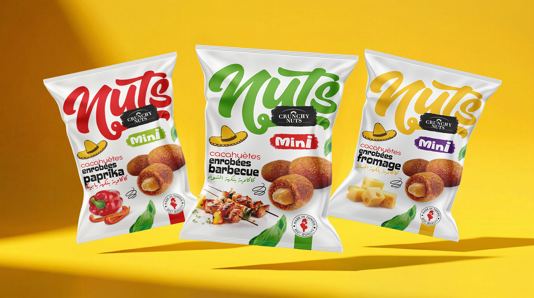
The name “Nuts” is simple, direct, and instantly communicates the product category.
The addition of “Crunchy Nuts Mini” highlights:
- texture (crunchy)
- format (small, snackable size)
- immediate enjoyment
Packaging Design Concept
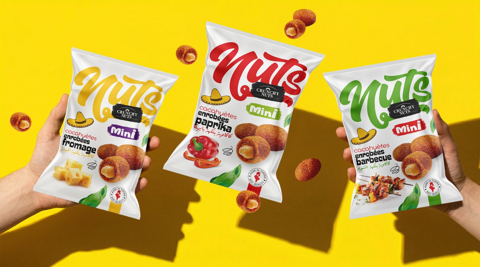
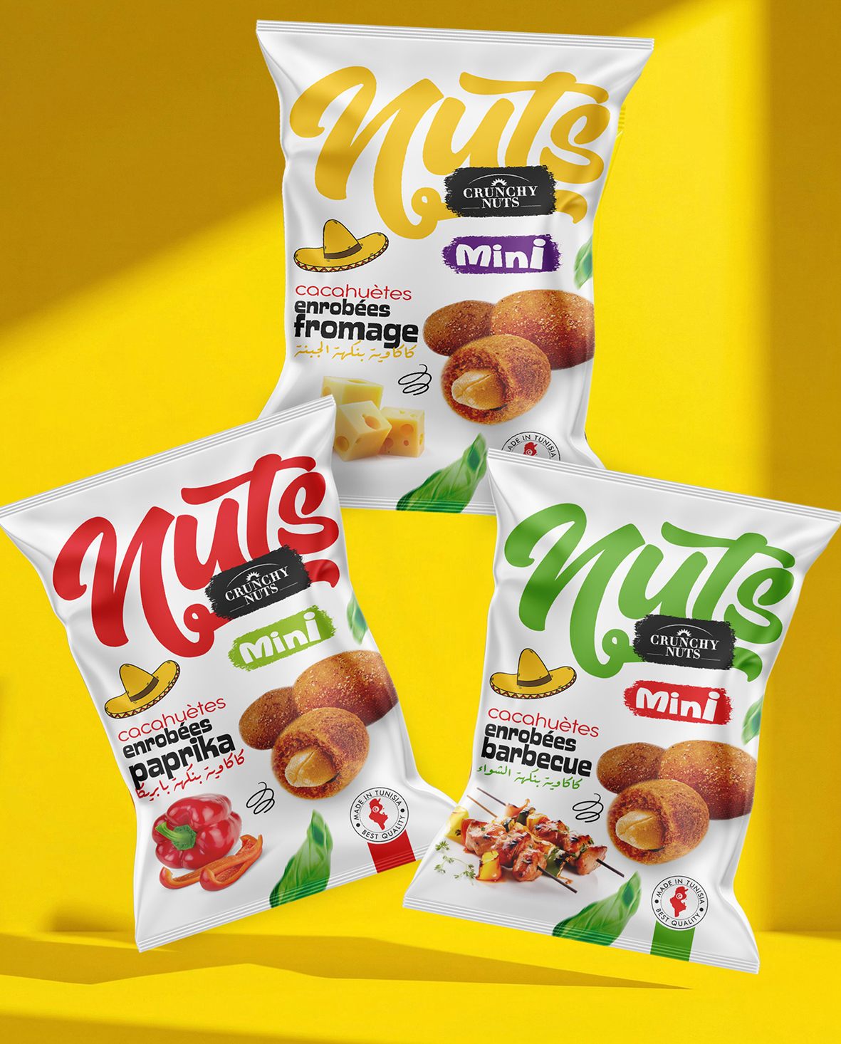
The packaging was designed for maximum shelf impact within seconds. 1. Strong Visual Hierarchy
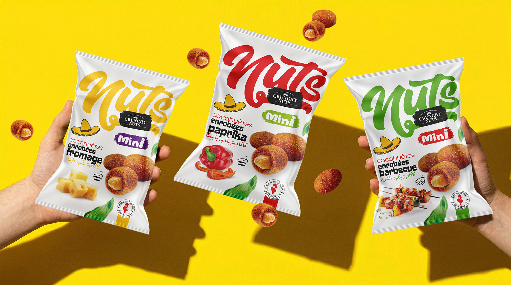
- The bold, flowing “Nuts” logo dominates the pack
- The Crunchy Nuts label reinforces product quality
- The Mini tag adds a modern, snack-friendly touch
2. Color Coding by Flavor
Each variant uses a bold color for quick recognition:
- Yellow → Cheese (rich and indulgent)
- Red → Paprika (spicy and vibrant)
- Green → Barbecue (grilled and fresh feel)
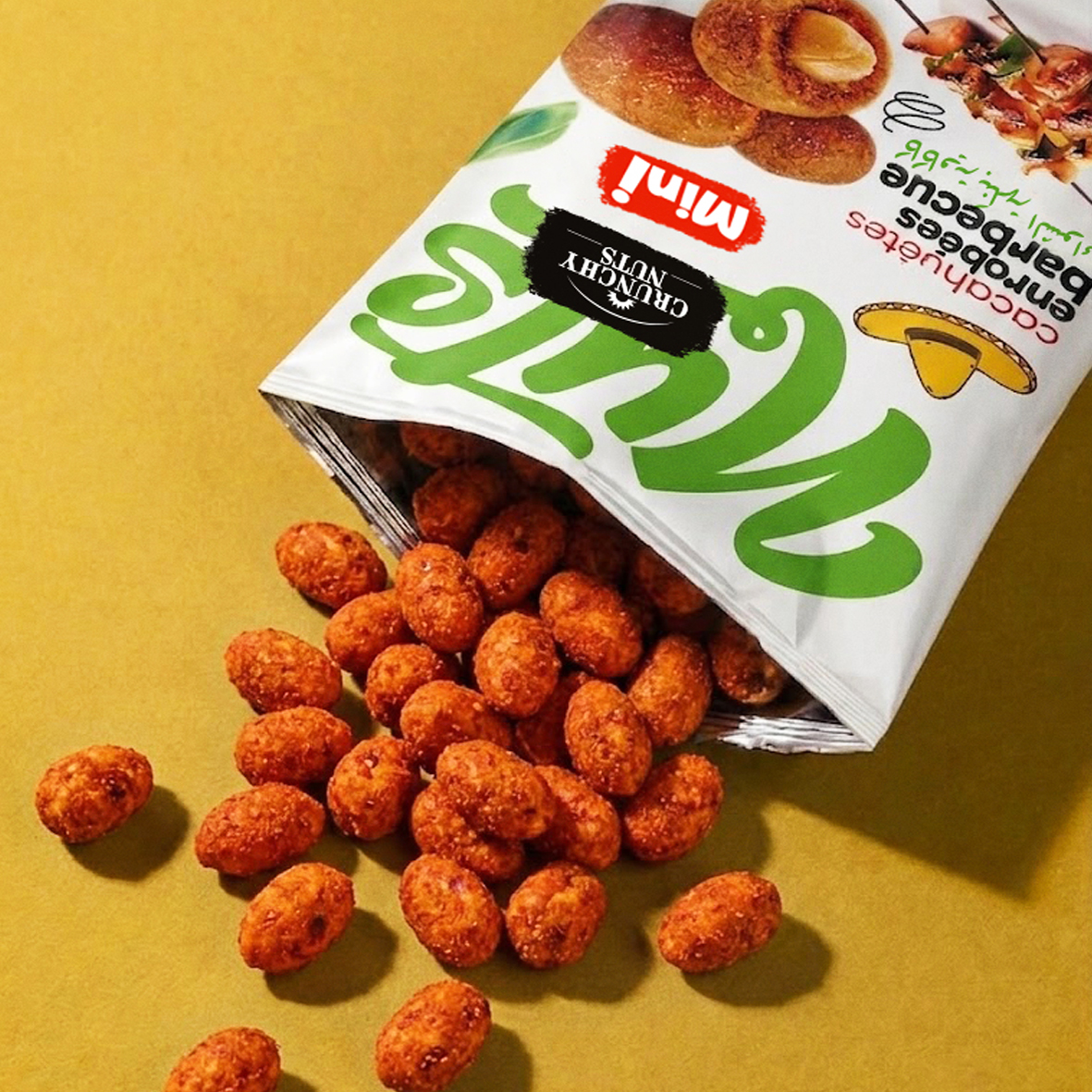
3. Appetite Appeal (Food Focus)
A high-quality, realistic image of coated peanuts:
- highlights texture and crunch
- stimulates appetite
- communicates product quality instantly
4. Playful & Cultural Elements
- The sombrero icon adds a fun, distinctive personality
- Dynamic graphic elements bring energy and movement
- Green leaves suggest freshness and natural cues
5. Trust & Credibility
- “Made in Tunisia” clearly displayed
- Quality seal enhances consumer confidence
4. Brand Deployment
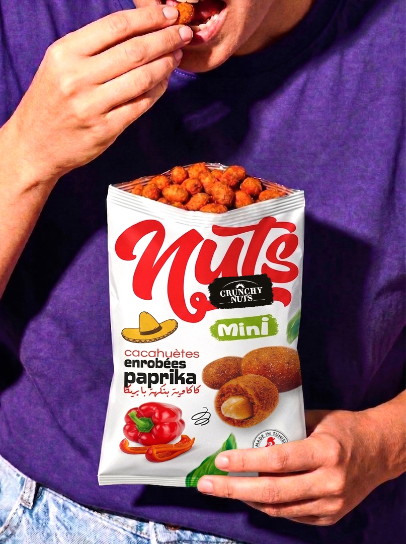
The visual identity can be extended across multiple touchpoints:
- shelf displays and wobblers (POS materials)
- promotional assets
- distributor catalogs
- digital content and product animations
The goal is to ensure a consistent and strong brand presence everywhere.
5. The Result
The Nuts – Crunchy Nuts Mini range successfully:
- captures attention instantly on shelf
- simplifies flavor recognition
- delivers a modern, dynamic, and accessible brand image
With bold design and clear structure, the brand stands out and competes effectively in a crowded market.

 Derrick Lin
 salutifg
 ADStudio
 WeAreDepot
 Manuvila
 Yellow Umbrella Creative
 Toka
Toka Studio Zak
 Atiq Alam
 monther al omari
 Modern Theory
 Sirka Agency
 DESIGN CONCEPTS
 Eva Chistyakova
 Puigdemont Roca
 marianaaworks
 bloomburo
 andreamarinnn
 Alina
Alina Saadmost
 Bruhken
 Maruf Nishat
 Richest Branding Pvt. Ltd.
 Sophiagdotcom
 saifullahmaslool
 Up-Brands