
Land Café Lahouimel — The pleasure of coffee begins at first glance
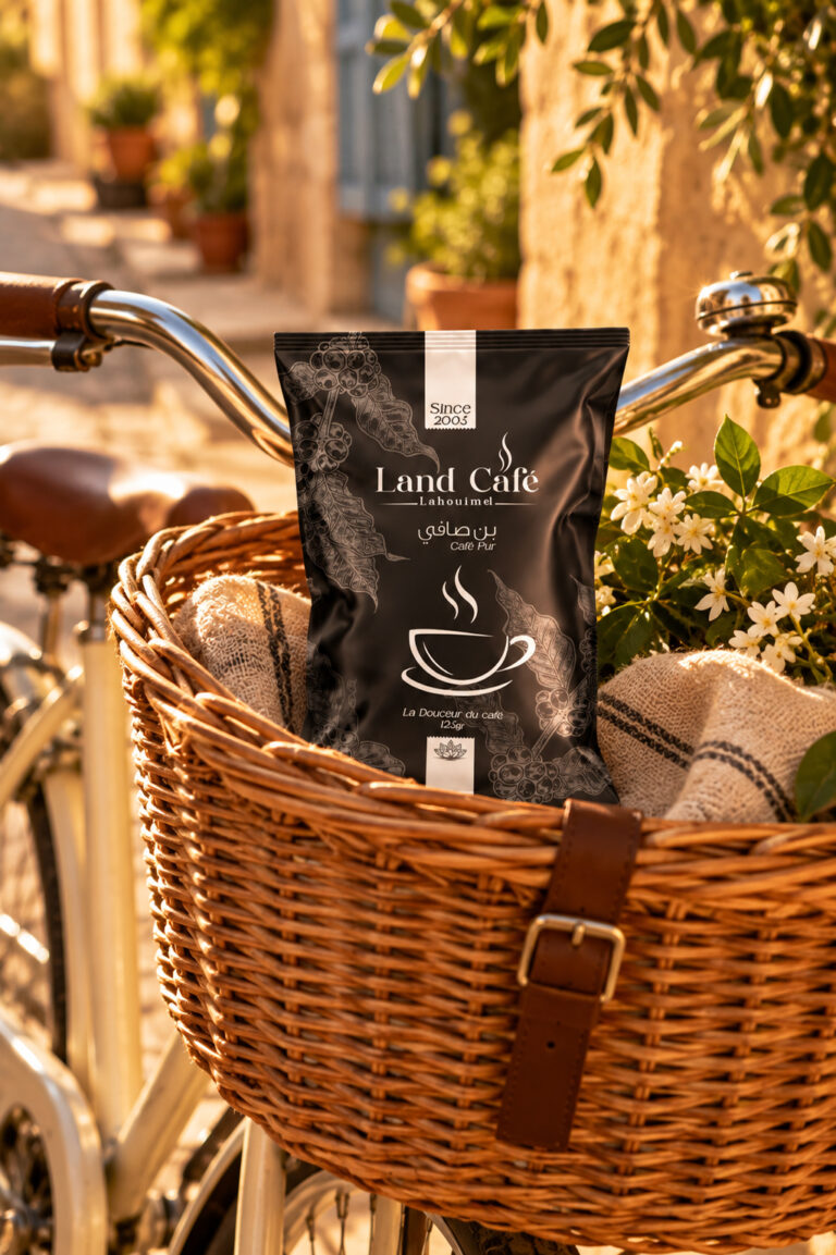
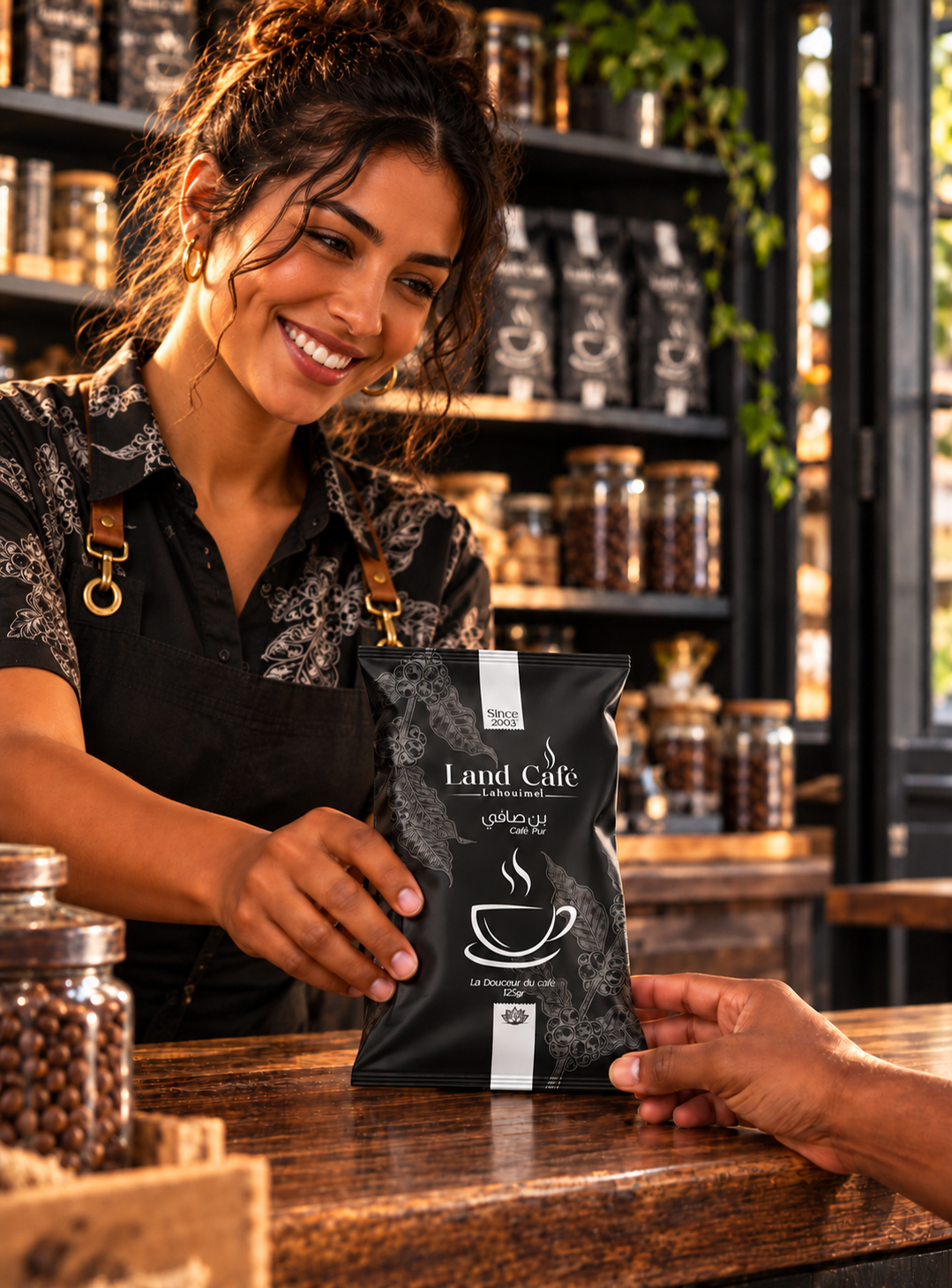
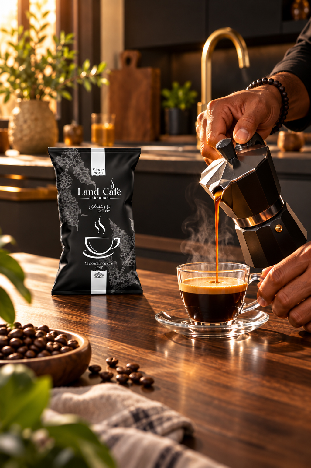
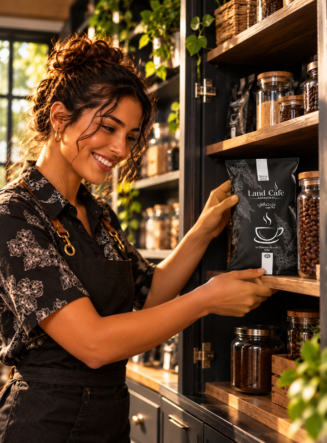
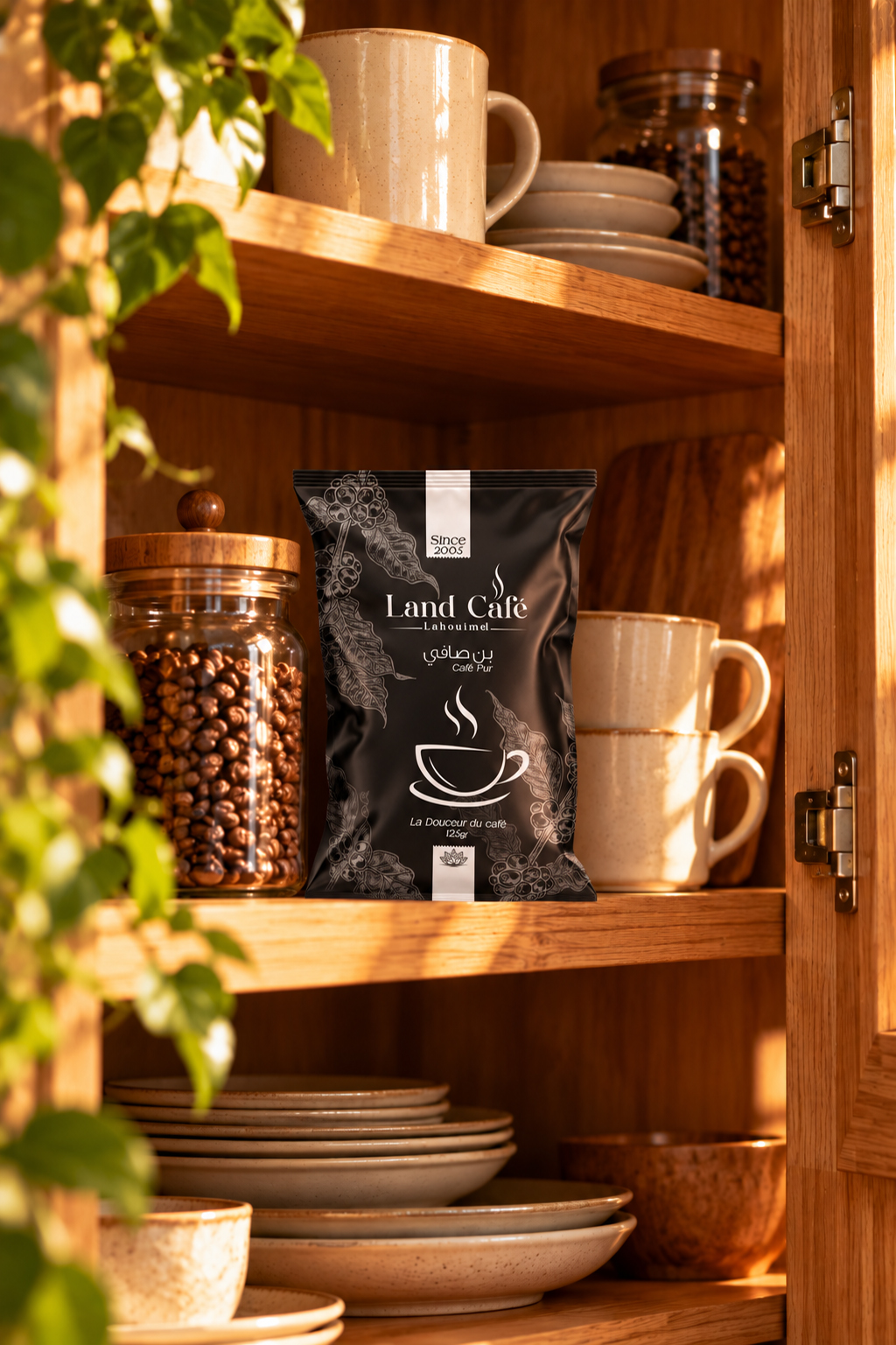
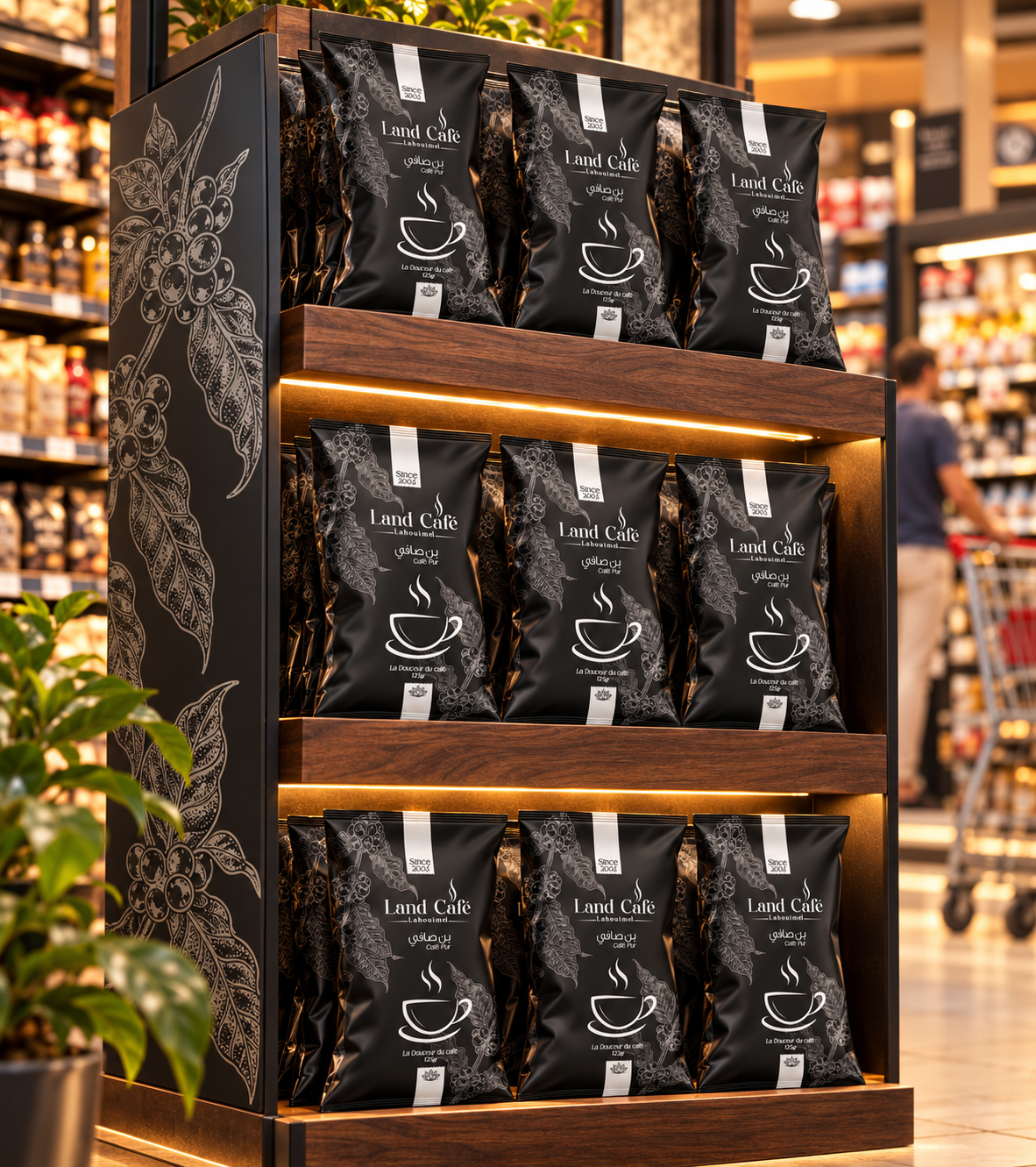
Land Café Lahouimel’s packaging combines the botanical richness of the coffee plant with the warmth of the coffee ritual. Its visual identity centres on a restrained, carefully considered composition, designed to showcase the brand and give the product a distinctive presence.
The deep black background features delicate grey illustrations of coffee leaves and cherries. This botanical backdrop evokes the product’s origins while adding texture to the design. Contrasting light lettering guides the eye and highlights the essential information.
At the centre of the composition, the Land Café wordmark is accompanied by a steam motif suggesting the warmth of freshly brewed coffee. French and Arabic lettering contribute to the brand’s identity within a balanced visual hierarchy. A stylised cup reinforces this sensory impression, supported by the promise “La Douceur du café” (“The smoothness of coffee”).
Two pale vertical accents give rhythm to the design and draw the eye towards the wordmark. The inscription “Since 2005” connects the brand’s history with its contemporary presentation.
Through its carefully controlled palette, botanical details and contrasting typography, the packaging offers an elegant and approachable expression of coffee culture. It turns the bag into a true expression of brand identity, building anticipation for the first sip before it is even opened.
 Lisa Pokrovskaya
 Simple Studio
 Studio Unbound
 David Byerlee
 M&A CREATIVE AGENCY
 alchimistestudioParis
 monther al omari
 Studio Be Design
 LogoSayLove
 agenciabud
 Shustova p
 mutta
 @Allenarts13
 Sirka Agency
 Atiq Alam
 Dozen Agency
 j.substance
 SCD
 Cristian Lepore | crilep Copia
 Chris Creative Works