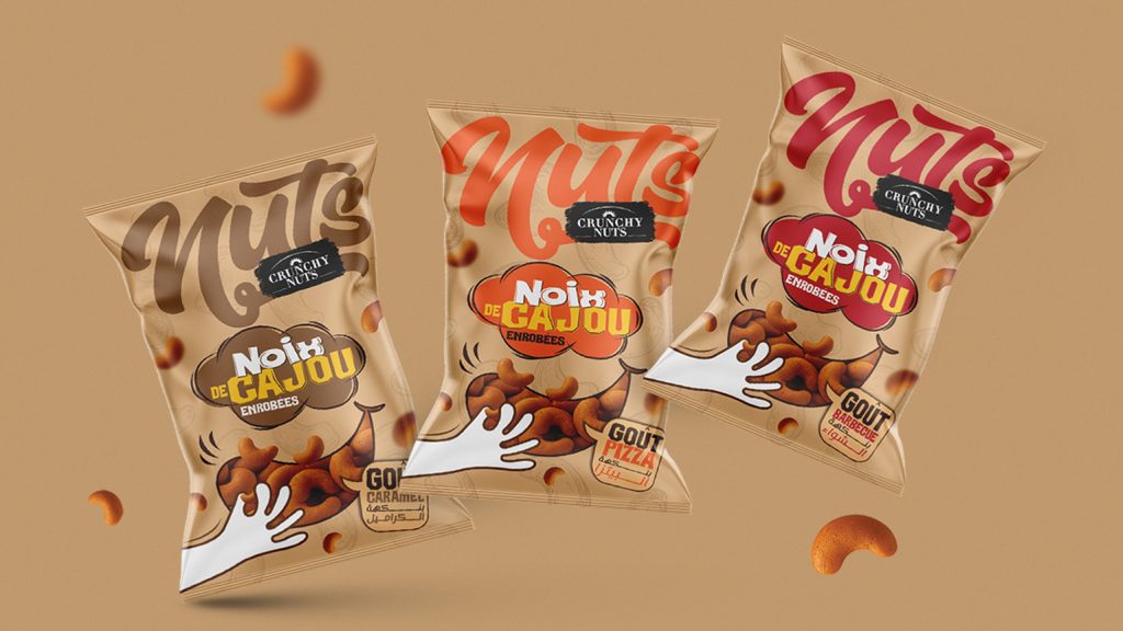

CRUNCHY NUTS — BRAND IDENTITY & PACKAGING DESIGN ( NOIX DE CAJOU ENROBÉES )
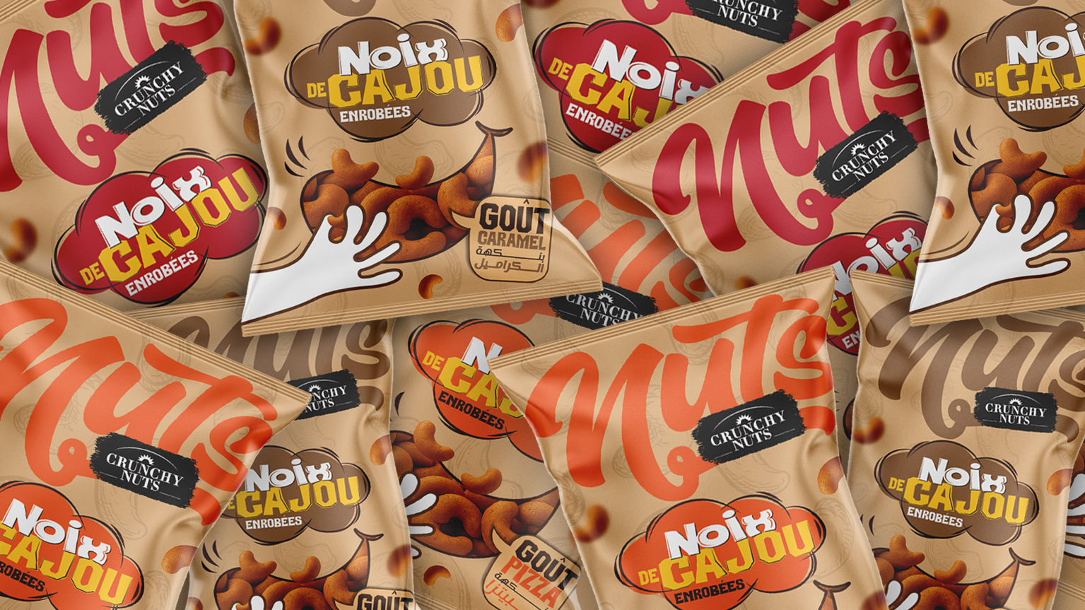
We developed the visual identity and packaging for Crunchy Nuts’ new range of coated cashews. Available in three distinctive flavors, Barbecue, Caramel, and Pizza, the collection combines individual flavor personalities with a consistent brand universe built around pleasure, energy, and spontaneity.
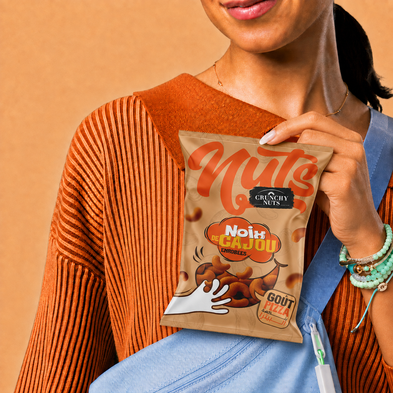
Created for a young, curious, and flavor-driven audience, the range transforms the familiar cashew into a bold and playful snacking experience. Whether enjoyed during a break, shared with friends, taken on the go, or served at a casual gathering, Crunchy Nuts adds an unexpected burst of flavor to every moment.
A FLAVOR YOU CAN SEE:
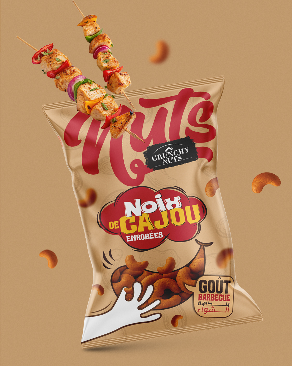
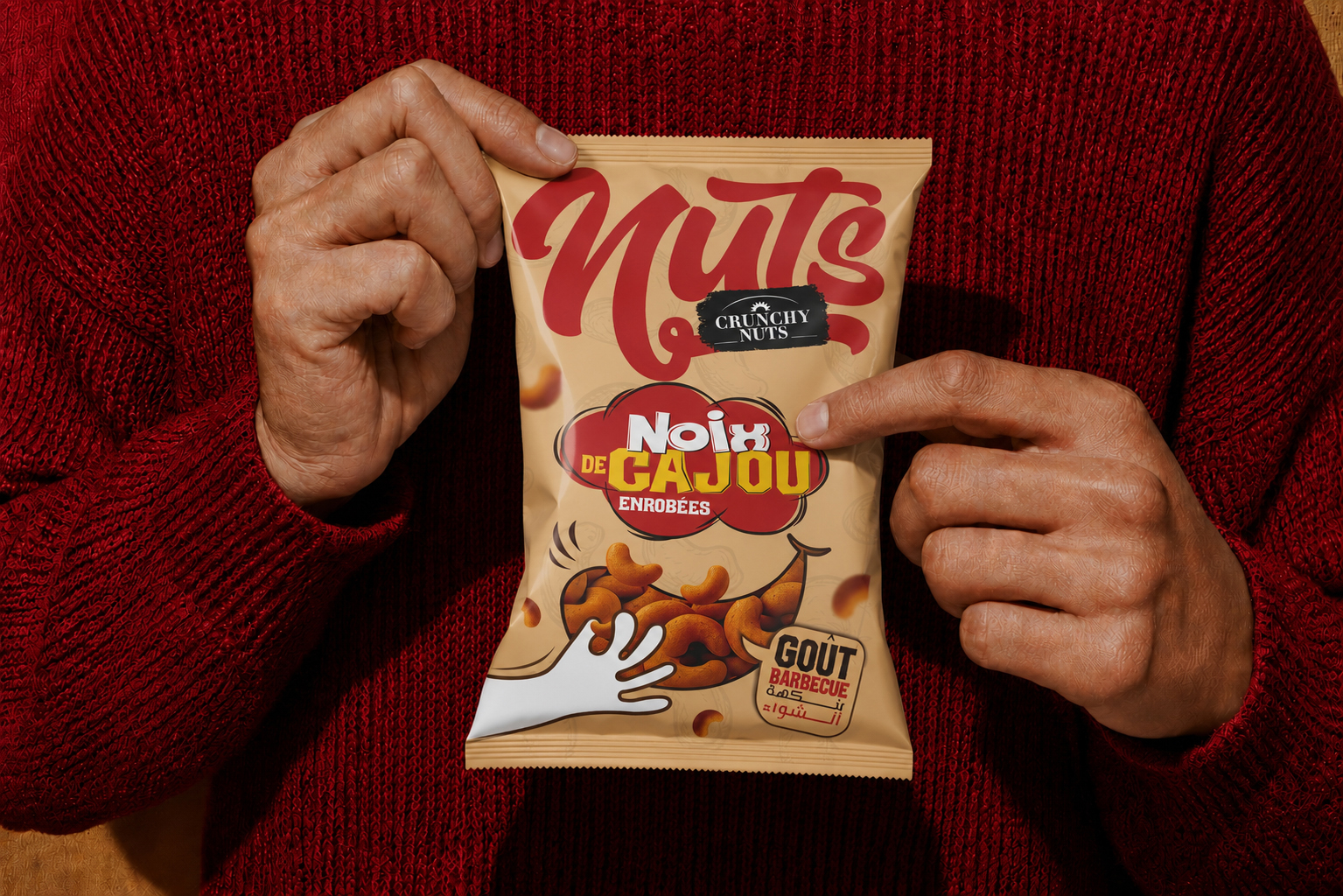
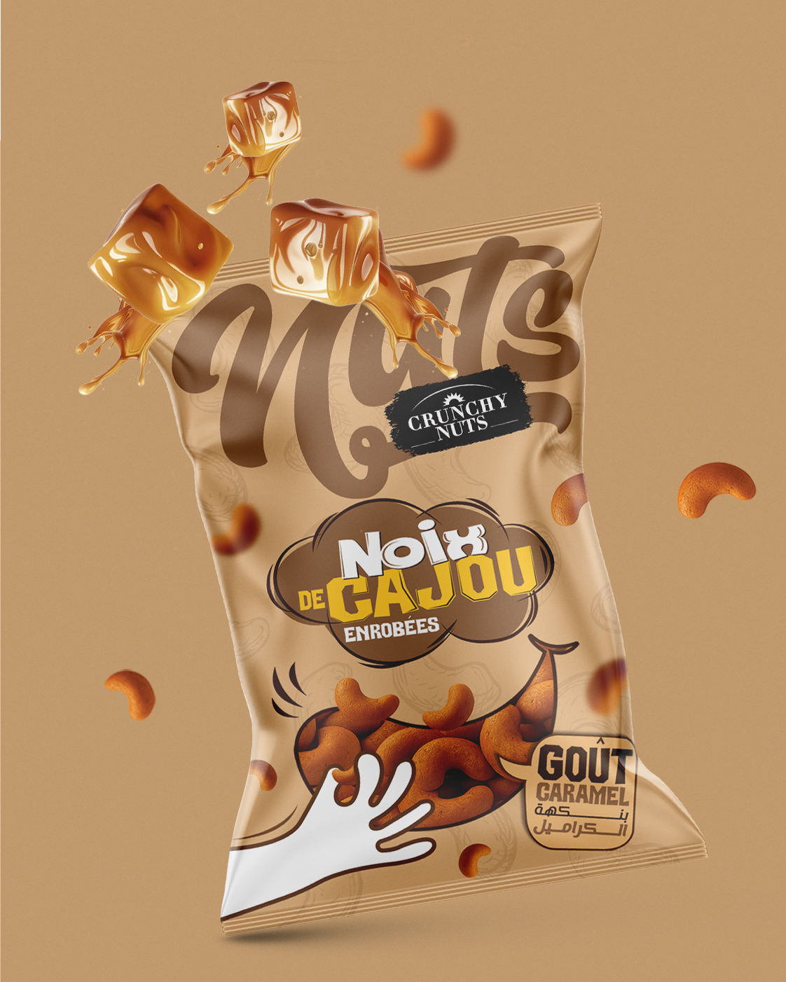
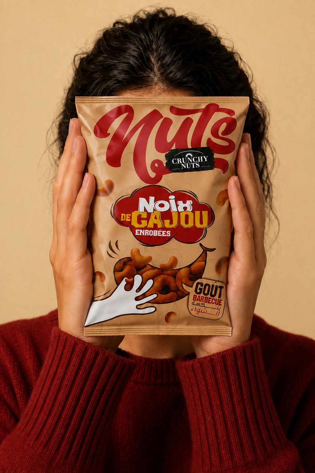
Each package is designed to communicate its flavor at first glance. The color palette functions as an intuitive navigation system across the range: deep red expresses the smoky intensity of Barbecue, warm brown conveys the rich sweetness of Caramel, and vibrant orange captures the generous, lively character of Pizza.
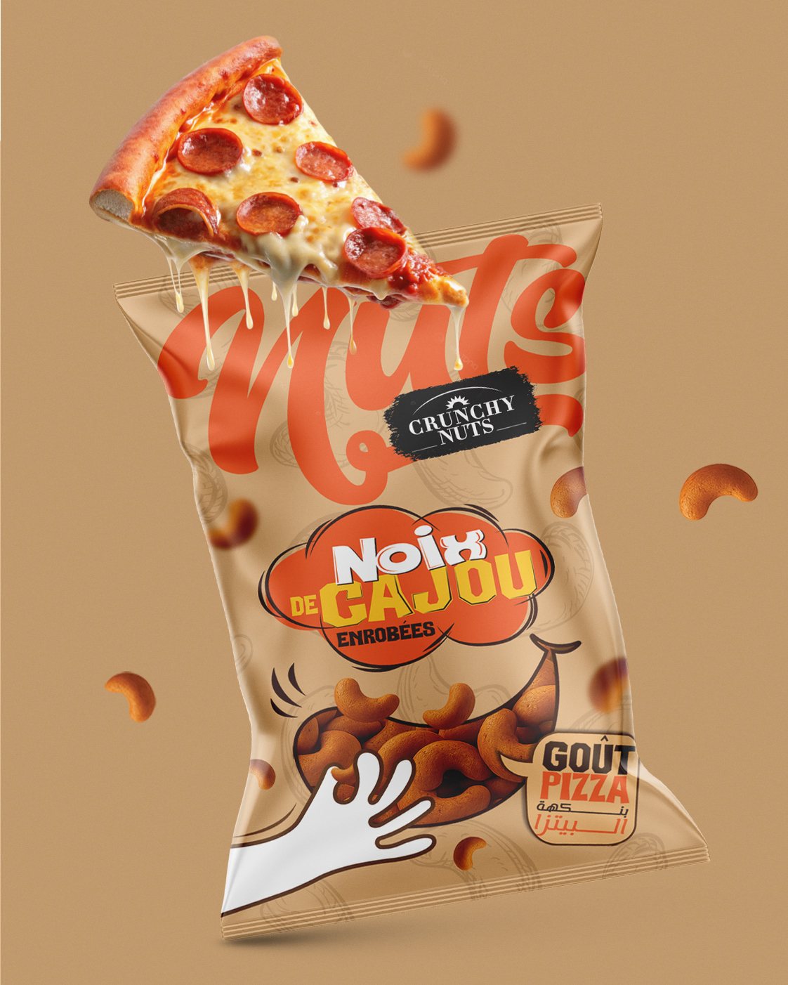
Beyond color, each variant features its own appetizing flavor cue, grilled skewers, melting caramel, or a cheese-filled pizza slice, creating immediate recognition and strengthening the product’s sensory appeal.
A BOLD AND COHESIVE VISUAL SYSTEM:
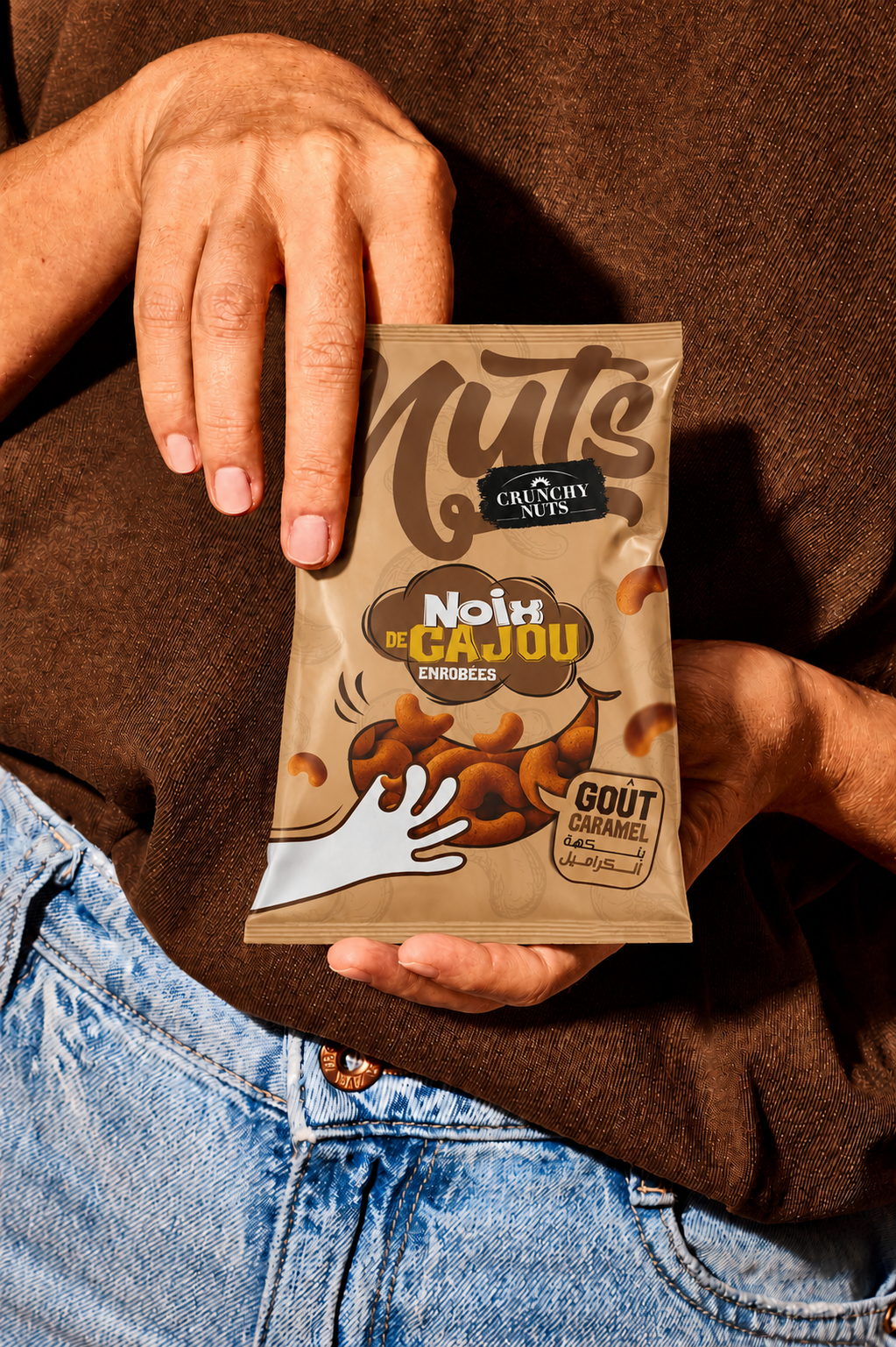
The packaging identity is built around oversized expressive lettering, comic-inspired graphic badges, illustrated cashews, dynamic gestures, and clearly structured French, Arabic labeling. Together, these elements create a vibrant visual language that feels youthful, energetic, and instantly approachable.
The hand reaching toward the illustrated cashews introduces movement and interaction, reinforcing the spontaneous and irresistible nature of the product. The black brushstroke logo acts as a strong visual anchor, while the generous “ Nuts ” lettering gives the packaging a distinctive and memorable shelf presence.
The natural kraft-inspired background connects the visual identity to the authenticity of the core ingredient. Contrasting flavor colors, expressive illustrations, and playful compositions give each variant a unique personality while maintaining strong consistency across the entire range.
DESIGNED FOR EVERYDAY MOMENTS:
The identity was extended through a series of dynamic product visuals and lifestyle compositions. Floating cashews, expressive flavor ingredients, bold monochromatic environments, and close-up product interactions place the packaging at the center of an energetic and contemporary brand world.
The result is a coherent packaging system that balances appetite appeal, visual impact, and accessibility, helping Crunchy Nuts stand out on the shelf while building a recognizable and engaging identity across every consumer touchpoint.
 Otherness
 Alena Chemodurova
 Estudio Argo
 Pomodoro Design Office
 amandacoppeti
 Rabia zouina
 VANESA GARCÍA ESTUDIO
 anima
 Radar Agency
 Aadarsh Jain
 M&A CREATIVE AGENCY
 Valérie Colace
 Antonia Skaraki
 Aurora Baréalisse
 Artrime Graphic Design
 Just Design
 ANONIMA/
 Armoder Arte y Diseño
 eimanbeh
 Biaa
 Hartson Creative
 Karen Danielyan
 AUN BRANDS
 Studio Zak
 Hey Joe Studio