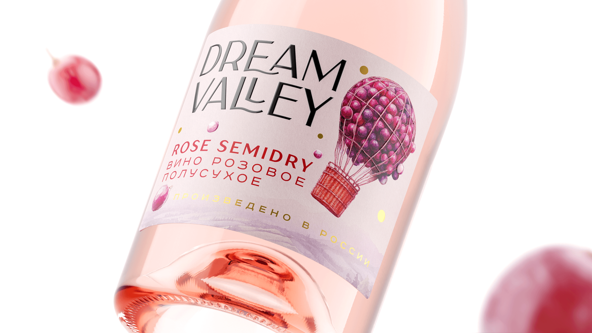

The task was to create packaging for a line of light, lightly sparkling wines that would play on the existing name “Dream Valley,” feel at home in the category, and speak to a broad mass-market consumer.
Wines in the accessible segment usually try to sell facts. Grape variety, region, vintage. Useful information, but not what the shopper actually needs. What they need is the right feeling — in this case, lightness, the playfulness of bubbles, a small escape from the everyday. We found the answer in a simple, legible image: a hot air balloon assembled from grape clusters, floating above Dream Valley itself.
The graphic language is watercolor and dreamy, built on translucent hues and soft gradients. Materials reinforce the concept: pearl paper gives the surface a gentle luminosity, raised UV varnish accents the berries and adds juiciness and weight, and foil stamping delivers a quiet golden shimmer.
The result is a design that holds its balance. It looks original and stands out on shelf, while staying immediately readable within the category and well within what consumers expect. The key is a strong anchor image, the “wine” balloon, that registers and sticks at a glance. A simple, universal metaphor for lightness, accessible to anyone.


 lunapanda
 Tridimage
 Analoguecreative
 lettera7
 alchimistestudioParis
 Lana B
 Colossal
 Pivot Studio
 M&A CREATIVE AGENCY
 monther al omari
 Anastasia Cherepanova | xtramez
 Hollóka Grafikai Műhely / Graphic Design Studio
 BOLD branding
 Antonia Skaraki
 Pâmella Lorrany
 Z9BKAdsgn
 Francesco Paternoster
 b1studio.ro
 Chris Creative Works
 Boordon
 Dmitriy Kuzovlev
 Brand Society
 yasharpic