
Challenge
Domaine Bertaud Belieu, one of France’s oldest wine estates, approached us to create the label design for La Grande Bastide, a premium French rosé. The design needed to capture the atmosphere of Provence, reflect the region’s winemaking heritage, and convey the wine’s refined character.
Our goal was to create a distinctive premium identity — elegant, sensual, and contemporary, yet with a subtle classical touch.
Solution
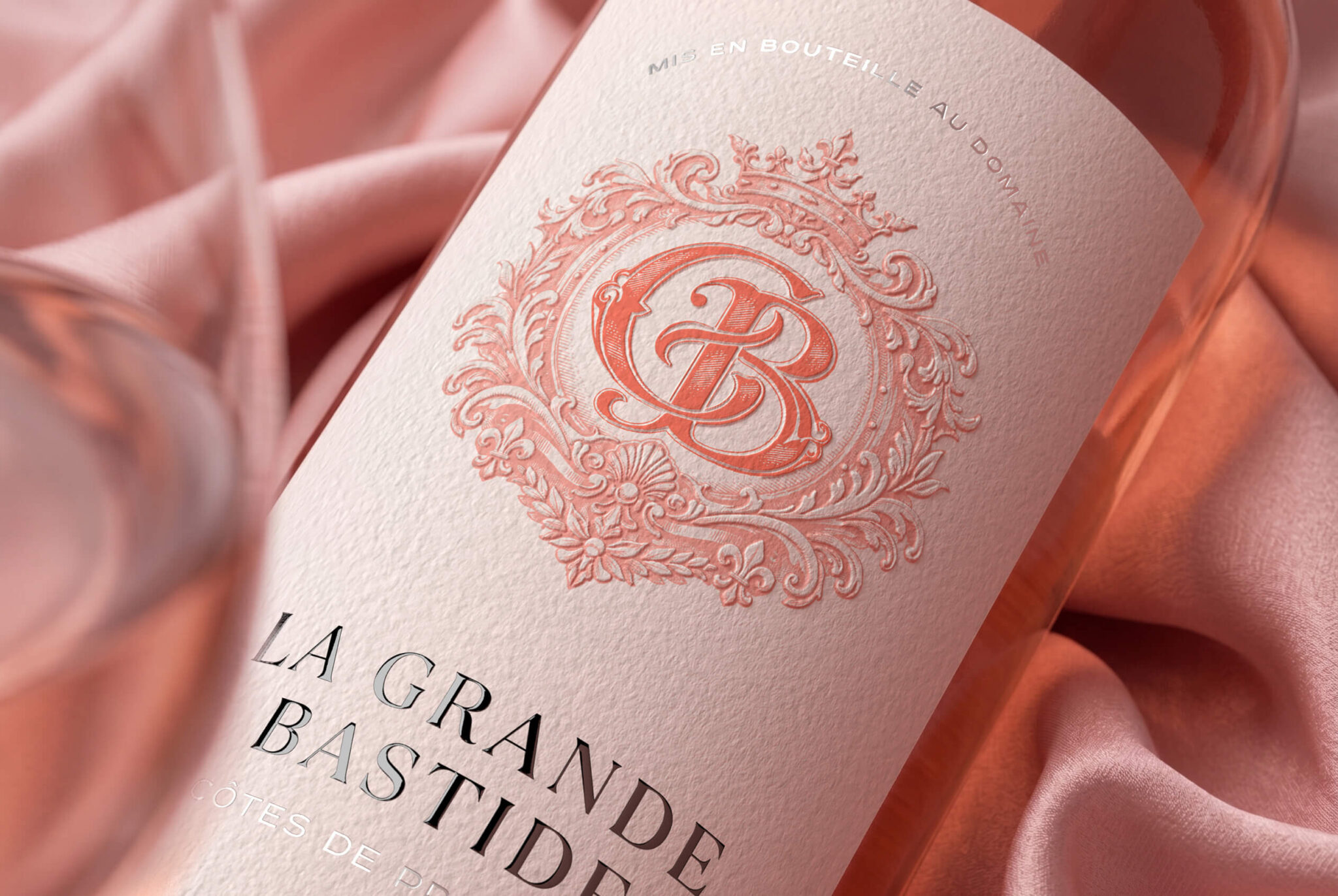
At the heart of the label is an elegant monogram framed by an intricate heraldic ornament. Fine linework, botanical motifs, and delicate decorative details evoke a sense of heritage, craftsmanship, and understated nobility.
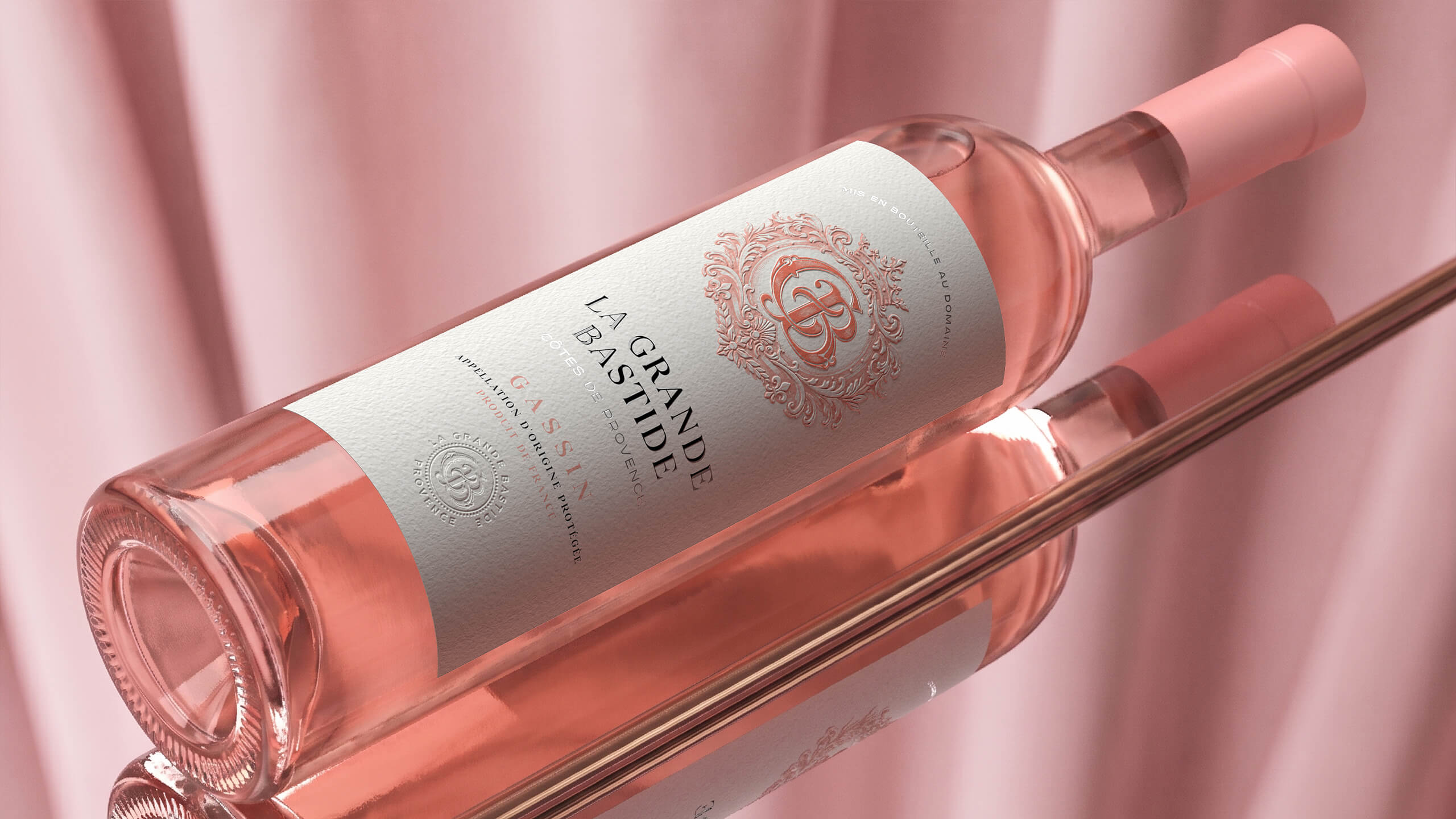
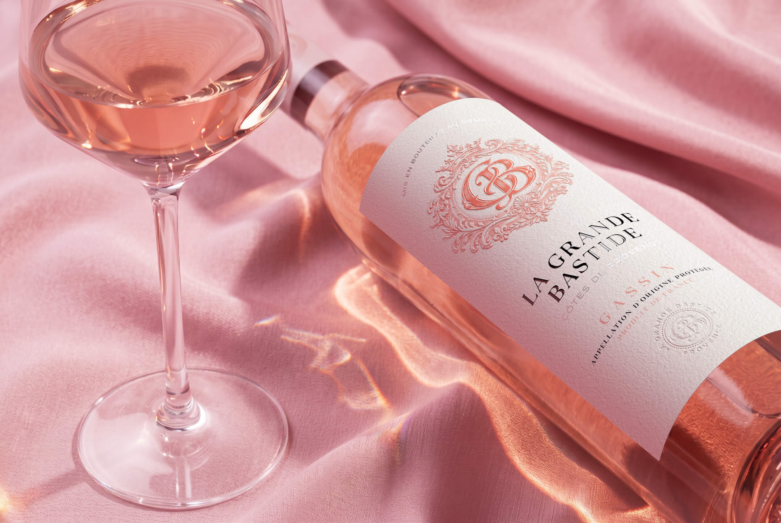
Thick, textured paper enhances the natural and premium character of the wine, while embossed elements add a tactile dimension to the label and reveal its intricate details as the light changes. Coral-pink accents echo the colour of the rosé itself, while contrasting black typography gives the composition clarity, character, and sophistication.
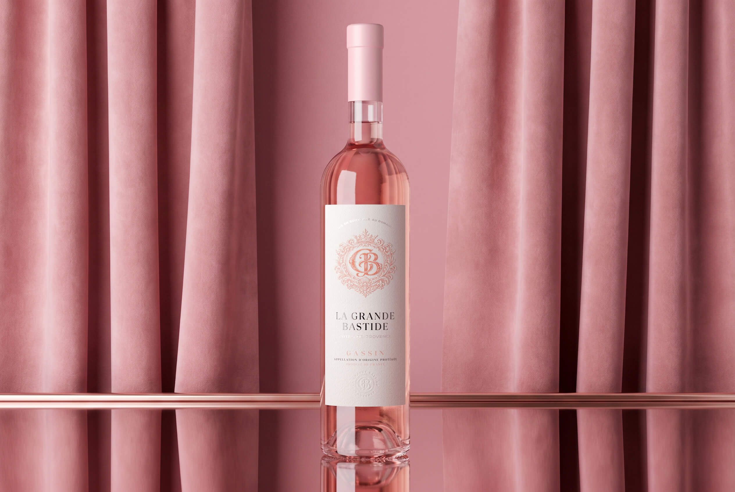
The La Grande Bastide name occupies a prominent place within the visual hierarchy. Classical serif typography, generous use of negative space, and subtle metallic accents create an impression that feels refined and celebratory, yet light and effortless. A pink capsule completes the bottle design, bringing all the elements together into a harmonious colour system.
Result
The result is a cohesive premium identity for La Grande Bastide, combining the traditions of French winemaking with a contemporary aesthetic. The packaging emphasises the wine’s French provenance, creates distinction through its expressive monogram, and establishes a strong and recognisable visual code for the brand.
Textured materials, delicate decorative graphics, and nuanced shades of pink create an emotional connection between the colour of the wine and the bottle itself. La Grande Bastide emerges as a refined Provençal rosé — light, elegant, and distinguished by a character of its own.
 hello ocean
 monther al omari
 the Labelmaker
 alamgirbrands
 kat bres
 Vantablack Studio
 GruppoSaida
 studiorevv
 grafisercreative
 Kate Reichel
 UPRISE
 Modern Theory
 By siddika
 MAISON D'IDÉE Prague
 Kinshuk Bainss
 Palashcc
 www.branding.uz
 Hutton Creative
 DESIGN CONCEPTS
 Tancybox
 habiba hatem
 Up-Brands
 sayadworks
 Kingdom & Sparrow
 furtgoods
 Si me preguntas