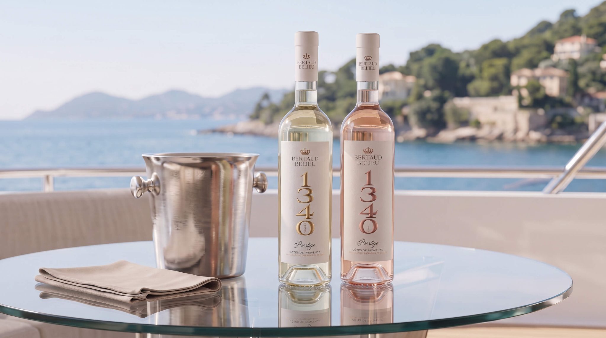

Founded in 1340, Domaine Bertaud Belieu is one of the oldest wine estates in France. Located on the French Riviera, the estate covers 65 hectares in the heart of the Saint-Tropez peninsula. Such a heritage is a rare asset in wine and spirits branding: few wineries can support their premium positioning with almost seven centuries of authentic history. The packaging design challenge was therefore to translate the château’s centuries-old legacy into a contemporary visual language—both in terms of design and production.
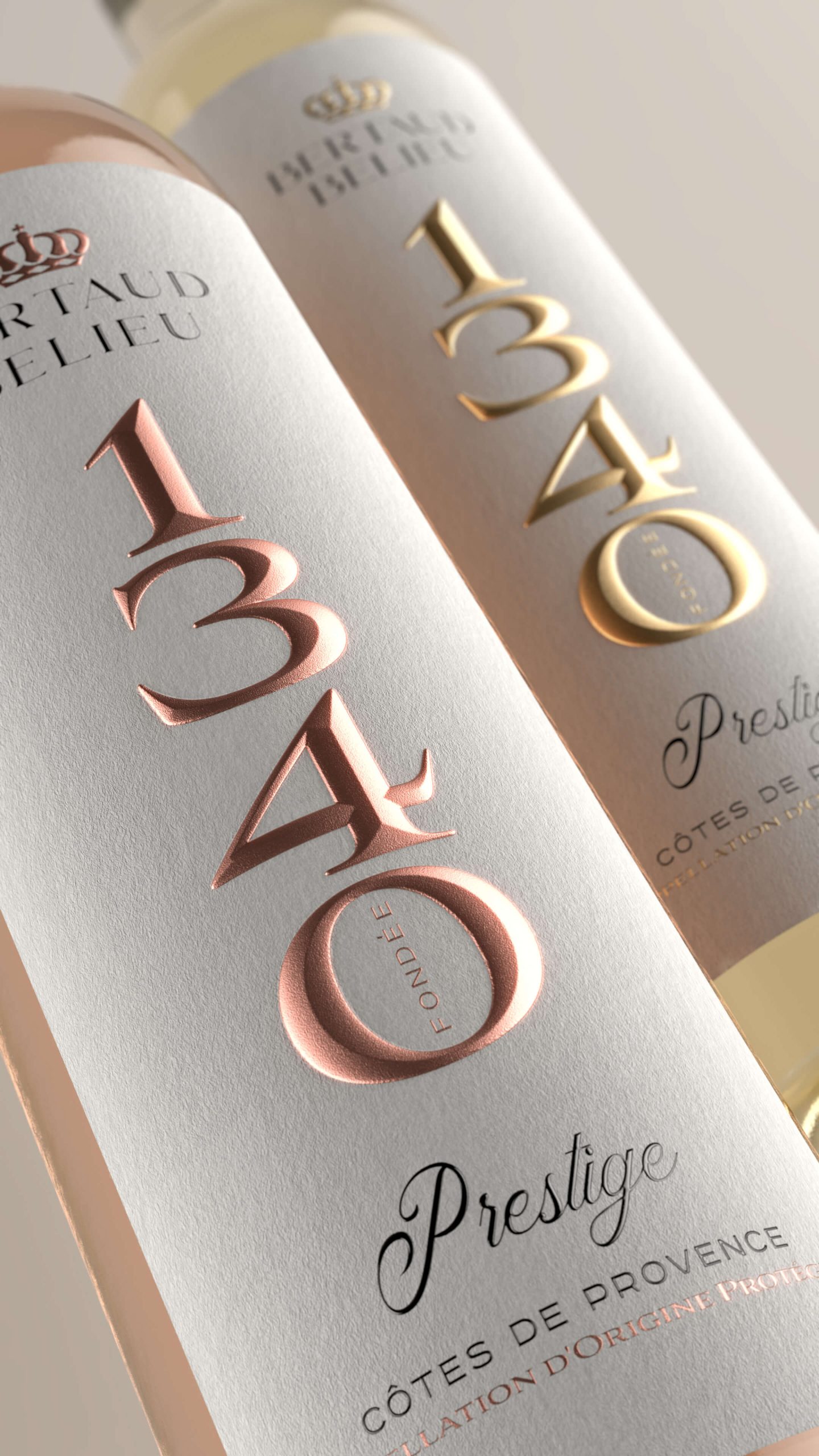
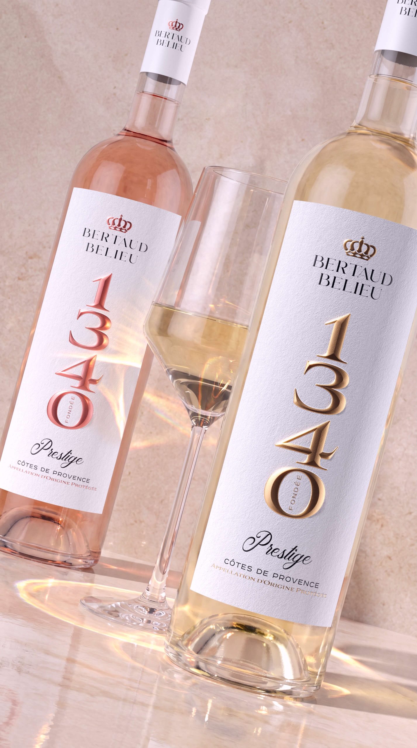
The centrepiece of the new label design is the number 1340—the year the estate was founded—presented through monumental, almost architectural typography. Large serif numerals arranged in a compact vertical column occupy nearly half the height of the label. They work equally well on the shelf of a fine wine boutique and in a digital storefront.
Foil colour differentiates the wines within the range: the rosé features the numerals in matte copper-rose foil, while the white wine uses gold foil. Their monumental character is enhanced by sculpted 3D embossing, which is particularly effective on the thick, textured paper. Its surface evokes the feel of precious stone and echoes the marble terraces of the historic château.
The handwritten italic word “Prestige” beneath the numerical block is the composition’s only soft element. It balances the austere geometry of the numerals and gives the label the character of a personal signature. Raised varnish intensifies this effect, making the lettering appear as though it has been written in fresh ink that has not yet dried.
The label design works at two viewing distances: from afar, it acts as a distinctive and recognisable brand code; up close, its tactile details reveal themselves to the attentive customer. The estate’s centuries-old history is conveyed through graphic design, premium paper, and sophisticated post-print finishing.


 NEV
NEV Stefano Bracci
 Alina
Alina monther al omari
 Lizakjx
 JOAOMARCOSDESIGN
 alchimistestudioParis
 Harriet Neild
 octavio rojo
 宏洛图品牌设计HONGLT
 DESIGN CONCEPTS
 Alexander Skurihin
 Studio K95
 ARMBRAND
 Richa Rai
 houseoferas by Miti
 Agence des Coteaux
 Kushi Eaknath
 Ann Treasa
 Xiao Ning
 krrrrrllii
 babyage
 Deep
Deep