
The Brand and Name:
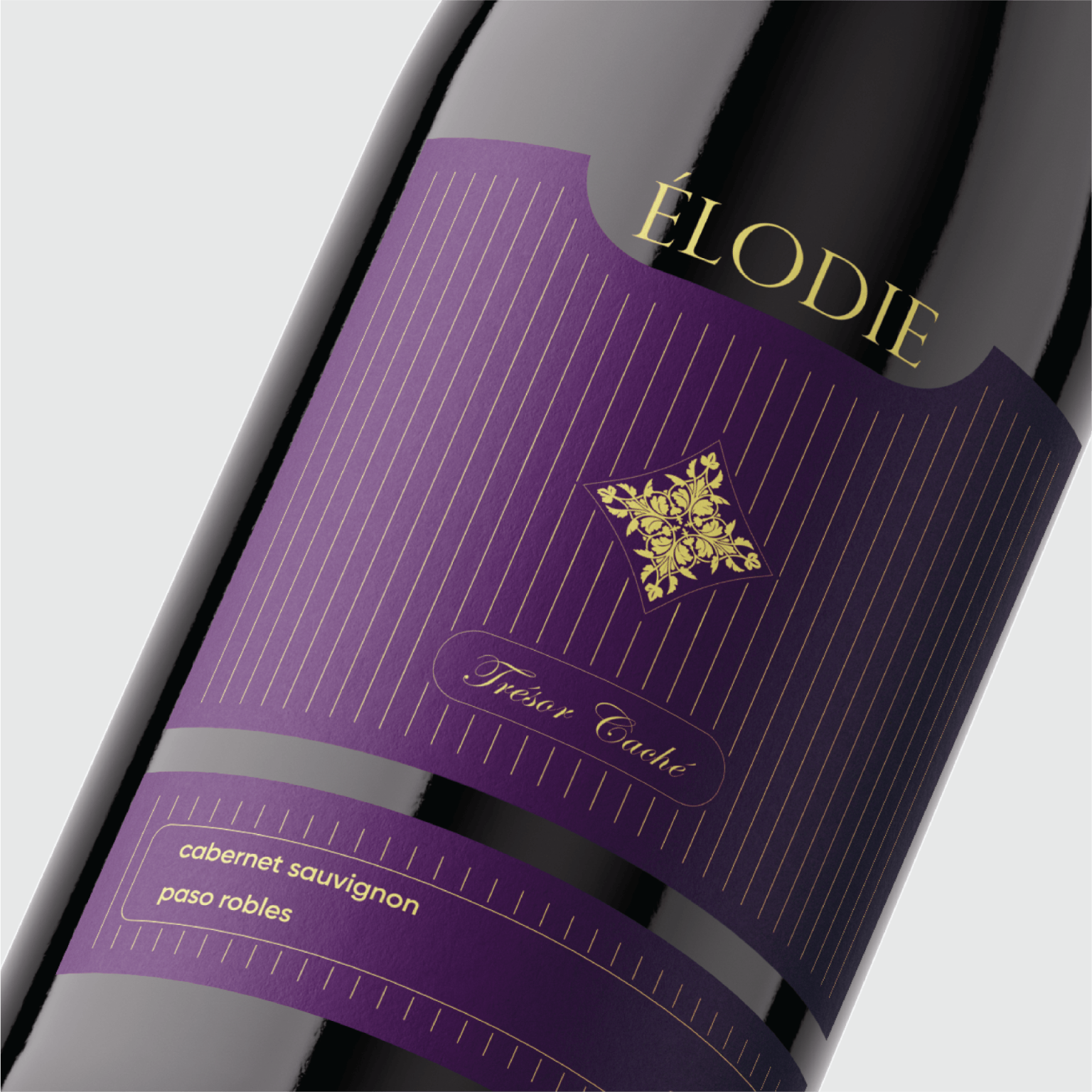
The project features ‘ÉLODIE,’ a premium wine brand that embodies sophisticated femininity and timeless elegance. The name, of French origin, sets the stage for a luxury product deeply rooted in classical design principles.
Design Concept:
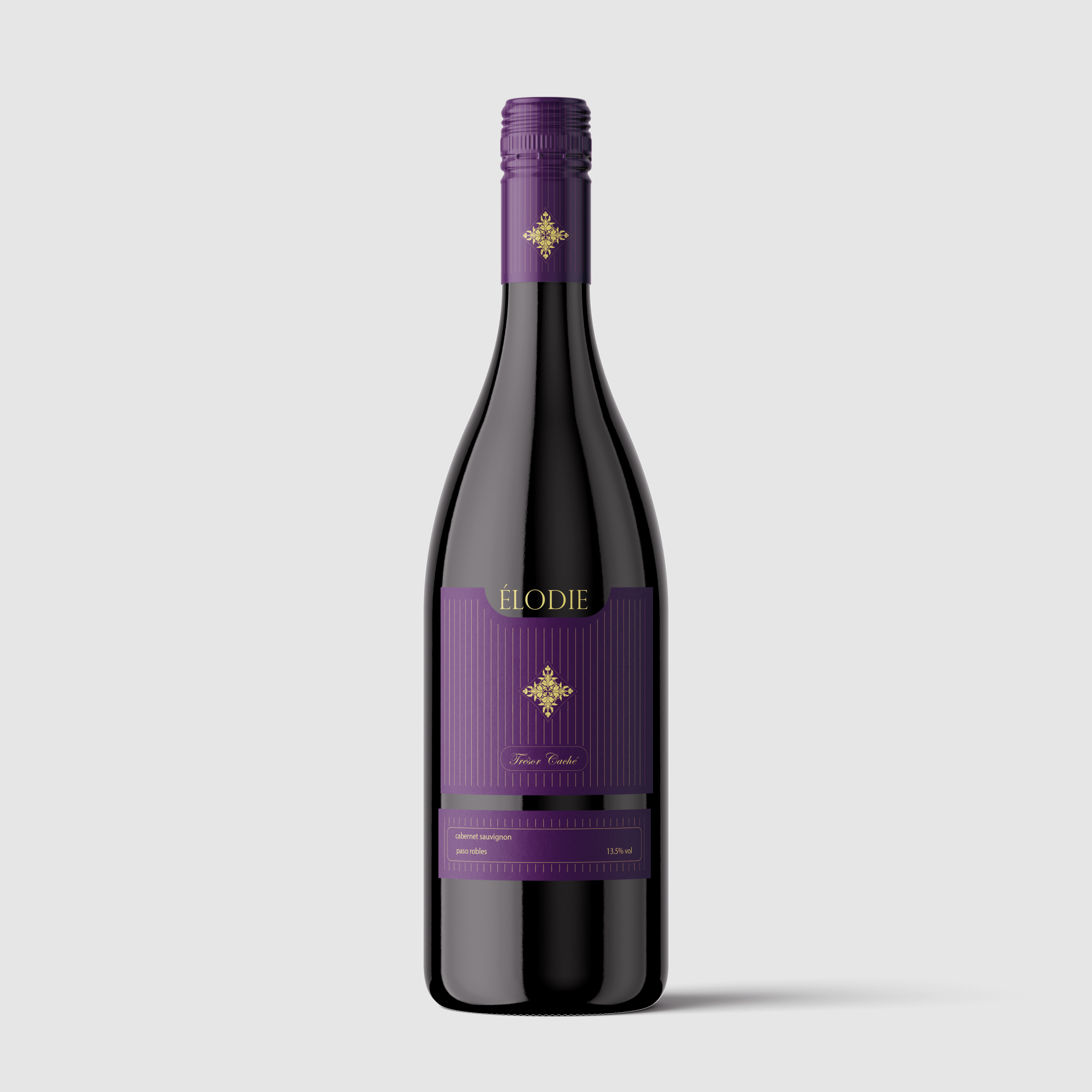
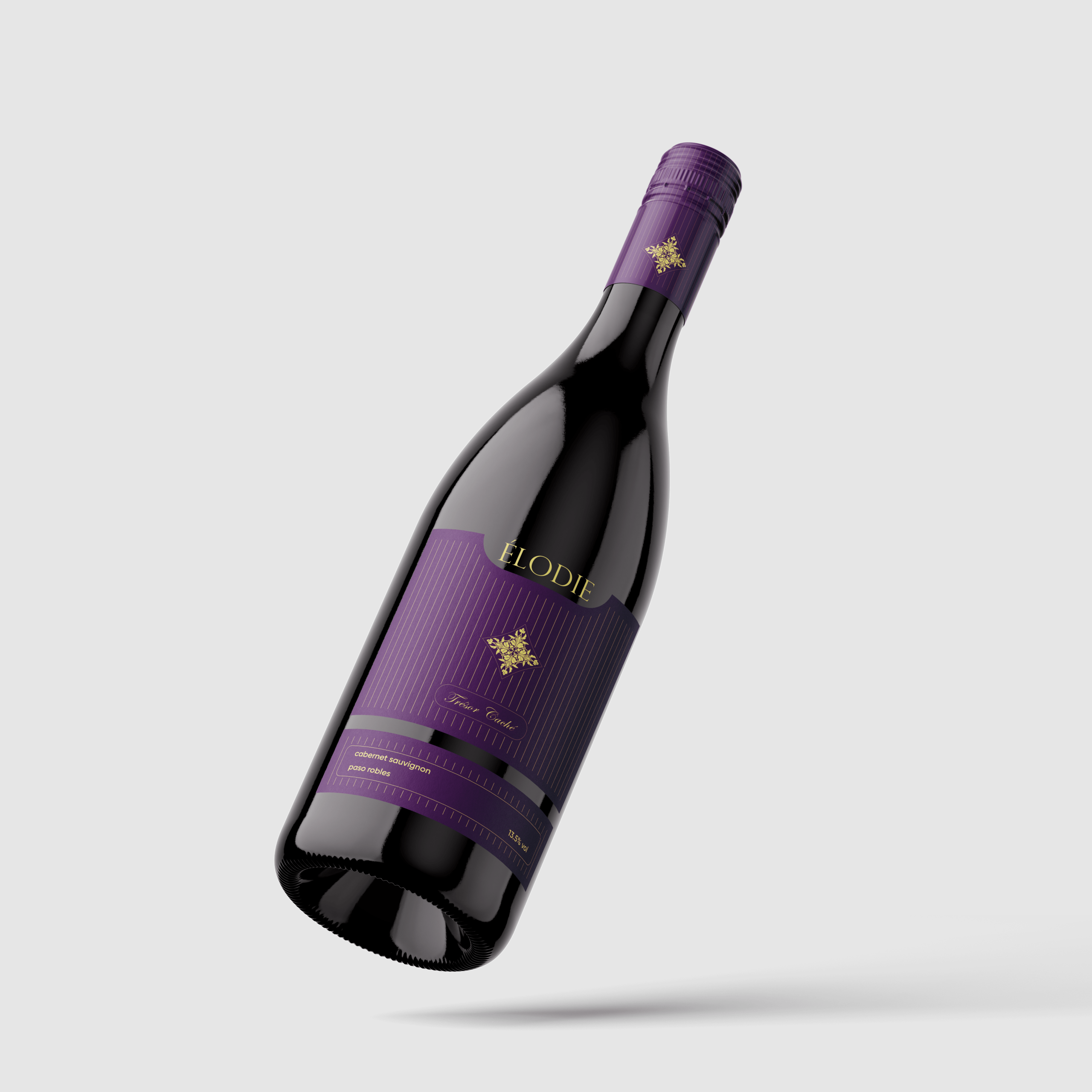
The packaging concept focuses on minimalism with high-end execution. A deep, rich Royal Purple was selected for the primary label color, serving as a distinct signifier of exclusivity and quality. To add depth and character to the visual narrative, the label features subtle vertical pinstripes and a finely textured paper stock.
Visual Elements and Execution:
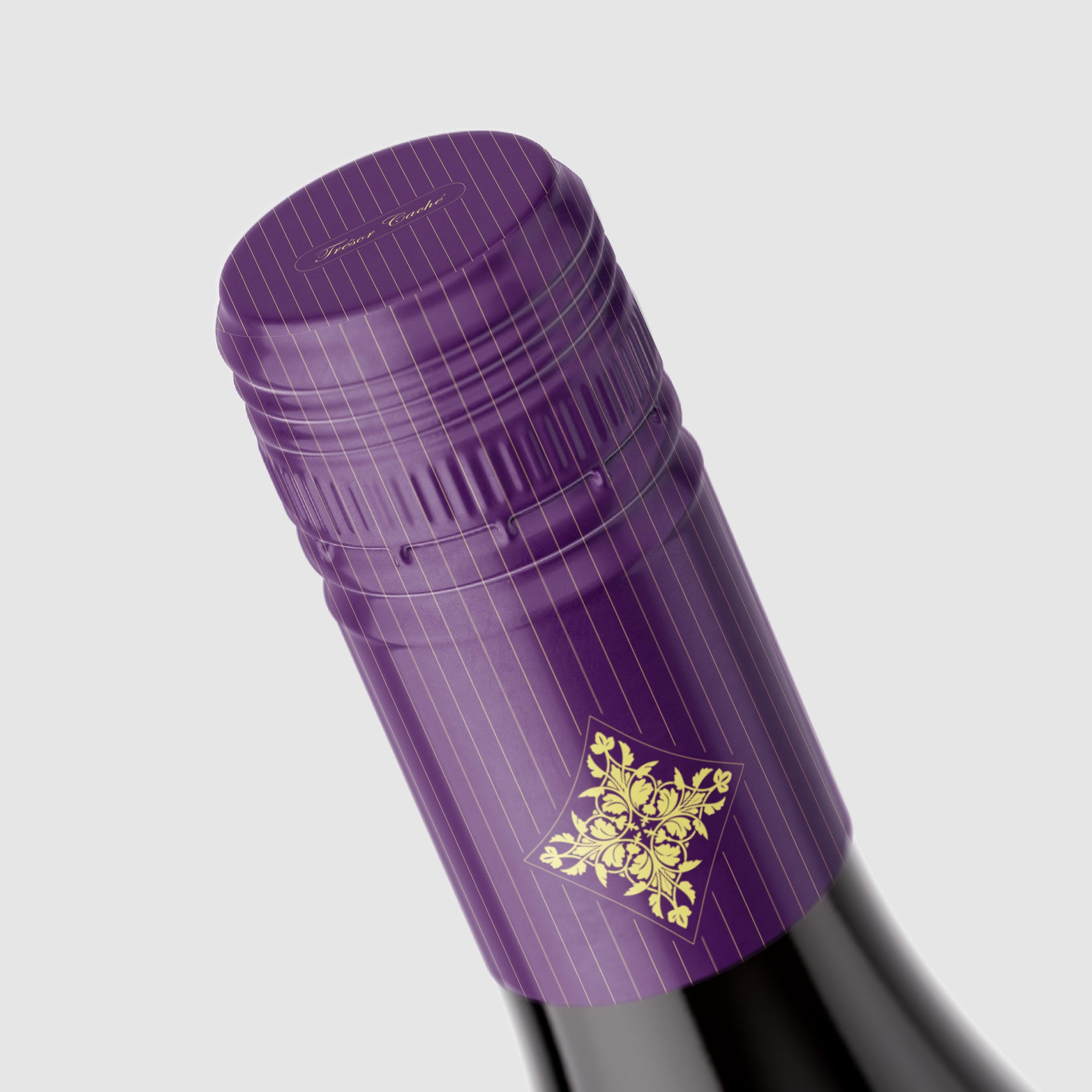
The branding utilizes a clean, bespoke typography for ‘ÉLODIE’ on the upper label, while the central focus is an intricate, classical ornamental emblem stamped in brilliant gold foil. This central mark is the ‘Trésor Caché’—the Hidden Treasure—which is subtly referenced in a delicate script below the emblem. The lower label cleanly presents the essential product details: ‘cabernet sauvignon’ and the specific region ‘paso robles,’ ensuring the brand’s premium perception is maintained with legible, sophisticated typography.
Overall Aesthetic:
The result is a contemporary interpretation of a vintage wine identity, offering a luxurious experience on the shelf. The interplay of tactile paper, deep color, and precise gold foil finishing ensures that ÉLODIE stands out to discerning consumers looking for quality and heritage.
 Li Jie
 Lung-Hao Chiang
 Alessandro Ammaturo
 Antonia Skaraki
 Narrow House Packaging Branding & Design
 teresaredon
 Eva Chistyakova
 Akshay 11
 cheleto
 nadayasser13e
 hello ocean
 Modern Theory
 Alexander Skurihin
 Valérie Colace
 Squad
Squad Studio Zak
 Bhumika Singh
 宏洛图品牌设计HONGLT