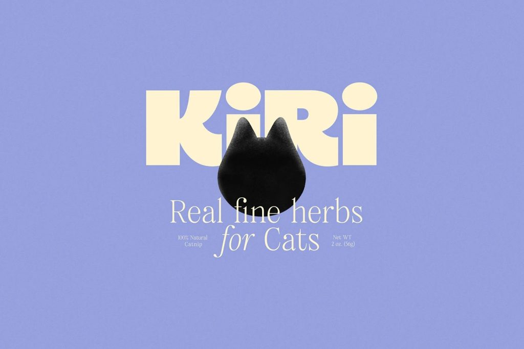

Curator’s Insight: Kiri — Real Fine Herbs for Cats
There’s a running joke among cat owners that half the money spent on pets is really spent on making the owner feel good. Kiri, a conceptual project by Estudio Albino, leans into that truth completely, and the result is one of the more quietly clever pet product concepts to come along in a while.
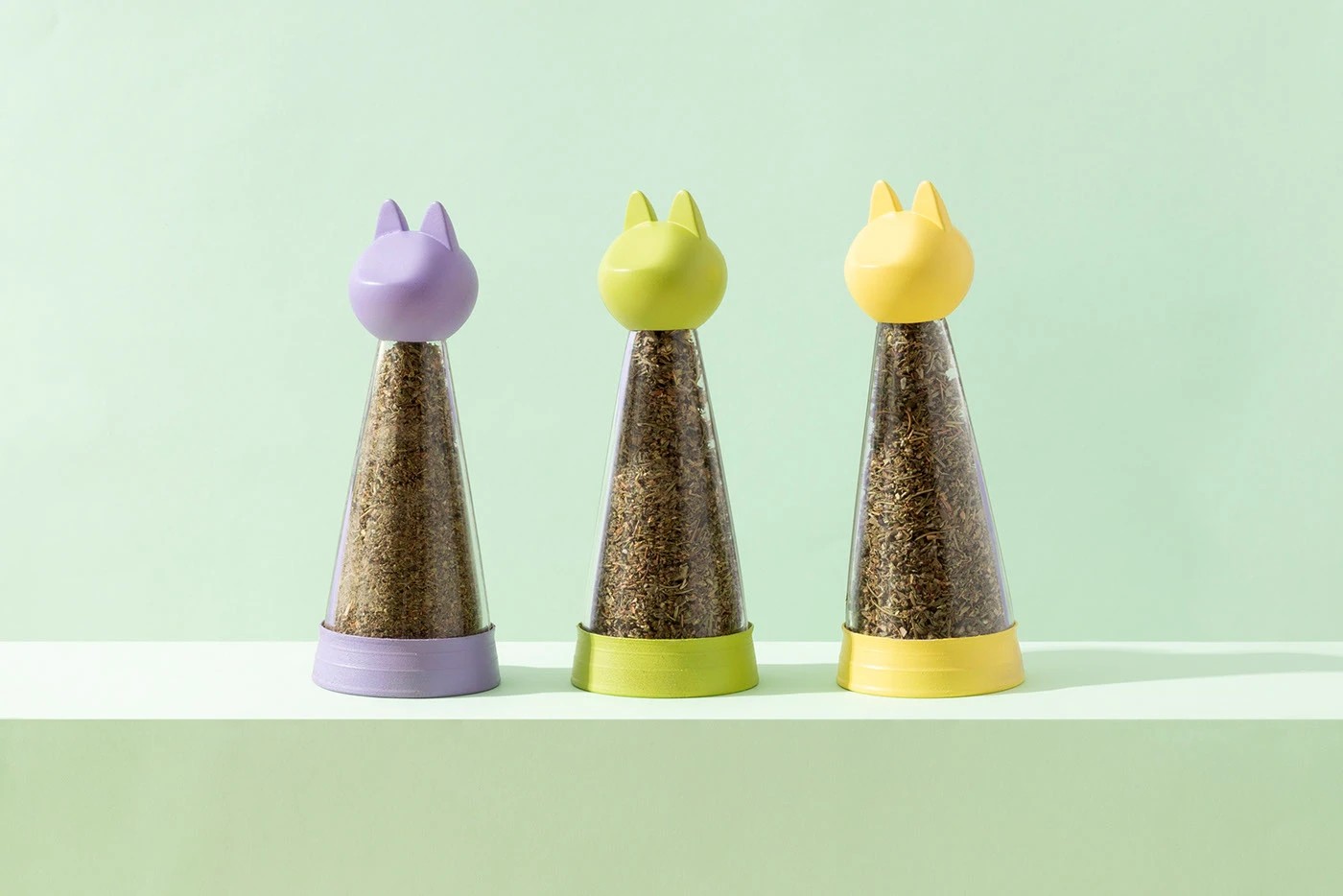
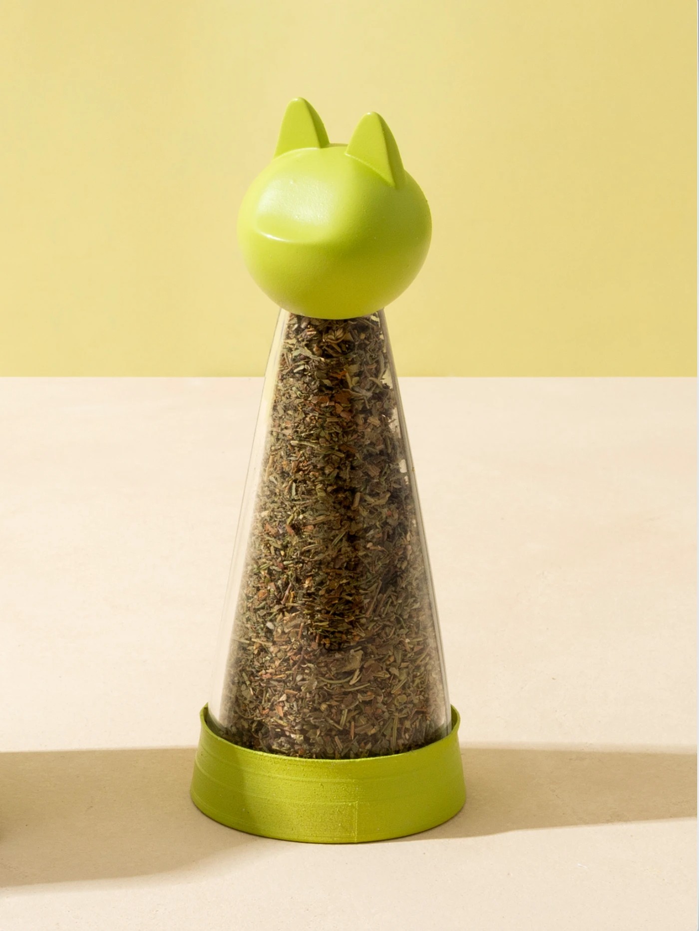
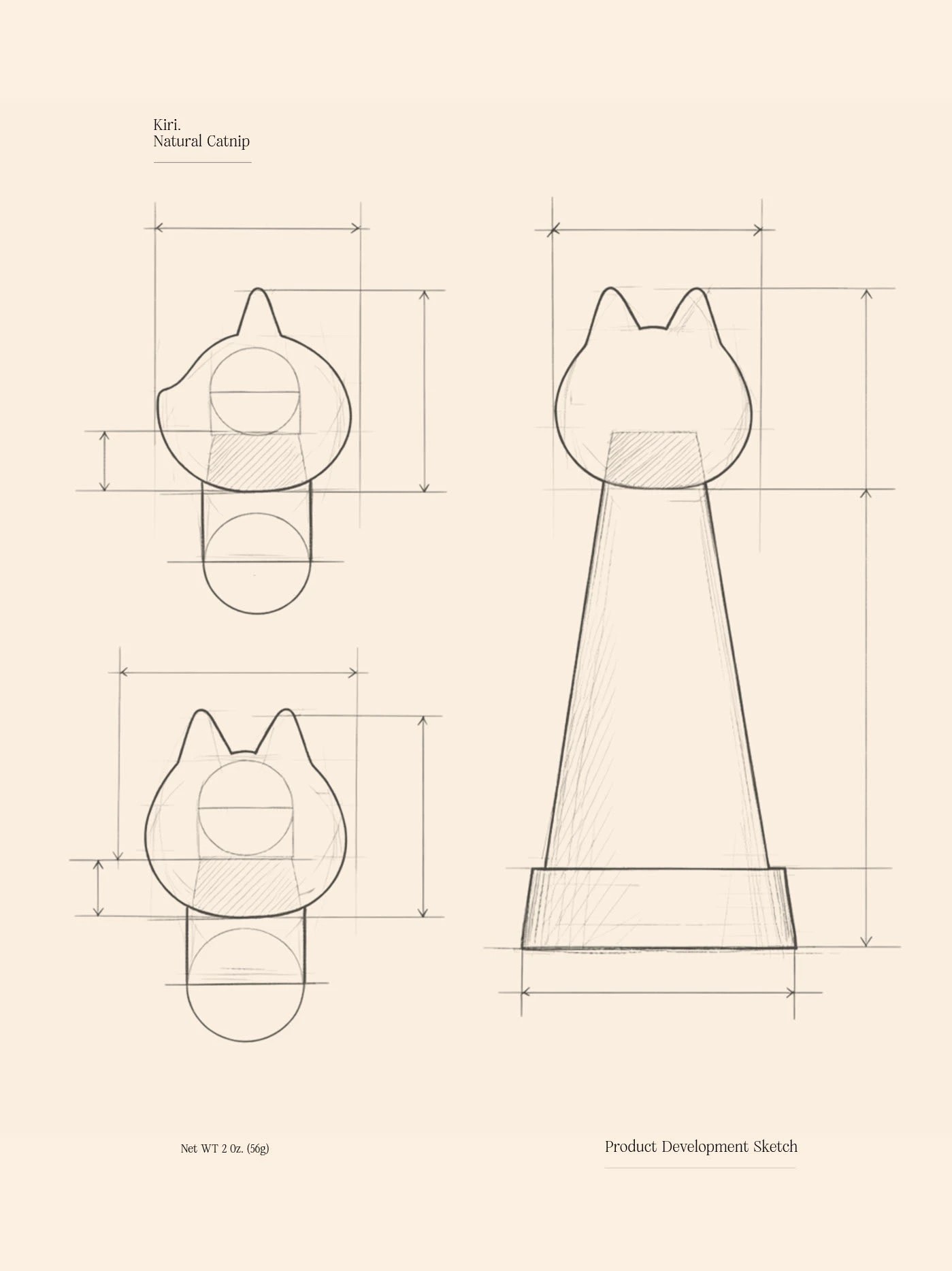
The first thing that stops you is the dispensing container. Cone-shaped, transparent, topped with a cat-eared cap in soft pastels, it looks like it belongs on a dining table next to the olive oil and fleur de sel, not tucked away in a pet supply drawer. That repositioning is the whole point. By treating catnip like a premium condiment, the design shifts how you think about the product before you even read a word on the label. The ritual of sprinkling becomes the experience, not just the means to an end.
What’s easy to miss is how much structural thinking went into something that reads as purely decorative. The container is designed to be refilled and kept, which means it had to earn its place as an object people actually want to hold onto. That’s a harder brief than it sounds. Most packaging asks to be noticed once. This one asks to be lived with.
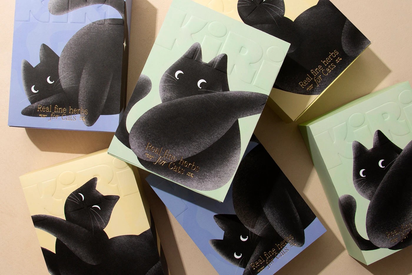
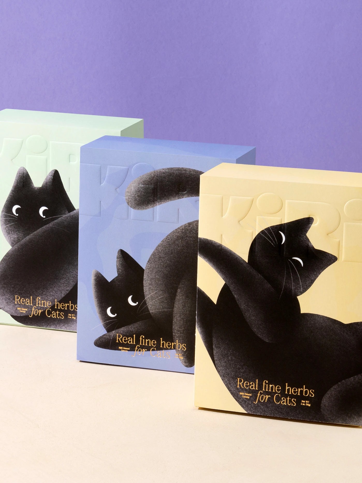
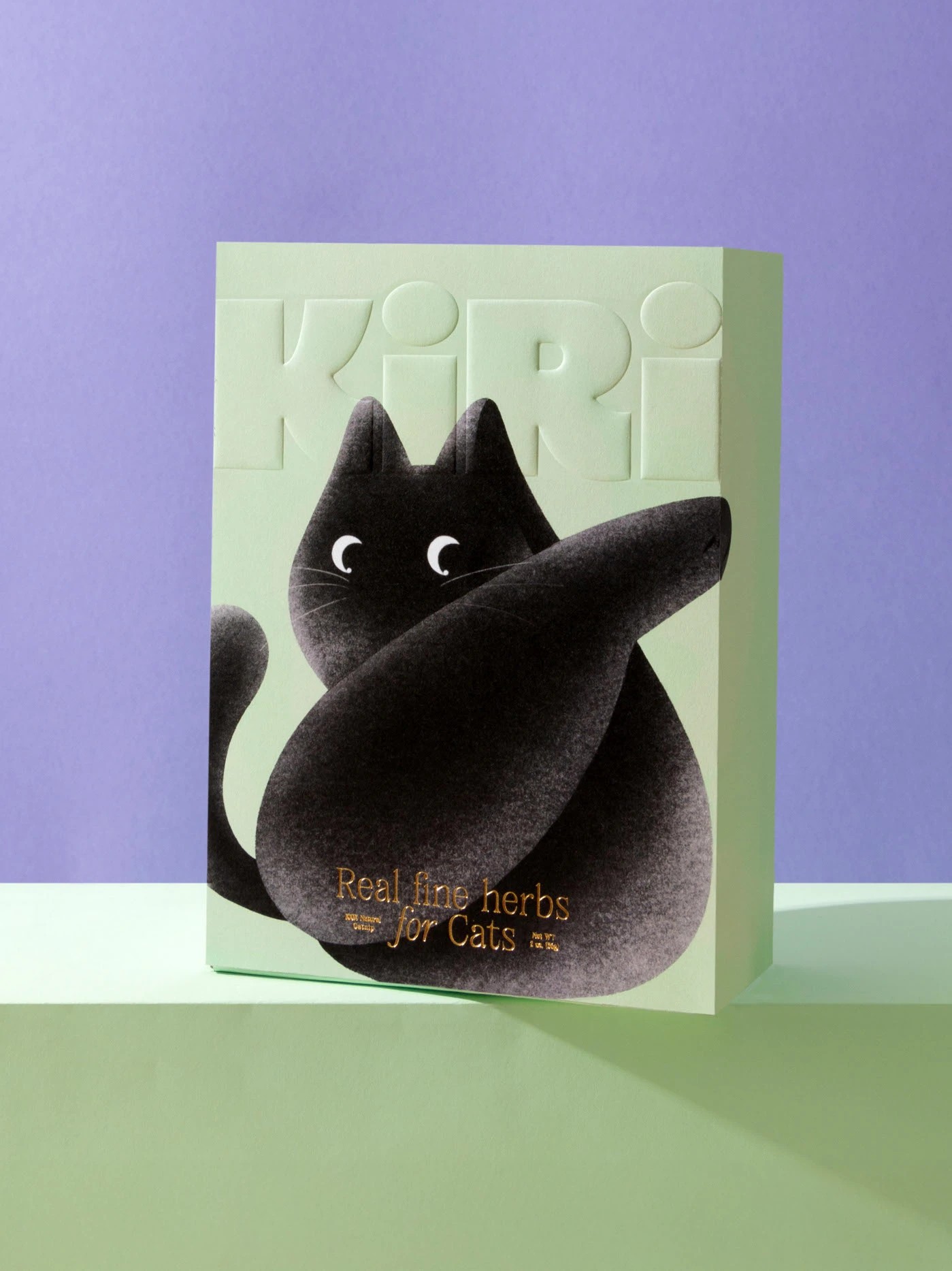
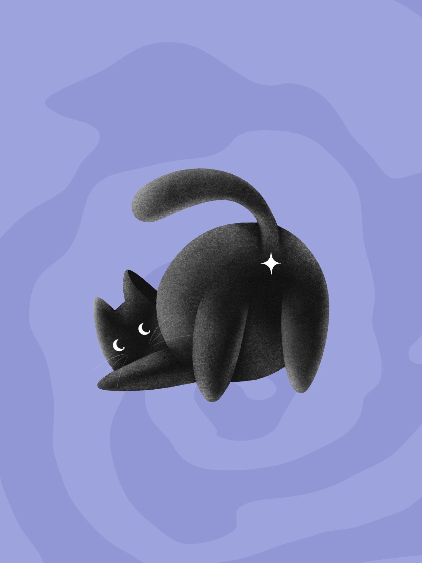
The box range takes a different but equally considered approach. Each variant features the same black cat illustration, rendered in a soft, almost tactile graphic style, caught mid-pose across pastel grounds in blue, cream, and mint. The brand name sits in blind emboss across the top, quiet enough that you almost have to tilt the box to find it. It’s a deliberate choice, the kind of restraint that signals confidence. Loud logos need to prove something. Embossed ones assume you’ll look closer.
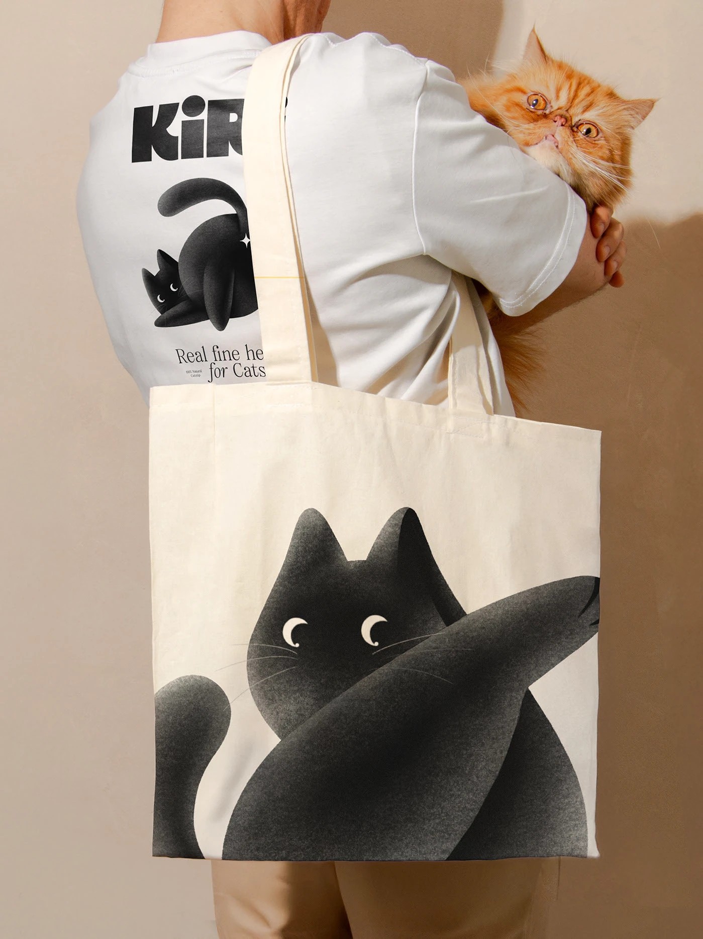
The illustration character deserves its own mention. Drawn with crescent-moon eyes and a rounded, plush silhouette, the cat feels less like a mascot and more like a mood. Each pose tells a slightly different story, and across the three boxes together, it reads almost like a storyboard. The decision to bleed the illustration edge-to-edge, letting the cat spill past the borders of the packaging, gives the whole range a generosity that tight, contained layouts can’t achieve.
The tagline “Real fine herbs for cats” is doing a lot of subtle work. It borrows the language of artisanal food culture and applies it to catnip without irony, and somehow it lands. It reframes a product that’s historically been sold in crinkly plastic bags as something worth presenting, worth choosing, worth gifting.
Kiri doesn’t try to appeal to cats. Cats don’t care about packaging. It appeals to the kind of person who cares that their cat’s things look as considered as the rest of their home. That’s a specific, knowing audience to design for, and Estudio Albino found exactly the right tone for them.



 Biaa
Biaa Petitmoulin Studio
 White Bear Studio
 Eva Chistyakova
 monther al omari
 Atipus
 alchimistestudioParis
 oneandother
 bloomburo
 helocrene
 Shapers Studio
 Denver Design
 Aidearte
 andrew.huerta
 softmachine
 airobtq
 Buzz & Co.
 Ruby
Ruby themythographer
 IDNB Inc.
 viktorflr
 Zenpack
 Wessam Hussien