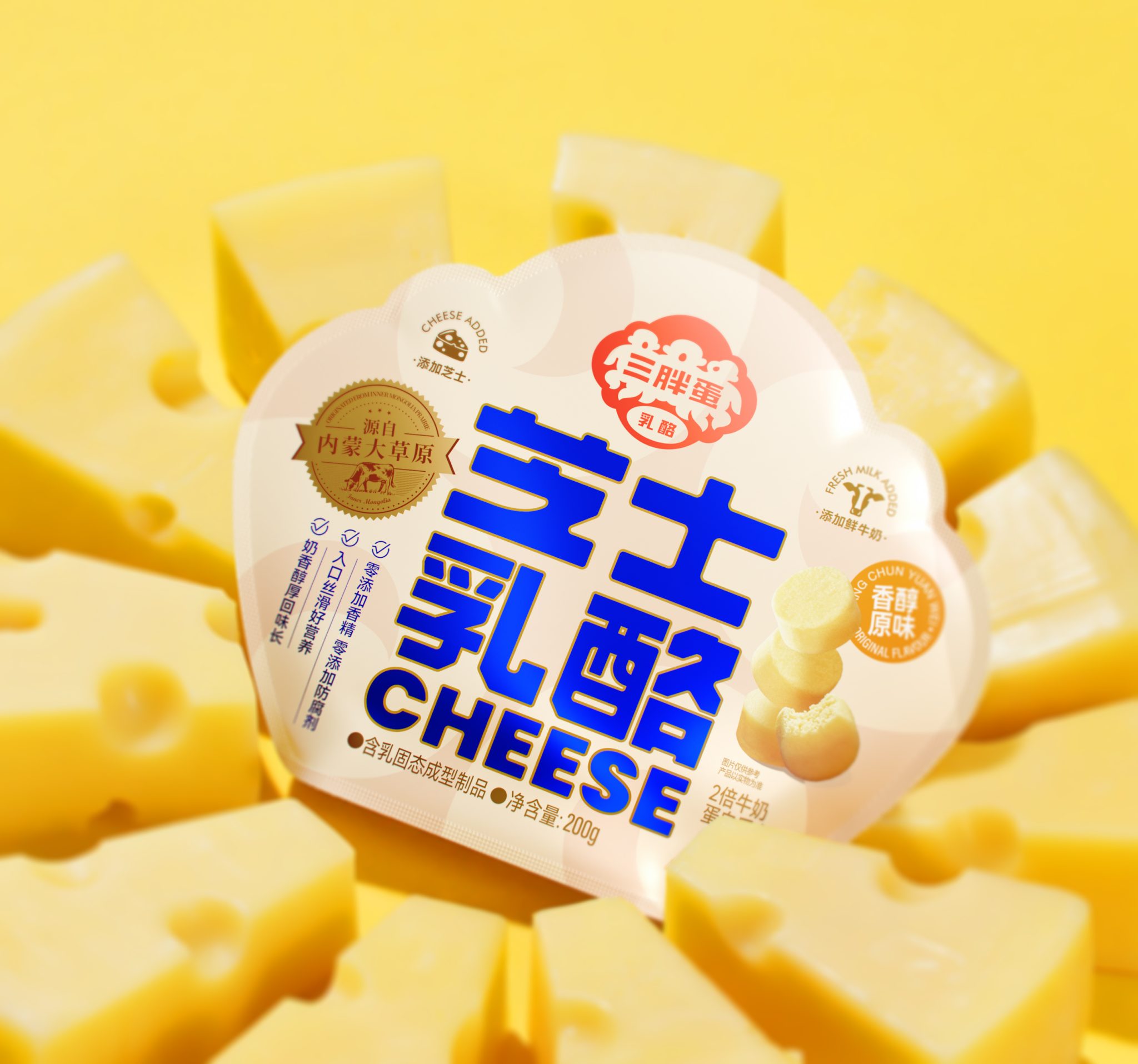

三胖蛋—芝士乳酪包装设计
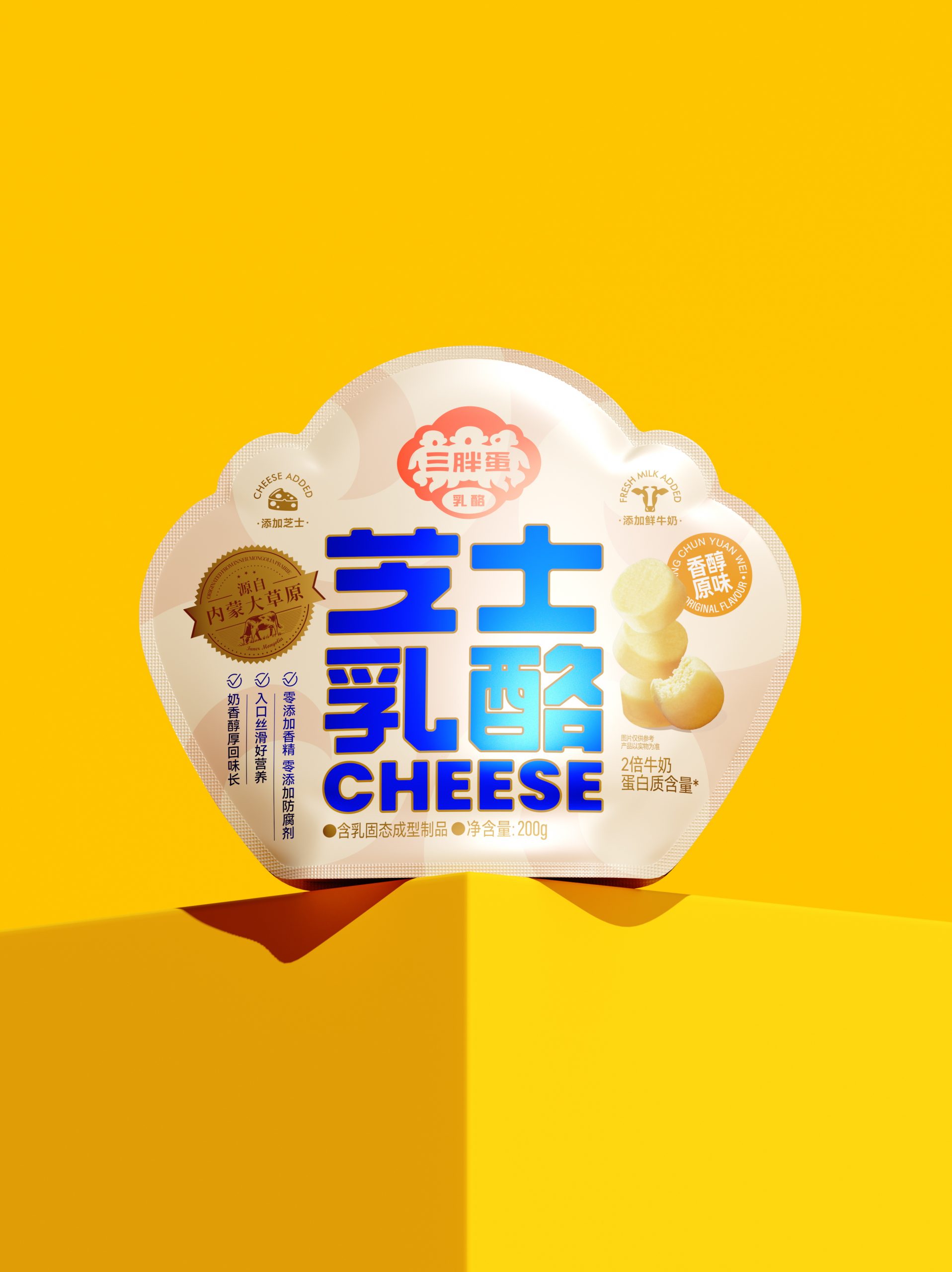
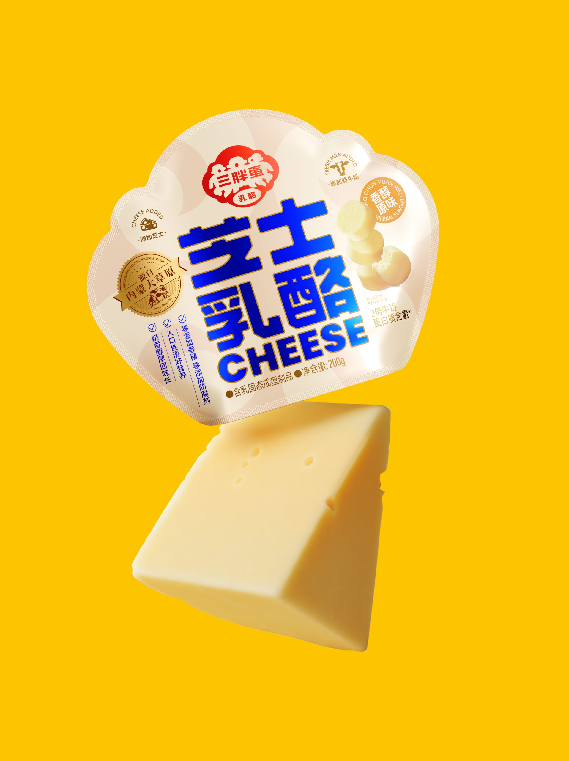
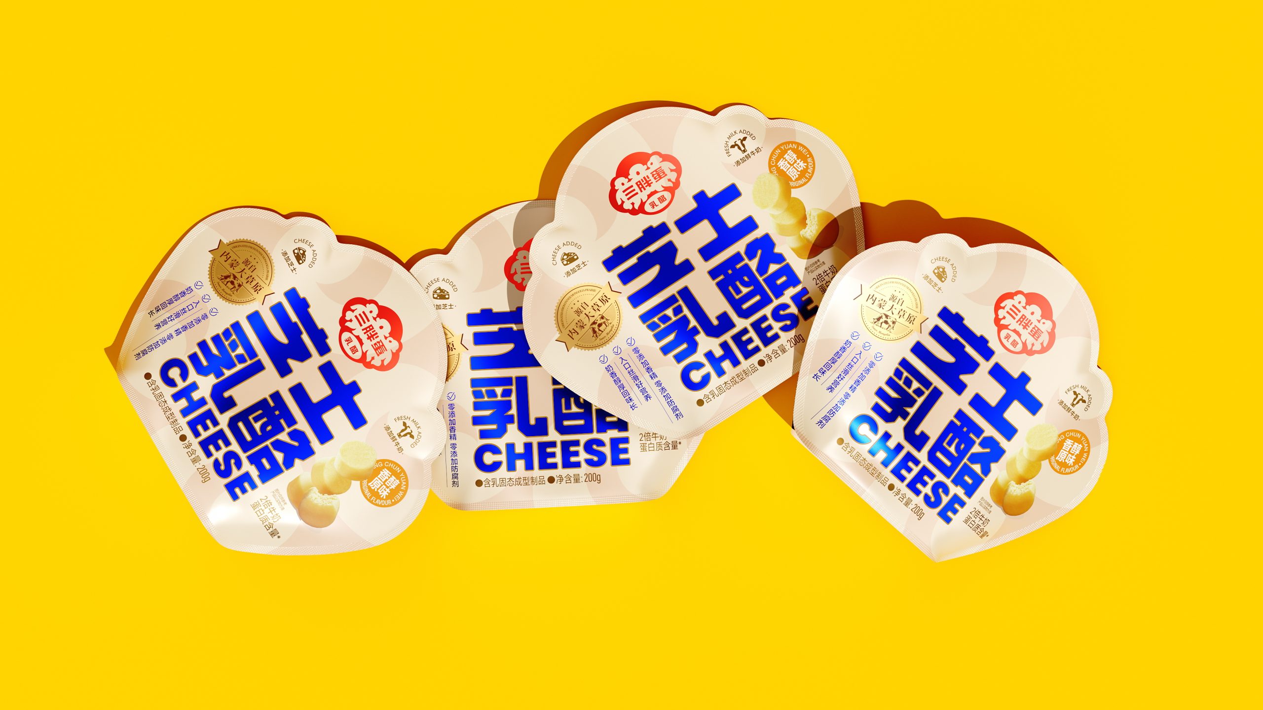
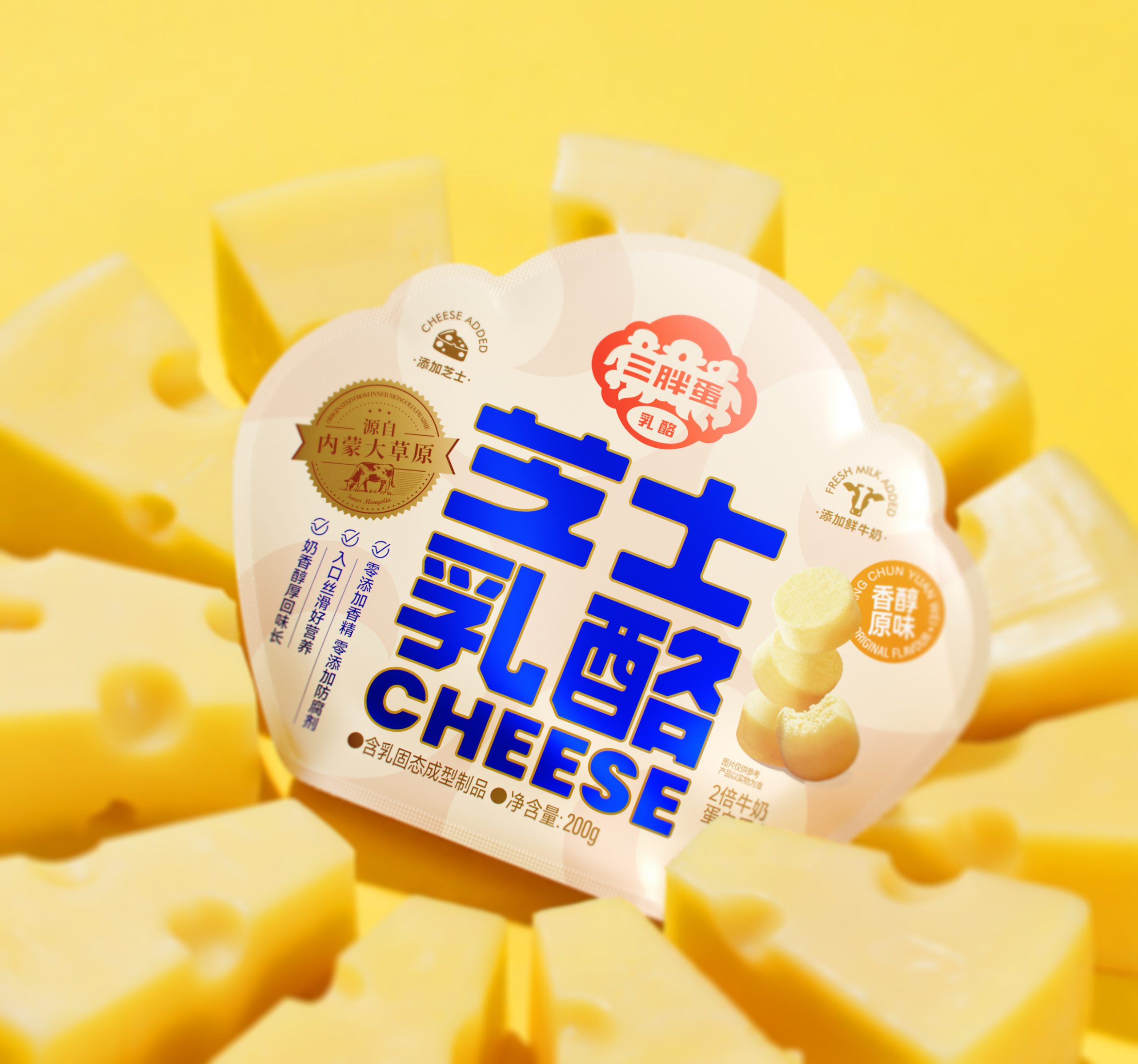
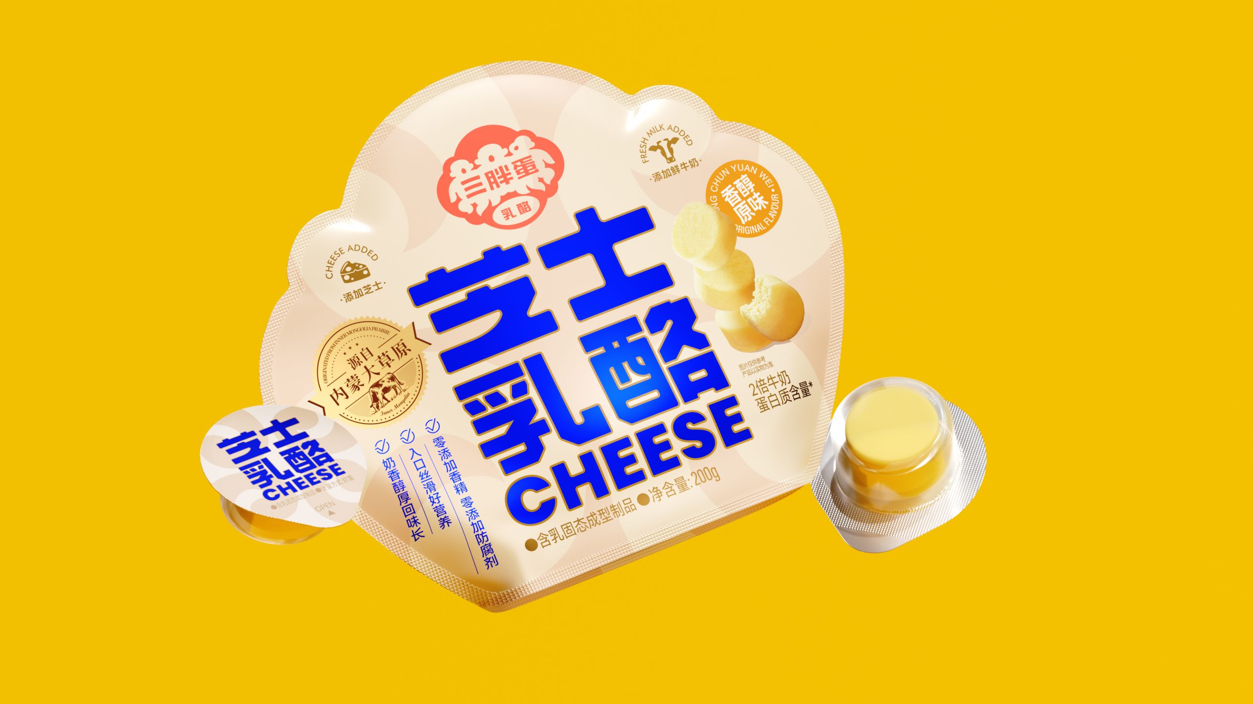
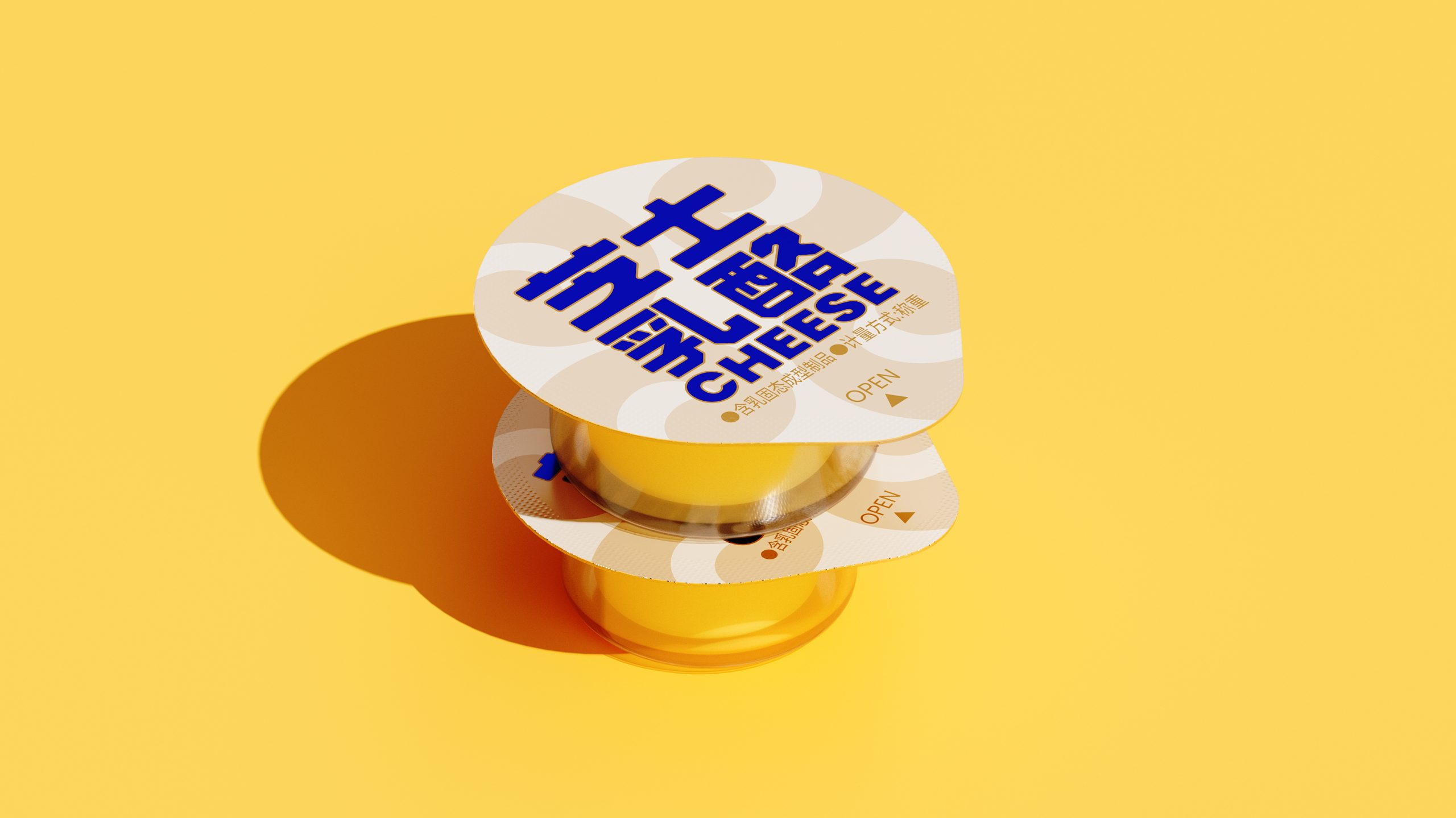
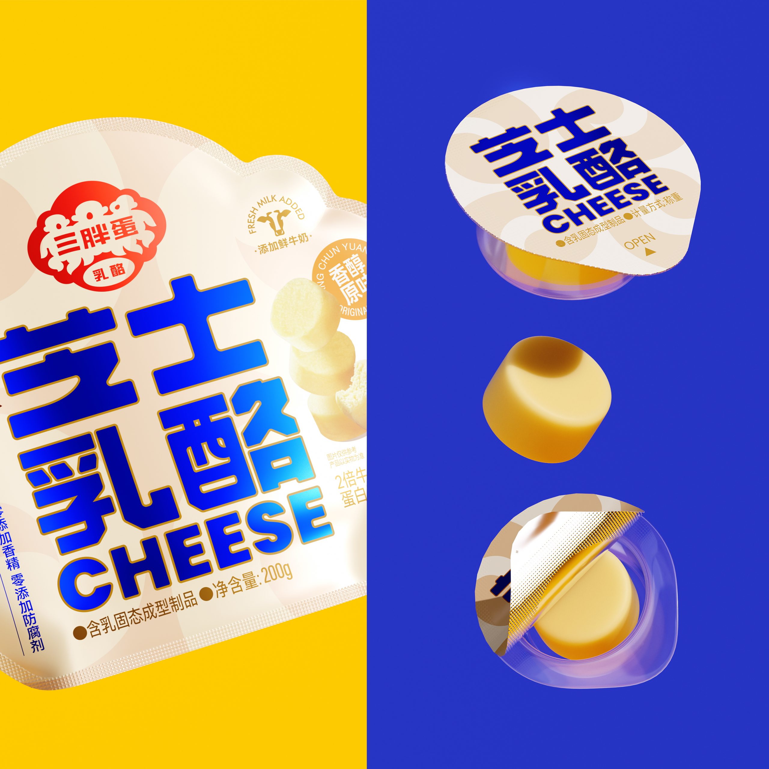
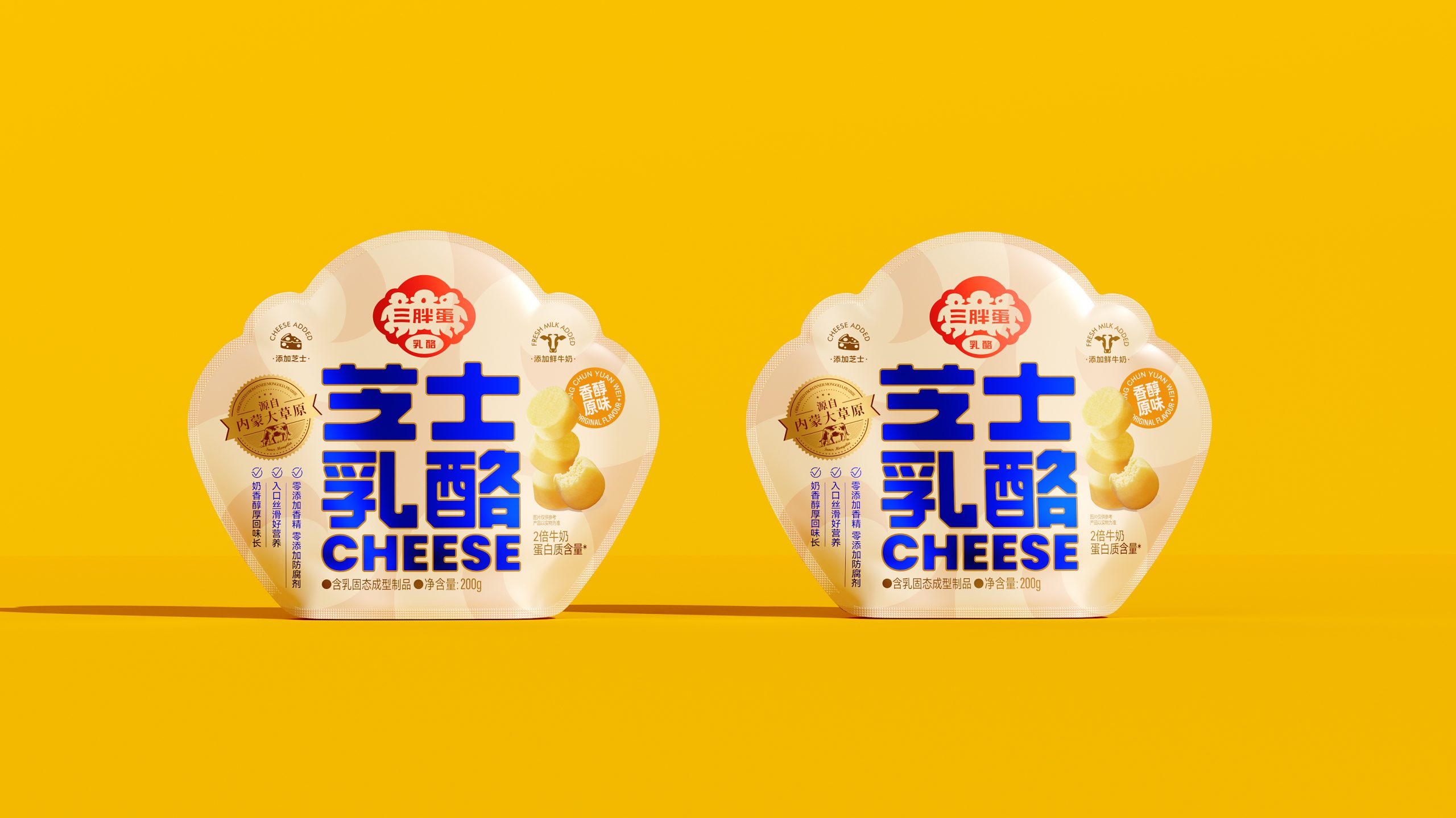
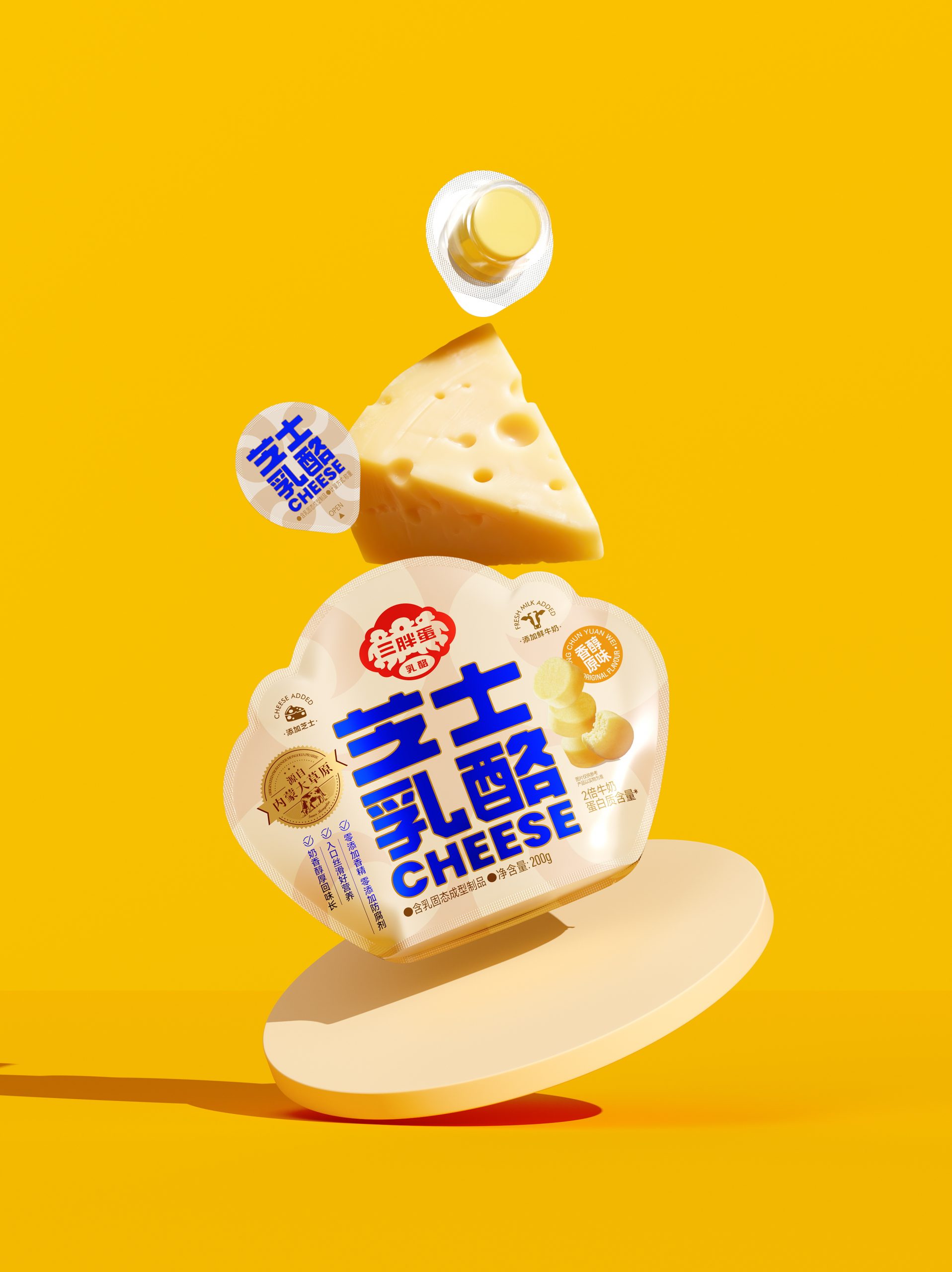
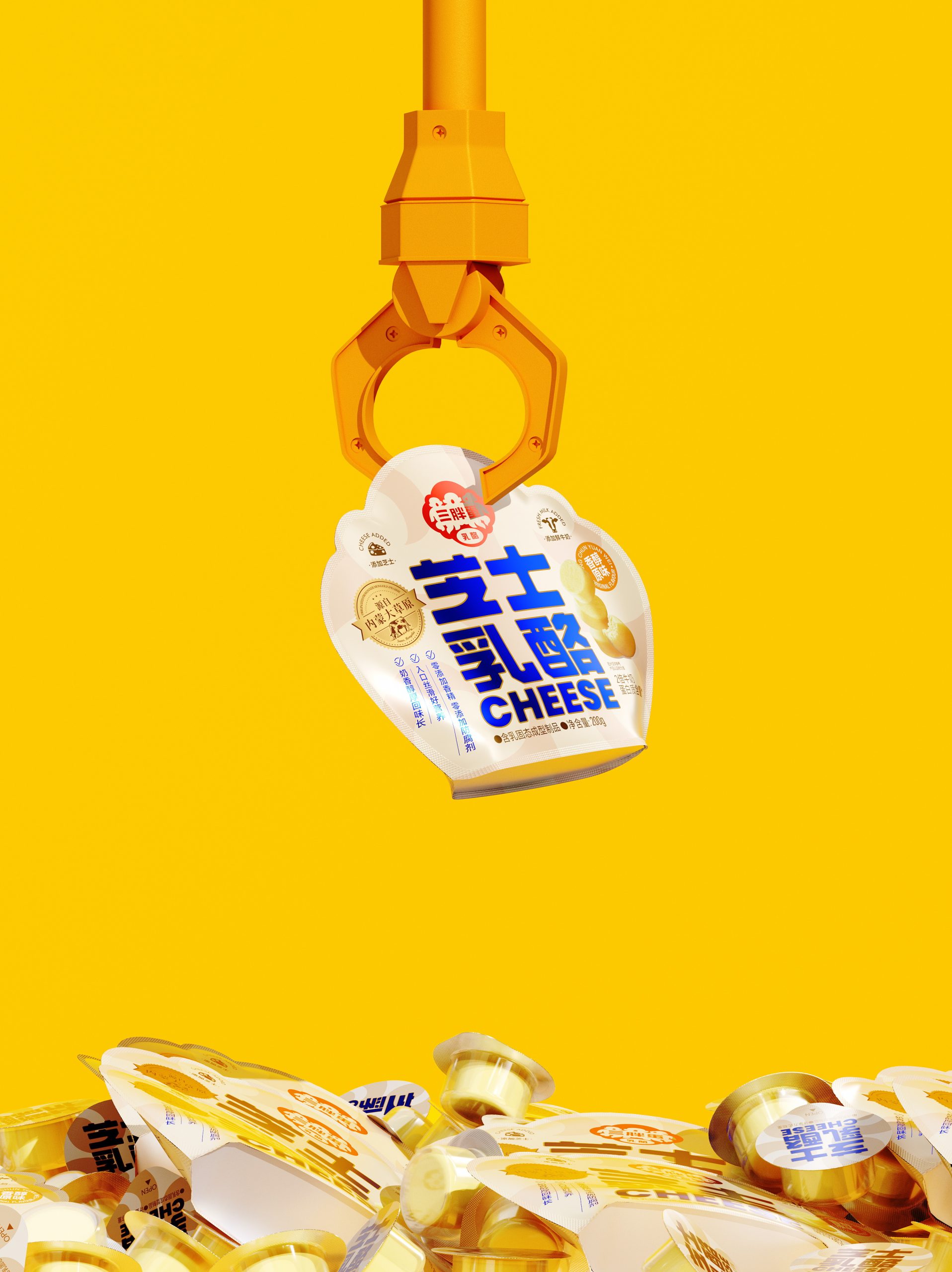
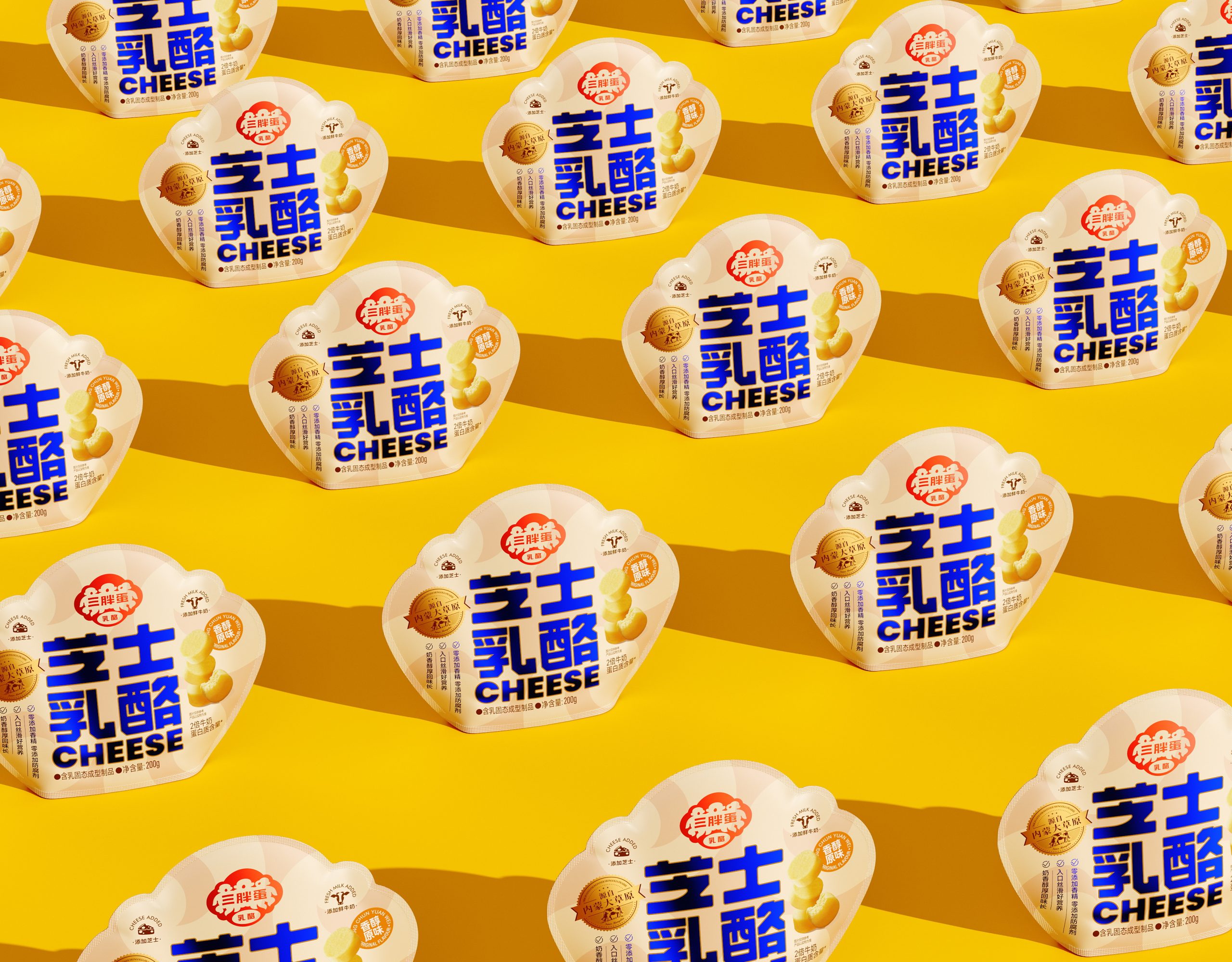
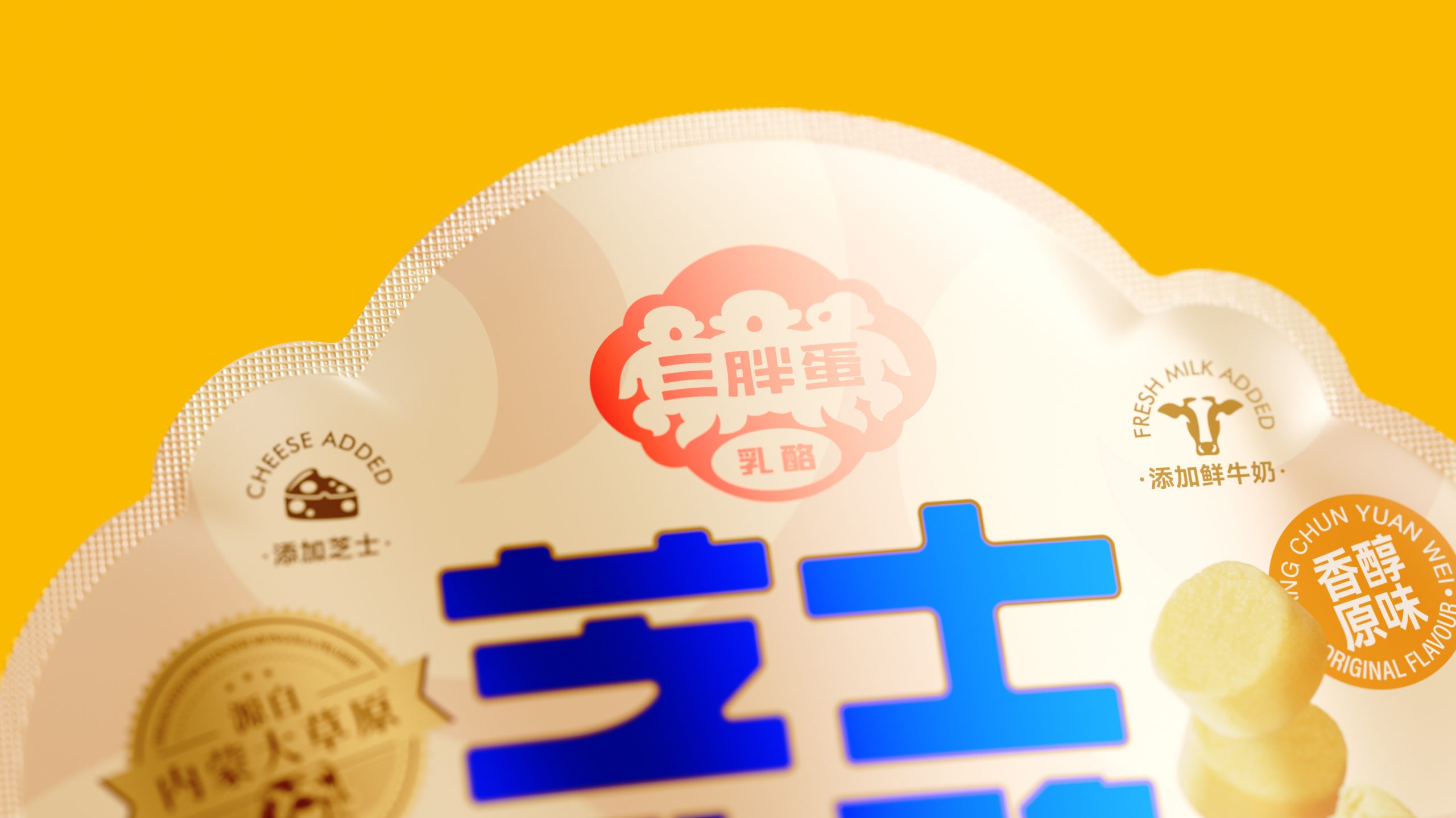
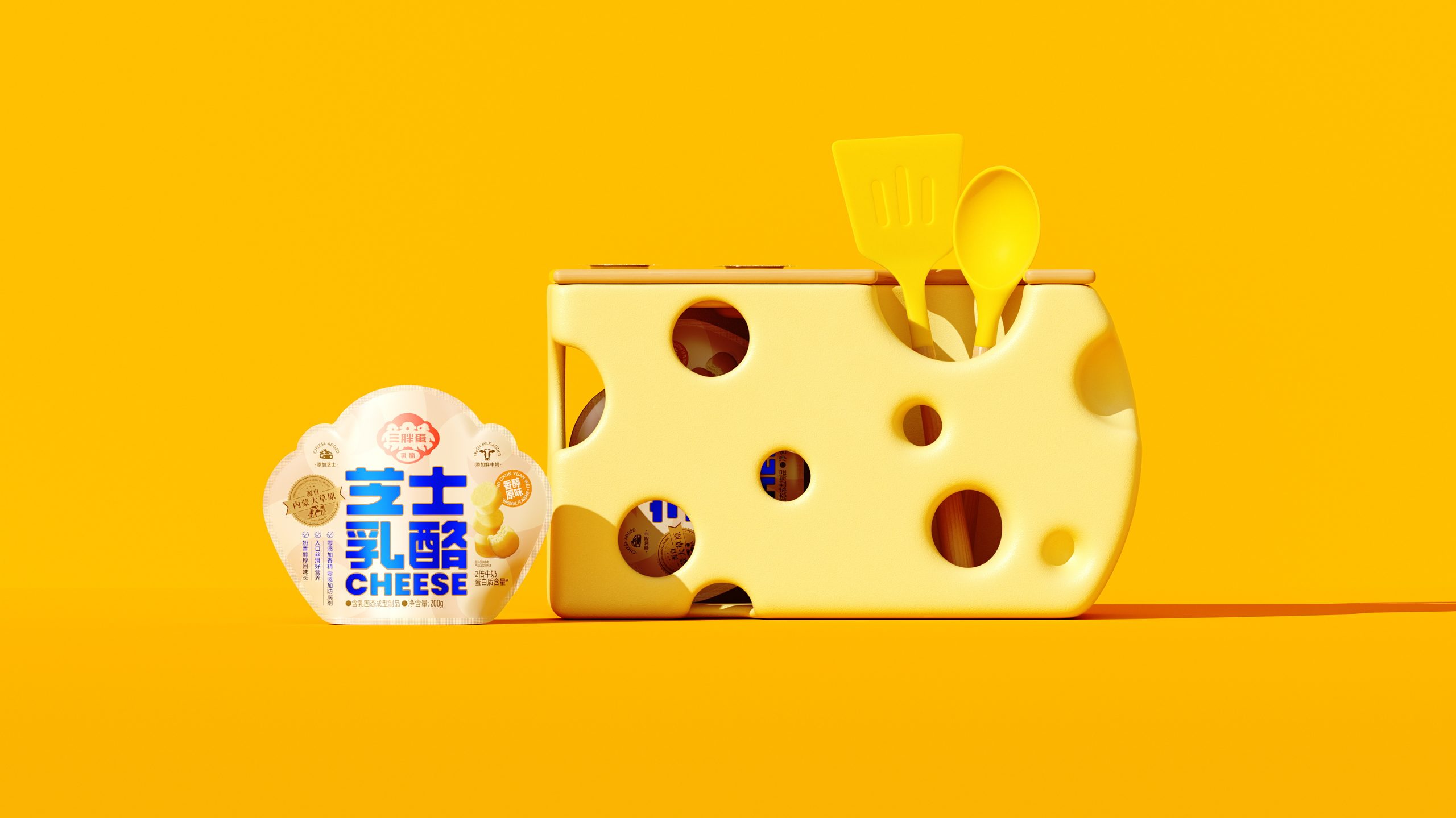
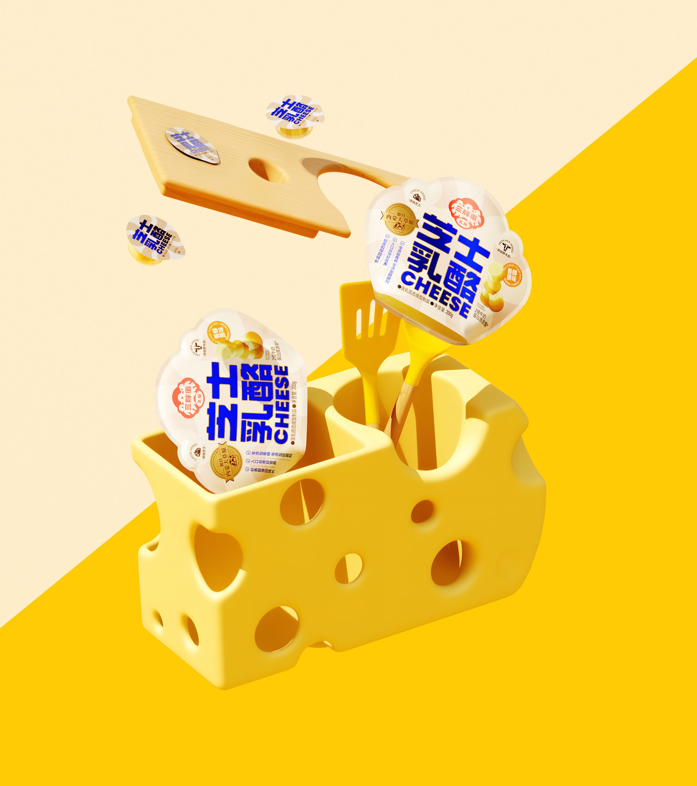
The packaging for Sanpangdan cheese snack leans into a warm, approachable aesthetic that feels distinctly playful without losing credibility. The cloud-like silhouette of the pouch is an immediately clever choice… soft and rounded, it mirrors the pillowy texture of the cheese bites inside while giving the package a shelf presence that breaks from category conventions.
Bold cobalt blue typography for “芝士乳酪 CHEESE” commands attention against the creamy off-white background, with the high contrast doing a lot of heavy lifting in communicating both confidence and dairy freshness. The golden-yellow brand stamp nodding to Inner Mongolian origins adds a layer of provenance storytelling, balancing the otherwise youthful energy of the design.
Overall, it’s a tightly considered piece of work — the colour palette, shape, and type hierarchy all pull in the same direction, making the product feel simultaneously fun, trustworthy, and premium.





 MID-AIR STUDIO
 Heramb Arora
 monther al omari
 Tríona O'Donoghue • Design
 Cocoon Prague
 alchimistestudioParis
 hugo zapata
 Bonsanco Creative Studio
 parawaradesign
 UPRISE
 Brand Society
 Que Cálido Studio®
 Richest Branding Pvt. Ltd.
 STRATEDGY
 Shapers Studio
 Platon Ivantsov
 WPA Pinfold
 giselepereiradesign
 ShalaSketches
 05Creation
 Voit Studio
 SSTO
SSTO