
Curator’s Insight – Wakening: When the Package Knows It’s a Product
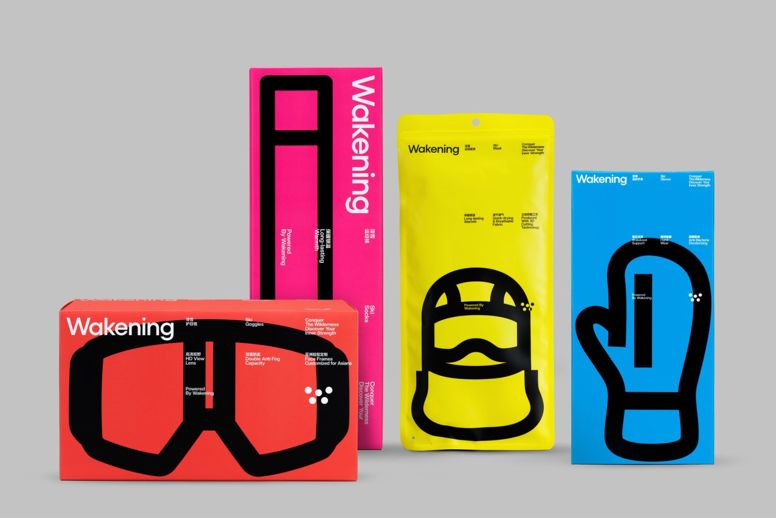
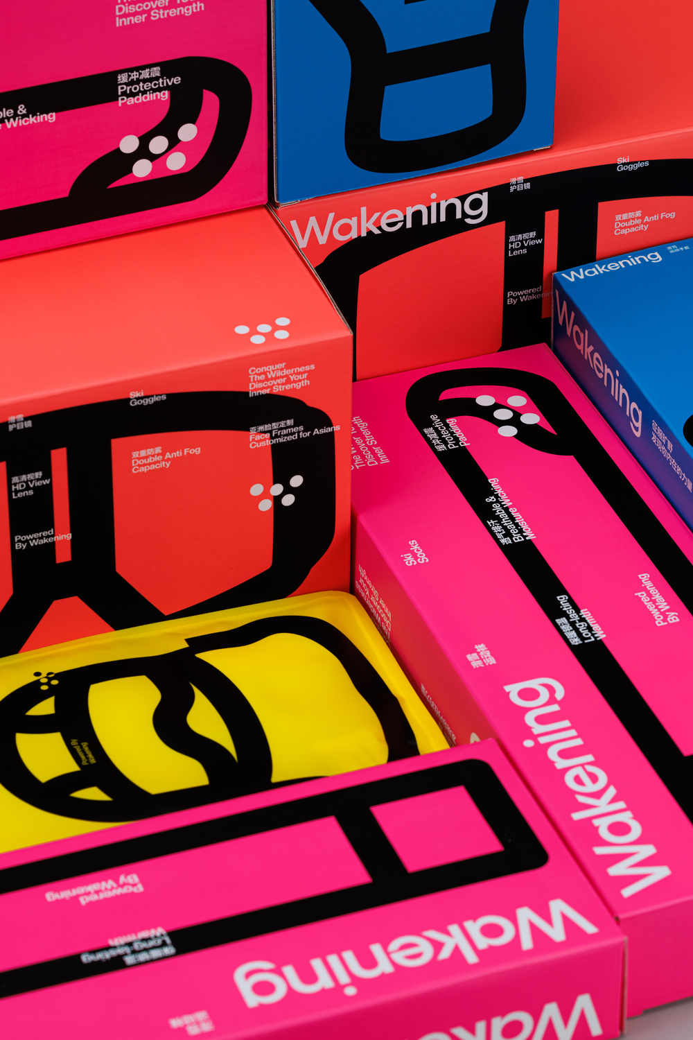
There’s a specific kind of confidence that’s rare in sports packaging, and Wakening has it in abundance. This Shenzhen-based ski gear brand, designed by Studioenok, doesn’t ease you in. It hits you with red, yellow, hot pink, and electric blue, all at once, and somehow it works without feeling like a mess. That’s harder to pull off than it looks.
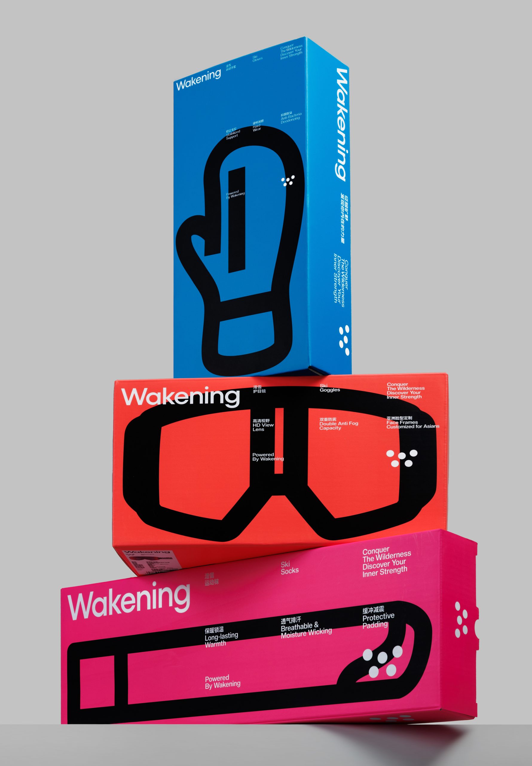
What makes the system truly clever is the icon-as-silhouette approach. Each SKU gets its own product illustration rendered as a thick, graphic outline, blown up to near-fill the entire face of the package. Ski goggles on the red box. A ski mask on yellow. A mitt on blue. Ski socks on pink. The illustration isn’t decoration here; it literally tells you what’s inside without you having to read a word. That kind of visual communication is what separates smart packaging design from pretty packaging design.
The typography is doing just as much work. The wordmark “Wakening” is set in a clean, modern sans that rotates confidently across vertical orientations, yet it never fights for attention with the illustration. The bilingual text blocks, Chinese and English side by side, are treated with almost journalistic discipline, small, structured, and precise. It respects the reader rather than shouting at them.
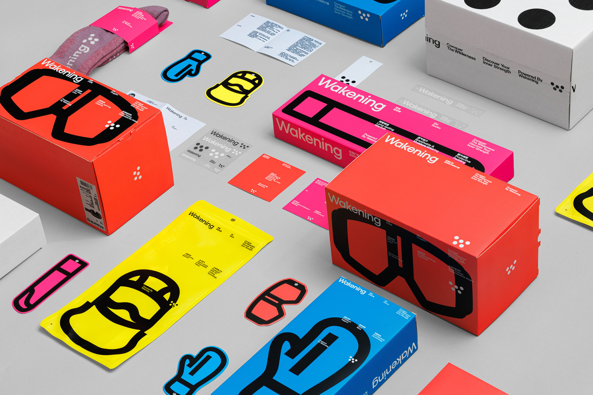
What’s quietly brilliant is how the brand applies this system across very different substrates. A rigid box, a standup pouch, a tall carton. Each format behaves differently, but the color-coding and icon logic holds everything together. The flat lay image reveals stickers, tags, and inserts that carry the same visual DNA down to the smallest touchpoint. Nothing breaks the system.
At its core, Wakening treats packaging as the first piece of sports gear you interact with. And that’s exactly the right instinct.



 Studio Zak
 Ander Sanchez
 Atipus
 Widarto Impact
 hovski
 Ohmybrand
 CreativeWise
 Rauf Karaev
 Hooperstudio
 La Nube de Ideas
 Modern Theory
 Akim Melnik Design Studio
 preflightcreative
 Seyf El Haq Menouer
 Badraddine Attik
 Samriddhi Ravi
 Alessandro Ammaturo
 Amblr Studio
 vladlenalevit
 Sis Tsarukyan
 monther al omari
 alchimistestudioParis
 designsbysukaina
 About House of Ta
 Amjad Battal